- What Does a Global Traffic Ecosystem Service Provider Do? What Are the Differences from a Single Advertising AgencyJul 16, 2026View details
- What should you focus on in the latest enterprise SaaS report? From renewal rates and delivery costs to overseas growth opportunitiesJul 12, 2026View details
- What signals are worth paying attention to in a cross-border marketing trend report? B2B companies should look at these 6 signalsJul 11, 2026View details
- How to Read a Cross-Border Marketing Trends Report? Five Key Dimensions for Evaluating Channel OpportunitiesJul 11, 2026View details
- Which channel has the highest ROI in the global traffic ecosystem? Comparative analysis of search, social media, and advertisingJul 10, 2026View details
- What multilingual website services are available in Sanya? Which model is more suitable for local businesses going global?Jul 08, 2026View details
- How to view the complete list of China SaaS companies in the top 100? Practical methods for screening website-building and marketing service providersJul 08, 2026View details
- How to view pricing in the global traffic ecosystem? Cost comparison of search, social media, and content channel advertisingJul 06, 2026View details
Are mobile adaptation and responsive design the same thing?
Are mobile adaptation and responsive design the same thing? Many companies often confuse the two when building an official website or independent site. In fact, they differ significantly in implementation methods, cost investment, and marketing effectiveness.
For foreign trade companies, manufacturing factories, cross-border e-commerce sellers, and brands expanding overseas, this is not merely a technical issue. It is a business decision that directly affects customer acquisition efficiency, advertising conversion, SEO indexing, and ongoing maintenance costs. If a page cannot load reliably within 3 seconds or the above-the-fold content frequently shifts out of place on mobile devices, users often leave after just one swipe.
In an integrated website and marketing services scenario, companies are not merely building a website that “looks good,” but a digital asset that can be promoted, indexed, and converted. Understanding the difference between mobile adaptation and responsive design can help companies avoid 1 to 2 rounds of rework during the initial website-building stage, while also facilitating subsequent SEO, advertising, and multilingual expansion.
What Exactly Is the Core Difference Between Mobile Adaptation and Responsive Design?
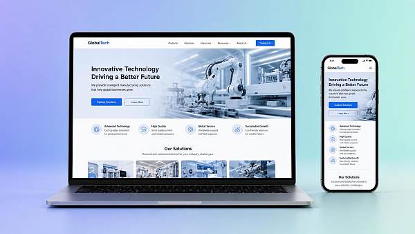
Simply put, mobile adaptation typically involves separately adjusting the page structure and element sizes for different devices such as smartphones and tablets, or independently loading a set of mobile pages. Responsive design, on the other hand, uses the same set of front-end code to automatically rearrange the layout according to screen widths at breakpoints such as 320px, 768px, and 1024px.
Definitions and Implementation Logic
Mobile adaptation places greater emphasis on “optimizing for specific devices.” Common practices include designing separate mobile pages, hiding certain PC modules, simplifying navigation levels, and adjusting button touch areas. It may involve an independent m-site or partial adaptation based on the original site.
Responsive design places greater emphasis on “one site adapting to multiple devices.” The page uses flexible grids, media queries, and scalable images so that the same URL automatically displays an appropriate layout on different devices. This approach generally offers greater advantages in content consistency, maintenance efficiency, and the consolidation of SEO authority.
3 Points Companies Most Commonly Confuse
- Confusing “the site can be opened on a mobile phone” with “mobile adaptation has been completed.” Being accessible does not mean being user-friendly. Buttons that are too small, difficult-to-complete forms, and oversized images can all affect conversion.
- Confusing “the page can be scaled” with “it is responsive design.” If the page is merely compressed as a whole without optimizing the content hierarchy for different breakpoints, the user experience will still be poor.
- Putting “low website-building costs” first while ignoring maintenance costs over the next 1 to 3 years. The costs saved at the initial stage may multiply during subsequent redesigns, SEO fixes, and reconstruction of advertising landing pages.
To make the differences more intuitive, the following section compares the two approaches from the perspective of actual website-building and overseas marketing applications.
If a company aims for long-term SEO growth, multilingual content expansion, and a consistent brand image, responsive design is generally the more reliable choice. If the business relies heavily on mobile advertising, campaign pages, or single-page conversion, mobile adaptation may deliver stronger engagement and conversion results. The key is not which “concept” to choose, but whether it matches the business scenario.
Why Does This Choice Affect SEO, Advertising Conversion, and Overseas Customer Acquisition Efficiency?
In integrated website and marketing service projects, the page adaptation method simultaneously affects search engine crawling, user dwell time, inquiry form submission rates, and the quality of conversions after ad clicks. This is not a matter of a designer’s aesthetic preferences, but an infrastructure issue at the front end of the marketing funnel.
Impact on SEO: It Is Not Just About “Getting Indexed”
If an independent mobile site or multiple URL structures are used, companies need to additionally manage canonical tags, redirect logic, page consistency, and crawling paths. For websites with more than 200 pages and more than 3 language versions, this management complexity increases significantly.
Because responsive design uses a unified URL, it is generally easier for search engines to understand the page topic and helps avoid indexing fluctuations caused by excessive content differences between PC and mobile versions. For B2B foreign trade websites in particular, product pages, solution pages, and blog pages need to consistently pass internal link authority. A unified structure makes continuous optimization easier.
Impact on Advertising Conversion: Above-the-Fold Content and Forms Determine Costs
More than 50% of traffic from Google Ads, Facebook Ads, and short-video campaigns typically comes from mobile devices. If the above-the-fold copy is squeezed by a large image, the CTA button is pushed more than 2 screens down, or the form contains more than 6 fields, even a low click cost will make it difficult to generate qualified inquiries.
The advantage of mobile adaptation is that companies can make more aggressive simplifications for advertising traffic. For example, they can limit the core selling points to no more than 3, keep 1 to 2 buttons above the fold, and reduce the form to 3 to 5 fields, thereby improving the landing page conversion rate.
Common Impact Metrics
- Above-the-fold loading time should generally be controlled within 2 to 3 seconds.
- The recommended touch area for the main mobile button is no smaller than 40px.
- Body text lines should not be excessively long. A common readable range is the visual width of 20 to 30 Chinese characters.
- Core inquiry forms should generally be limited to 3 to 6 fields.
The following table can help companies determine which approach is more suitable for their current stage from a customer acquisition perspective.
For most companies seeking long-term growth through Google SEO, the more practical combination is often “using responsive design for the official website and applying in-depth mobile adaptation to advertising pages based on conversion goals,” rather than treating the two as mutually exclusive choices.
How Should Different Companies Choose? Work Backward from Business Goals to Determine the Website-Building Plan
Are mobile adaptation and responsive design the same thing? Clearly, they are not. More importantly, how should a company choose based on its customer acquisition model? The criteria are generally straightforward, focusing on 4 dimensions: traffic structure, content scale, update frequency, and conversion path.
Companies Suited to Prioritizing Responsive Design
If a company’s official website serves multiple purposes, including brand presentation, product introduction, case accumulation, blog content, and multilingual SEO, and contains more than 50 pages, responsive design is generally more suitable. It is more conducive to continuous content expansion and facilitates unified management of technical standards, redirect rules, and conversion components.
Companies Suited to Strengthening Mobile Adaptation
If a company currently relies mainly on Google Ads, Facebook Ads, social media traffic acquisition, or KOL content promotion, and traffic primarily enters campaign pages, inquiry pages, or single-product pages, mobile adaptation will provide greater value. Especially during a 2- to 4-week customer acquisition campaign, optimizing the above-the-fold content, buttons, and forms for mobile devices often produces results more quickly.
4 Decision Checklist Items
- Does mobile traffic account for more than 60%?
- Does the website need to support more than 3 language versions?
- Is the company planning to publish content continuously, with more than 8 new pages added per month?
- Is there a need for independent advertising landing pages, holiday promotion pages, or regional market pages?
If 2 of the 4 items above are more focused on long-term content operations, responsive design should be used as the foundation. If more than 2 items are focused on advertising conversion and short-cycle customer acquisition, dedicated mobile optimization should be added on the basis of responsive design.
Key Risks and Optimization Priorities for Companies During Implementation
The factors that truly create performance differences are often not the choice of terminology, but the implementation details. Many websites appear to use responsive design, but overly large mobile images, excessively deep navigation levels, and inconspicuous conversion buttons ultimately still affect promotional performance.
Common Risks
- Directly transferring PC content to mobile devices, resulting in excessive information density above the fold.
- Translating only the copy on multilingual sites without synchronously optimizing mobile layouts, resulting in irregular line heights in English, German, and Russian.
- Failing to compress and crop images, causing single-page resources to exceed 3MB and slowing down access.
- Scattering consultation entry points by placing WhatsApp, forms, email, and phone numbers together above the fold, thereby weakening the primary conversion path.
An Implementation Approach Better Suited to Overseas Expansion
For foreign trade and cross-border businesses, the recommended approach is a combination of a “marketing-oriented responsive official website + channel-specific mobile landing pages.” The former is responsible for brand credibility, SEO indexing, and content asset accumulation, while the latter handles traffic from advertising, social media, and short videos, reducing wasted clicks.
For an AI-driven enterprise SaaS intelligent website-building and overseas marketing service platform such as 易营宝, the advantage lies in integrating website building, SEO, advertising, multilingual content, and ongoing optimization into a unified growth framework. Companies do not need to split website development, mobile experience, SEO indexing, and advertising conversion into 4 isolated projects. Instead, they can advance them collaboratively according to their market objectives.
Recommended 5-Step Implementation Process
- Clarify the objectives first: brand presentation, SEO customer acquisition, advertising conversion, or multilingual expansion.
- Review the device structure: analyze the proportion of mobile traffic over the past 30 or 90 days.
- Determine the page strategy: a responsive official website, mobile-first landing pages, or parallel implementation of both.
- Test before launch: cover at least 3 types of devices, 2 operating systems, and mainstream browsers.
- Optimize after launch: review bounce rate, dwell time, and conversion rate in stages at 7, 30, and 90 days.
Mobile adaptation and responsive design are not the same, but neither are they opposites. For most companies expanding overseas, the best answer is often not a single choice. Instead, they can use responsive design to build a website foundation capable of long-term growth, then apply in-depth mobile adaptation to improve conversion efficiency for specific channels.
If you are planning a foreign trade website, cross-border independent site, or multilingual marketing-oriented website, it is recommended that you evaluate the four dimensions of traffic sources, SEO objectives, advertising, and ongoing maintenance as early as possible. Choosing an appropriate website-building and marketing solution can significantly reduce rework costs over the next 6 to 12 months and improve global customer acquisition efficiency. If you would like to learn about an implementation path better suited to your business, contact us now to obtain a customized solution or learn more about our solution details.
Related Articles
Related Products
 EasyCamp SaaS Smart Website Marketing SystemE-Yingbao SaaS Smart Website Marketing System: AI-powered, zero-code website building. Rapidly launch multilingual independent e-commerce sites in just 10 minutes. Global server acceleration and AI-driven SEO optimization empower businesses to efficiently connect with global markets. The seamless integration of technology and user-friendly operation makes building e-commerce sites incredibly simple.
 AI+SEM Intelligent Advertising Marketing SystemAI+SEM drives intelligent ad creation, empowering full-funnel precision advertising marketing. The system automatically generates weekly/monthly reports, AI recommends keywords and target countries, monitors core metrics in real-time with intelligent alerts, and enables one-click high-conversion ad solutions to help quickly acquire customers and improve ROI.
 AI+SEO Dual Engine Optimization ServiceEasyWin AI+SEO Dual Engine Optimization System leverages AI-powered keyword mining, content generation, and comprehensive technical optimization to help foreign trade enterprises acquire high-quality organic traffic, significantly improving search rankings and conversion rates.
 AI+SNS Social Media Marketing SystemYingbao AI+SNS Social Media Marketing System - Precision social capture for the social media era. Supports one-click content synchronization across major platforms like Facebook and LinkedIn. AI intelligently rewrites posts for enhanced relevance. 24/7 AI customer service and user profiling analysis empower businesses to efficiently expand into global markets.
 AI+SEO营销解决方案易营宝AI+SEO营销解决方案,通过AI批量写作、智能生成TDK、精准关键词扩词等功能,全面优化网站SEO效果,提升流量与转化率。助力企业构建高效智能网站新生态。
 AI+SEM Advertising Marketing SolutionsAI+SEM Advertising Marketing Solution leverages AI technology to deeply empower SEM ad campaigns. It automatically generates weekly/monthly reports using AI, presenting account data across multiple dimensions for comprehensive insights into campaign performance and trends. The system precisely recommends keywords and target countries, intelligently generates high-conversion ad copy, and enables one-click activation of efficient campaign plans to help businesses rapidly acquire customers. Simultaneously, it monitors core metrics in real time, intelligently identifies abnormal fluctuations, and issues timely alerts to ensure stable, high-return advertising results.
 Domain Name ServicesEasyWin provides professional domain name services, including intelligent queries, one-stop registration, brand protection, and full lifecycle management, helping businesses build a digital brand image.
 EasyOperate B2C Cross-Border E-Commerce Platform & Independent WebsiteEasyStore B2C Cross-border E-commerce Independent Store is an intelligent website building and cross-border e-commerce integrated solution independently developed by EasyStore Information Technology (Beijing) Co., Ltd. The system is specially designed for small and medium-sized as well as large export enterprises, integrating 'website building, operation, marketing, advertising, and conversion' into one, helping enterprises quickly establish cross-border e-commerce independent stores to achieve brand globalization and global sales growth.
The platform supports multiple languages, multiple currencies, and multi-channel marketing, with built-in AI intelligent translation and SEO optimization systems, suitable for mainstream markets such as Southeast Asia, Europe and America, Latin America, and the Middle East, assisting Chinese manufacturing enterprises in efficiently deploying international e-commerce strategies. SSL证书易营宝提供专业SSL安全证书服务,包括单域名和泛域名证书,确保网站数据传输加密、身份验证和完整性保护,助力企业建立安全可信的在线业务环境。