1. Definition of Responsive Websites
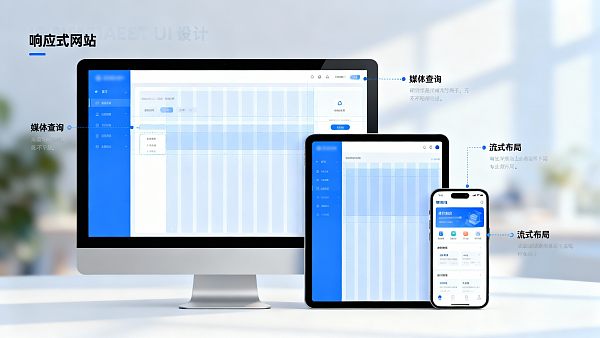
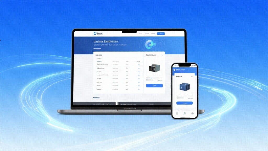
A responsive website (Responsive Website) refers to a web design model that automatically adjusts layout and content display based on the screen size, resolution, and orientation of the user's device. Its core concept is "one website, multi-device compatibility," ensuring that whether users access it via computers, tablets, or mobile phones, the page intelligently adapts to maintain consistent visual and interactive logic.
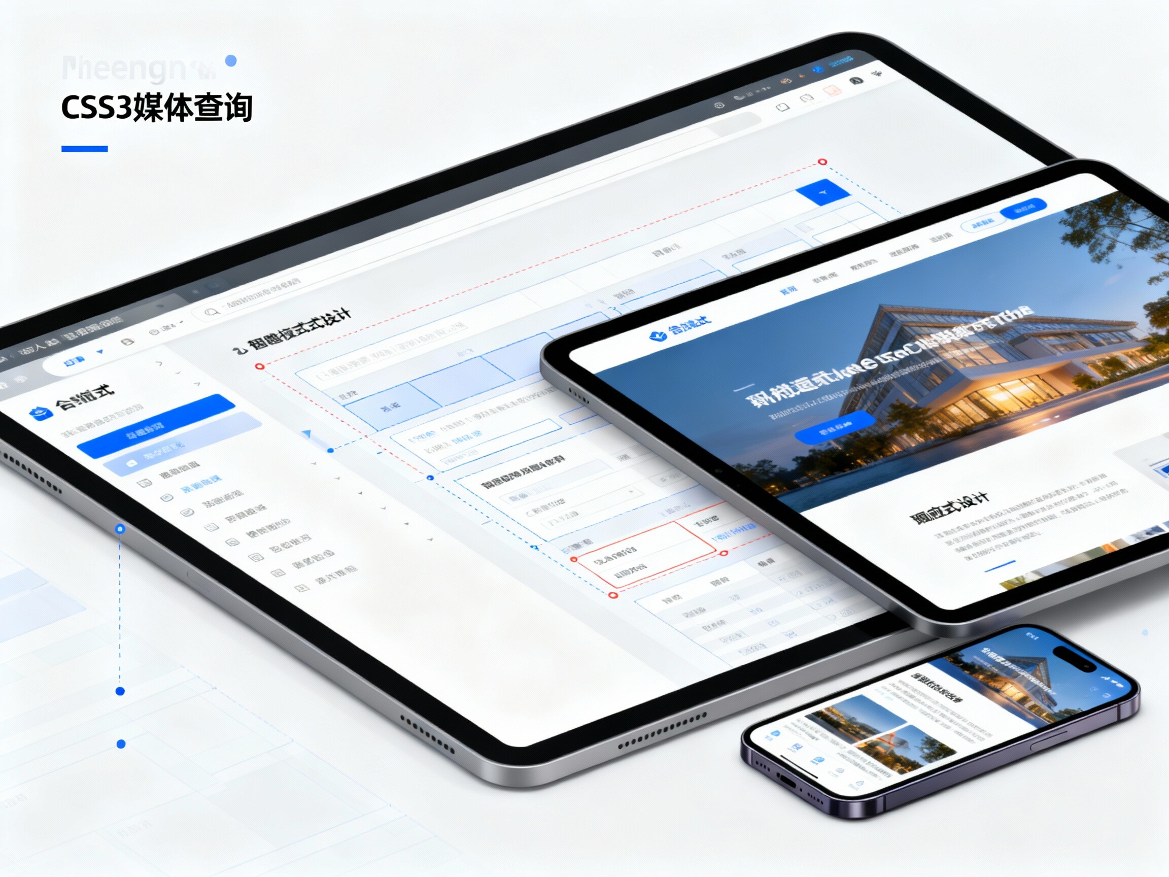
Responsive websites utilize HTML5 and CSS3 media query (Media Query) technology, achieving dynamic adjustments to webpage structure and styles through flexible layout ratios, grid systems, and adaptive image loading. This design approach avoids the complexity of traditional "PC version + mobile version" separate development, significantly reducing maintenance costs and SEO optimization difficulties.
2. Development History of Responsive Websites
The concept of responsive design was first proposed by American designer Ethan Marcotte in 2010. In his article "Responsive Web Design" published in "A List Apart" magazine, he systematically introduced the idea of "responsive design." With the proliferation of smartphones and tablets, the issue of traditional fixed-width webpages displaying incompletely on small screens became increasingly prominent, necessitating new webpage design approaches.
2012 is considered the breakout year for responsive design, with global mainstream websites (such as Microsoft, Starbucks, BBC, etc.) fully adopting responsive layouts. In 2015, Google officially incorporated "mobile-friendliness" into its ranking algorithm, directly driving responsive websites to become the standard for corporate websites. Today, responsive design has become the mainstream standard recommended by W3C and is the core model for corporate brand websites, foreign trade independent sites, and e-commerce platforms.
3. Technical Principles of Responsive Websites

The implementation principles of responsive websites are based on the following key technologies:
- 1. CSS3 Media Query: Applies different style sheets based on device width, resolution, orientation, etc., enabling dynamic layout adjustments.
- 2. Fluid Grid: Uses percentages and relative units (such as vw, vh, rem) instead of fixed pixels to achieve proportional element scaling.
- 3. Flexible Images & Media Objects: Controls image auto-scaling through the max-width property to ensure it does not exceed container boundaries.
- 4. Breakpoints Design: Sets layout switching points for common device widths (e.g., 1200px, 992px, 768px, 480px).
- 5. Framework Support: Front-end frameworks like Bootstrap and Tailwind CSS provide standardized components and grid systems for responsive development.
- 6. JavaScript Dynamic Interaction: Used to adjust navigation menus, carousels, pop-ups, and other interactive logic across different devices.
4. Key Technical Features of Responsive Websites
- 1. Cross-Device Adaptability: The same website automatically adapts to different devices without requiring separate mobile version development.
- 2. Unified User Experience: Consistent content, structure, and interaction enhance user trust and dwell time.
- 3. SEO-Friendly: A unified URL structure benefits search engines like Google and Bing for crawling and ranking.
- 4. Low Maintenance Costs: No need for multi-version synchronization; one update applies across all devices.
- 5. High Loading Efficiency: Responsive design, combined with lazy loading and CDN acceleration, effectively improves access speed.
- 6. Brand Consistency: Presents a unified brand image across devices, strengthening brand recognition.
- 7. Convenient Data Analysis: A unified traffic data analysis system facilitates cross-device performance evaluation.
5. Typical Application Scenarios of Responsive Websites
Responsive websites are suitable for almost all types of website construction, particularly excelling in the following industries and scenarios:
- 1. Corporate Websites: Ideal for showcasing brand image and product information, facilitating anytime, anywhere access for clients.
- 2. Foreign Trade Independent Sites: Enhances international buyers' browsing experience across devices, increasing inquiry conversion rates.
- 3. E-Commerce Websites: Provides mobile-friendly interfaces for shopping, boosting purchase conversion rates.
- 4. Education & Training Platforms: Supports adaptive course displays and video playback, improving learning convenience.
- 5. Government & Institutional Websites: Ensures information accessibility and readability across different devices.
- 6. News Media Portals: With frequent content updates, responsive design enhances user stickiness and reading experience.
6. Comparative Analysis of Responsive Websites vs. Adaptive Websites
7. Industry Applications & Case Studies

Responsive websites are widely used in manufacturing, cross-border e-commerce, financial services, education and training, healthcare, real estate, and many other industries. Below are typical industry cases:
- Manufacturing: Corporate websites adopt responsive layouts, making it convenient for overseas clients to view product parameters and video demonstrations on mobile devices.
- Cross-Border E-Commerce: Achieves mobile transaction closures through responsive websites, increasing mobile purchase rates.
- Education & Training: Supports adaptive video playback and course table scaling, optimizing the learning experience.
- Brand Marketing: Unified brand style and interactive experience enhance international brand trust.
8. International Standards & Industry Certifications
- 1. W3C Web Standards: Ensures code compatibility and accessibility.
- 2. Google Mobile-Friendly Standards: Passes mobile-friendliness tests to improve SEO scores.
- 3. ISO 9241 Usability Standards: Focuses on webpage interaction experience and user satisfaction.
- 4. HTTPS & GDPR Compliance: Enhances data security and privacy protection.
- 5. Lighthouse Performance Evaluation: Optimizes loading speed and interaction scores through Google performance tests.
Conclusion
Responsive websites are not just a technical upgrade but a crucial component of digital marketing strategies. In an era of multi-device integration and mobile-first approaches, responsive design has become the core standard for brand website construction. It enables businesses to achieve higher traffic conversion, better user experience, and stronger brand image at lower costs. In the future, with the development of AI design and smart interaction technologies, responsive websites will advance toward a smarter, more efficient, and more personalized new stage.
Topic Introduction
This topic provides an in-depth analysis of the definition, technical principles, development history, and application value of "responsive websites," thoroughly examining their strategic significance in the mobile internet era. From cross-device adaptability to SEO optimization, from industry applications to international standards, this article aims to help businesses grasp the core advantages and practical strategies of responsive websites. Through scientific design and technical implementation, brands can stand out in global digital marketing, improving access experience and business conversion, achieving true intelligent brand upgrades.
FAQ
1. Are Responsive Websites Suitable for All Businesses?
Yes, whether small businesses or large corporations, responsive websites can enhance brand image and user experience.
2. Can Responsive Websites Improve SEO Rankings?
Yes. A unified URL structure and mobile-friendly design are key factors in Google rankings.
3. What's the Difference Between Responsive Websites and Apps?
Websites require no installation and can be accessed directly, making them suitable for information display and marketing; apps are better suited for high-frequency interactive services.

Customer Reviews
Mr. Wang, Machinery Export Business
"After adopting a responsive website, our clients can easily access it whether on mobile or computer, and foreign trade inquiry rates have increased by 40%."
Ms. Chen, Education Industry
"After the website redesign, page loading speed improved, SEO rankings rose significantly, and both user experience and conversion rates increased."
![How to use global CDN acceleration to improve user experience for foreign trade independent websites? How to use global CDN acceleration to improve user experience for foreign trade independent websites?]() How to use global CDN acceleration to improve user experience for foreign trade independent websites?This article deeply analyzes how to improve user experience and conversion rate of foreign trade independent station through global CDN acceleration technology. Combined with YiYingBao AI + SEO dual engine optimization system, to create high-speed and stable foreign trade responsive website, breaking through geographical restrictions to achieve global business growth. Covering the principles of CDN technology, performance comparison, SEO synergies and implementation paths to help you choose the optimal SaaS marketing platform solution. Learn how to control website loading speed within 1.2 seconds and increase 70% mobile conversion rate!
How to use global CDN acceleration to improve user experience for foreign trade independent websites?This article deeply analyzes how to improve user experience and conversion rate of foreign trade independent station through global CDN acceleration technology. Combined with YiYingBao AI + SEO dual engine optimization system, to create high-speed and stable foreign trade responsive website, breaking through geographical restrictions to achieve global business growth. Covering the principles of CDN technology, performance comparison, SEO synergies and implementation paths to help you choose the optimal SaaS marketing platform solution. Learn how to control website loading speed within 1.2 seconds and increase 70% mobile conversion rate!![Shenzhen foreign trade station: why responsive design is the standard? Shenzhen foreign trade station: why responsive design is the standard?]() Shenzhen foreign trade station: why responsive design is the standard?Shenzhen foreign trade station experts analyze why responsive design has become a standard match for the sea! Yiyingbao AI intelligent website building system combined with global CDN acceleration technology, help foreign trade enterprises in Guangzhou, Dongguan, Zhejiang, Jiangsu and other places to build high conversion website, mobile loading speed increased to 0.9 seconds, inquiry conversion rate increased by 3 times. Uncover how to improve SEO ranking by 50% through responsive design, reduce CPC cost by 40% in South America, and avoid multi-language adaptation traps. Immediately get the mobile optimization solution for foreign trade independent station to seize the first opportunity in emerging markets!
Shenzhen foreign trade station: why responsive design is the standard?Shenzhen foreign trade station experts analyze why responsive design has become a standard match for the sea! Yiyingbao AI intelligent website building system combined with global CDN acceleration technology, help foreign trade enterprises in Guangzhou, Dongguan, Zhejiang, Jiangsu and other places to build high conversion website, mobile loading speed increased to 0.9 seconds, inquiry conversion rate increased by 3 times. Uncover how to improve SEO ranking by 50% through responsive design, reduce CPC cost by 40% in South America, and avoid multi-language adaptation traps. Immediately get the mobile optimization solution for foreign trade independent station to seize the first opportunity in emerging markets!![SaaS Marketing Platform + Fast SEO Tools: a Decision Maker's Guide to Growth SaaS Marketing Platform + Fast SEO Tools: a Decision Maker's Guide to Growth]() SaaS Marketing Platform + Fast SEO Tools: a Decision Maker's Guide to GrowthEYB SaaS marketing platform to AI + SEO dual-engine optimization system and fast SEO tools as the core, to help foreign trade independent station and foreign trade website SEO to achieve responsive website SEO optimization and overseas acceleration. Support Shenzhen SEO optimization software, Guangdong SEO optimization software, Beijing SEO optimization software localization deployment, and provide EYB agent joining policy and landing services. Immediate free testing, 3 months to see results, improve natural traffic and conversion.
SaaS Marketing Platform + Fast SEO Tools: a Decision Maker's Guide to GrowthEYB SaaS marketing platform to AI + SEO dual-engine optimization system and fast SEO tools as the core, to help foreign trade independent station and foreign trade website SEO to achieve responsive website SEO optimization and overseas acceleration. Support Shenzhen SEO optimization software, Guangdong SEO optimization software, Beijing SEO optimization software localization deployment, and provide EYB agent joining policy and landing services. Immediate free testing, 3 months to see results, improve natural traffic and conversion.![SEO tips for foreign trade websites: how do researchers plan keywords? SEO tips for foreign trade websites: how do researchers plan keywords?]() SEO tips for foreign trade websites: how do researchers plan keywords?Foreign trade website SEO secret: from keyword planning to implementation, combined with responsive website SEO optimization and AI + SEO dual-engine optimization system for foreign trade independent station and SaaS marketing platform to provide fast SEO tools and batch TDK generation, to improve the mobile conversion and global inclusion. To learn more about EYB agent joining policy and trial program, click to get customized keyword planning.
SEO tips for foreign trade websites: how do researchers plan keywords?Foreign trade website SEO secret: from keyword planning to implementation, combined with responsive website SEO optimization and AI + SEO dual-engine optimization system for foreign trade independent station and SaaS marketing platform to provide fast SEO tools and batch TDK generation, to improve the mobile conversion and global inclusion. To learn more about EYB agent joining policy and trial program, click to get customized keyword planning.![EYB agent joining policy: zero threshold entrepreneurial new opportunities EYB agent joining policy: zero threshold entrepreneurial new opportunities]() EYB agent joining policy: zero threshold entrepreneurial new opportunitiesEasy Campbell agent to join the policy re-launched zero threshold entrepreneurial opportunities! Specializing in Guangzhou, Shenzhen, Shanghai and other foreign trade station building enterprises to create, provide global CDN acceleration and responsive website construction technical support. Whether you are a Dongguan foreign trade station building enterprises or Zhejiang foreign trade website production team, join to share 100,000 + enterprise service experience and Meta/Google official resources.AI intelligent marketing platform to support the construction of multi-language independent station, 15 patented technology to protect 200% conversion rate increase. Now open primary, senior and regional general agent to join, enjoy exclusive training and marketing support, to help you quickly open the blue sea of digital marketing wealth!
EYB agent joining policy: zero threshold entrepreneurial new opportunitiesEasy Campbell agent to join the policy re-launched zero threshold entrepreneurial opportunities! Specializing in Guangzhou, Shenzhen, Shanghai and other foreign trade station building enterprises to create, provide global CDN acceleration and responsive website construction technical support. Whether you are a Dongguan foreign trade station building enterprises or Zhejiang foreign trade website production team, join to share 100,000 + enterprise service experience and Meta/Google official resources.AI intelligent marketing platform to support the construction of multi-language independent station, 15 patented technology to protect 200% conversion rate increase. Now open primary, senior and regional general agent to join, enjoy exclusive training and marketing support, to help you quickly open the blue sea of digital marketing wealth!![Shenzhen SEO optimization software comparison: which is suitable for small and medium-sized enterprises? Shenzhen SEO optimization software comparison: which is suitable for small and medium-sized enterprises?]() Shenzhen SEO optimization software comparison: which is suitable for small and medium-sized enterprises?Want to increase traffic and conversion for foreign trade independent website under limited budget? This article compares responsive website SEO, SaaS marketing platform and AI+SEO dual-engine optimization system, evaluates the localization advantages of Shenzhen SEO optimization software, Guangdong SEO optimization software and Beijing SEO optimization software in terms of bandwidth, compliance, and Ease2Easy agency joining policy, and recommends fast SEO tools and foreign trade website SEO implementation routes. Click for step-by-step selection and free trial advice.
Shenzhen SEO optimization software comparison: which is suitable for small and medium-sized enterprises?Want to increase traffic and conversion for foreign trade independent website under limited budget? This article compares responsive website SEO, SaaS marketing platform and AI+SEO dual-engine optimization system, evaluates the localization advantages of Shenzhen SEO optimization software, Guangdong SEO optimization software and Beijing SEO optimization software in terms of bandwidth, compliance, and Ease2Easy agency joining policy, and recommends fast SEO tools and foreign trade website SEO implementation routes. Click for step-by-step selection and free trial advice.![How can Guangzhou foreign trade website builders help enterprises to go overseas? How can Guangzhou foreign trade website builders help enterprises to go overseas?]() How can Guangzhou foreign trade website builders help enterprises to go overseas?Guangzhou foreign trade station building how to help enterprises go to sea through global CDN acceleration and responsive design? EYB AI intelligent website building system provides multilingual solutions for foreign trade enterprises in Dongguan, Hangzhou, Shenzhen and Shanghai, covering responsive website construction for foreign trade, international SEO optimization and accurate traffic conversion. From electronic components in the Pearl River Delta to machinery and equipment industries in the Yangtze River Delta, we customize Shopify integration and B2B technology display solutions, combined with global server clusters to improve loading speed by 40%. Get your copy of the "Compliance Guide for Foreign Trade Standalone Websites" now and start your journey of overseas market expansion!
How can Guangzhou foreign trade website builders help enterprises to go overseas?Guangzhou foreign trade station building how to help enterprises go to sea through global CDN acceleration and responsive design? EYB AI intelligent website building system provides multilingual solutions for foreign trade enterprises in Dongguan, Hangzhou, Shenzhen and Shanghai, covering responsive website construction for foreign trade, international SEO optimization and accurate traffic conversion. From electronic components in the Pearl River Delta to machinery and equipment industries in the Yangtze River Delta, we customize Shopify integration and B2B technology display solutions, combined with global server clusters to improve loading speed by 40%. Get your copy of the "Compliance Guide for Foreign Trade Standalone Websites" now and start your journey of overseas market expansion!![Foreign trade responsive website construction: how to avoid common design mistakes? Foreign trade responsive website construction: how to avoid common design mistakes?]() Foreign trade responsive website construction: how to avoid common design mistakes?How can foreign trade enterprises break through the overseas market through responsive website construction? EYB's expert team deeply analyzes 7 common design misunderstandings in foreign trade B2B website building, covering global CDN acceleration, multi-language adaptation and other key points. Reveal how to reduce website loading speed from 4.2 seconds to 1.3 seconds and increase conversion rate by 28%. Learn how AI+SEO dual-engine optimization system can achieve a 320% increase in natural search traffic for core keywords. Get immediate access to 100,000+ enterprises' verified SaaS marketing platform practical experience!
Foreign trade responsive website construction: how to avoid common design mistakes?How can foreign trade enterprises break through the overseas market through responsive website construction? EYB's expert team deeply analyzes 7 common design misunderstandings in foreign trade B2B website building, covering global CDN acceleration, multi-language adaptation and other key points. Reveal how to reduce website loading speed from 4.2 seconds to 1.3 seconds and increase conversion rate by 28%. Learn how AI+SEO dual-engine optimization system can achieve a 320% increase in natural search traffic for core keywords. Get immediate access to 100,000+ enterprises' verified SaaS marketing platform practical experience!


