









- Can the average annual growth rate reflect real opportunities in overseas markets?Oct 07, 2026View details
- Which customer acquisition channels will be affected by cross-border marketing trends in 2026?Sep 06, 2026View details
- Which homogenization risks should be considered in an analysis of the AI-powered website building industry?Aug 30, 2026View details
- How Will AI Marketing Trends 2026 Change Advertising Budget AllocationAug 28, 2026View details
- Is the EV SSL certificate market shrinking or upgrading? How should companies assess certificate procurement?Aug 11, 2026View details
- Why the old AMP SEO 2020 practices no longer work and what has changed in current optimization prioritiesAug 02, 2026View details
Does a Japanese website need a separate mobile adaptation?
Does a Japanese website need a separate mobile adaptation? The short answer is: mobile should be taken seriously in most cases, but it is not always necessary to create a separate mobile website. What really needs to be evaluated is not whether a mobile version exists as a format, but whether Japanese users can read the page smoothly, tap accurately, and load it without delays when accessing it on their phones, and whether they can complete the core conversion actions.
This issue is particularly common in the Japanese and South Korean markets. When many companies build multilingual websites, their Chinese and English sites may already be online. When it comes to the Japanese site, they often wonder: Isn't the template responsive? Can't we just translate it directly? In actual projects, this is often where problems arise. The length of Japanese content, layout conventions, user reading paths, and form details may all cause a page that appears mobile-compatible to perform poorly in real-world use.
The conclusion first: A separate mobile site is generally not recommended, but mobile must be treated as a primary scenario in the design
If “separate mobile adaptation” means developing an independent mobile URL or maintaining a dedicated set of mobile pages, most businesses do not need to do this today. The reasons are practical: maintenance costs are high, content synchronization is inconvenient, SEO signals can become fragmented, and later redesigns and advertising landing page management become more complicated.
However, if “mobile adaptation” refers to responsive layouts, mobile-first interaction design, mobile optimization of images and fonts, and adjustments to the readability of Japanese text on small screens, then these are almost essential. For brand websites, inquiry websites, cross-border e-commerce stores, and advertising landing pages targeting the Japanese market, the mobile experience directly affects bounce rates, time on page, and conversions.
In other words, the question is not whether it should be done, but whether it should be done properly.
Why Japanese websites are more likely than many people expect to “deform” on mobile
There is an easily overlooked detail in Japanese website development: even when the meaning is the same, the visual rhythm of Japanese typesetting differs from that of Chinese and English. Headings may be longer, button copy may take up more space, and certain explanatory fields that work well on a PC may be squeezed into two or three lines on a phone. A page not being broken does not mean the experience is acceptable.
Forms are another common issue. Many companies building B2B overseas websites simply copy fields such as “company name, contact person, email, phone number, and inquiry details” into their Japanese site, resulting in an awkward input process on mobile. If the field order, input prompts, button size, and submission feedback are not optimized for mobile usage habits, inquiries can be lost faster than expected. Users may not complain; they may simply close the page.
Navigation is another issue. Horizontal menus at the top of a PC site are often placed inside a hamburger menu on mobile. However, if Japanese menu names are relatively long and there are many secondary menu items, users may need to navigate through too many levels. This is particularly noticeable for manufacturing websites, service-oriented corporate websites, and e-commerce stores with many product categories.
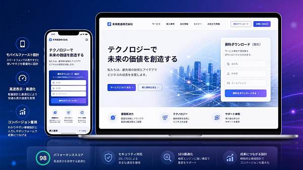
Which situations require more attention to mobile adaptation
If your Japanese website falls into any of the following categories, mobile adaptation involves more than simply ensuring compatibility.
- B2B corporate websites focused on inquiries: Users may first browse on their phones before deciding whether to make further contact.
- Advertising landing pages: Mobile traffic usually accounts for a larger share, and loading speed and above-the-fold messaging directly affect conversion costs.
- Cross-border e-commerce stores or websites with online ordering: Product listings, filtering, checkout, and address entry all depend on whether the mobile process is smooth.
- Websites that rely on search for organic traffic: Search engines have consistently placed great importance on mobile usability, speed, and content consistency.
- Corporate websites with a large amount of content: For example, case studies, solutions, technical articles, and FAQs are difficult to fully absorb if they are hard to read on mobile.
Conversely, if the site is only a very simple brand showcase page, has low traffic, and does not depend on search or advertising in the short term, it is not entirely impossible to launch first with a basic responsive solution. However, this is more of a temporary trade-off than a long-term approach.
The problems with creating a separate mobile site often lie not in development, but in later operations
Many companies initially consider creating a separate mobile site because they want the mobile pages to be lighter, faster, and simpler. This idea is not wrong in itself, but the more common approach today is to achieve these goals through responsive architecture and front-end performance optimization rather than splitting the site into two versions.
Once a site is split into two versions, content updates, SEO indexing, analytics tracking, advertising attribution, and page testing all become more complicated. This is especially true in multilingual scenarios. If Chinese, English, and Japanese each have separate PC and mobile versions, information synchronization problems are almost inevitable during later maintenance. Product specifications may be updated while the Japanese mobile site is forgotten; an SEO title may be updated without being synchronized to the mobile version; a form tracking script may be present on the PC site but missing from the mobile site. These are not major incidents, but they continuously consume operational efficiency.
For teams providing integrated website and marketing services, this is also why website development cannot be judged solely by whether the pages look attractive. Site structure, subsequent SEO, advertising, social media traffic acquisition, and AI search visibility are all related to the underlying architecture. Service providers such as Yiyingbao, which have long focused on multilingual independent websites and overseas marketing, generally place greater emphasis on integrated planning for website development and promotion rather than building a site first and trying to fix problems later.
What you should really check is not whether a mobile version exists, but these specific details
If you are evaluating whether a Japanese website needs separate mobile adaptation, you can start by working backward from several practical questions.
Is the text easy to read on a phone?
Check the font size, line height, paragraph spacing, and whether the button copy feels crowded. If the font size on a Japanese page is reduced too much for visual consistency, the reading burden will increase significantly. For information-oriented pages such as FAQs, product descriptions, and service introductions, mobile readability is more important than flashy effects.
Can visitors understand the page as soon as it opens?
Many companies create a comprehensive above-the-fold section for the PC version, but on mobile it becomes a large image accompanied by a lot of shrunken text. If users cannot understand within three seconds what you do, what you provide, and where they can click next, losses are to be expected. Japanese users generally have relatively high expectations for clarity of information, and vague messaging is even more disadvantageous on mobile.
Do the form and contact details actually work?
Whether buttons are easy to tap, inputs are convenient, error messages are clear, and phone numbers and email addresses can be activated with one tap are all more closely related to conversion than whether the page looks impressive. For the long forms commonly used on B2B websites, conversion rates are generally unsatisfactory if they are not simplified for mobile.
Is the site being slowed down by large images and scripts?
Many Japanese websites favor refined visual design, but if the hero image, carousel, and animations are too heavy, mobile loading can easily become slow. This is especially noticeable when target users access the site from overseas, where the connection path is longer. If the company plans to conduct Google SEO or advertising campaigns later, addressing this issue early will save effort.
When can a more “independent” mobile strategy be considered?
This does not mean that no project should ever adopt a separate mobile solution. In some situations, a more differentiated mobile experience may be considered, but it is usually still preferable to implement it within the same website rather than splitting it into two URL systems.
Note that “separate” here is closer to designing a separate interaction logic, not creating a separate mobile website.
Practical advice for companies preparing to build a Japanese website
If you are still in the planning stage, the most cost-effective approach is not to design the PC version first and then compress it for mobile, but to plan the mobile prototype from the beginning. The navigation hierarchy, CTA placement, form fields, page length, and content-collapsing methods should ideally be considered together with SEO, advertising, and subsequent operations during the early stages of website development.
Companies building multilingual overseas websites should especially avoid the idea that “translation completed equals launch completed.” Japanese website development involves more than switching languages; it also includes localized messaging, alignment with search needs, mobile experience, page performance, and conversion paths. The core reason platforms such as Yiyingbao, which provide integrated intelligent website development and overseas marketing, are better suited to these projects is not the tool itself, but their ability to consider website development, SEO, advertising, content, and subsequent growth as one integrated process, avoiding considerable rework.
So, returning to the original question: Does a Japanese website need separate mobile adaptation? If you mean “Do we need to create an additional mobile website?”, in most cases, no. If you mean “Do we need to optimize specifically for mobile visitors?”, then there is essentially no avoiding it. Get the mobile experience right before discussing traffic and conversions; do not reverse the order.
Related Articles
Related Products
 Yiyingbao SaaS Intelligent Website Building and Marketing SystemYiyingbao SaaS Intelligent Website Building and Marketing System, AI-powered no-code website building, rapid creation of multilingual B2B international websites in 10 minutes, global server acceleration, AI-powered SEO optimization, helping businesses connect efficiently with global markets. The perfect integration of technology and operation makes building an international trade website remarkably simple
 AI+SEM Intelligent Advertising Marketing SystemAI+SEM drives intelligent ad creation, empowering full-funnel precision advertising marketing. The system automatically generates weekly/monthly reports, AI recommends keywords and target countries, monitors core metrics in real-time with intelligent alerts, and enables one-click high-conversion ad solutions to help quickly acquire customers and improve ROI.
 AI+SEO Dual-Engine System Optimization ServicesYiyingbao’s AI+SEO dual-engine optimization system helps foreign trade enterprises acquire high-quality organic traffic through AI-powered keyword research, content generation, and comprehensive technical optimization, significantly improving search rankings and conversion rates.
 AI+SNS Social Media Marketing SystemYingbao AI+SNS Social Media Marketing System - Precision social capture for the social media era. Supports one-click content synchronization across major platforms like Facebook and LinkedIn. AI intelligently rewrites posts for enhanced relevance. 24/7 AI customer service and user profiling analysis empower businesses to efficiently expand into global markets.
 AI+SEO营销解决方案易营宝AI+SEO营销解决方案,通过AI批量写作、智能生成TDK、精准关键词扩词等功能,全面优化网站SEO效果,提升流量与转化率。助力企业构建高效智能网站新生态。
 AI+SEM Advertising Marketing SolutionsAI+SEM Advertising Marketing Solution leverages AI technology to deeply empower SEM ad campaigns. It automatically generates weekly/monthly reports using AI, presenting account data across multiple dimensions for comprehensive insights into campaign performance and trends. The system precisely recommends keywords and target countries, intelligently generates high-conversion ad copy, and enables one-click activation of efficient campaign plans to help businesses rapidly acquire customers. Simultaneously, it monitors core metrics in real time, intelligently identifies abnormal fluctuations, and issues timely alerts to ensure stable, high-return advertising results.
 Domain Name ServicesEasyWin provides professional domain name services, including intelligent queries, one-stop registration, brand protection, and full lifecycle management, helping businesses build a digital brand image.
 EasyOperate B2C Cross-Border E-Commerce Platform & Independent WebsiteEasyStore B2C Cross-border E-commerce Independent Store is an intelligent website building and cross-border e-commerce integrated solution independently developed by EasyStore Information Technology (Beijing) Co., Ltd. The system is specially designed for small and medium-sized as well as large export enterprises, integrating 'website building, operation, marketing, advertising, and conversion' into one, helping enterprises quickly establish cross-border e-commerce independent stores to achieve brand globalization and global sales growth.
The platform supports multiple languages, multiple currencies, and multi-channel marketing, with built-in AI intelligent translation and SEO optimization systems, suitable for mainstream markets such as Southeast Asia, Europe and America, Latin America, and the Middle East, assisting Chinese manufacturing enterprises in efficiently deploying international e-commerce strategies. SSL证书易营宝提供专业SSL安全证书服务,包括单域名和泛域名证书,确保网站数据传输加密、身份验证和完整性保护,助力企业建立安全可信的在线业务环境。









