









- Can the average annual growth rate reflect real opportunities in overseas markets?Oct 07, 2026View details
- Which customer acquisition channels will be affected by cross-border marketing trends in 2026?Sep 06, 2026View details
- Which homogenization risks should be considered in an analysis of the AI-powered website building industry?Aug 30, 2026View details
- How Will AI Marketing Trends 2026 Change Advertising Budget AllocationAug 28, 2026View details
- Is the EV SSL certificate market shrinking or upgrading? How should companies assess certificate procurement?Aug 11, 2026View details
- Why the old AMP SEO 2020 practices no longer work and what has changed in current optimization prioritiesAug 02, 2026View details
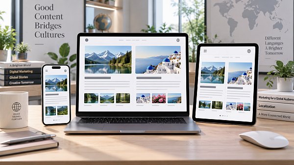
How to Achieve Responsive Design for Multilingual Article Pages
Responsive adaptation for multilingual article pages is not about shrinking desktop content onto a mobile screen. It is about ensuring that different languages, reading directions, and content lengths can be properly viewed, clicked, and understood by search engines across all types of devices. On foreign trade websites, English, German, Russian, Arabic, and other versions often share one article template. If the template is designed only for short Chinese or English titles, issues such as truncated titles, misaligned tables of contents, overflowing buttons, and unreadable tables can easily occur.
A truly usable adaptation solution should address page layout, text expansion, images and tables, interactive controls, language switching, and technical markup at the same time. Whether a mobile page “looks normal” is only the minimum standard. More importantly, readers should be able to quickly locate information, switch languages smoothly, and maintain stability in terms of page loading and indexing.
First distinguish between “responsive layout” and “multilingual content adaptation”
Responsive layout addresses changes in screen size: the same page adjusts its grid, font size, spacing, navigation, and content columns according to the available width. Multilingual content adaptation addresses variables caused by the languages themselves, such as long German compound words, wider button labels caused by Russian inflections, right-to-left reading direction in Arabic, and different line-breaking conventions in Japanese and Chinese.
The two should not be confused. A page that displays neatly on a Chinese mobile device may have its layout squeezed after switching to German because of long copy such as “Download Product Catalogue.” Even if Arabic text does not overflow, the reading path will still face obvious obstacles if icon directions, breadcrumbs, floating buttons, and sidebars continue to follow left-to-right rules.
Therefore, when building responsive article pages, it is not advisable to patch pages one by one by “duplicating pages for each language version.” Instead, a set of template rules capable of accommodating content differences should be established. Content fields, component widths, and breakpoint strategies should all assume that length is unpredictable.
The article body should maintain a single, flexible reading column
The core task of an informational article is continuous reading. The desktop version may retain areas such as the main text, table of contents, related articles, or inquiry entry points, but the main text column should not be excessively compressed by auxiliary modules. On tablets and mobile devices, sidebars should generally become content below the main text or collapse into expandable modules rather than remain displayed side by side.
A more reliable approach is to use a fluid container together with a maximum content width: the outer page scales with the screen, while the main reading area has a reasonable maximum width to prevent lines from becoming too long on ultra-wide displays. On narrow screens, the main text should occupy the available space while retaining safe margins on both sides. The main text area should not rely on fixed pixel widths, nor should article content be restricted by fixed heights.
Titles are where template issues are most easily exposed. Title containers should allow natural line wrapping and avoid single-line truncation, fixed line heights, or absolutely positioned decorative elements. Summaries, publication dates, tags, and author information should also be allowed to wrap onto separate lines on small screens. If metadata must be displayed on the same line, wrapping rules should be set instead of forcing it into one line by reducing the font size.
Breakpoints should not be set only by device category
Many pages set only three breakpoints—desktop, tablet, and mobile—but actual failures often occur at widths between common device sizes, such as small landscape phones, split-screen browsers, portrait tablets, or embedded web containers. Breakpoints should be determined by the critical point at which components begin to become crowded, rather than mechanically corresponding to a particular device model.
For article pages, at least several areas should be observed: when the top navigation can no longer accommodate the menu and language selector; when the main text and sidebar are no longer suitable for a side-by-side layout; when two-column images within an article need to become a single column; when tables exceed the visible area; and when fixed floating components block the main text or bottom action area. Each component can have its own responsive logic and does not need to be determined by one global breakpoint.
In CSS, flexible layouts or grid layouts should be prioritized so that elements can automatically wrap or change the number of columns when space is insufficient. For components with unstable content lengths, such as buttons, tags, and language switchers, fixed widths should be avoided for appearance control. Using minmax(), flex-wrap, clamp(), and similar rules is generally easier to maintain than writing separate styles for each language.
Long text is not an exception; it is a template input condition
A common mistake on multilingual pages is limiting text length to maintain visual neatness. Article titles, category names, CTA buttons, and download file names becoming longer after translation does not in itself mean there is a content problem. Templates should prioritize displaying content in full before addressing the resulting layout changes.
- Buttons should be allowed to increase in height and wrap automatically, preventing text from being truncated with ellipses;
- Tag groups should support wrapping and must not rely on single-line horizontal scrolling to reveal all content;
- On mobile devices, breadcrumbs may retain only the current level and a back entry point, but complete accessible navigation logic must be preserved;
- Strings that should not be arbitrarily broken, such as product models, email addresses, and URLs, should have appropriate wrapping rules to prevent them from breaking the container;
- English phrases in titles may use suitable word-breaking rules, but the readability of brand names, models, and key terms should not be compromised.
The main text layout should also set the correct page language attribute. The html lang of each language version should match the content language. This not only helps browsers, translation tools, and assistive technologies recognize the text, but also provides a basic signal for search engines to understand the page language. Do not allow all translated pages to retain lang="zh" simply because the default backend language is Chinese.
Right-to-left languages require separate handling of direction rules
Right-to-left writing languages such as Arabic and Hebrew cannot be handled merely by right-aligning the main text. The corresponding language version should use dir="rtl", and all components that depend on left-right direction should be checked, including breadcrumb arrows, carousel navigation arrows, table-of-contents expansion icons, pagination buttons, quotation block borders, form icons, and floating customer service entry points.
At the styling level, logical properties such as margin-inline-start, padding-inline-end, and border-inline-start are more suitable than numerous physical direction properties such as margin-left and right. This allows the layout to adjust automatically with text direction when the page switches to RTL, reducing the burden of maintaining two sets of styles.
It should be noted that product models, numbers, URLs, code snippets, and English brand names may appear in a disordered sequence within RTL paragraphs. For such localized content, text direction should be explicitly set or bidirectional text control rules should be used instead of relying only on automatic browser detection.
Images, tables, and embedded content determine whether mobile reading is truly accessible
Hero images and content images in articles should use responsive widths and retain their original width and height information to reduce layout shifts during loading. Text within images should not carry critical explanations, as it becomes difficult to identify after scaling down and cannot be properly translated, searched, or read by assistive tools. Where parameters, processes, or comparison information are involved, corresponding textual explanations should still be provided outside the image.
Wide tables are among the most common obstacles to mobile reading on multilingual article pages. Directly compressing a table can make each column too narrow to recognize, while forced line breaks may disrupt the correspondence between parameters. When there is little information, a vertical “field–value” card format can be used on mobile devices. When horizontal comparison relationships must be retained, the table can be placed in a horizontally scrollable container with a clear scrolling prompt. Do not allow the entire page to scroll horizontally; the scrolling area should exist only inside the table container.
Videos, maps, PDF previews, and third-party forms also need to be checked separately. They often contain fixed widths, heights, or embedded script styles, and may still cause page overflow even when the main text has been adapted. Embedded content should be placed in proportion-based containers, with alternative links or brief explanations provided for loading failures or cases where it is not suitable for mobile devices.
Language switching should not disrupt the current reading position
The language switcher on article pages should clearly identify language names and avoid using flags alone as language selections. Flags represent countries or regions and do not always accurately convey language versions. For languages used across multiple regions, such as English, Spanish, and Arabic, displaying only flags is especially likely to cause misunderstanding.
When switching, users should preferably be directed to the corresponding language page of the same article rather than being sent back to the homepage or category page. If the article does not yet have a translated version, a clear status should be provided to avoid directing users to content-irrelevant pages. On mobile devices, the language switcher should not be hidden deep within multiple menu levels, but neither should it obscure the reading area with an oversized overlay.
Language relationships for search engines also need to remain consistent with frontend switching. Different language pages with clearly equivalent content can use hreflang to indicate their relationship; each page should have an independently indexable URL and use a canonical link in its own language. Placing content in multiple languages on one page and relying on frontend scripts to temporarily replace text increases the difficulty of crawling, sharing, and locating content in a specific language.
Before publishing, check by content variables rather than screenshots from a single device
Responsive acceptance should not involve only the homepage and one short article. At minimum, articles with long titles, wide tables, multiple images, tables of contents, embedded videos, and RTL language versions should be selected for review. Browser developer tools can simulate viewport widths, but menu expansion, form input, horizontal scrolling, fixed buttons, and font loading performance must still be confirmed in real mobile browsers.
The focus of inspection is not whether the page is “exactly the same,” but whether the content hierarchy remains clear: whether titles are complete, paragraphs are readable, links are easy to click, language switching is visible, images and tables are understandable, and the page has no meaningless horizontal scrolling. Only by incorporating these rules into article templates and component libraries can responsive work for multilingual article pages avoid repeated rework whenever new languages or content are added.
Related Articles
Related Products
 Yiyingbao SaaS Intelligent Website Building and Marketing SystemYiyingbao SaaS Intelligent Website Building and Marketing System, AI-powered no-code website building, rapid creation of multilingual B2B international websites in 10 minutes, global server acceleration, AI-powered SEO optimization, helping businesses connect efficiently with global markets. The perfect integration of technology and operation makes building an international trade website remarkably simple
 AI+SEM Intelligent Advertising Marketing SystemAI+SEM drives intelligent ad creation, empowering full-funnel precision advertising marketing. The system automatically generates weekly/monthly reports, AI recommends keywords and target countries, monitors core metrics in real-time with intelligent alerts, and enables one-click high-conversion ad solutions to help quickly acquire customers and improve ROI.
 AI+SEO Dual-Engine System Optimization ServicesYiyingbao’s AI+SEO dual-engine optimization system helps foreign trade enterprises acquire high-quality organic traffic through AI-powered keyword research, content generation, and comprehensive technical optimization, significantly improving search rankings and conversion rates.
 AI+SNS Social Media Marketing SystemYingbao AI+SNS Social Media Marketing System - Precision social capture for the social media era. Supports one-click content synchronization across major platforms like Facebook and LinkedIn. AI intelligently rewrites posts for enhanced relevance. 24/7 AI customer service and user profiling analysis empower businesses to efficiently expand into global markets.
 AI+SEO营销解决方案易营宝AI+SEO营销解决方案,通过AI批量写作、智能生成TDK、精准关键词扩词等功能,全面优化网站SEO效果,提升流量与转化率。助力企业构建高效智能网站新生态。
 AI+SEM Advertising Marketing SolutionsAI+SEM Advertising Marketing Solution leverages AI technology to deeply empower SEM ad campaigns. It automatically generates weekly/monthly reports using AI, presenting account data across multiple dimensions for comprehensive insights into campaign performance and trends. The system precisely recommends keywords and target countries, intelligently generates high-conversion ad copy, and enables one-click activation of efficient campaign plans to help businesses rapidly acquire customers. Simultaneously, it monitors core metrics in real time, intelligently identifies abnormal fluctuations, and issues timely alerts to ensure stable, high-return advertising results.
 Domain Name ServicesEasyWin provides professional domain name services, including intelligent queries, one-stop registration, brand protection, and full lifecycle management, helping businesses build a digital brand image.
 EasyOperate B2C Cross-Border E-Commerce Platform & Independent WebsiteEasyStore B2C Cross-border E-commerce Independent Store is an intelligent website building and cross-border e-commerce integrated solution independently developed by EasyStore Information Technology (Beijing) Co., Ltd. The system is specially designed for small and medium-sized as well as large export enterprises, integrating 'website building, operation, marketing, advertising, and conversion' into one, helping enterprises quickly establish cross-border e-commerce independent stores to achieve brand globalization and global sales growth.
The platform supports multiple languages, multiple currencies, and multi-channel marketing, with built-in AI intelligent translation and SEO optimization systems, suitable for mainstream markets such as Southeast Asia, Europe and America, Latin America, and the Middle East, assisting Chinese manufacturing enterprises in efficiently deploying international e-commerce strategies. SSL证书易营宝提供专业SSL安全证书服务,包括单域名和泛域名证书,确保网站数据传输加密、身份验证和完整性保护,助力企业建立安全可信的在线业务环境。









