









- Which customer acquisition channels will be affected by cross-border marketing trends in 2026?Sep 06, 2026View details
- Which homogenization risks should be considered in an analysis of the AI-powered website building industry?Aug 30, 2026View details
- How Will AI Marketing Trends 2026 Change Advertising Budget AllocationAug 28, 2026View details
- Is the EV SSL certificate market shrinking or upgrading? How should companies assess certificate procurement?Aug 11, 2026View details
- Why the old AMP SEO 2020 practices no longer work and what has changed in current optimization prioritiesAug 02, 2026View details
- How to Choose Topics for an Industry News Section to Attract More Organic Search TrafficJul 29, 2026View details
Which mobile optimization tasks should be prioritized first in technical SEO?
Why Should Priorities Be Set First for Mobile Adaptation in Technical SEO Optimization
When implementing mobile adaptation for technical SEO optimization, the key is not to “do more,” but to “do the right things first.” Mobile is no longer an auxiliary entry point; it is the primary arena for search crawling, page experience, and conversion evaluation.
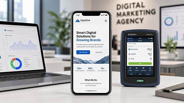
Based on search engine signals in recent years, mobile-first indexing, Core Web Vitals, and accessibility standards are collectively affecting indexing efficiency and ranking stability. This also means that mobile adaptation for technical SEO optimization must be investigated item by item, starting with the underlying capabilities.
If efforts are initially focused on visual redesign, button colors, or localized conversion components, the fundamental issues that truly affect crawling and user experience are often overlooked. The result is that the page looks different, but its search performance does not improve significantly.
Therefore, the more reliable approach is to first address the aspects of mobile adaptation that most affect crawlability, renderability, and interactivity, and then proceed with content expansion and conversion optimization. This makes the input-output relationship clearer and technical evaluation easier to implement.
First Priority: Confirm That the Responsive Layout Is Truly Usable
The first step in mobile adaptation for technical SEO optimization is usually not speed testing, but checking whether the page structure is truly responsive. Many websites appear to have a mobile version, but are essentially just scaled-down desktop pages, which can easily cause problems with both user experience and crawling.
Prioritize checking the following items:
- Whether the viewport setting is missing or abnormal.
- Whether content extends beyond the screen and causes horizontal scrolling.
- Whether navigation, forms, and buttons can be clicked and used properly.
- Whether the font size, line spacing, and margins are suitable for handheld reading.
- Whether the main content remains consistent between desktop and mobile versions.
There is a common misconception here. To make mobile pages “simpler,” some websites remove large sections of body text, parameter tables, or internal links. Although this makes the page lighter, it can also leave mobile-first indexing with insufficient information, affecting topic evaluation.
A more appropriate approach is to maintain consistency in the core content while controlling the reading burden through collapsible sections, pagination, and grouped presentation, rather than deleting content directly. For mobile adaptation in technical SEO optimization, structural consistency is more important than superficial lightness.
Second Priority: Bring Core Web Vitals Back into the Safe Zone
After confirming the responsive structure, the next step is to examine performance. In mobile adaptation for technical SEO optimization, the factors most likely to affect the actual experience are Core Web Vitals, especially LCP, INP, and CLS.
These three metrics correspond respectively to initial page loading, interaction responsiveness, and layout stability. Mobile network environments are more complex, and device performance varies more widely, so meeting the requirements on desktop does not mean that there are no problems on mobile.
During the investigation, it is recommended to focus first on the following sources:
- Large above-the-fold images are not compressed, or their dimensions far exceed the container requirements.
- Too many third-party scripts block rendering and interaction.
- Font files are too large, resulting in delayed text display.
- No space is reserved for images, advertising placements, or pop-ups, causing layout shifts.
- Excessive JS execution slows click feedback.
In actual business operations, slow mobile loading is not merely a matter of user complaints; it can also reduce the efficiency of crawl budget utilization. When the resource chain is too long or the rendering burden is too heavy during crawler visits, page quality evaluation is usually less than ideal.
Therefore, performance optimization for mobile adaptation in technical SEO optimization is not only a front-end experience task; it also directly affects search visibility. Only after stabilizing the above-the-fold content, scripts, and layout shifts can subsequent content optimization reach its full potential.
Third Priority: Verify Mobile Crawling, Rendering, and Indexing Signals
When carrying out mobile adaptation for technical SEO optimization, many teams focus on the interface and speed while overlooking the crawling process. The fact that a page can open does not mean that search engines can crawl it consistently, render it correctly, and successfully add it to the index.
The following aspects should be checked carefully:
- Whether robots incorrectly blocks key resources such as CSS, JS, and images.
- Whether canonical incorrectly points to a page that is not mobile-friendly.
- Whether hreflang and multilingual versions work consistently on mobile.
- Whether lazy-loaded content can be discovered normally.
- Whether important text appears only after deferred script rendering.
Multilingual websites, foreign trade websites, and cross-border e-commerce stores in particular must be alert to indexing discrepancies caused by separating mobile templates from desktop templates. Inconsistent content versions, missing structured data, and changes in navigation hierarchy may all affect search understanding.
For these types of websites, mobile adaptation for technical SEO optimization is not a single-page repair task, but template-level governance. As long as the logic at the template layer is unified, newly added pages can generally remain compliant and stable more easily.
Fourth Priority: Improve Mobile Loading Efficiency and Resource Scheduling
Once the structure and crawling are confirmed to be problem-free, mobile adaptation for technical SEO optimization must continue to examine resource efficiency. The focus here is not merely speed, but “delivering critical content earlier.”
Effective actions generally include:
After integrating advertising, tracking, customer service, and marketing plugins, many corporate websites become noticeably heavier on mobile. In the short term, they offer more complete functionality, but in the long term, they reduce search traffic efficiency. This is a typical hidden cost in mobile adaptation for technical SEO optimization.
Therefore, evaluation should distinguish between “must load” and “can be loaded later.” Any resource that occupies the above-the-fold loading path must be subject to stricter performance review.
Fifth Priority: Move on to Conversion and Business-Scenario Optimization
Only after the preceding aspects are stable is it most efficient to optimize forms, inquiry entry points, and landing-page pathways. Since the foundation for mobile adaptation in technical SEO optimization has already been established, conversion improvements made at this stage are easier to interpret in terms of data fluctuations.
It is recommended to focus on three types of pages:
- Core product pages: Can they quickly explain value and differentiation?
- Inquiry pages: Do they reduce the input burden and points of abandonment?
- Content pages: Do they provide clear internal-link pathways?
This step is particularly important for integrated website and marketing service projects. A website is not an isolated asset; it must serve SEO, advertising, social media traffic acquisition, and improved visibility in AI search at the same time. Solid mobile adaptation makes subsequent coordination among channels much smoother.
For an AI-driven website-building and overseas marketing platform such as 易营宝, its value lies in managing website development, performance, SEO/GEO, advertising, and multilingual capabilities within one continuous process, avoiding repeated rework between different systems.
Implementation Sequence for Mobile Adaptation in Technical SEO Optimization
If condensed into a clear roadmap, mobile adaptation for technical SEO optimization should proceed in the following order:
- First check the responsive layout to ensure that mobile content is readable, clickable, and consistent.
- Then check Core Web Vitals and bring above-the-fold loading, interaction, and layout shifts back into the safe zone.
- Next verify the crawling, rendering, and indexing process to eliminate resource and template obstacles.
- Continue optimizing resource loading and script scheduling to improve mobile efficiency.
- Finally refine conversion paths, inquiry components, and business pages.
The benefit of this sequence is straightforward: solve underlying constraints first, then amplify business results. In this way, whether it is an independent website, multilingual corporate website, B2B inquiry website, or cross-border e-commerce store, it can avoid the common problem of “a great deal of front-end work with no improvement in search performance.”
Ultimately, mobile adaptation for technical SEO optimization is not a single-point fix, but a governance logic that addresses fundamentals first, performance next, indexing afterward, and conversion last. Once these aspects are handled properly, subsequent growth initiatives are more likely to generate stable returns.
Related Articles

Related Products
 Yiyingbao SaaS Intelligent Website Building and Marketing SystemYiyingbao SaaS Intelligent Website Building and Marketing System, AI-powered no-code website building, rapid creation of multilingual B2B international websites in 10 minutes, global server acceleration, AI-powered SEO optimization, helping businesses connect efficiently with global markets. The perfect integration of technology and operation makes building an international trade website remarkably simple
 AI+SEM Intelligent Advertising Marketing SystemAI+SEM drives intelligent ad creation, empowering full-funnel precision advertising marketing. The system automatically generates weekly/monthly reports, AI recommends keywords and target countries, monitors core metrics in real-time with intelligent alerts, and enables one-click high-conversion ad solutions to help quickly acquire customers and improve ROI.
 AI+SEO Dual-Engine System Optimization ServicesYiyingbao’s AI+SEO dual-engine optimization system helps foreign trade enterprises acquire high-quality organic traffic through AI-powered keyword research, content generation, and comprehensive technical optimization, significantly improving search rankings and conversion rates.
 AI+SNS Social Media Marketing SystemYingbao AI+SNS Social Media Marketing System - Precision social capture for the social media era. Supports one-click content synchronization across major platforms like Facebook and LinkedIn. AI intelligently rewrites posts for enhanced relevance. 24/7 AI customer service and user profiling analysis empower businesses to efficiently expand into global markets.
 AI+SEO营销解决方案易营宝AI+SEO营销解决方案,通过AI批量写作、智能生成TDK、精准关键词扩词等功能,全面优化网站SEO效果,提升流量与转化率。助力企业构建高效智能网站新生态。
 AI+SEM Advertising Marketing SolutionsAI+SEM Advertising Marketing Solution leverages AI technology to deeply empower SEM ad campaigns. It automatically generates weekly/monthly reports using AI, presenting account data across multiple dimensions for comprehensive insights into campaign performance and trends. The system precisely recommends keywords and target countries, intelligently generates high-conversion ad copy, and enables one-click activation of efficient campaign plans to help businesses rapidly acquire customers. Simultaneously, it monitors core metrics in real time, intelligently identifies abnormal fluctuations, and issues timely alerts to ensure stable, high-return advertising results.
 Domain Name ServicesEasyWin provides professional domain name services, including intelligent queries, one-stop registration, brand protection, and full lifecycle management, helping businesses build a digital brand image.
 EasyOperate B2C Cross-Border E-Commerce Platform & Independent WebsiteEasyStore B2C Cross-border E-commerce Independent Store is an intelligent website building and cross-border e-commerce integrated solution independently developed by EasyStore Information Technology (Beijing) Co., Ltd. The system is specially designed for small and medium-sized as well as large export enterprises, integrating 'website building, operation, marketing, advertising, and conversion' into one, helping enterprises quickly establish cross-border e-commerce independent stores to achieve brand globalization and global sales growth.
The platform supports multiple languages, multiple currencies, and multi-channel marketing, with built-in AI intelligent translation and SEO optimization systems, suitable for mainstream markets such as Southeast Asia, Europe and America, Latin America, and the Middle East, assisting Chinese manufacturing enterprises in efficiently deploying international e-commerce strategies. SSL证书易营宝提供专业SSL安全证书服务,包括单域名和泛域名证书,确保网站数据传输加密、身份验证和完整性保护,助力企业建立安全可信的在线业务环境。









