








- China’s Ministry of Commerce Responds to Additional Charges on Low-Value Imports Imposed by the EUNov 06, 2026View details
- Two Internet Development Reports Released at the 2026 World Internet ConferenceNov 05, 2026View details
- Internet Business Revenue of Enterprises Above the Designated Size Reached RMB 1.716 Trillion in the First Three Quarters, with Profits Up 17.6%Nov 05, 2026View details
- Shopify's Third-Quarter Revenue and GMV Fall Short of Expectations, Sending Shares Tumbling Before the Market OpensNov 04, 2026View details
- Temu Sellers See a Decline in Traffic as the Platform’s Traffic Allocation ShiftsNov 04, 2026View details
- UK Regulator Requires E-Commerce Businesses to Clearly Display Total Prices Including Mandatory Delivery ChargesNov 04, 2026View details
How Can Ad Landing Page Design Reduce Form Abandonment?
Landing page design affects not only the browsing experience after a click, but also the form submission rate. When people click on an ad but few inquiries come in, the problem may not be the button color: customers may not find the promised information, or they may be deterred halfway through by required fields, error messages, or privacy concerns. To reduce drop-off, first identify where users are getting stuck, then decide whether to change the page or the ad campaign.
First, distinguish between users who don’t fill out the form and those who fill it out but don’t submit it
Before looking at the number of form submissions, break the user journey into several steps: the landing page loads successfully, the form enters the visible area, the user starts filling it out, the user clicks Submit, and the server confirms successful submission. Each step can help pinpoint a different issue. If many people see the form but don’t start filling it out, check the page’s offer, the number of fields, and the trust information. If many start filling it out but few successfully submit it, focus on validation, CAPTCHA, network requests, and the mobile input experience.
When reviewing data, break it down by ad channel, device, region, and keyword. For example, visitors searching for product prices may have a different intent to submit an inquiry than those looking for industry solutions. Don’t look only at the overall conversion rate and conclude that the page is the problem. Also check whether the ads are attracting the wrong audience and whether the page opens properly after an ad is clicked.
Make it clear as soon as users land on the page what they’ll get by filling out the form
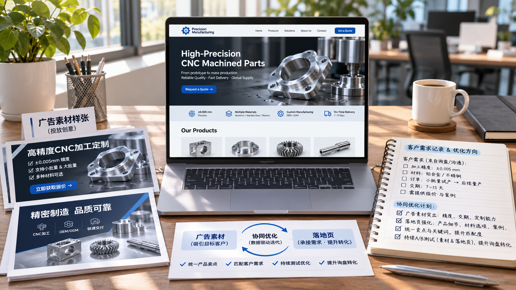
If an ad says “Get equipment pricing” but the page opens with the company’s history, it’s no surprise if users drop off while searching for the pricing inquiry form. The content above the fold should align with the product, use case, and call to action in the ad: make it easy to understand what you sell, who it’s for, and what happens after the form is submitted.
The form button should also make the outcome clear. “Submit” is fine, but “Get the product catalog” or “Request a bulk quote” usually makes the next step easier to understand. For quote requests, you can ask customers to provide a model or intended use before an assessment. Don’t imply that they’ll receive an accurate price immediately just by filling out the form.
For manufacturing inquiries, consider placing product specifications, application scenarios, delivery capabilities, or links to FAQs near the form. Make sure the information matches the product being promoted. Don’t make blanket promises about lead times, certifications, or service coverage that you can’t confirm. Before filling out the form, users are most concerned with whether you can solve their problem—not how many decorative elements the page has.
Fewer fields aren’t always better: every field should have a purpose
When reviewing a form, consider each field and ask yourself: can the sales team start following up using only the information already provided? If so, there’s no need to make fields that aren’t currently needed mandatory. An initial inquiry form can often collect contact details and a description of the customer’s needs. Whether you need a name, company name, order quantity, or destination depends on the product, quoting process, and follow-up service.
Some fields increase the effort required to fill out the form but can prevent a lot of unproductive communication. For example, custom equipment may require information about the operating environment, while cross-border shipping quotes may require the destination. Rather than removing these fields outright, explain why the information is needed—for example, “to assess the right model” or “to calculate a shipping plan”—and let customers select “Not sure yet.” Non-essential information can also be collected after the first conversation.
Downloading materials and requesting a solution are different intentions, so they shouldn’t necessarily share one long form. The former can be kept relatively simple. For the latter, if you genuinely need more technical details, consider using a multi-step form that shows the user’s progress. But a multi-step form shouldn’t just hide a long form: if every step asks for more information and users can’t see how much is left, they may still leave.

Fill out the form on a mobile device yourself—don’t just review the design mockup
When ad traffic lands on a mobile page, how smoothly the form works is more important than whether it looks neat on a computer. Use a real phone to go through the entire journey from the ad: does the page shift around after loading? Does the keyboard cover the input fields? Is the button easy to tap? Do error messages appear next to the relevant fields? Also test on a weak network and try going back to make changes; don’t test only the ideal scenario once.
Input rules should be as flexible as possible. Use the appropriate keyboard for email addresses, and allow phone numbers to be entered with spaces or country codes in ways users commonly use. If a specific format is genuinely required, show an example in advance. If an error occurs, retain the information already entered and explain how to fix it instead of displaying only a message saying “Submission failed.” CAPTCHA can block some spam, but it can also get in the way of legitimate users. Choose an appropriate approach based on the volume of spam inquiries rather than automatically adding multiple verification steps.
For international markets, also check the language and local conventions: are the form labels, error messages, and success messages all in the same language? Is the country or region easy to find in the selector? Does the phone number field support international dialing codes? A multilingual page involves more than translating the headline; the entire submission journey needs to be checked.
Address users’ concerns by providing trustworthy information
Providing contact details means users risk being contacted repeatedly. Near the form, briefly explain how the information will be used, how follow-up will take place, and what response commitments you can fulfill. Also provide a clear, accessible privacy notice. Whether separate consent is required and how personal information should be handled in different regions must be verified based on the target market, the information collected, and how it is actually processed. A fixed line of copy cannot replace that assessment.
Trust information should be verifiable. Genuine company contact details, materials relevant to the product, and clearly defined service coverage are usually more convincing than a row of badges with no source. If the page offers an instant messaging option, explain what it is for. Don’t let pop-ups repeatedly obscure the form, or redirect users to another path as soon as they start filling it out.
After submission, check that the lead has actually been received
Clicking the button doesn’t mean the inquiry has been recorded. During testing, confirm that the server receives the data, notification emails or the lead management system record it properly, repeated clicks don’t create duplicate entries, and users see a clear success message. A confirmation page can tell customers how to get in touch next and what information to prepare, but don’t display “Submission successful” before confirming that the data has been saved.
When evaluating optimization results, look beyond the submission rate and review the quality of inquiries and follow-up. Removing all qualifying fields may increase the number of submissions, but it can also make the sales team spend more time confirming basic requirements. When comparing data before and after a redesign, try to keep the ad audience, campaign settings, and measurement criteria consistent, and allow enough time to observe the results. When traffic is low, don’t draw conclusions based on just a few submissions.
When website development, advertising, and lead follow-up are handled by different teams, tracking and field requirements can easily fall out of sync. Platforms such as 易营宝, which provide both website development and international marketing services, make it possible to review the page, ad campaign, and inquiry process together. The right tools still depend on whether they can connect to your existing systems and whether the data can be verified. When optimizing, start by completing an end-to-end test from clicking the ad to receiving the inquiry in the backend, then fix the most obvious obstacle.
Related Articles
 How can you optimize Facebook ads to reduce customer acquisition costs?
 How Can Overseas Advertising and Social Media Work Together? An Integrated Approach from Audience Reach to Lead Conversion
 How Can Ad Landing Page Design Reduce Form Abandonment?

Related Products
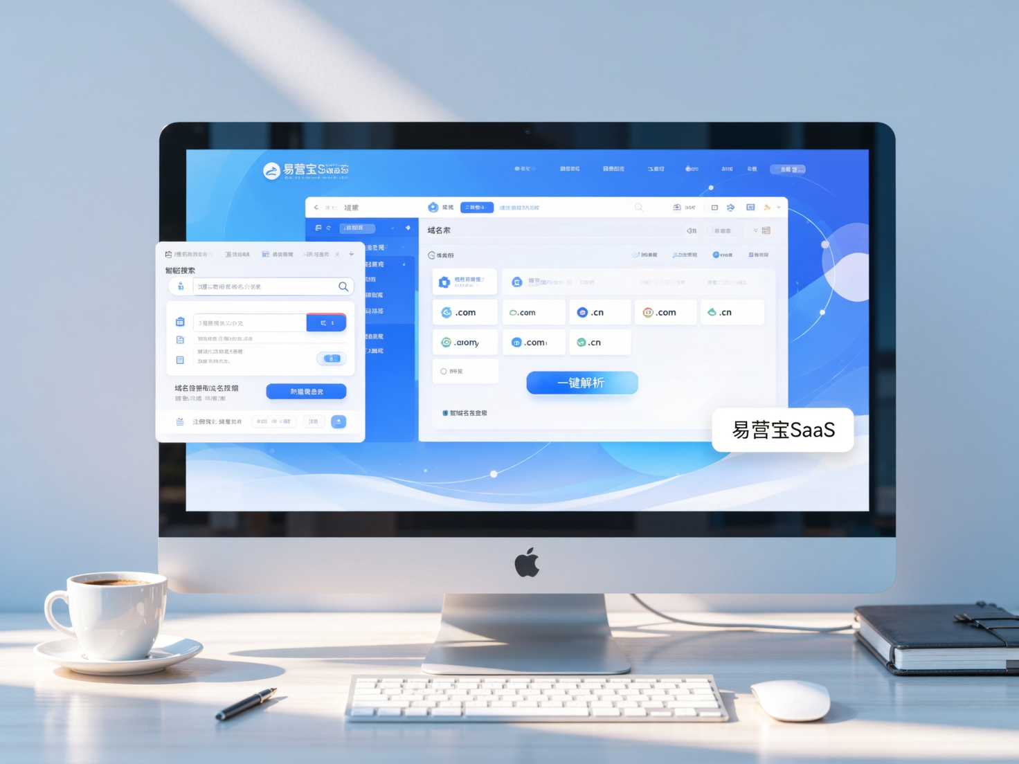
 Yiyingbao SaaS Intelligent Website Building and Marketing SystemYiyingbao SaaS Intelligent Website Building and Marketing System, AI-powered no-code website building, rapid creation of multilingual B2B international websites in 10 minutes, global server acceleration, AI-powered SEO optimization, helping businesses connect efficiently with global markets. The perfect integration of technology and operation makes building an international trade website remarkably simple
 AI+SEM Intelligent Advertising Marketing SystemAI+SEM drives intelligent ad creation, empowering full-funnel precision advertising marketing. The system automatically generates weekly/monthly reports, AI recommends keywords and target countries, monitors core metrics in real-time with intelligent alerts, and enables one-click high-conversion ad solutions to help quickly acquire customers and improve ROI.
 AI+SEO Dual-Engine System Optimization ServicesYiyingbao’s AI+SEO dual-engine optimization system helps foreign trade enterprises acquire high-quality organic traffic through AI-powered keyword research, content generation, and comprehensive technical optimization, significantly improving search rankings and conversion rates.
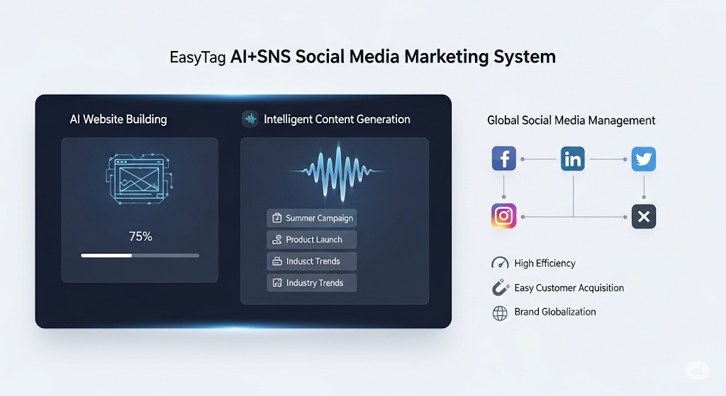
 AI+SNS Social Media Marketing SystemYingbao AI+SNS Social Media Marketing System - Precision social capture for the social media era. Supports one-click content synchronization across major platforms like Facebook and LinkedIn. AI intelligently rewrites posts for enhanced relevance. 24/7 AI customer service and user profiling analysis empower businesses to efficiently expand into global markets.
 AI+SEO营销解决方案易营宝AI+SEO营销解决方案,通过AI批量写作、智能生成TDK、精准关键词扩词等功能,全面优化网站SEO效果,提升流量与转化率。助力企业构建高效智能网站新生态。
 AI+SEM Advertising Marketing SolutionsAI+SEM Advertising Marketing Solution leverages AI technology to deeply empower SEM ad campaigns. It automatically generates weekly/monthly reports using AI, presenting account data across multiple dimensions for comprehensive insights into campaign performance and trends. The system precisely recommends keywords and target countries, intelligently generates high-conversion ad copy, and enables one-click activation of efficient campaign plans to help businesses rapidly acquire customers. Simultaneously, it monitors core metrics in real time, intelligently identifies abnormal fluctuations, and issues timely alerts to ensure stable, high-return advertising results.
 Domain Name ServicesEasyWin provides professional domain name services, including intelligent queries, one-stop registration, brand protection, and full lifecycle management, helping businesses build a digital brand image.
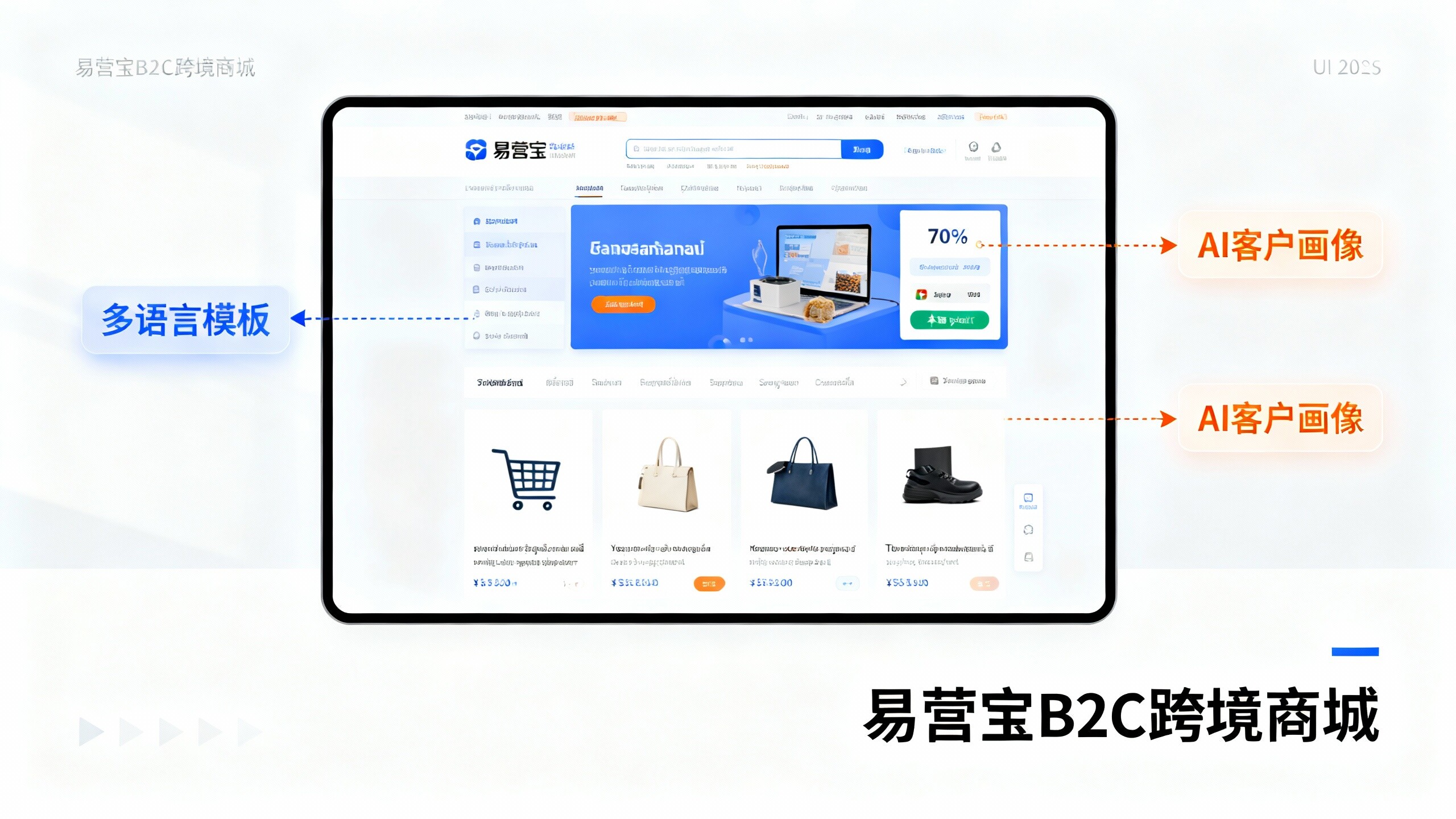
 EasyOperate B2C Cross-Border E-Commerce Platform & Independent WebsiteEasyStore B2C Cross-border E-commerce Independent Store is an intelligent website building and cross-border e-commerce integrated solution independently developed by EasyStore Information Technology (Beijing) Co., Ltd. The system is specially designed for small and medium-sized as well as large export enterprises, integrating 'website building, operation, marketing, advertising, and conversion' into one, helping enterprises quickly establish cross-border e-commerce independent stores to achieve brand globalization and global sales growth.
The platform supports multiple languages, multiple currencies, and multi-channel marketing, with built-in AI intelligent translation and SEO optimization systems, suitable for mainstream markets such as Southeast Asia, Europe and America, Latin America, and the Middle East, assisting Chinese manufacturing enterprises in efficiently deploying international e-commerce strategies. SSL证书易营宝提供专业SSL安全证书服务,包括单域名和泛域名证书,确保网站数据传输加密、身份验证和完整性保护,助力企业建立安全可信的在线业务环境。