








- Levanta’s Inaugural China Summit Held in Shenzhen, Focusing on AI and Cross-Border Brand GrowthOct 20, 2026View details
- The October Edition of the 2026 GGE Shenzhen Cross-Border E-Commerce Expo OpensOct 20, 2026View details
- Dongguan’s foreign trade imports and exports reached RMB 1.29 trillion in the first three quarters, a record high for the same periodOct 20, 2026View details
- Liaoning Holds Province-Wide Meeting to Advance Cross-Border E-Commerce, Emphasizing the Need to Explore Differentiated Development PathsOct 20, 2026View details
- Advanced Manufacturing Seizes Global Opportunities as Guangdong’s Q3 Foreign Trade Surpasses RMB 3 Trillion for the First TimeOct 20, 2026View details
- Can the average annual growth rate reflect real opportunities in overseas markets?Oct 07, 2026View details
How Can an Independent Beauty Brand Website Improve Overseas Conversion Rates?
After beauty brands direct traffic to their overseas independent websites, the most common gap is this: ad clicks and social media engagement may be strong, yet visitors stay only briefly, leave after adding items to the cart, or abandon payment at checkout. This is usually not because the products are “not good enough,” but because consumers do not gain sufficient understanding, trust, and purchasing convenience within a few minutes.
How can beauty brand independent websites improve overseas conversions? The key is not to optimize a single button in isolation, but to address four aspects throughout the user purchase journey: help visitors understand whether a product suits them, make them trust efficacy and safety information, provide clear purchasing and delivery rules, and use pages that match the originating traffic channel to meet their needs. Identify where drop-off occurs first, then adjust pages and marketing actions; this is more efficient than making blind revisions.
First, determine where users are leaving
Do not focus only on the overall conversion rate. Beauty purchase decisions often involve assessing skin type, selecting shades, considering ingredients, confirming how to use the product, and comparing shipping costs and delivery times. Abnormalities on different pages point to different issues.
When reviewing data, distinguish between organic search, advertising, social media content, and remarketing traffic. Users arriving through search may already have a specific question, such as looking for a cleanser suitable for sensitive skin; visitors brought in by short videos may first be attracted by the makeup finish. If both groups land directly on the same generic product page, conversion may not be ideal.
Product pages should first answer the questions consumers truly hesitate over
Overseas users will not automatically understand brand terminology, nor will they spend much time reading an entire block of promotional copy. Above the fold, a product page should quickly explain what the product is, who it is for, what everyday concern it addresses, how to use it, and the main current costs involved in purchasing it. Concise text below the product name can describe skin type, makeup finish, texture, or application area, rather than relying solely on abstract terms such as “premium” or “radiance-enhancing.”
For example, with complexion products, consumers often need to know the coverage level, whether the finish is more matte or luminous, whether it suits dry or oily skin, and how to choose a shade. For skincare products, they pay greater attention to ingredient functions, order of use, frequency, and skin conditions for which the product may not be suitable. Hiding this information at the bottom of the product details page may cause users to leave before they have developed purchase interest.

Visual content should reduce the “cost of imagination”
A simple product bottle image on a white background is not enough to support a beauty purchase decision. In addition to the main image, content can be prepared according to product features, such as texture close-ups, the product in actual use, shade references or references for different skin tones, packaging dimensions, and how the package is opened. Images cannot replace text: shades are significantly affected by screens, so visual differences should be clearly noted and selection guidance should be provided, rather than implying that everyone will achieve the same result.
Video is suitable for showing spreadability, the foaming process, layering effects, or makeup application steps, but key conclusions should be placed where they are visible on the static page first. Some users browse with sound muted, and their network conditions may not be suitable for loading large video files.
Ingredient information should be clear, not overloaded with jargon
Ingredients are an important entry point for building trust, but a longer ingredient list does not necessarily make a product more convincing. A more effective approach is to explain the role of key ingredients in the formula and how consumers should use the product. For example, moisturizing products can describe their texture, suitable times of use, and layering recommendations; products containing active ingredients should specify frequency of use, combination restrictions, and necessary precautions. When describing efficacy, avoid absolute language and do not present improvements that some individuals may experience as guaranteed results.
Multilingual support does not end when translation is complete
Many websites offer language switching, but their pages still retain directly translated product names, measurement units, expressions, and customer service instructions. Being understandable does not mean reading naturally; once critical information is unclear, purchases will be delayed.
Localization should first cover content that directly affects ordering: navigation categories, product selling points, skin type and shade descriptions, shipping coverage, currency display, size or volume units, return and exchange instructions, and checkout prompts. Different markets understand expressions such as “sets,” “travel sizes,” and “subscription replenishment” differently, so the original website structure cannot simply be copied. Each language version should also separately check links, inventory status, and the checkout process to prevent users from returning to the default currency or an incorrect region after switching languages.
Turn shipping, taxes, and after-sales service from “hidden terms” into purchase information
When consumers discover only after adding items to the cart that shipping costs are high, delivery times are too long, or taxes are unknown, they often will not proceed with payment. Especially for cross-border beauty orders, logistics information is not only an after-sales issue but also a conversion issue.
- State the regions available for delivery, estimated processing time, and approximate transit time on the product page or near the shopping cart.
- Clearly explain how shipping costs are calculated and whether order value affects free-shipping eligibility.
- Use an easy-to-find page to explain return and exchange restrictions, unopened-item requirements, and contact channels.
- If prices do not include potential taxes, avoid concealing this with vague wording to reduce unexpected costs at checkout.
This information does not need to occupy the first screen, but it cannot be placed only in the footer. For users encountering a brand for the first time, transparent rules are themselves a signal of reliability. Customer service entry points should also connect with order, logistics, and product inquiry scenarios, rather than merely retaining a hard-to-find contact page.
Send traffic from different sources to different destination pages
The promise conveyed by social media content, ad creatives, and search terms must align with the first screen of the landing page. If an ad shows the long-lasting finish of a lip tint but the click leads to an all-category homepage, users must search for the same product themselves, naturally increasing the likelihood of drop-off. Creating corresponding pages around individual products, collections, skin concerns, or holiday gifting usually makes it easier to create a continuous experience than directing all traffic to the homepage.
Landing pages should not carry too many choices either. For one clear need, they can retain the core product, relevant pairing recommendations, instructions for use, and a purchase entry point. When users who have already purchased visit again, it is more appropriate for them to see refill sizes, similar shades, or complementary products. Recommendations must be relevant; displaying large discounts, subscription prompts, or multiple pop-ups too early can instead interrupt the process of learning about the product.
The goal of the checkout page is to reduce hesitation, not collect more information
When reviewing the checkout experience, complete the process once from the product page to the point before payment. Focus on whether addresses are easy to enter on mobile devices, whether promo codes distract from the main task, whether error messages are understandable, and whether users can confirm the final price, shipping costs, delivery location, and product specifications. The more fields there are, the more likely users are to abandon the process; information unrelated to fulfillment should, as far as possible, not be required for a first order.
Payment methods and currency display should also match the target market. Even if front-end pages have already been localized, trust built earlier will quickly be weakened if checkout suddenly switches to an unfamiliar language, the default currency differs from the one shown while browsing, or the price composition changes.
Use continuous testing instead of a one-time “redesign”
Improving overseas conversions does not require redesigning all pages at once. Start by selecting a page with stable traffic and relatively clear issues, then prioritize testing the above-the-fold selling points, shade guidance, placement of shipping notices, or checkout fields. Observe whether the add-to-cart rate, checkout initiation rate, and payment completion rate change accordingly. Adjusting only a few key variables at a time makes it easier to determine where the effect comes from.
For new products or pages with insufficient data, begin with usability checks: whether mobile loading is smooth, whether primary buttons remain visible, whether the language reads naturally, whether pricing and inventory are consistent, and whether users can make decisions about shades, specifications, and shipping without consulting customer service. Improving conversion on beauty independent websites is essentially about providing the right information before every point of hesitation, so consumers do not need to guess what will happen next.
Related Articles



Related Products
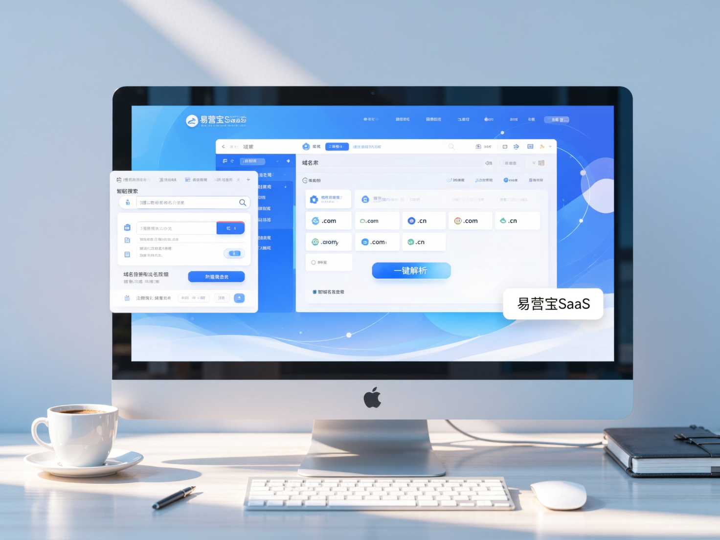
 Yiyingbao SaaS Intelligent Website Building and Marketing SystemYiyingbao SaaS Intelligent Website Building and Marketing System, AI-powered no-code website building, rapid creation of multilingual B2B international websites in 10 minutes, global server acceleration, AI-powered SEO optimization, helping businesses connect efficiently with global markets. The perfect integration of technology and operation makes building an international trade website remarkably simple
 AI+SEM Intelligent Advertising Marketing SystemAI+SEM drives intelligent ad creation, empowering full-funnel precision advertising marketing. The system automatically generates weekly/monthly reports, AI recommends keywords and target countries, monitors core metrics in real-time with intelligent alerts, and enables one-click high-conversion ad solutions to help quickly acquire customers and improve ROI.
 AI+SEO Dual-Engine System Optimization ServicesYiyingbao’s AI+SEO dual-engine optimization system helps foreign trade enterprises acquire high-quality organic traffic through AI-powered keyword research, content generation, and comprehensive technical optimization, significantly improving search rankings and conversion rates.
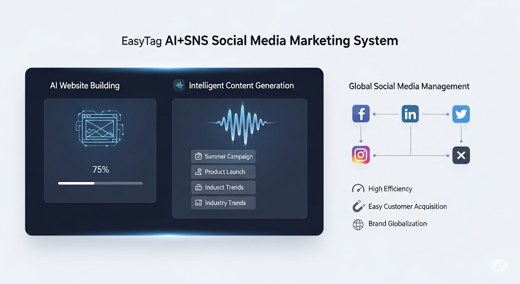
 AI+SNS Social Media Marketing SystemYingbao AI+SNS Social Media Marketing System - Precision social capture for the social media era. Supports one-click content synchronization across major platforms like Facebook and LinkedIn. AI intelligently rewrites posts for enhanced relevance. 24/7 AI customer service and user profiling analysis empower businesses to efficiently expand into global markets.
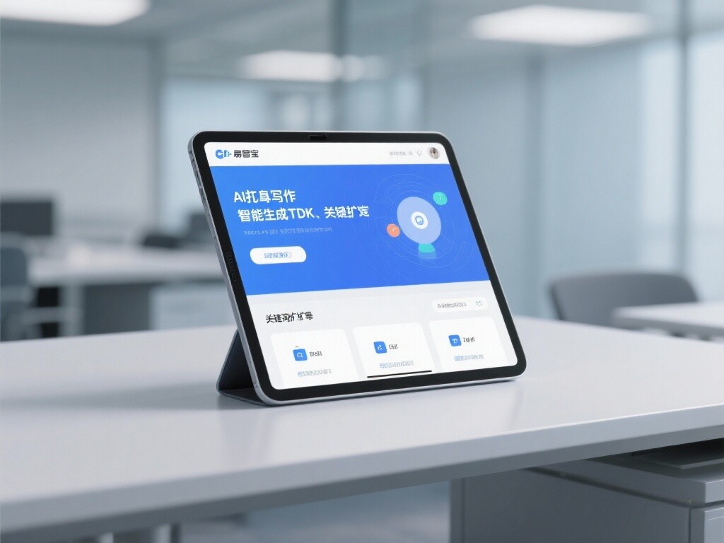
 AI+SEO营销解决方案易营宝AI+SEO营销解决方案,通过AI批量写作、智能生成TDK、精准关键词扩词等功能,全面优化网站SEO效果,提升流量与转化率。助力企业构建高效智能网站新生态。
 AI+SEM Advertising Marketing SolutionsAI+SEM Advertising Marketing Solution leverages AI technology to deeply empower SEM ad campaigns. It automatically generates weekly/monthly reports using AI, presenting account data across multiple dimensions for comprehensive insights into campaign performance and trends. The system precisely recommends keywords and target countries, intelligently generates high-conversion ad copy, and enables one-click activation of efficient campaign plans to help businesses rapidly acquire customers. Simultaneously, it monitors core metrics in real time, intelligently identifies abnormal fluctuations, and issues timely alerts to ensure stable, high-return advertising results.
 Domain Name ServicesEasyWin provides professional domain name services, including intelligent queries, one-stop registration, brand protection, and full lifecycle management, helping businesses build a digital brand image.
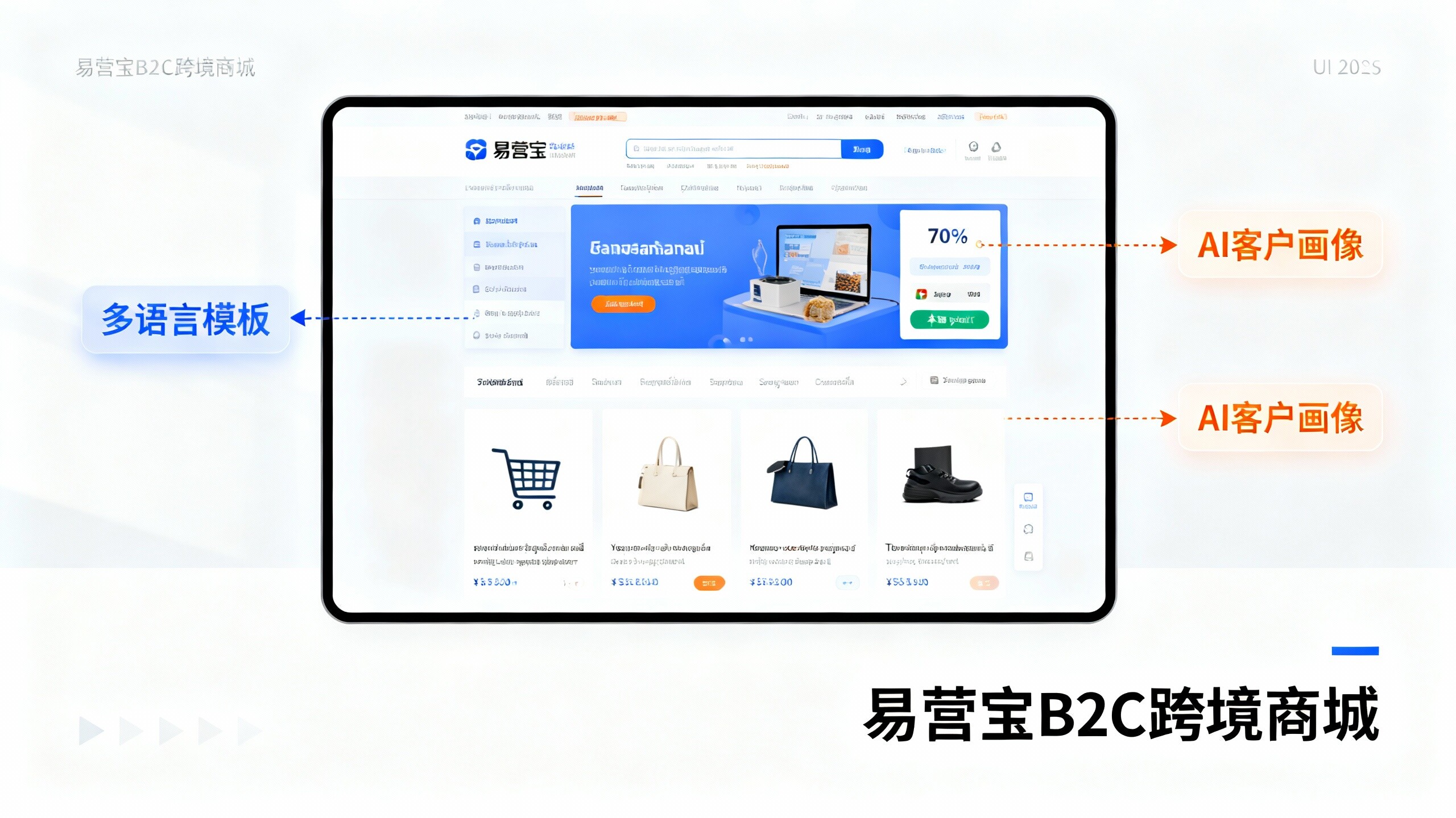
 EasyOperate B2C Cross-Border E-Commerce Platform & Independent WebsiteEasyStore B2C Cross-border E-commerce Independent Store is an intelligent website building and cross-border e-commerce integrated solution independently developed by EasyStore Information Technology (Beijing) Co., Ltd. The system is specially designed for small and medium-sized as well as large export enterprises, integrating 'website building, operation, marketing, advertising, and conversion' into one, helping enterprises quickly establish cross-border e-commerce independent stores to achieve brand globalization and global sales growth.
The platform supports multiple languages, multiple currencies, and multi-channel marketing, with built-in AI intelligent translation and SEO optimization systems, suitable for mainstream markets such as Southeast Asia, Europe and America, Latin America, and the Middle East, assisting Chinese manufacturing enterprises in efficiently deploying international e-commerce strategies. SSL证书易营宝提供专业SSL安全证书服务,包括单域名和泛域名证书,确保网站数据传输加密、身份验证和完整性保护,助力企业建立安全可信的在线业务环境。