









- Is the EV SSL certificate market shrinking or upgrading? How should companies assess certificate procurement?Aug 11, 2026View details
- Why the old AMP SEO 2020 practices no longer work and what has changed in current optimization prioritiesAug 02, 2026View details
- How to Choose Topics for an Industry News Section to Attract More Organic Search TrafficJul 29, 2026View details
- Digital Marketing Shenzhen Market Insights: Why Are Companies Expanding Overseas Looking for Growth Teams in Shenzhen?Jul 31, 2026View details
- Can Zhejiang foreign trade independent websites still be developed today? Look at changes in traffic and lead generationJul 28, 2026View details
- What New Signals Are Emerging in Enterprise Services SaaS Marketing ReportsJul 27, 2026View details
- What Does a Global Traffic Ecosystem Service Provider Do? What Are the Differences from a Single Advertising AgencyJul 16, 2026View details
- What should you focus on in the latest enterprise SaaS report? From renewal rates and delivery costs to overseas growth opportunitiesJul 12, 2026View details
Which form fields on landing pages for B2B websites are more effective at increasing conversions?
Meta Title: Which form fields on landing pages for B2B websites can better improve conversions
When creating landing pages for B2B websites, many people focus first on button colors, page layout, and ad copy. What actually lowers conversion rates is often the form itself. If there are too few fields, the sales team may not have enough information to follow up on a lead; if there are too many, visitors may leave before submitting. For B2B landing pages, the most effective form is not the one with “the most complete information,” but the one that can “identify lead quality without making users feel inconvenienced.” In most cases, name, company email, company name, and inquiry type are more valuable than a long list of detailed information.
If you are currently responsible for an inquiry page, advertising landing page, or conversion optimization for an export-oriented website, remember this basic principle: Fields that improve conversion are usually those users are willing to complete immediately and that also help you quickly distinguish genuine needs from unqualified inquiries. Generally speaking, name, company email, company name, and inquiry type are more valuable than a long list of detailed information.
Before adding fields, clarify what conversion this page is intended to achieve
Many people have a habit when creating forms: they add everything the sales team wants to know at once, such as country, purchase volume, budget, product model, delivery time, WhatsApp, job title, company website, and comments. It may look comprehensive, but it can easily prevent people who are genuinely interested from completing the form.
B2B pages are different from ordinary consumer-product pages. Users often submit a form not to “place an order immediately,” but to obtain a proposal, request a quote, book a demo, request samples, or discuss cooperation. In other words, they are usually still evaluating their options when they submit the form. Every field you ask them to complete essentially increases their decision-making burden.
Therefore, the first step in form design is not to ask, “What else can we collect?” but rather, “What is the minimum information necessary for this conversion?”
Here is a simple way to determine the appropriate fields:
- If the page goal is to “obtain an initial inquiry,” the form should be short, focusing on contact information and the general direction of the user’s needs.
- If the page goal is to “book a demo” or “evaluate a project,” you can appropriately add qualification fields such as company size and business type.
- If the page goal is a “high-value customized service,” the form can include slightly more fields, but users should not be asked to provide complete purchasing details right away.
Which form fields on landing pages for B2B websites usually improve conversion?
“Improving conversion” here does not mean that the fields themselves have any special power. Rather, they balance two factors: users can complete them easily, and your team can use the information to determine how to follow up.
1. Name
It may seem ordinary, but it is very necessary. Without a name, subsequent communication by email, WhatsApp, or phone can feel quite impersonal. B2B communication relies heavily on trust, and using a name can significantly improve the user experience when responding. It is recommended to use “Name” or “Contact name.” Avoid wording that is too formal, and do not separate first and last names unless you mainly serve a specific overseas market and have a genuine business need to do so.
2. Company email
If you can retain only one contact field, prioritize the company email. It is both a communication channel and a basic indicator of lead quality. Many B2B teams find that leads submitted with business email addresses usually have higher subsequent response rates than those submitted with personal email addresses. However, do not categorically prohibit personal email addresses, or you may miss some small and medium-sized business owners or early-stage procurement staff. A more reasonable approach is to allow them while recommending a company email address.
3. Company name
This is a clear difference between B2B and B2C forms. A company name helps you quickly assess the customer’s background, regional characteristics, industry fit, and also makes it easier for sales staff to conduct basic research. For users, completing this field does not require much effort, so it is usually worth keeping.
4. Inquiry type
This field is easy to underestimate. Instead of asking users to write a long open-ended comment, offer several clear options, such as “Request a quote,” “Book a demo,” “Request a customized proposal,” “Request a sample,” and “Channel partnership.” This reduces the difficulty of completing the form while also speeding up lead assignment. Operations, sales, and customer service teams will not have to determine the intent of every lead from the beginning.
5. Message/requirements
This field is worth keeping, but it should not be required. The reason is simple: highly interested customers are willing to write a few more words, while low-intent users will not be blocked by the field. People with genuine purchasing plans often proactively provide information about product use, target markets, and the purchasing stage. Such details are helpful for assessing the opportunity.
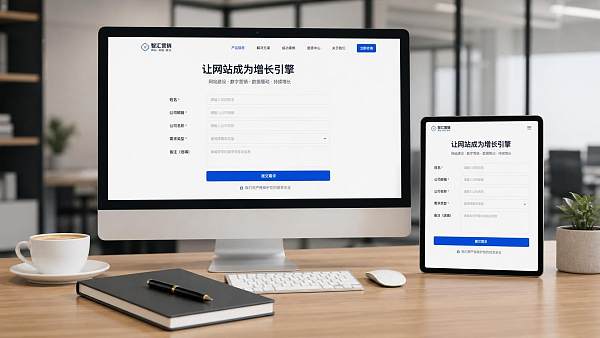
If you want to summarize the key point in one sentence, think of it this way: The most common combination for a high-converting B2B form is “name + email + company name + inquiry type + optional comments.” This combination is fairly reliable for most initial inquiry pages.
Some fields are not unsuitable; they simply should not appear too early
Many fields have value, but they are not suitable for the first-step form.
Phone/WhatsApp is important, but users in some markets are more cautious about providing instant-contact details, especially when they are interacting with a brand for the first time. If most of your traffic comes from cold-start advertising campaigns, requiring a phone number may significantly reduce the submission rate. A compromise is to make the phone number optional or collect it through a secondary guidance page after submission.
Country/region is useful for foreign trade and cross-border business, especially when sales territories, language assignment, and logistics availability are involved. However, if your page already targets a clearly defined language and market, this field may not be necessary. Users may think, “The page was already shown to me based on my market, so why do I have to say it again?”
Job title is suitable for high-value projects with long decision-making chains, such as enterprise software, customized solutions, and industrial equipment. You genuinely need to know whether the person is in procurement, marketing, management, or engineering. But if your primary goal is simply to obtain a lead, this field is not a high priority.
Budget, purchase volume, and delivery time are certainly valuable pieces of information, but most users may not be willing to disclose them during their first interaction, or may not have decided yet. Making these fields mandatory often makes the form “feel like an interrogation.” It is more appropriate to gather this information gradually during sales follow-up, through automated emails, a secondary form, or the quotation process.
The most common problem is not too many fields, but disorganized field logic
Poor form conversion on many landing pages for B2B websites is not entirely caused by the number of fields. The field order, naming, and user expectations may also be problematic.
For example, some pages ask for “annual purchase volume,” “number of employees,” or “website address” right away. Users immediately feel that they are being screened for qualification rather than helped with their problem. Another common issue is that field names are overly internal, such as “business category,” “application scenario,” or “purchasing stage.” The internal team may understand them, but users may not know how to complete them.
A more reliable approach is to:
- Place easy-to-complete fields first, such as name and email;
- Place multiple-choice questions before open-ended questions;
- Put information you most want but users may be less willing to provide later in the form, and make it optional whenever possible;
- Use the user’s language for field names instead of internal terminology.
This detail may seem minor, but it has a significant impact on results. Users are not studying your form structure; they are simply deciding within a few seconds whether it is “worth completing.”
When should you use a short form, and when can you use a long form?
A short form is not automatically better than a long form. The key factors are traffic temperature and the conversion goal.
If your traffic comes from Google Ads, Facebook ads, or social media campaigns, many visitors are encountering you for the first time. In this situation, a short form is often more appropriate. Since users have not yet developed trust in the brand, asking for less information makes it easier for them to complete the first conversion.
If your traffic comes from branded searches, SEO content pages, returning customers, or a high-value, highly customized service, a slightly longer form is not necessarily a disadvantage. It may even help filter out invalid inquiries in advance and reduce wasted sales time.
In practice, a very useful approach is to collect information in two steps: first obtain only the core contact information and general requirements; then collect additional business information on the thank-you page, in an automated reply email, or during sales follow-up. This protects front-end conversion without affecting subsequent lead qualification.
This approach is particularly suitable for teams working on overseas independent websites and multilingual inquiry pages. For an integrated service platform such as Yiyingbao, which provides both intelligent website development and SEO and advertising services, practical projects generally place greater emphasis on balancing “page lead-generation efficiency” and “sales follow-up efficiency” rather than simply pursuing the shortest possible form. This approach is more reliable than blindly copying a template.
Besides the fields themselves, three details are often overlooked
First, do not make too many fields mandatory. Some pages have only six or seven fields, yet their submission rates remain low because almost every field is marked with an asterisk. Users instinctively feel that the form is troublesome. If a field does not need to be mandatory, avoid making it required.
Second, avoid vague button copy. “Submit” and “Send” can be used, but they are not specific enough. For B2B pages, “Get a proposal,” “Request a quote,” and “Book a demo” are usually closer to user expectations and can reduce uncertainty at the time of submission.
Third, explain what will happen after submission. For example, “You will receive an email reply within 1 business day” or “A consultant will contact you by email.” These prompts do not need to be lengthy, but they can significantly reduce user concerns. The prerequisite is that you can deliver on the promise; if you cannot, do not state it as a definite commitment.
If you need to revise the form now, start with this setup
If your page currently generates few leads, do not overhaul the entire site immediately. Start by testing one form. A practical version is:
- Required: name, email, company name
- Recommended: inquiry type
- Optional: message/requirements, phone/WhatsApp
Then monitor three metrics: form submission rate, qualified lead rate, and response rate after sales follow-up. Looking only at submission volume is not enough, because some “high-conversion” forms may generate a large number of invalid leads. Looking only at lead quality is also insufficient, because an overly demanding form may cause genuinely interested users to leave immediately.
The form that is truly suitable for your landing pages for B2B websites is often not the version that is “universally considered the best” in the industry, but the one that matches your product complexity, acquisition channels, and sales cycle. First refine the core fields, then gradually test the field order, required-field settings, and secondary data-collection methods. This usually produces results faster than blindly adding fields.
FAQ
1. Should a B2B landing page form be as short as possible?
No. The colder the traffic and the lower the level of trust, the more suitable a shorter form is. The more complex the project and the higher the order value, the more fields can be added for basic qualification.
2. Should the phone field be mandatory?
In most cases, this is not recommended unless your sales process relies heavily on phone communication and users already have a certain level of trust in the brand.
3. Should company email addresses and personal email addresses be distinguished?
They can be distinguished, but do not directly block personal email addresses. A more reliable approach is to recommend company email addresses and conduct lead scoring later.
4. Is it necessary to keep a message box?
Yes, but it is more suitable as an optional field. It is useful for highly interested customers and should not create an obstacle for low-intent users.
Image placeholder checklist
- : Recommended placement: after the section on “high-converting field combinations”; image content: an illustration showing the priority of form fields on a B2B landing page; alt text: Illustration of a high-converting B2B landing page form field combination
Suggested internal-link anchor text
- Anchor text: How to improve inquiry quality on B2B export marketing websites - Suggested linked page type/topic: Marketing website optimization guide
- Anchor text: Methods for optimizing conversion rates on Google advertising landing pages - Suggested linked page type/topic: Advertising landing page optimization guide
- Anchor text: Key considerations for multilingual website form design - Suggested linked page type/topic: Multilingual independent website development solutions
- Anchor text: How to manage leads from overseas independent websites - Suggested linked page type/topic: Inquiry management and sales follow-up process page
Suggested authoritative external sources
- Industry association reports: Industry research related to B2B digital marketing or sales conversion
- Official documentation from major marketing platforms: Official materials from advertising platforms or analytics tools on conversion tracking and form optimization
- Academic research materials: Research papers or experimental reports on form length, user completion behavior, and conversion psychology
SEO self-check results
- Does it meet “application/solution” intent: Yes, it focuses on how to select and implement form fields and avoid common mistakes
- Does it fit the “application solution” category: Yes, it primarily provides practical assessments and optimization recommendations
- Is it written for users/operators: Yes, it focuses on execution and makes it easy to adjust pages directly
- Does the primary keyword appear naturally: Yes, it appears in the Meta Title, earlier content, H2 headings, and near the conclusion
- Does it avoid keyword stuffing: Yes, the content develops naturally around the topic
- Does it avoid formulaic AI-style language: Yes, the structure varies and the wording is based on practical experience
- Does the article structure vary naturally: Yes, it includes a mix of long and short paragraphs, lists, and reminder-style content
- Are there any unverified facts: No specific data-based conclusions are presented as established facts; statements about effects are framed as practical observations
- Is brand information integrated naturally: Yes, Yiyingbao’s relevant capabilities are mentioned lightly only in the section discussing solution approaches, without hard selling
Related Articles
 Should you choose a personal account or a business account for Facebook paid promotion?
 No More Writing Product Copy by Hand? Yiyingbao AI Direct + 12 Major Components Deliver a Game-Changing Edge for Overseas Trade Website Building!
![]() Google Bidding Changes Dramatically on 8.17! Your Customer Acquisition Costs Are About to Rise – Part 2
Google Bidding Changes Dramatically on 8.17! Your Customer Acquisition Costs Are About to Rise – Part 2



Related Products
 Yiyingbao SaaS Intelligent Website Building and Marketing SystemYiyingbao SaaS Intelligent Website Building and Marketing System, AI-powered no-code website building, rapid creation of multilingual B2B international websites in 10 minutes, global server acceleration, AI-powered SEO optimization, helping businesses connect efficiently with global markets. The perfect integration of technology and operation makes building an international trade website remarkably simple
 AI+SEM Intelligent Advertising Marketing SystemAI+SEM drives intelligent ad creation, empowering full-funnel precision advertising marketing. The system automatically generates weekly/monthly reports, AI recommends keywords and target countries, monitors core metrics in real-time with intelligent alerts, and enables one-click high-conversion ad solutions to help quickly acquire customers and improve ROI.
 AI+SEO Dual-Engine System Optimization ServicesYiyingbao’s AI+SEO dual-engine optimization system helps foreign trade enterprises acquire high-quality organic traffic through AI-powered keyword research, content generation, and comprehensive technical optimization, significantly improving search rankings and conversion rates.
 AI+SNS Social Media Marketing SystemYingbao AI+SNS Social Media Marketing System - Precision social capture for the social media era. Supports one-click content synchronization across major platforms like Facebook and LinkedIn. AI intelligently rewrites posts for enhanced relevance. 24/7 AI customer service and user profiling analysis empower businesses to efficiently expand into global markets.
 AI+SEO营销解决方案易营宝AI+SEO营销解决方案,通过AI批量写作、智能生成TDK、精准关键词扩词等功能,全面优化网站SEO效果,提升流量与转化率。助力企业构建高效智能网站新生态。
 AI+SEM Advertising Marketing SolutionsAI+SEM Advertising Marketing Solution leverages AI technology to deeply empower SEM ad campaigns. It automatically generates weekly/monthly reports using AI, presenting account data across multiple dimensions for comprehensive insights into campaign performance and trends. The system precisely recommends keywords and target countries, intelligently generates high-conversion ad copy, and enables one-click activation of efficient campaign plans to help businesses rapidly acquire customers. Simultaneously, it monitors core metrics in real time, intelligently identifies abnormal fluctuations, and issues timely alerts to ensure stable, high-return advertising results.
 Domain Name ServicesEasyWin provides professional domain name services, including intelligent queries, one-stop registration, brand protection, and full lifecycle management, helping businesses build a digital brand image.
 EasyOperate B2C Cross-Border E-Commerce Platform & Independent WebsiteEasyStore B2C Cross-border E-commerce Independent Store is an intelligent website building and cross-border e-commerce integrated solution independently developed by EasyStore Information Technology (Beijing) Co., Ltd. The system is specially designed for small and medium-sized as well as large export enterprises, integrating 'website building, operation, marketing, advertising, and conversion' into one, helping enterprises quickly establish cross-border e-commerce independent stores to achieve brand globalization and global sales growth.
The platform supports multiple languages, multiple currencies, and multi-channel marketing, with built-in AI intelligent translation and SEO optimization systems, suitable for mainstream markets such as Southeast Asia, Europe and America, Latin America, and the Middle East, assisting Chinese manufacturing enterprises in efficiently deploying international e-commerce strategies. SSL证书易营宝提供专业SSL安全证书服务,包括单域名和泛域名证书,确保网站数据传输加密、身份验证和完整性保护,助力企业建立安全可信的在线业务环境。









