









- Which customer acquisition channels will be affected by cross-border marketing trends in 2026?Sep 06, 2026View details
- Which homogenization risks should be considered in an analysis of the AI-powered website building industry?Aug 30, 2026View details
- How Will AI Marketing Trends 2026 Change Advertising Budget AllocationAug 28, 2026View details
- Is the EV SSL certificate market shrinking or upgrading? How should companies assess certificate procurement?Aug 11, 2026View details
- Why the old AMP SEO 2020 practices no longer work and what has changed in current optimization prioritiesAug 02, 2026View details
- How to Choose Topics for an Industry News Section to Attract More Organic Search TrafficJul 29, 2026View details
Does responsive design help with Google SEO?
Does responsive design help Google SEO? The answer is yes. For corporate websites targeting overseas customers, responsive design is not only related to the mobile browsing experience, but also directly affects Google's crawling, indexing, page usability, and conversion performance. It is not the only factor determining rankings, but it has become a basic requirement for modern marketing websites.
When building an independent website or an international trade website, many companies focus more on whether the pages look attractive and whether the content is comprehensive, while overlooking the browsing experience on different devices. In fact, Google has long treated the mobile experience as an important reference criterion. If a website loads slowly on mobile devices, has a disorganized layout, or has buttons that are difficult to tap, its SEO performance is usually difficult to improve consistently.
Why responsive design has become a basic requirement for Google SEO
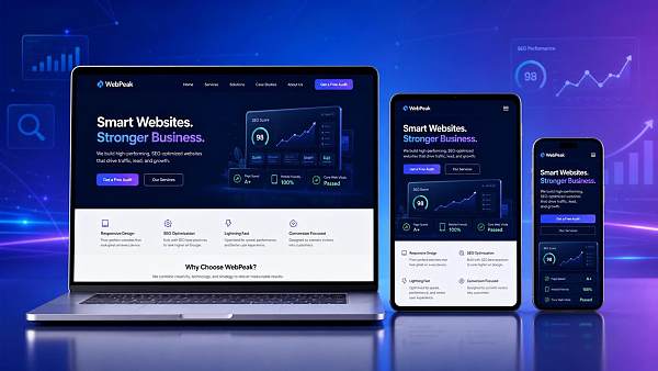
To answer the question “Does responsive design help Google SEO?”, we must first understand how Google evaluates websites. Google does not directly give a website higher rankings simply because it is “responsive.” Instead, it focuses more on whether this design genuinely improves the page experience, crawling efficiency, and content consistency.
The core of responsive design is to enable the same URL to automatically adjust its layout, font sizes, images, and button positions according to the screen size on computers, tablets, and mobile phones. For Google, this means a more consistent website structure, clearer content versions, and an easier way to understand the topic and value of a page.
Compared with creating a separate mobile website, responsive design generally retains only one set of URLs and one main body of content. This can reduce problems such as duplicate pages, redirect errors, and indexing confusion. For companies that plan to continuously invest in Google SEO, this structure is clearly more conducive to building authority over the long term.
How does it specifically affect Google SEO performance?
First, responsive design affects the mobile user experience. Google has consistently emphasized “user-centered” search result rankings. If users need to zoom in and out to view content after entering a page, or if buttons are crowded together and difficult to tap, page usability will decline, and SEO performance may also be affected.
Second, it helps improve crawling and indexing efficiency. A responsive website using a unified URL does not need to separate desktop and mobile pages into two sets, nor does it require complex canonical or alternate tags. This reduces the probability of technical errors and enables search engines to crawl and understand pages more efficiently.
Third, responsive design is usually easier to combine with page-speed optimization. Although “responsive” does not mean “fast loading,” standardized responsive development often addresses issues such as adaptive images, front-end compression, and simplified layouts at the same time. These are closely related to the Core Web Vitals that Google focuses on.
Fourth, it indirectly affects user behavior data. When mobile browsing is smooth, visitors are more likely to continue browsing product pages, case study pages, and inquiry pages. Time on site, page depth, and conversion intent will generally improve. Although these are not simple direct ranking factors, they continuously influence the overall performance of a website.
The point companies most often misunderstand: responsive design does not guarantee rankings
Many companies ask during website development why their Google SEO still delivers no results even though their website uses responsive design. The reason is simple: responsive design is only one of the basic infrastructures of SEO. It solves the question of whether a website can be accessed and understood more effectively, but it cannot replace the development of content, links, and page topics.
If a website can adapt to mobile screens but has superficial page content, disorganized keyword placement, unclear title tags, or product pages lacking genuine information, Google will still find it difficult to determine that the website provides high value. In other words, responsive design is the foundation, not the complete answer to growth.
In addition, some websites appear to be responsive but actually contain many technical issues. For example, hiding important content on mobile devices, using an oversized above-the-fold image, allowing pop-ups to cover essential information, or relying too heavily on JS loading can all weaken SEO performance. Therefore, companies should not only ask “Is it responsive?” but also “Is it responding appropriately?”
What business value should corporate managers be more concerned about?
From a management perspective, the value of responsive design is not limited to improving SEO rankings. More importantly, it can simultaneously support brand presentation, lead conversion, and subsequent marketing campaigns. A website adapted to multiple devices can reduce duplicate development and maintenance costs, and is also more suitable for long-term content operations and advertising campaigns.
For international trade companies, manufacturing factories, and brands expanding overseas, overseas customers often first encounter a brand on a mobile phone and then learn more about its products on a computer. If the experience is inconsistent across different devices, potential customers are more likely to drop off. Responsive design can make the entire decision-making process smoother and reduce visitor loss.
At the same time, responsive websites are better suited for use with Google Ads, social media traffic acquisition, and SEO content planning. Companies do not need to create multiple landing pages for different devices, nor do they need to worry about users exiting immediately after clicking an advertisement because the page layout is distorted. This is critical for improving inquiry efficiency and the return on marketing investment.
How to determine whether a website's responsive design truly has SEO value
First, check whether the mobile content is consistent with the core content on the desktop version. Google prefers to see the main information remain complete on the same page across different devices, rather than having large sections of text removed or key information hidden on mobile. If the mobile content is significantly reduced, its SEO value will usually be compromised.
Second, check whether the page is genuinely easy to use. This includes whether the font is clear, the buttons are easy to tap, the navigation is smooth, and the form is convenient to complete. For inquiry-focused websites in particular, the mobile form experience directly affects conversion results. If users reach the page but have difficulty submitting their requirements, it becomes difficult to realize the value of the traffic.
Third, check whether loading performance is stable. Companies can use Google PageSpeed Insights or Search Console to check mobile performance, focusing on above-the-fold loading, image compression, layout shifts, and interaction response time. If these metrics are poor, the advantages of responsive design will also be reduced.
Fourth, check whether the technical structure is standardized. For example, check for incorrect redirects, duplicate pages, confusing meta settings, resources that cannot be crawled, or script blocking. A responsive website that truly benefits Google SEO must not only be able to scale across screen sizes, but also meet requirements for code structure and search engine accessibility.
Which companies especially need to make responsive design a standard requirement?
If a company mainly relies on organic Google traffic to acquire overseas customers, responsive design is essentially not optional but mandatory. Potential visitors may come from different countries, devices, and network environments, so the website must provide a consistent experience as reliably as possible in order to capture traffic opportunities.
For B2B international trade websites, buyers often search for suppliers and browse products on their mobile phones before deciding whether to continue engaging. For B2C independent websites and cross-border e-commerce stores, the proportion of mobile visits is generally higher, and the responsive experience directly affects add-to-cart actions, inquiries, and orders. Both scenarios depend on this basic capability.
In addition, companies preparing to operate multilingual websites over the long term need responsive design even more. Multilingual and multi-region pages already increase structural complexity. If mobile and PC websites are further separated, maintenance difficulty and the probability of SEO errors will rise significantly. A unified responsive architecture is more suitable for global content management.
What other capabilities should be planned together with responsive design when building a marketing website?
If a company's goal is merely to “build a website that can be viewed,” responsive design may be treated as an ordinary feature. However, if the goal is to “build an overseas marketing website that can generate leads, be indexed, and drive conversions,” responsive design must be planned as a whole together with the website structure, SEO content, speed optimization, and multilingual strategy.
A more effective approach is to incorporate Google SEO requirements into the development standards at the initial website-building stage. For example, the URL structure, page templates, content modules, Schema markup, image standards, and mobile interactions should be designed simultaneously. Only a website built this way can truly balance brand presentation, search indexing, and sustainable growth.
For companies seeking to expand into overseas markets, simply launching a responsive website is not enough. They also need supporting keyword planning, content production, page optimization, advertising landing page design, and subsequent data tracking. Responsive design solves the basic user experience problem, while marketing growth depends on systematic operational capabilities.
Conclusion: Responsive design helps Google SEO and is no longer an advantage, but a basic requirement
Returning to the original question, does responsive design help Google SEO? The answer is not only “yes.” More accurately, it has become a basic requirement that companies must meet when building modern websites. It can improve the mobile experience, reduce technical risks, and lay a more stable foundation for indexing, rankings, and conversions.
However, companies must also make a clear assessment: responsive design alone cannot determine the success or failure of SEO. It must work together with content quality, website speed, structural optimization, and marketing strategies. A truly effective overseas marketing website must not only adapt to screens, but also be understood by Google, accepted by customers, and ultimately generate business growth.
Related Articles

Related Products
 Yiyingbao SaaS Intelligent Website Building and Marketing SystemYiyingbao SaaS Intelligent Website Building and Marketing System, AI-powered no-code website building, rapid creation of multilingual B2B international websites in 10 minutes, global server acceleration, AI-powered SEO optimization, helping businesses connect efficiently with global markets. The perfect integration of technology and operation makes building an international trade website remarkably simple
 AI+SEM Intelligent Advertising Marketing SystemAI+SEM drives intelligent ad creation, empowering full-funnel precision advertising marketing. The system automatically generates weekly/monthly reports, AI recommends keywords and target countries, monitors core metrics in real-time with intelligent alerts, and enables one-click high-conversion ad solutions to help quickly acquire customers and improve ROI.
 AI+SEO Dual-Engine System Optimization ServicesYiyingbao’s AI+SEO dual-engine optimization system helps foreign trade enterprises acquire high-quality organic traffic through AI-powered keyword research, content generation, and comprehensive technical optimization, significantly improving search rankings and conversion rates.
 AI+SNS Social Media Marketing SystemYingbao AI+SNS Social Media Marketing System - Precision social capture for the social media era. Supports one-click content synchronization across major platforms like Facebook and LinkedIn. AI intelligently rewrites posts for enhanced relevance. 24/7 AI customer service and user profiling analysis empower businesses to efficiently expand into global markets.
 AI+SEO营销解决方案易营宝AI+SEO营销解决方案,通过AI批量写作、智能生成TDK、精准关键词扩词等功能,全面优化网站SEO效果,提升流量与转化率。助力企业构建高效智能网站新生态。
 AI+SEM Advertising Marketing SolutionsAI+SEM Advertising Marketing Solution leverages AI technology to deeply empower SEM ad campaigns. It automatically generates weekly/monthly reports using AI, presenting account data across multiple dimensions for comprehensive insights into campaign performance and trends. The system precisely recommends keywords and target countries, intelligently generates high-conversion ad copy, and enables one-click activation of efficient campaign plans to help businesses rapidly acquire customers. Simultaneously, it monitors core metrics in real time, intelligently identifies abnormal fluctuations, and issues timely alerts to ensure stable, high-return advertising results.
 Domain Name ServicesEasyWin provides professional domain name services, including intelligent queries, one-stop registration, brand protection, and full lifecycle management, helping businesses build a digital brand image.
 EasyOperate B2C Cross-Border E-Commerce Platform & Independent WebsiteEasyStore B2C Cross-border E-commerce Independent Store is an intelligent website building and cross-border e-commerce integrated solution independently developed by EasyStore Information Technology (Beijing) Co., Ltd. The system is specially designed for small and medium-sized as well as large export enterprises, integrating 'website building, operation, marketing, advertising, and conversion' into one, helping enterprises quickly establish cross-border e-commerce independent stores to achieve brand globalization and global sales growth.
The platform supports multiple languages, multiple currencies, and multi-channel marketing, with built-in AI intelligent translation and SEO optimization systems, suitable for mainstream markets such as Southeast Asia, Europe and America, Latin America, and the Middle East, assisting Chinese manufacturing enterprises in efficiently deploying international e-commerce strategies. SSL证书易营宝提供专业SSL安全证书服务,包括单域名和泛域名证书,确保网站数据传输加密、身份验证和完整性保护,助力企业建立安全可信的在线业务环境。









