









- Which customer acquisition channels will be affected by cross-border marketing trends in 2026?Sep 06, 2026View details
- Which homogenization risks should be considered in an analysis of the AI-powered website building industry?Aug 30, 2026View details
- How Will AI Marketing Trends 2026 Change Advertising Budget AllocationAug 28, 2026View details
- Is the EV SSL certificate market shrinking or upgrading? How should companies assess certificate procurement?Aug 11, 2026View details
- Why the old AMP SEO 2020 practices no longer work and what has changed in current optimization prioritiesAug 02, 2026View details
- How to Choose Topics for an Industry News Section to Attract More Organic Search TrafficJul 29, 2026View details
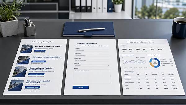
Low conversion rates on multilingual landing pages for PPC advertising: Is the common problem translation or form design?
Before Revising the Copy, First Identify Where the Problem Actually Lies
When creating multilingual landing pages, many teams instinctively suspect inaccurate traffic or blame the translation as soon as the conversion rate of a
For project managers, the order of investigation matters. First determine whether users “don’t understand” or are “unwilling to fill it out,” then decide whether to revise the translation or the form. If the order is wrong, the team will repeatedly rework minor details while the advertising budget continues to be spent and the quality of inquiries fails to improve.
Step One: Check Whether the Ad Copy and Landing Page Use the Same Message
This is the easiest step to overlook. The ad may say “Free Solution Assessment,” while the hero section of the page talks about “premium customized services.” The ad may emphasize “fast delivery,” while the landing page begins with a long introduction to the brand. Users will not patiently fill in the connection between the two themselves; they will simply feel that they clicked the wrong link.
The checking method is straightforward: place the ad headline, description, and button copy alongside the landing page’s hero headline, subheadline, and first button for comparison. If any of the core promise, target audience, or next action does not match, conversion will suffer. This is especially common with multilingual pages. Chinese teams often write the logic in Chinese first and then translate it page by page, resulting in differences in the key promises across language versions.
- If the ad talks about pricing, do not make users read the company history first on the page.
- If the ad talks about samples, delivery time, MOQ, or customization capabilities, the hero section should address these points directly.
- Keep button actions consistent. Do not alternate among “Get a Quote,” “Contact Us,” and “Submit Your Request.”
If this alignment is missing, even the most natural translation cannot fix the problem.
Translation Problems Are Not Just About Whether There Are Grammar Errors
Many pages appear error-free on the surface: the sentences are fluent and the terminology seems appropriate, yet conversion remains low. The reason is often that the translation is “correct” but does not sound like wording that local buyers would encounter in a procurement context. Project owners should focus not only on literal accuracy, but also on whether the business message is natural, direct, and capable of helping users make a quick decision.
Pay particular attention to the following issues:
- Translating Chinese sales language mechanically. For example, overemphasizing “strong capabilities” and “quality assurance” without addressing buyers’ concerns about delivery, specifications, certification support, and after-sales response.
- Overly obvious machine-translation style. Every word may seem recognizable, but the overall wording feels awkward, which can make users instinctively perceive the page as unprofessional.
- Inconsistent terminology. Using different product names, industry terms, or units of measurement on the same page can make users question your supply capabilities and attention to detail.
- Omitting conditions and limitations. For example, saying that customization is available without explaining whether it is based on drawings, samples, or specifications; or saying that quotations are available without stating what basic information is required.
If you are responsible for multiple markets, do not assume that one English version can cover every region. Buyers in North America, Europe, and Southeast Asia differ in their communication preferences, trust factors, and willingness to complete forms. Even if you do not create fully separate websites, you should at least localize the headlines, proof points, and form prompts by region.
Check Whether the Hero Section Answers Three Questions Within Seconds
After entering a landing page, users usually scan it briefly rather than read every paragraph. If the hero section cannot quickly answer the following three questions, conversion will drop significantly:
- What exactly is the service or product you provide?
- Is it suitable for my current procurement or project needs?
- What will I receive after submitting the form now?
The common problem is not insufficient content, but the wrong content order. Teams like to place the company introduction, global presence, and technology platform first, while project-oriented users care more about “whether you can solve my current delivery problem.” If the focus of the hero section is misplaced, making the form more prominent may still not persuade anyone to complete it.
A Form with Many Fields Is Not Necessarily Collecting Information More Completely
The form is often what truly stops users at the door. This is especially true on multilingual landing pages, where forms are frequently copied directly from the Chinese version without revising the field logic, making them highly inconvenient for overseas users.
Project managers can begin with a practical standard: collect only the information essential for making an initial sales assessment. If sales cannot contact the user or make a preliminary assessment without certain fields, keep them. If the fields are included merely because the internal team wants to collect a little more information, consider moving them to a later stage.
A common misconception is that teams add too many qualification questions to the initial form in order to “screen for high-quality customers.” Although this does filter out some invalid traffic, it often filters out genuine customers as well. A more reliable approach is to first let users submit low-barrier information, then screen them through automated replies, follow-up communication, or sales segmentation.
A Form Is Not Finished Once It Has Been Translated; Field Order Also Affects Submission Rates
A common detail on multilingual forms is that the fields themselves are translated correctly, but their order is copied from Chinese conventions. This makes the filling experience awkward for users. In particular, information such as country, region, telephone country code, and company type should be organized according to the usual input patterns of the target market. Otherwise, users may hesitate or leave the page altogether.
You can check the following points:
- Are the required fields genuinely necessary, or were they simply set as required by default in the system?
- Does the error message appear next to the field instead of showing a collective error only after submission?
- Do the placeholder prompts tell users what format to enter?
- Does the mobile keyboard type match the field—for example, does an email field open an email keyboard and a phone field open a numeric keyboard?
These may seem like minor issues, but they have a significant impact on advertising traffic because users brought in through paid clicks are already less patient.
Do Not Leave All Trust-Building to the Bottom of the Page
Some teams place qualifications, delivery processes, service scope, and common cooperation methods in the second half of the page, expecting users to read through them. In reality, many users will only browse the hero section and a small portion of the middle section before deciding whether to complete the form.
If your business has a high decision threshold, such as customization, bulk procurement, cross-border delivery, or multi-country marketing, trust-related information should be presented earlier—but not as a lengthy introduction. A more effective approach is to move the information users care about most to the front:
- Which markets or languages does the service cover?
- How will you respond after receiving an inquiry?
- What type of feedback will users receive after submitting, such as a solution, a pricing range, or a needs assessment?
For teams providing integrated services such as website development, advertising, SEO, and social media, this step is particularly important. Users are not only concerned with whether you can perform the work, but also whether you can make the language, page, and channels work together in their target market.
When Reviewing Data, Do Not Focus Only on the Submission Rate—Separate “Did Not Understand” from “Could Not Be Bothered to Fill It Out”
If you look only at the final number of conversions, it is easy to reach the wrong conclusion. A more useful approach is to break page performance down into several action points: page entry, time spent, scrolling, button clicks, form starts, and successful submissions. This allows you to identify whether the problem occurs during the reading stage or the form-filling stage.
In practice, you can broadly categorize the situations as follows:
- If users leave soon after entering, first check the match between the ad and the hero section, the headline wording, and the loading speed.
- If users stay for a reasonable amount of time but few click the form, prioritize checking the value proposition in the hero section and the button copy.
- If users start filling out the form but few submit it, focus on the number of fields, required-field logic, error messages, and the mobile experience.
This step is especially valuable for project owners because it helps assign responsibility to the right people. It becomes much clearer what should be changed by the advertising, content, localization, front-end, and sales follow-up teams.
When Revising the Page, Do Not Change Too Much at Once; Start with the Parts Most Likely to Affect Conversions
The biggest risk when a landing page has a low conversion rate is a “major overhaul.” If you change the headline, layout, form, case studies, and buttons all at once, you will not know which change produced the improvement if the data gets better; if performance declines, it will be even harder to review what happened.
A more practical sequence is usually as follows:
- First align the advertising promise with the hero-section messaging.
- Then optimize the form fields, required fields, and button actions.
- Finally, add trust-building content in the middle section and refine the localization further.
If you can prioritize only one task, check the form first in most cases. Translation problems affect whether users are “willing to continue reading,” while form problems directly affect whether they “can successfully submit.” In many multilingual advertising projects, what truly lowers conversion is not that the page is insufficiently attractive, but that users who are willing to leave their information are blocked by a complicated form.
Therefore, when the conversion rate of a PPC advertising multilingual landing page is low, do not rush to argue whether the problem lies in translation or form design. A more effective approach is to investigate along the user journey: Has the advertising promise been carried through? Does the hero section communicate clearly? Is the form blocking users? Clarify these three points first in the project, and subsequent optimization will not keep going in circles at the surface level.
Related Articles

Related Products
 Yiyingbao SaaS Intelligent Website Building and Marketing SystemYiyingbao SaaS Intelligent Website Building and Marketing System, AI-powered no-code website building, rapid creation of multilingual B2B international websites in 10 minutes, global server acceleration, AI-powered SEO optimization, helping businesses connect efficiently with global markets. The perfect integration of technology and operation makes building an international trade website remarkably simple
 AI+SEM Intelligent Advertising Marketing SystemAI+SEM drives intelligent ad creation, empowering full-funnel precision advertising marketing. The system automatically generates weekly/monthly reports, AI recommends keywords and target countries, monitors core metrics in real-time with intelligent alerts, and enables one-click high-conversion ad solutions to help quickly acquire customers and improve ROI.
 AI+SEO Dual-Engine System Optimization ServicesYiyingbao’s AI+SEO dual-engine optimization system helps foreign trade enterprises acquire high-quality organic traffic through AI-powered keyword research, content generation, and comprehensive technical optimization, significantly improving search rankings and conversion rates.
 AI+SNS Social Media Marketing SystemYingbao AI+SNS Social Media Marketing System - Precision social capture for the social media era. Supports one-click content synchronization across major platforms like Facebook and LinkedIn. AI intelligently rewrites posts for enhanced relevance. 24/7 AI customer service and user profiling analysis empower businesses to efficiently expand into global markets.
 AI+SEO营销解决方案易营宝AI+SEO营销解决方案,通过AI批量写作、智能生成TDK、精准关键词扩词等功能,全面优化网站SEO效果,提升流量与转化率。助力企业构建高效智能网站新生态。
 AI+SEM Advertising Marketing SolutionsAI+SEM Advertising Marketing Solution leverages AI technology to deeply empower SEM ad campaigns. It automatically generates weekly/monthly reports using AI, presenting account data across multiple dimensions for comprehensive insights into campaign performance and trends. The system precisely recommends keywords and target countries, intelligently generates high-conversion ad copy, and enables one-click activation of efficient campaign plans to help businesses rapidly acquire customers. Simultaneously, it monitors core metrics in real time, intelligently identifies abnormal fluctuations, and issues timely alerts to ensure stable, high-return advertising results.
 Domain Name ServicesEasyWin provides professional domain name services, including intelligent queries, one-stop registration, brand protection, and full lifecycle management, helping businesses build a digital brand image.
 EasyOperate B2C Cross-Border E-Commerce Platform & Independent WebsiteEasyStore B2C Cross-border E-commerce Independent Store is an intelligent website building and cross-border e-commerce integrated solution independently developed by EasyStore Information Technology (Beijing) Co., Ltd. The system is specially designed for small and medium-sized as well as large export enterprises, integrating 'website building, operation, marketing, advertising, and conversion' into one, helping enterprises quickly establish cross-border e-commerce independent stores to achieve brand globalization and global sales growth.
The platform supports multiple languages, multiple currencies, and multi-channel marketing, with built-in AI intelligent translation and SEO optimization systems, suitable for mainstream markets such as Southeast Asia, Europe and America, Latin America, and the Middle East, assisting Chinese manufacturing enterprises in efficiently deploying international e-commerce strategies. SSL证书易营宝提供专业SSL安全证书服务,包括单域名和泛域名证书,确保网站数据传输加密、身份验证和完整性保护,助力企业建立安全可信的在线业务环境。









