









- Which customer acquisition channels will be affected by cross-border marketing trends in 2026?Sep 06, 2026View details
- Which homogenization risks should be considered in an analysis of the AI-powered website building industry?Aug 30, 2026View details
- How Will AI Marketing Trends 2026 Change Advertising Budget AllocationAug 28, 2026View details
- Is the EV SSL certificate market shrinking or upgrading? How should companies assess certificate procurement?Aug 11, 2026View details
- Why the old AMP SEO 2020 practices no longer work and what has changed in current optimization prioritiesAug 02, 2026View details
- How to Choose Topics for an Industry News Section to Attract More Organic Search TrafficJul 29, 2026View details
- Digital Marketing Shenzhen Market Insights: Why Are Companies Expanding Overseas Looking for Growth Teams in Shenzhen?Jul 31, 2026View details
- Can Zhejiang foreign trade independent websites still be developed today? Look at changes in traffic and lead generationJul 28, 2026View details
How Does Website Experience Affect Conversion Rates? Start by Checking These 4 Areas
How Does Website Experience Affect Conversion Rates? Start by Checking These 4 Areas
Many companies directly attribute declining inquiries and rising advertising costs to insufficient traffic, and immediately respond by increasing their budgets, expanding keyword packages, and adding target regions. However, anyone who has worked on an international trade website, an independent website, or an advertising landing page knows that what happens after traffic arrives is often more valuable than “how many people came in.” How does website experience affect conversion rates? Start by checking these four areas: loading speed, page structure, mobile adaptation, and the conversion path. These are not merely design details; they are the basic conditions that determine whether visitors are willing to continue reading, can find key information, and are willing to submit a form.
This issue varies significantly across different international expansion scenarios. On a B2B inquiry website, visitors usually repeatedly verify product capabilities, factory qualifications, delivery scope, and contact details. The decision-making cycle is long, so page credibility and information organization are more important than flashy effects. On a B2C cross-border e-commerce store, the pace is faster, and bottlenecks in the checkout process can directly amplify bounce rates. Advertising landing pages are different again: users arrive with a specific question or need. If the first screen does not immediately address that need, even precisely targeted traffic will be consumed by the page itself.
Start with Speed—Not Just “Opening a Little Faster”
Many companies still understand website speed as “it opens without problems on my office computer.” That is not enough. What really affects conversion is how long it takes for the above-the-fold content to appear, how quickly clickable areas become stable, and whether forms and buttons respond without delay when users in target markets access the site through local network conditions, mobile phones, or standard office equipment. Users in North America and Europe generally have low tolerance for slow page responses, while Southeast Asia and some emerging markets often experience network fluctuations. If a page relies on oversized images, automatically playing videos, or uncompressed scripts, traffic costs can be silently lost at the landing-page stage.
This type of problem is particularly common on manufacturing websites. Companies often want to place aerial factory footage, panoramic equipment views, and large product images all over the homepage. As a result, the first screen becomes heavy, and visitors may leave before seeing the core selling points. For international trade websites, the issue is not whether images can be used, but whether display-oriented assets and decision-making assets are distinguished. The former are suitable for compression and placement in secondary positions, while the latter should be featured prominently on the first screen or product pages. Platforms such as 易营宝, which provide both intelligent website development and overseas marketing, emphasize being “promotable, indexable, and conversion-oriented” because they are essentially addressing this conflict: a website must not focus only on presentation, but also support subsequent SEO indexing, advertising landing, and inquiry conversion.
When checking speed, start with three practical points: Is the main image on the first screen too large? Are there too many third-party plugins? Does the multilingual website load resources for all languages at once? Many websites do not have major problems with their technical architecture; instead, their page assets are managed too broadly.
When the Page Structure Is Disorganized, Visitors May Not Lack Demand—They May Simply Not Understand What You Sell
How does website experience affect conversion rates? The second key area to check is page structure, because it is often overlooked yet directly affects inquiry quality. This is especially true for B2B industry websites. Users do not patiently “explore” them as they might social media. Their judgment after entering a page is usually quick: What do you provide? Can you solve my problem? Do you have similar delivery capabilities? How can I contact you next? If any one of these questions is answered ambiguously on the page, users may return to the search results and look at the next provider.
Two common structural misjudgments can be found in actual projects. In one case, a company turns its homepage into a brand brochure. The layout is full, but the core information is scattered, and visitors have to scroll through several screens before they know the main products and target customers. In the other case, there is plenty of content but no hierarchy. Technical specifications, application industries, solutions, and company information are crowded together, creating a heavy reading burden. For overseas visitors, especially buyers or potential partners who are encountering a Chinese supplier for the first time, this confusion directly affects the establishment of trust.
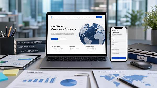
A clear structure does not mean that less content is always better; it means that the information sequence should match the visitor’s decision-making logic. For a B2B international trade marketing website, the first screen should prioritize answering “What do you provide, who is it for, and how can I contact you?” A product detail page should focus more on “specifications, application scope, customization capabilities, and delivery methods.” A solutions page is suitable for addressing industry needs such as factory procurement, engineering support, contract manufacturing, and multilingual market promotion. This logic is even more important for multilingual websites. Users of different languages may have a higher patience cost, and even high-quality translation cannot compensate for reduced information efficiency caused by a disorganized structure.
Mobile Adaptation Is Not Simply About Shrinking the Page
Many companies still assume that “customers will eventually review the materials carefully on a computer,” so they treat mobile adaptation as something to be done casually. This assumption is dangerous today. Whether traffic comes from Google organic search, social media referrals, or advertising clicks, the proportion of first visits taking place on mobile devices is usually significant. Users may first open a page at a trade show, during their commute, or in spare moments at the office to conduct an initial screening. If the mobile page immediately presents crowded text, buttons that are too small, difficult-to-complete forms, or misaligned images, users may not give you a second chance.
Poor mobile experience is most obvious on several types of pages. Advertising landing pages are the first. Such traffic often arrives with a clear action goal, such as downloading a catalog, obtaining a quotation, or submitting an inquiry. If the page still retains the long descriptions, complex navigation, and lengthy forms designed for desktop devices, conversion rates will usually decline. The second type is cross-border e-commerce stores. If product images, prices, variant selection, shipping information, and payment entry points are poorly organized, users will leave before adding items to their carts. The third type is multilingual websites. Some languages require longer text. If sufficient space is not reserved during the design stage, mobile pages can easily develop crowded line breaks, compressed buttons, and key information buried too deeply.
What mobile adaptation truly needs to address is the cost of taking action, not merely whether the page has a “mobile version.” Can visitors complete the main action with one hand? Is the contact button always visible? Are inquiry form fields limited to what is necessary? Are the address, email, WhatsApp, or other communication entry points clear enough? These factors are more important than visually reproducing the desktop version in full.
When the Conversion Path Is Too Long, Traffic Dies in the Final Mile
Some websites are not slow and do not look unattractive, yet they still receive few inquiries. The problem is often in the path design. Visitors have already been persuaded by the content but are blocked before submitting an inquiry. For example, they may be required to register first, complete too many form fields, search through a deeply hidden contact method, find no direct inquiry entry point on the product page, or go through multiple redirects to download materials. For B2B companies, a user’s willingness to make an inquiry is already a strong signal, so too many barriers should not be added.
The most common misjudgment here is “we want to collect a little more customer information.” This motivation is understandable, but if users are asked during their first interaction to provide company size, purchasing cycle, budget range, and detailed address, much of the valuable traffic will give up immediately. A more practical approach is usually to reduce the initial conversion goal: first collect basic contact details and the direction of the user’s needs, then complete the remaining information through follow-up communication. This is especially important for Google advertising landing pages, Facebook advertising pages, and short-video referral pages, because users are still in the rapid evaluation stage and are not prepared to complete a complicated action.
If a company runs SEO, advertising, and social media acquisition at the same time, the consistency between channels must also be considered when designing the conversion path. The advertising copy may emphasize delivery time, while the landing page discusses brand history at length. Social media content may highlight case studies, while visitors cannot find the relevant product page after entering the website. SEO articles may attract problem-oriented traffic, while the page contains only sales-oriented forms. All of these situations create a gap between expectations and reality. The value of an integrated service such as 易营宝, which covers website development, SEO optimization, advertising, and overseas social media operations, lies in viewing front-end customer acquisition and back-end conversion as one connected chain rather than treating the website as an independent display platform.
Which Area to Check First Depends on Your Business Model
These four areas do not need to receive equal attention from every business. For manufacturing factories and international B2B companies, page structure and the conversion path are usually worth prioritizing, because buyers need to quickly assess professionalism and the feasibility of cooperation. For cross-border e-commerce stores, mobile experience and the checkout path are often more sensitive. For websites pursuing long-term growth through Google SEO, speed and information architecture affect both indexing performance and user engagement. For advertising-focused pages, first-screen loading and single-page conversion actions are the factors most likely to be immediately reflected in cost data.
Another condition that is often underestimated is the company’s internal ability to coordinate content. Many websites do not lack optimization ideas; rather, product materials, industry cases, language versions, and customer service responses are scattered across different departments. By the time the page goes live, it can only be “assembled first.” In this situation, a complete redesign may not solve the problem immediately. A more realistic approach is to make targeted adjustments around high-value pages, such as the homepage, core product pages, pages in the languages of key countries, and primary advertising landing pages, so that the entry points most likely to affect conversion are connected first.
So, how does website experience affect conversion rates? The recommended troubleshooting sequence is not merely a technical checklist; it is also a review of the business’s ability to receive and convert visitors. First identify where users come from, then determine where they get stuck after entering the page, and finally assess whether the problem lies in speed, structure, mobile experience, or the conversion path. After clarifying these four areas, deciding whether to further increase the SEO, advertising, or social media budget will generally be more stable and closer to real growth than simply pursuing more traffic first.
Related Articles
Related Products
 Yiyingbao SaaS Intelligent Website Building and Marketing SystemYiyingbao SaaS Intelligent Website Building and Marketing System, AI-powered no-code website building, rapid creation of multilingual B2B international websites in 10 minutes, global server acceleration, AI-powered SEO optimization, helping businesses connect efficiently with global markets. The perfect integration of technology and operation makes building an international trade website remarkably simple
 AI+SEM Intelligent Advertising Marketing SystemAI+SEM drives intelligent ad creation, empowering full-funnel precision advertising marketing. The system automatically generates weekly/monthly reports, AI recommends keywords and target countries, monitors core metrics in real-time with intelligent alerts, and enables one-click high-conversion ad solutions to help quickly acquire customers and improve ROI.
 AI+SEO Dual-Engine System Optimization ServicesYiyingbao’s AI+SEO dual-engine optimization system helps foreign trade enterprises acquire high-quality organic traffic through AI-powered keyword research, content generation, and comprehensive technical optimization, significantly improving search rankings and conversion rates.
 AI+SNS Social Media Marketing SystemYingbao AI+SNS Social Media Marketing System - Precision social capture for the social media era. Supports one-click content synchronization across major platforms like Facebook and LinkedIn. AI intelligently rewrites posts for enhanced relevance. 24/7 AI customer service and user profiling analysis empower businesses to efficiently expand into global markets.
 AI+SEO营销解决方案易营宝AI+SEO营销解决方案,通过AI批量写作、智能生成TDK、精准关键词扩词等功能,全面优化网站SEO效果,提升流量与转化率。助力企业构建高效智能网站新生态。
 AI+SEM Advertising Marketing SolutionsAI+SEM Advertising Marketing Solution leverages AI technology to deeply empower SEM ad campaigns. It automatically generates weekly/monthly reports using AI, presenting account data across multiple dimensions for comprehensive insights into campaign performance and trends. The system precisely recommends keywords and target countries, intelligently generates high-conversion ad copy, and enables one-click activation of efficient campaign plans to help businesses rapidly acquire customers. Simultaneously, it monitors core metrics in real time, intelligently identifies abnormal fluctuations, and issues timely alerts to ensure stable, high-return advertising results.
 Domain Name ServicesEasyWin provides professional domain name services, including intelligent queries, one-stop registration, brand protection, and full lifecycle management, helping businesses build a digital brand image.
 EasyOperate B2C Cross-Border E-Commerce Platform & Independent WebsiteEasyStore B2C Cross-border E-commerce Independent Store is an intelligent website building and cross-border e-commerce integrated solution independently developed by EasyStore Information Technology (Beijing) Co., Ltd. The system is specially designed for small and medium-sized as well as large export enterprises, integrating 'website building, operation, marketing, advertising, and conversion' into one, helping enterprises quickly establish cross-border e-commerce independent stores to achieve brand globalization and global sales growth.
The platform supports multiple languages, multiple currencies, and multi-channel marketing, with built-in AI intelligent translation and SEO optimization systems, suitable for mainstream markets such as Southeast Asia, Europe and America, Latin America, and the Middle East, assisting Chinese manufacturing enterprises in efficiently deploying international e-commerce strategies. SSL证书易营宝提供专业SSL安全证书服务,包括单域名和泛域名证书,确保网站数据传输加密、身份验证和完整性保护,助力企业建立安全可信的在线业务环境。









