









- Which customer acquisition channels will be affected by cross-border marketing trends in 2026?Sep 06, 2026View details
- Which homogenization risks should be considered in an analysis of the AI-powered website building industry?Aug 30, 2026View details
- How Will AI Marketing Trends 2026 Change Advertising Budget AllocationAug 28, 2026View details
- Is the EV SSL certificate market shrinking or upgrading? How should companies assess certificate procurement?Aug 11, 2026View details
- Why the old AMP SEO 2020 practices no longer work and what has changed in current optimization prioritiesAug 02, 2026View details
- How to Choose Topics for an Industry News Section to Attract More Organic Search TrafficJul 29, 2026View details
Does a poor mobile experience on a B2B lead generation website affect conversions?
Overseas buyers often view supplier websites on their phones while commuting, during breaks at trade shows, after being redirected from social media, or when initially screening search results. They may not make a purchasing decision immediately, but within seconds they will decide whether the company is worth contacting further. Does a poor mobile experience on a B2B inquiry website affect conversions? The answer is yes. Slow page loading, difficult-to-read product information, and inquiry forms that cannot be completed smoothly can all cause interested visitors to stop browsing, resulting in lost inquiry opportunities.
Mobile issues are not merely about an “unattractive layout.” For websites designed to generate inquiries, they affect whether visitors can quickly understand products, confirm supply capabilities, find contact information, and submit their requirements. Good desktop performance does not mean the mobile version can also fulfill the task of customer acquisition. In particular, when traffic comes from Google search, ad landing pages, or overseas social media, the proportion of mobile visits is high, and every point of friction on mobile is amplified.
Why Mobile Experience Directly Reduces Inquiries
The B2B purchasing process is usually lengthy, but trust must be established quickly during the first visit. After entering a product page, visitors first look for whether the product is suitable, whether specifications are clear, whether the company is reliable, and how to make contact next. Mobile screens are limited. Once the content hierarchy becomes confusing and users need to repeatedly zoom, scroll horizontally, or return to menus several times, they are likely to give up searching further.
What is more easily overlooked is a broken action path. For example, there may be no clear “Get a Quote” entry at the bottom of the product page, while WhatsApp, email, and forms are scattered across different pages; clicking to inquire may lead to a long form that is not suitable for mobile devices; phone numbers may not be clickable for direct dialing. These issues may not make the website completely unusable, but they can cause visitors with clear needs to postpone contacting the company, and postponement usually means loss.
- Excessive loading time: The first screen takes too long to appear, and visitors leave before seeing the products.
- Key information is compressed: Parameter tables, application descriptions, and certification materials have text that is too small or tables that overflow on mobile devices.
- Navigation is difficult to use: Category levels are too deep, preventing visitors from quickly reaching target products from the homepage.
- Inquiry barriers are too high: Too many fields, difficult-to-use verification codes, and inconspicuous submit buttons all reduce completion rates.
- Trust information is not visible: Content such as factory capabilities, delivery scope, and contact details is buried too deeply to support an initial assessment.
Review Three Pages First to Determine Whether the Issue Is Already Affecting Conversions
There is no need to begin with a comprehensive redesign. You can first use an actual mobile phone to open the homepage, core product page, and inquiry page separately. During testing, do not simply check whether you “know where to find things.” Instead, assume that visitors are encountering the website for the first time and assess whether they can make an information-based judgment and contact the company within a short period of time.
Homepage: Can It Quickly Explain “What You Offer”?
The first screen should prioritize presenting the main products or service focus, rather than using large amounts of space for carousels, animations, or company slogans. After scrolling down, visitors should naturally reach core categories, key applications, or descriptions of advantages. The menu button should be easy to tap with one hand, and the expanded hierarchy should not be too deep. If the homepage contains only visual materials without clear product entry points, mobile traffic will be difficult to direct effectively to the inquiry page.
Product Page: Is the Information Suitable for Mobile Reading?
A common issue with product pages is directly copying desktop layouts: long parameter tables are compressed, images are too large, downloadable materials are placed at the very bottom, and visitors need to scroll for a long time before seeing the inquiry entry. A more reasonable approach is to place model numbers, core parameters, application scenarios, and differentiators near the top. Complex technical parameters can be displayed in groups to avoid horizontal scrolling. Product images only need to support clicking to view details; too many oversized images should be avoided because they slow down the page.
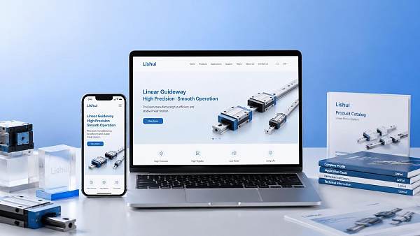
Inquiry Page: Can Visitors Complete Submission Easily?
The purpose of an inquiry form is to obtain valid leads, not to collect all information at once. For an initial submission, it is generally sufficient to retain essential fields such as name, company, email or phone number, and requirements. Information such as product model, purchase quantity, and target market can be optional or collected during subsequent communication. The form button should be clearly visible within the mobile screen, and clear feedback should also be provided after submission to prevent users from repeating actions because they are unsure whether the form was sent successfully.
Investigate Through the Visitor Journey, Rather Than Only Improving Visual Design
Mobile optimization should focus on the journey of “entering—understanding—taking action.” First, confirm where visitors enter from: search results usually need to match the landing page topic; ad traffic requires the first screen to align with the promise of the advertisement; social media visitors rely more on concise product introductions and direct contact details. Different traffic sources require different information to be viewed first, but users should not face a large amount of irrelevant content on the first screen.
Prioritize These High-Friction Issues When Making Changes
Speed should usually come first. Large uncompressed images, autoplay videos, repeatedly loaded scripts, and too many third-party components can all slow page response on mobile networks. During optimization, content that genuinely drives conversions should be retained first, such as product images, key descriptions, and inquiry components. Decorative animations and pop-ups with no practical purpose should be used cautiously.
Next is content prioritization. More information is not always better for B2B websites, especially on mobile. The homepage is responsible for establishing direction, the product page answers questions about suitability, and the inquiry page lowers the barrier to making contact. Qualification documents, complete catalogs, and in-depth technical materials can remain available, but they should not obscure product names, core selling points, and inquiry entry points.
Finally, check consistency across devices. Mobile buttons may appear to exist but can be covered by floating components; dropdown menus that work normally on desktop may fail to expand on touch devices; certain forms may not trigger the keyboard or allow country code selection in specific browsers. Before going live, complete testing for browsing, clicking, filling out forms, and submitting on different screen sizes and commonly used browsers.
Do Not Treat “Responsive Design” as Completed Optimization
Responsive layouts can only ensure that pages generally fit the screen; they do not mean that the mobile conversion experience meets requirements. The truly effective criteria are whether visitors can quickly find target products, understand key information, and complete an inquiry without additional assistance. If a website already has a certain level of traffic but consistently shows short mobile visit durations, high product-page exits, and few inquiry actions, the mobile journey should be checked first rather than simply increasing the traffic budget.
After the mobile experience improves, continue monitoring visit and inquiry performance across different pages. List frequently visited product pages, ad landing pages, and major language versions as priority maintenance targets, and verify them again on a mobile phone after page content updates, image replacements, or form adjustments. For B2B inquiry websites, reducing one mistaken tap, one wait, and one unnecessary form entry may help a previously hesitant visitor send a contact request more smoothly.
Related Articles



Related Products
 Yiyingbao SaaS Intelligent Website Building and Marketing SystemYiyingbao SaaS Intelligent Website Building and Marketing System, AI-powered no-code website building, rapid creation of multilingual B2B international websites in 10 minutes, global server acceleration, AI-powered SEO optimization, helping businesses connect efficiently with global markets. The perfect integration of technology and operation makes building an international trade website remarkably simple
 AI+SEM Intelligent Advertising Marketing SystemAI+SEM drives intelligent ad creation, empowering full-funnel precision advertising marketing. The system automatically generates weekly/monthly reports, AI recommends keywords and target countries, monitors core metrics in real-time with intelligent alerts, and enables one-click high-conversion ad solutions to help quickly acquire customers and improve ROI.
 AI+SEO Dual-Engine System Optimization ServicesYiyingbao’s AI+SEO dual-engine optimization system helps foreign trade enterprises acquire high-quality organic traffic through AI-powered keyword research, content generation, and comprehensive technical optimization, significantly improving search rankings and conversion rates.
 AI+SNS Social Media Marketing SystemYingbao AI+SNS Social Media Marketing System - Precision social capture for the social media era. Supports one-click content synchronization across major platforms like Facebook and LinkedIn. AI intelligently rewrites posts for enhanced relevance. 24/7 AI customer service and user profiling analysis empower businesses to efficiently expand into global markets.
 AI+SEO营销解决方案易营宝AI+SEO营销解决方案,通过AI批量写作、智能生成TDK、精准关键词扩词等功能,全面优化网站SEO效果,提升流量与转化率。助力企业构建高效智能网站新生态。
 AI+SEM Advertising Marketing SolutionsAI+SEM Advertising Marketing Solution leverages AI technology to deeply empower SEM ad campaigns. It automatically generates weekly/monthly reports using AI, presenting account data across multiple dimensions for comprehensive insights into campaign performance and trends. The system precisely recommends keywords and target countries, intelligently generates high-conversion ad copy, and enables one-click activation of efficient campaign plans to help businesses rapidly acquire customers. Simultaneously, it monitors core metrics in real time, intelligently identifies abnormal fluctuations, and issues timely alerts to ensure stable, high-return advertising results.
 Domain Name ServicesEasyWin provides professional domain name services, including intelligent queries, one-stop registration, brand protection, and full lifecycle management, helping businesses build a digital brand image.
 EasyOperate B2C Cross-Border E-Commerce Platform & Independent WebsiteEasyStore B2C Cross-border E-commerce Independent Store is an intelligent website building and cross-border e-commerce integrated solution independently developed by EasyStore Information Technology (Beijing) Co., Ltd. The system is specially designed for small and medium-sized as well as large export enterprises, integrating 'website building, operation, marketing, advertising, and conversion' into one, helping enterprises quickly establish cross-border e-commerce independent stores to achieve brand globalization and global sales growth.
The platform supports multiple languages, multiple currencies, and multi-channel marketing, with built-in AI intelligent translation and SEO optimization systems, suitable for mainstream markets such as Southeast Asia, Europe and America, Latin America, and the Middle East, assisting Chinese manufacturing enterprises in efficiently deploying international e-commerce strategies. SSL证书易营宝提供专业SSL安全证书服务,包括单域名和泛域名证书,确保网站数据传输加密、身份验证和完整性保护,助力企业建立安全可信的在线业务环境。









