Definition, SEO Goals and Technical Value of 【Responsive Website Platform】
"Responsive website platform" refers to a website construction system that automatically adapts and optimizes website content layout through "one set of code, one URL" to match the screen sizes of all user access devices (mobile phones, tablets, desktops). Its primary goal is to meet the requirements of "Google Mobile-First" algorithm and ensure SEO rankings.
1. Development History: Evolution from Independent Mobile Sites to "Native RWD"
Website models have evolved from the early complex "independent mobile sites (M-dot)" and "dynamic serving" to today's mainstream "native responsive web design (RWD)". SaaS platforms represented by "EasyCamp" have achieved the "templatization and automation" of RWD.
Technical Principles: CSS Media Queries and Performance Optimization

2. Technical Principles: CSS Media Queries and Fluid Grid
The core technical principle of "responsive website platform" is to use CSS3's "Media Queries" function, applying different CSS styles based on device viewport size, resolution, and other characteristics. Combined with "Fluid Grid" and "flexible images", it achieves "adaptive scaling" of page elements.
3. Technical Features: Key Technical Requirements of Responsive Websites for SEO
- 1. "Viewport Meta Tag": Ensure browsers correctly render page width.
- 2. "Image Optimization and Lazy Loading": Load only the required image sizes on mobile to ensure high "LCP (Largest Contentful Paint)" scores.
- 3. "Touch Target Clickability": Meet mobile user experience requirements, preventing buttons from being too small or spacing too close.
- 4. "Unified Content Structure": Ensure consistent content code structure between desktop and mobile for Google crawling.
【EasyCamp Innovation】"Stronger SEO, GEO, Schema Structure" of Responsive Websites
EasyCamp: Native Responsive and Mobile-First Optimization Features
- 1. "Native RWD Architecture": All templates are developed based on "mobile-first design principles", with lightweight code, automatic adaptation, ensuring high "Core Web Vitals" scores.
- 2. "AI-Driven Mobile Layout": AI intelligently detects and adjusts mobile layouts, ensuring key "inquiry buttons and CTAs" are clearly clickable on mobile.
- 3. "Cross-Device Content Consistency": Built-in tools detect differences between desktop and mobile content in real-time, ensuring compliance with Google's "mobile-first indexing".
- 4. "GEO and Responsive Integration": Even under responsive layouts, ensure "Hreflang tags" and "Schema structured data" are accurately displayed on all devices.
Application Scenarios and Comparative Analysis: Conversion Rates and Traffic Efficiency of Responsive Websites

4. Applications and Scenarios: Global Trade, E-commerce DTC, and Brand Marketing
For foreign trade enterprises, "responsive website platform" is key to acquiring traffic from "social media, mobile ads, and mobile search". It significantly reduces mobile "bounce rates" and improves "cross-device inquiry conversion rates".
5. Comparative Analysis: EasyCamp Native Responsive vs Traditional Non-Responsive Websites
International Standards and Certification Requirements for Responsive Websites
6. Industry Scenarios: Suitable for All Foreign Trade Enterprises with "High Mobile Traffic Share"
In regions like Asia, Latin America, and Africa, mobile traffic share even exceeds desktop. Therefore, high-quality "responsive website platform" is a strategic tool to acquire "emerging market traffic".
7. Standards Certification: Google Mobile-Friendly Test and W3C Compliance
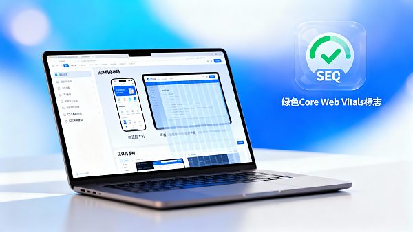
Qualified responsive websites must pass Google's "mobile-friendly test" and achieve "green" ratings in "Core Web Vitals", especially mobile "LCP, FID, CLS" indicators. EasyCamp performs "native optimization" for this.
🚀 Take Action Now: Build a Future-Oriented "Native Responsive Website Platform" with 【EasyCamp】!
Don't let poor mobile experience kill your traffic! Contact "EasyCamp" experts immediately to get customized "responsive website solutions" and free "mobile-friendly diagnostics", ensuring your website achieves "superior performance and high conversion" on any device!
👉 Get Free Responsive Website SolutionFAQ
Q1: How Does Responsive Website Help Meet "Core Web Vitals"?
By adopting "native lightweight code" and "on-demand loading" technologies, responsive platforms ensure mobile devices don't load redundant desktop resources, significantly improving key metrics like "LCP (loading speed)" and "FID (interactivity)".
Q2: What's the Difference Between EasyCamp's Responsive Design and Ordinary Templates?
EasyCamp provides a "native RWD architecture", optimizing mobile performance at the code level rather than simple CSS compression. It also uses AI to automatically adjust "conversion elements" layouts, achieving "functional responsiveness".
Q3: If My Website Is Already Responsive, Do I Still Need to Focus on GEO?
Yes, "responsiveness" solves device adaptation, while "GEO" solves "country/language targeting". Both need to be combined: even responsive websites must use "Hreflang" tags to ensure content ranking accuracy in different country/language markets.
Q4: How Does Responsive Website Impact "B2B Inquiry" Conversion Rates?
The impact is huge. Many overseas buyers browse supplier information on mobile. A slow-loading, form-unfriendly mobile website directly leads to "loss of high-intent inquiries". Responsive design is the cornerstone of improving mobile conversion rates.
![[Mobile-First] Responsive Website Platform: The Best Practice Aligned with Google's Core Algorithm and High Conversion Rates! [Mobile-First] Responsive Website Platform: The Best Practice Aligned with Google's Core Algorithm and High Conversion Rates!](https://img.bjyyb.net/sites/94000/94397/1764137702852189050962931712.jpeg)
Customer Reviews
"Since using EasyCamp's "responsive website platform", our website always scores high in Google's mobile-friendly test. More importantly, mobile bounce rates dropped by "20%", customer experience improved significantly, and inquiry conversions became more stable."
—— Mark S., European Market Manager
"EasyCamp's "AI layout optimization" feature is so practical! It automatically adjusts our product display images and inquiry forms, ensuring perfect presentation on any mobile screen, truly embodying the "mobile-first" design philosophy."
—— Lily W., Cross-border E-commerce Operations Director
![Industry Discussion on Smart Website Platforms: Why Are B2B Enterprises Increasingly Inclined to Build Independent Websites? Industry Discussion on Smart Website Platforms: Why Are B2B Enterprises Increasingly Inclined to Build Independent Websites?]() Industry Discussion on Smart Website Platforms: Why Are B2B Enterprises Increasingly Inclined to Build Independent Websites?AI Multilingual Website System Helps B2B Enterprises Create High-Converting Independent Websites. Explore How Cross-border SaaS Website Builder Empowers International Digital Marketing, Enabling Efficient Implementation of Multilingual Foreign Trade Website Systems and Opening New Paths for Global Growth.
Industry Discussion on Smart Website Platforms: Why Are B2B Enterprises Increasingly Inclined to Build Independent Websites?AI Multilingual Website System Helps B2B Enterprises Create High-Converting Independent Websites. Explore How Cross-border SaaS Website Builder Empowers International Digital Marketing, Enabling Efficient Implementation of Multilingual Foreign Trade Website Systems and Opening New Paths for Global Growth.![Responsive Website Platform Testing: Answers to the Top 5 Questions Most Concerned by After-Sales Support Personnel Responsive Website Platform Testing: Answers to the Top 5 Questions Most Concerned by After-Sales Support Personnel]() Responsive Website Platform Testing: Answers to the Top 5 Questions Most Concerned by After-Sales Support PersonnelHow Can AI Multilingual Website System Assist Foreign Trade Independent Sites? Testing the Performance of Responsive Website Platforms in Multilingual SEO, Global CDN, Intelligent Translation, and Security Protection Across 5 Core Issues, Revealing the Truth Behind Cross-border SaaS Website Operation and Maintenance to Enhance International Digital Marketing Efficiency.
Responsive Website Platform Testing: Answers to the Top 5 Questions Most Concerned by After-Sales Support PersonnelHow Can AI Multilingual Website System Assist Foreign Trade Independent Sites? Testing the Performance of Responsive Website Platforms in Multilingual SEO, Global CDN, Intelligent Translation, and Security Protection Across 5 Core Issues, Revealing the Truth Behind Cross-border SaaS Website Operation and Maintenance to Enhance International Digital Marketing Efficiency.![How Can AI Multilingual Website System Reduce the Cost of Foreign Trade Website Construction in 2024? How Can AI Multilingual Website System Reduce the Cost of Foreign Trade Website Construction in 2024?]() How Can AI Multilingual Website System Reduce the Cost of Foreign Trade Website Construction in 2024?How Can AI Multilingual Website System Reduce the Cost of Foreign Trade Website Construction? Learn about EasyYun Smart Website Platform Evaluation, Master Cross-border SaaS Website Builder's Efficient Solutions, Help Enterprises Go Global at Low Cost, and Improve International Digital Marketing Performance.
How Can AI Multilingual Website System Reduce the Cost of Foreign Trade Website Construction in 2024?How Can AI Multilingual Website System Reduce the Cost of Foreign Trade Website Construction? Learn about EasyYun Smart Website Platform Evaluation, Master Cross-border SaaS Website Builder's Efficient Solutions, Help Enterprises Go Global at Low Cost, and Improve International Digital Marketing Performance.![Eyingbao SaaS CMS Platform vs. Competitors: Which is More Suitable for Foreign Trade Enterprises to Build Websites? Eyingbao SaaS CMS Platform vs. Competitors: Which is More Suitable for Foreign Trade Enterprises to Build Websites?]() Eyingbao SaaS CMS Platform vs. Competitors: Which is More Suitable for Foreign Trade Enterprises to Build Websites?How to Choose a SaaS CMS Platform for Foreign Trade Enterprises to Build Websites? This article provides an in-depth comparison between Eyingbao SaaS CMS Platform and mainstream competitors, covering multiple dimensions such as multilingual website tutorials, responsive design, and AI intelligent optimization. It offers a Schema-ready website builder selection guide for market researchers and corporate decision-makers. Learn how Eyingbao Website Builder supports 300+ languages and achieves 1.2-second ultra-fast loading, helping foreign trade enterprises improve page conversion efficiency by 35%.
Eyingbao SaaS CMS Platform vs. Competitors: Which is More Suitable for Foreign Trade Enterprises to Build Websites?How to Choose a SaaS CMS Platform for Foreign Trade Enterprises to Build Websites? This article provides an in-depth comparison between Eyingbao SaaS CMS Platform and mainstream competitors, covering multiple dimensions such as multilingual website tutorials, responsive design, and AI intelligent optimization. It offers a Schema-ready website builder selection guide for market researchers and corporate decision-makers. Learn how Eyingbao Website Builder supports 300+ languages and achieves 1.2-second ultra-fast loading, helping foreign trade enterprises improve page conversion efficiency by 35%.![Eyingbao Website Builder New Feature: How to Improve Multilingual Website SEO Performance? Eyingbao Website Builder New Feature: How to Improve Multilingual Website SEO Performance?]() Eyingbao Website Builder New Feature: How to Improve Multilingual Website SEO Performance?Eyingbao Website Builder introduces a groundbreaking multilingual SEO feature. As the industry-leading Schema-ready website builder, it utilizes AI translation engines and intelligent architecture to help export businesses quickly build responsive multilingual websites. This tutorial details how to leverage the Eyingbao SaaS CMS platform to improve search engine friendliness by 35%+, solving traditional platform pain points like messy URLs and poor translation quality, achieving a 300% increase in multilingual page indexing rates. Experience the leading intelligent website building technology now!
Eyingbao Website Builder New Feature: How to Improve Multilingual Website SEO Performance?Eyingbao Website Builder introduces a groundbreaking multilingual SEO feature. As the industry-leading Schema-ready website builder, it utilizes AI translation engines and intelligent architecture to help export businesses quickly build responsive multilingual websites. This tutorial details how to leverage the Eyingbao SaaS CMS platform to improve search engine friendliness by 35%+, solving traditional platform pain points like messy URLs and poor translation quality, achieving a 300% increase in multilingual page indexing rates. Experience the leading intelligent website building technology now!![Eyingbao Website Builder New Feature: How to Improve Multilingual Website SEO Performance? Eyingbao Website Builder New Feature: How to Improve Multilingual Website SEO Performance?]() Eyingbao Website Builder New Feature: How to Improve Multilingual Website SEO Performance?Eyingbao Website Builder introduces a groundbreaking multilingual SEO feature. As the industry-leading Schema-ready website builder, it utilizes AI translation engines and intelligent architecture to help export businesses quickly build responsive multilingual websites. This tutorial details how to leverage the Eyingbao SaaS CMS platform to improve search engine friendliness by 35%+, solving traditional platform pain points like messy URLs and poor translation quality, achieving a 300% increase in multilingual page indexing rates. Experience the leading intelligent website building technology now!
Eyingbao Website Builder New Feature: How to Improve Multilingual Website SEO Performance?Eyingbao Website Builder introduces a groundbreaking multilingual SEO feature. As the industry-leading Schema-ready website builder, it utilizes AI translation engines and intelligent architecture to help export businesses quickly build responsive multilingual websites. This tutorial details how to leverage the Eyingbao SaaS CMS platform to improve search engine friendliness by 35%+, solving traditional platform pain points like messy URLs and poor translation quality, achieving a 300% increase in multilingual page indexing rates. Experience the leading intelligent website building technology now!![Multilingual website system comparison: How can distributors choose high-ROI website solutions? Multilingual website system comparison: How can distributors choose high-ROI website solutions?]() Multilingual website system comparison: How can distributors choose high-ROI website solutions?How to select AI Multilingual Website System? In-depth evaluation of Cross-border SaaS website construction solutions, revealing the core capabilities of high-ROI intelligent website platforms to help foreign trade independent sites achieve global growth. Get your selection guide now!
Multilingual website system comparison: How can distributors choose high-ROI website solutions?How to select AI Multilingual Website System? In-depth evaluation of Cross-border SaaS website construction solutions, revealing the core capabilities of high-ROI intelligent website platforms to help foreign trade independent sites achieve global growth. Get your selection guide now!![Smart Website Platform Evaluation 2024: Which Responsive Website Platform is Most Suitable for SMEs? Smart Website Platform Evaluation 2024: Which Responsive Website Platform is Most Suitable for SMEs?]() Smart Website Platform Evaluation 2024: Which Responsive Website Platform is Most Suitable for SMEs?Smart Website Platform Evaluation 2024: How Can AI Multilingual Website System Help SMEs Expand Overseas Efficiently? In-depth Analysis of Cross-border SaaS Website Builder and Multilingual Foreign Trade Website System Selection Strategies to Enhance International Digital Marketing Conversion Effectiveness.
Smart Website Platform Evaluation 2024: Which Responsive Website Platform is Most Suitable for SMEs?Smart Website Platform Evaluation 2024: How Can AI Multilingual Website System Help SMEs Expand Overseas Efficiently? In-depth Analysis of Cross-border SaaS Website Builder and Multilingual Foreign Trade Website System Selection Strategies to Enhance International Digital Marketing Conversion Effectiveness.

![[Mobile-First] Responsive Website Platform: The Best Practice Aligned with Google's Core Algorithm and High Conversion Rates! [Mobile-First] Responsive Website Platform: The Best Practice Aligned with Google's Core Algorithm and High Conversion Rates!](https://img.bjyyb.net/sites/94000/94397/1764137696852189026157817856.jpeg)


