









- Which customer acquisition channels will be affected by cross-border marketing trends in 2026?Sep 06, 2026View details
- Which homogenization risks should be considered in an analysis of the AI-powered website building industry?Aug 30, 2026View details
- How Will AI Marketing Trends 2026 Change Advertising Budget AllocationAug 28, 2026View details
- Is the EV SSL certificate market shrinking or upgrading? How should companies assess certificate procurement?Aug 11, 2026View details
- Why the old AMP SEO 2020 practices no longer work and what has changed in current optimization prioritiesAug 02, 2026View details
- How to Choose Topics for an Industry News Section to Attract More Organic Search TrafficJul 29, 2026View details
Should Japanese Website Development Include Separate Mobile Adaptation
“Whether a Japanese-language website needs separate mobile adaptation” is not a simple development approach decision. For technical evaluators, the real questions are whether mobile access scenarios in the Japanese market have already made the existing desktop site's information architecture, interaction methods, and performance uncompetitive, and whether maintaining a separate mobile site can generate benefits sufficient to cover the subsequent costs.
Most corporate websites, B2B lead generation sites, and cross-border online stores targeting the Japanese market are better suited to a mobile adaptation solution with the same content, the same URLs, and a responsive frontend, rather than building a separate “mobile website.” However, “responsive” does not mean proportionally shrinking desktop pages. Japanese typography, form preferences, mobile network conditions, and search engine indexing logic all determine whether the mobile experience is truly usable.
Conclusion first: choose responsive design by default; only a few scenarios require a separate mobile site
If a Japanese-language website primarily focuses on brand presentation, product catalogs, technical documentation, inquiry conversion, or content-based customer acquisition, responsive design is usually the lower-risk approach. It allows desktop and mobile versions to share page URLs and primary content, consolidates SEO authority, and eliminates the need to repeatedly synchronize Japanese content between two systems.
A separate mobile site, such as the traditional m.example.com, or dynamic serving that returns different HTML based on the device, is not unusable. It is simply more suitable where there are clear business differences: the mobile version handles high-frequency actions such as store navigation, appointments, instant consultations, and member ordering, while the desktop version supports in-depth tasks such as complex configuration, bulk purchasing, and downloading technical documents. Even in such cases, first assess whether component restructuring within a responsive architecture can solve the issue, rather than splitting it into two sites from the outset.
Based on Google's mobile-first indexing logic, search engines primarily interpret the content of mobile page versions. If a separate mobile site has missing content, inconsistent structured data, unsynchronized internal links, or redirect errors, the indexing and rankings of Japanese keywords will be affected. For businesses expanding overseas that want to pursue Google SEO over the long term, maintaining two sets of pages often means twice the governance work, not merely twice the frontend workload.
Japanese mobile user experience: the challenge is more than screen size
Japanese pages generally have a higher visual density than English pages. They combine kanji, hiragana, and katakana, and often include numerous product models, specification parameters, and notes. Multi-column information sections, floating parameter tables, and horizontal navigation commonly found on desktop sites can easily become pages requiring frequent zooming and horizontal scrolling when directly compressed for mobile. Users may not complain when they cannot read clearly, but they may leave within seconds.
During technical evaluation, the following details should be checked carefully:
- Fonts and line breaks: Overly heavy Japanese font loading can slow down the first screen; font sizes that are too small or line spacing that is too tight make long paragraphs and product descriptions difficult to read. A reliable Japanese font fallback strategy should be configured to prevent layout shifts caused by font resource failures.
- Navigation hierarchy: Japanese B2B websites often have multiple levels of sections for products, applications, industries, support, document downloads, and more. The desktop drop-down menu should not simply be copied to mobile. Primary entry points should be clear, and breadcrumbs and return paths should remain understandable.
- Form input: Fields such as name, company name, postal code, prefecture, and telephone number should align with Japanese user habits. Overly rigid full-width/half-width character validation can frustrate users before submission.
- Tap targets: Inquiry buttons, call buttons, document downloads, and product filters should not be crowded together. Especially at the top of the page, users need to quickly understand what they can do next.
- Content expansion: Specifications, FAQs, and technical descriptions are suitable for expandable modules; however, core selling points, pricing terms, or important delivery schedule information should not be hidden by default, so that both search engines and users can quickly obtain the key information.
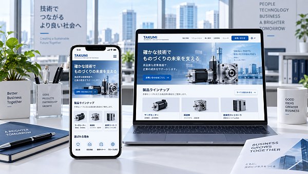
Where the technical cost differs between responsive websites and separate mobile sites
One common misconception must be avoided: assuming that a separate mobile version is inherently faster. Page speed depends on image strategy, script size, third-party tracking code, server response, caching, and resource loading order, not on whether the domain begins with “m.” A mobile site packed with high-definition carousel images, map plugins, and multiple advertising pixels will still make Japanese users wait when commuting or using weak network connections.
The SEO baseline for mobile adaptation of Japanese-language websites
Regardless of the architecture used, the core Japanese content on mobile and desktop should remain consistent, including titles, body text, product parameters, internal links, image alt text, and structured data. Do not remove key category terms, technical specifications, or inquiry entry points simply to make the “mobile page cleaner”; this would make the mobile version an information-incomplete version.
A responsive solution should ensure that the page has the correct viewport settings and avoid fixed-width containers, horizontal scrolling, and obscured buttons. Images should ideally deliver suitable resources based on device dimensions, with above-the-fold visual assets prioritized for compression and below-the-fold content loaded lazily. However, core text and primary product images should not be delayed until users scroll down.
If a separate mobile site must be retained for historical reasons, desktop and mobile pages should have clear associations: use canonical tags, alternate annotations, and reliable device redirects. Do not indiscriminately direct all mobile visitors to the homepage, and do not redirect Japanese users to English pages due to language detection errors. Multilingual projects also need hreflang to point to page versions in the corresponding language that are accessible on the corresponding device.
Use business processes to determine the “depth of adaptation,” rather than looking only at design mockups
Technical teams can conduct acceptance testing based on real tasks. For example, can procurement personnel find a model and download a PDF on their phones? Can prospective customers find a Japanese inquiry form in two or three steps? Can cross-border retail users smoothly complete specification selection, review delivery information, and confirm before payment? These tasks are more indicative of mobile quality than whether “the page scales properly.”
For manufacturing and foreign trade companies, mobile sites do not need to replicate the aggressive promotional style of B2C stores. When Japanese customers browse corporate information on mobile devices, they are often more concerned with qualifications, product application scope, delivery capabilities, after-sales service methods, and contact details. Placing this trust-building information in clear, scannable locations is more meaningful than adding excessive animations.
A decision-making path for implementation
First, review the mobile traffic, exit pages, form completion rates, and primary device dimensions of existing Japanese pages; then select key templates such as the homepage, product detail page, case study page, and contact page for testing on actual devices. If the main issues are crowded layouts, slow loading, and difficult form completion, responsive redesign can solve them. Consider a separate mobile product only when mobile and desktop users have completely different visit purposes, functional permissions, and transaction processes.
In multilingual website development and overseas marketing projects, Yiyingbao is more inclined to evaluate mobile adaptation together with website development, SEO, and the conversion journey: how the same Japanese content is crawled by search engines, how pages are presented quickly on mobile devices, and how inquiry leads enter subsequent marketing processes. The focus is not on “creating one more version,” but on ensuring that every version serves the goals of indexability, accessibility, and conversion.
Therefore, regarding whether Japanese-language website development requires separate mobile adaptation, the usual answer is: mobile adaptation must be done well, but a separate mobile site may not be necessary. Building on a responsive architecture and then refining the design for Japanese content, forms, performance, and key conversion paths usually better meets the practical needs of long-term maintenance and overseas growth.
Related Articles

Related Products
 Yiyingbao SaaS Intelligent Website Building and Marketing SystemYiyingbao SaaS Intelligent Website Building and Marketing System, AI-powered no-code website building, rapid creation of multilingual B2B international websites in 10 minutes, global server acceleration, AI-powered SEO optimization, helping businesses connect efficiently with global markets. The perfect integration of technology and operation makes building an international trade website remarkably simple
 AI+SEM Intelligent Advertising Marketing SystemAI+SEM drives intelligent ad creation, empowering full-funnel precision advertising marketing. The system automatically generates weekly/monthly reports, AI recommends keywords and target countries, monitors core metrics in real-time with intelligent alerts, and enables one-click high-conversion ad solutions to help quickly acquire customers and improve ROI.
 AI+SEO Dual-Engine System Optimization ServicesYiyingbao’s AI+SEO dual-engine optimization system helps foreign trade enterprises acquire high-quality organic traffic through AI-powered keyword research, content generation, and comprehensive technical optimization, significantly improving search rankings and conversion rates.
 AI+SNS Social Media Marketing SystemYingbao AI+SNS Social Media Marketing System - Precision social capture for the social media era. Supports one-click content synchronization across major platforms like Facebook and LinkedIn. AI intelligently rewrites posts for enhanced relevance. 24/7 AI customer service and user profiling analysis empower businesses to efficiently expand into global markets.
 AI+SEO营销解决方案易营宝AI+SEO营销解决方案,通过AI批量写作、智能生成TDK、精准关键词扩词等功能,全面优化网站SEO效果,提升流量与转化率。助力企业构建高效智能网站新生态。
 AI+SEM Advertising Marketing SolutionsAI+SEM Advertising Marketing Solution leverages AI technology to deeply empower SEM ad campaigns. It automatically generates weekly/monthly reports using AI, presenting account data across multiple dimensions for comprehensive insights into campaign performance and trends. The system precisely recommends keywords and target countries, intelligently generates high-conversion ad copy, and enables one-click activation of efficient campaign plans to help businesses rapidly acquire customers. Simultaneously, it monitors core metrics in real time, intelligently identifies abnormal fluctuations, and issues timely alerts to ensure stable, high-return advertising results.
 Domain Name ServicesEasyWin provides professional domain name services, including intelligent queries, one-stop registration, brand protection, and full lifecycle management, helping businesses build a digital brand image.
 EasyOperate B2C Cross-Border E-Commerce Platform & Independent WebsiteEasyStore B2C Cross-border E-commerce Independent Store is an intelligent website building and cross-border e-commerce integrated solution independently developed by EasyStore Information Technology (Beijing) Co., Ltd. The system is specially designed for small and medium-sized as well as large export enterprises, integrating 'website building, operation, marketing, advertising, and conversion' into one, helping enterprises quickly establish cross-border e-commerce independent stores to achieve brand globalization and global sales growth.
The platform supports multiple languages, multiple currencies, and multi-channel marketing, with built-in AI intelligent translation and SEO optimization systems, suitable for mainstream markets such as Southeast Asia, Europe and America, Latin America, and the Middle East, assisting Chinese manufacturing enterprises in efficiently deploying international e-commerce strategies. SSL证书易营宝提供专业SSL安全证书服务,包括单域名和泛域名证书,确保网站数据传输加密、身份验证和完整性保护,助力企业建立安全可信的在线业务环境。









