









- Can the average annual growth rate reflect real opportunities in overseas markets?Oct 07, 2026View details
- Which customer acquisition channels will be affected by cross-border marketing trends in 2026?Sep 06, 2026View details
- Which homogenization risks should be considered in an analysis of the AI-powered website building industry?Aug 30, 2026View details
- How Will AI Marketing Trends 2026 Change Advertising Budget AllocationAug 28, 2026View details
- Is the EV SSL certificate market shrinking or upgrading? How should companies assess certificate procurement?Aug 11, 2026View details
- Why the old AMP SEO 2020 practices no longer work and what has changed in current optimization prioritiesAug 02, 2026View details
What Should Be Optimized First for Landing Page Compliance and Conversion Before Running Ads in the U.S. Market
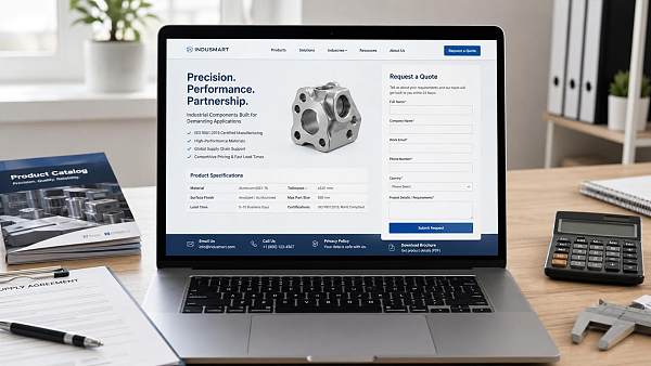
Address compliance first, then optimize for conversions. When running advertising campaigns in the U.S. market, if a landing page has obvious issues with privacy disclosures, information collection, claims, or page ownership, traffic may be blocked during review before it even enters the effective evaluation stage, or visitors may leave quickly after arriving. A low conversion rate is sometimes not caused by button colors, form length, or above-the-fold layout, but by visitors being unable to tell at a glance whose website it is, what information is collected, or what will happen after submission.
In practice, compliance does not mean turning a page into a stack of legal text. It is more like resolving several high-risk points first: Is the page owner clearly identified? Are the contact details genuine and visible? Can the privacy policy be accessed? Does the form explain how the information will be used? Do the materials and copy avoid absolute statements that could easily cause misunderstandings? For inquiry pages, appointment pages, sample request pages, and quotation pages targeting the U.S. market, a common mistake is to interpret “conversion rate optimization” as reducing text and explanations as much as possible, thereby deleting required disclosures as well. The page may look lighter, but its foundation of trust disappears at the same time.
First, identify the areas most likely to hinder ad delivery
Many page problems are not technical but related to communication. For example, a homepage or landing page may display only the product name without clearly explaining the supply scope, service regions, shipping methods, delivery terms, or after-sales boundaries. For industrial products, building materials, equipment components, and custom-processed parts, visitors usually first assess whether the offering suits their application scenario. If the page only emphasizes selling points without providing information about materials, specifications, compatible models, dimensional tolerances, surface treatment, packaging methods, minimum order quantities, or delivery time ranges, users will find it difficult to proceed with an inquiry. This may appear to be a lack of complete content, but fundamentally it also means that the trust required before conversion has not been established.
Another frequent issue is collecting too much information through the form. If a landing page for the U.S. market immediately requires the company’s full name, phone number, email address, purchase quantity, budget, project stage, shipping address, or even uploaded drawings, while failing to explain the purpose of collection, storage method, or whether a salesperson will make contact, users will naturally hesitate. In B2B customization businesses in particular, drawings, material codes, and structural parameters may involve sensitive information. The more prominently a page emphasizes “Submit Now,” the more important it is to provide an explanation at the same time.
Compliance comes first—not because it is conservative, but because it directly affects conversion
Many pages continue to convert poorly even after passing ad review, often because “passing the review” is mistakenly treated as “users already feel confident.” These are not the same thing. Reviews focus more on obvious violations, while real visitors continue to ask whether the page is trustworthy, whether the information is complete, and whether the claims are reliable.
If a page has any of the following issues, they should generally be corrected before discussing detailed optimization:
- There is no clear information about the business entity at the bottom of the page, so visitors cannot determine whether they are dealing with a manufacturer, trading company, or intermediary, and it is unclear to whom the form is being submitted.
- The privacy policy link exists but cannot be opened, or the text is too general and does not explain which fields are collected or whether they are used to respond to inquiries or for subsequent marketing communications.
- Terms such as “free,” “fastest,” “guaranteed,” “official,” and “lowest price” are used too absolutely without explaining the applicable conditions, creating potential issues in both review and user trust.
- Before-and-after comparisons, performance claims, or conclusions about product capabilities are presented without defining the applicable conditions. For example, claims about material temperature resistance, equipment capacity, structural service life, or energy savings may appear exaggerated if the testing scenario or conditions of use are not provided.
Only after this layer has been addressed does conversion optimization become meaningful. Otherwise, even if the button is made more prominent or two fields are removed from the form, the improvement will be limited because the obstacle is not interaction friction but a lack of trust.
The quality of inquiries is often determined by the granularity of the content
When advertising in the U.S. market, many page problems are not caused by inaccurate traffic but by landing pages that fail to answer practical purchasing questions. This is particularly evident for industrial parts, packaging materials, home furnishings and building materials, mechanical accessories, and electronic components. After entering the page, visitors generally confirm several basic points first: What is the material? Is customization supported? Are the units imperial or metric? Is delivery calculated by piece, carton, or pallet? Is the product compatible with existing equipment? How will it be protected from moisture, shock, and scratches during transportation? Does installation require special tools? How frequently is maintenance required?
When this key information is removed in the name of “simple design,” the page may look cleaner, but the quality of conversions usually does not improve. Before leaving their information, users are already conducting an initial screening. For example, for custom sheet metal parts, the page should at least make clear the available sheet materials, thickness range, punching or bending capabilities, surface treatment methods, and drawing format requirements. For international shipments, it should also explain common packaging methods and whether wooden crates, cartons with corner protection, vacuum bags, or pallet securing are supported. The content does not need to be exhaustive, but the page should provide a basis for “continuing the conversation.”
How the form should be adjusted depends on product complexity
Many people habitually begin by discussing the idea that “shorter forms are better,” but this applies only to standardized products with low explanation costs. For projects that are parameter-sensitive, highly customized, or expensive to communicate about later, an overly short form may instead generate large numbers of low-quality leads, requiring repeated confirmation by email and extending the conversion cycle.
A more reliable approach is to collect information in layers according to business complexity. For standard or in-stock products, it may be sufficient to retain the name, email address, and required quantity. For molds, machined parts, structural components, and complete equipment, an “application scenario” or “drawing/specification details” field can be added, but these fields should be optional and their purpose should be clearly stated beside them. Users are willing to provide more information only after the page has first demonstrated that the company understands the product, delivery requirements, and boundaries of communication.
Field formats also require attention. When targeting the U.S. market, if the phone field is forced into a particular local format, overseas visitors may abandon the form immediately. If dimensions, weight, capacity, and other parameters support only millimeters, kilograms, and liters without providing unit guidance on the page, the error rate will increase significantly. The form itself is also part of the content, not merely a data collection tool.
Where should conversion optimization begin?
Once the compliance foundation is in place, the priority is usually not visual style but the order of information. An effective landing page first answers “What do you provide?” in the first screen, then explains “Under what conditions is it suitable?” and finally shows “How can I take the next step?” If the page opens with a long series of adjectives but provides no models, parameters, application environments, or supply information, visitors can only continue guessing.
Button copy does not need to be excessively promotional. Compared with vague phrases such as “Get Started Now” or “Get It Immediately,” wording that directly corresponds to a business action is usually more effective, such as requesting a quotation, submitting specifications, requesting sample information, or confirming delivery time. This type of wording reduces ambiguity and is particularly suitable for high-value, long-cycle projects involving confirmation by multiple participants.
In addition, a small amount of specific supporting information should ideally appear near the conversion area rather than having all key explanations placed at the bottom of the page. For example:
- Whether samples are charged and whether the fee can be deducted from a subsequent order;
- What information is generally required for customized products, such as dimensional drawings, material numbers, color codes, operating temperatures, or target loads;
- Whether transportation is arranged by express delivery, air freight, or sea freight by default, and whether a specified method is supported;
- Whether installation products include instructions, hole-position drawings, or basic accessories.
These details may not look like conventional “conversion tactics,” but they can significantly reduce users’ questions before submission. The fewer questions they have, the cleaner the leads will be.
Page details that are easily overlooked
A common issue occurs on mobile devices. After clicking an ad, if the first screen is filled with a large image, floating windows, chat entrances, and regional pop-ups, pushing the core information and form entrance below the fold, users may not continue scrolling. Some pages appear complete on desktop but truncate specification tables on mobile, cut off unit abbreviations, or even cause buttons to overlap with disclaimers. These are not aesthetic issues but problems that directly affect advertising efficiency.
Another detail is that the promise made on the page must match the subsequent action. If the button says “Get a Quote,” but the user is redirected to a general subscription page after submitting, or the automatic reply email contains only marketing slogans without confirming which requirements were received, trust will quickly decline. For landing pages targeting the U.S. market, consistency is important: the material, model, use, or scenario visitors see in the advertisement should be continued along the same line on the landing page, rather than leading to a broad company introduction.
If the page involves installation, maintenance, or after-sales support, do not simply write “support available.” Clearer wording is more useful—for example, whether installation drawings or remote instructions are provided, whether replacement-part recommendations are available, and whether the maintenance cycle is affected by frequency of use, humidity, dust, outdoor exposure, or chemical contact. This reduces misunderstandings and also makes inquiries more closely aligned with actual projects.
The order is therefore clear: first make the page a place where visitors can “feel comfortable submitting information,” and then make it a place where they are “willing to continue the conversation.” The former determines whether advertising can run and whether visitors dare to leave their information; the latter determines whether the incoming traffic can become qualified leads. A landing page is not merely a display page. It simultaneously serves as an ad-review entry point, a trust-building mechanism, and a demand-screening tool. If any one of these layers is neglected, the advertising budget may be consumed by the page itself.
Related Articles



Related Products
 Yiyingbao SaaS Intelligent Website Building and Marketing SystemYiyingbao SaaS Intelligent Website Building and Marketing System, AI-powered no-code website building, rapid creation of multilingual B2B international websites in 10 minutes, global server acceleration, AI-powered SEO optimization, helping businesses connect efficiently with global markets. The perfect integration of technology and operation makes building an international trade website remarkably simple
 AI+SEM Intelligent Advertising Marketing SystemAI+SEM drives intelligent ad creation, empowering full-funnel precision advertising marketing. The system automatically generates weekly/monthly reports, AI recommends keywords and target countries, monitors core metrics in real-time with intelligent alerts, and enables one-click high-conversion ad solutions to help quickly acquire customers and improve ROI.
 AI+SEO Dual-Engine System Optimization ServicesYiyingbao’s AI+SEO dual-engine optimization system helps foreign trade enterprises acquire high-quality organic traffic through AI-powered keyword research, content generation, and comprehensive technical optimization, significantly improving search rankings and conversion rates.
 AI+SNS Social Media Marketing SystemYingbao AI+SNS Social Media Marketing System - Precision social capture for the social media era. Supports one-click content synchronization across major platforms like Facebook and LinkedIn. AI intelligently rewrites posts for enhanced relevance. 24/7 AI customer service and user profiling analysis empower businesses to efficiently expand into global markets.
 AI+SEO营销解决方案易营宝AI+SEO营销解决方案,通过AI批量写作、智能生成TDK、精准关键词扩词等功能,全面优化网站SEO效果,提升流量与转化率。助力企业构建高效智能网站新生态。
 AI+SEM Advertising Marketing SolutionsAI+SEM Advertising Marketing Solution leverages AI technology to deeply empower SEM ad campaigns. It automatically generates weekly/monthly reports using AI, presenting account data across multiple dimensions for comprehensive insights into campaign performance and trends. The system precisely recommends keywords and target countries, intelligently generates high-conversion ad copy, and enables one-click activation of efficient campaign plans to help businesses rapidly acquire customers. Simultaneously, it monitors core metrics in real time, intelligently identifies abnormal fluctuations, and issues timely alerts to ensure stable, high-return advertising results.
 Domain Name ServicesEasyWin provides professional domain name services, including intelligent queries, one-stop registration, brand protection, and full lifecycle management, helping businesses build a digital brand image.
 EasyOperate B2C Cross-Border E-Commerce Platform & Independent WebsiteEasyStore B2C Cross-border E-commerce Independent Store is an intelligent website building and cross-border e-commerce integrated solution independently developed by EasyStore Information Technology (Beijing) Co., Ltd. The system is specially designed for small and medium-sized as well as large export enterprises, integrating 'website building, operation, marketing, advertising, and conversion' into one, helping enterprises quickly establish cross-border e-commerce independent stores to achieve brand globalization and global sales growth.
The platform supports multiple languages, multiple currencies, and multi-channel marketing, with built-in AI intelligent translation and SEO optimization systems, suitable for mainstream markets such as Southeast Asia, Europe and America, Latin America, and the Middle East, assisting Chinese manufacturing enterprises in efficiently deploying international e-commerce strategies. SSL证书易营宝提供专业SSL安全证书服务,包括单域名和泛域名证书,确保网站数据传输加密、身份验证和完整性保护,助力企业建立安全可信的在线业务环境。









