









- Which customer acquisition channels will be affected by cross-border marketing trends in 2026?Sep 06, 2026View details
- Which homogenization risks should be considered in an analysis of the AI-powered website building industry?Aug 30, 2026View details
- How Will AI Marketing Trends 2026 Change Advertising Budget AllocationAug 28, 2026View details
- Is the EV SSL certificate market shrinking or upgrading? How should companies assess certificate procurement?Aug 11, 2026View details
- Why the old AMP SEO 2020 practices no longer work and what has changed in current optimization prioritiesAug 02, 2026View details
- How to Choose Topics for an Industry News Section to Attract More Organic Search TrafficJul 29, 2026View details
- Digital Marketing Shenzhen Market Insights: Why Are Companies Expanding Overseas Looking for Growth Teams in Shenzhen?Jul 31, 2026View details
- Can Zhejiang foreign trade independent websites still be developed today? Look at changes in traffic and lead generationJul 28, 2026View details
What Adaptation Details Should Be Considered When Selecting a Responsive Website Building Tool?
For Responsive Website Builders, the Evaluation Focus Is Not “Whether It Can Scale,” but “Whether the Adaptation Is Usable”
When many teams evaluate responsive website builders, they first look at the number of templates, price ranges, or whether the backend provides a “what you see is what you get” editing experience. All of these factors matter, but for those genuinely responsible for technical evaluation, the core question is not whether the page can become narrower or wider with the screen. It is whether the website can display reliably across different devices, network environments, and traffic sources, be correctly understood by search engines, and support subsequent marketing activities.
Responsive design itself is nothing new, and in today’s industry, simply being able to open a website on a mobile phone is no longer enough to qualify. Discussing responsive website builders today is actually about evaluating a complete set of system capabilities: frontend layout adaptation, resource loading strategies, content structure output, SEO controllability, multilingual processing, form conversion paths, and the cost of subsequent integration with advertising, social media, and data analytics systems. Choosing the wrong tool can result in problems after launch that are not merely unattractive styling, but slow indexing, high bounce rates, difficulty with redesigns, and unstable overseas access. Ultimately, both operations and technical teams have to bear the cost of early misjudgments.
Look at the Adaptation Logic First Instead of Focusing Only on the Preview
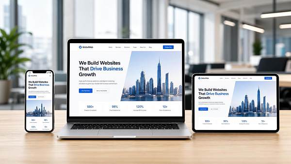
Many website builders list “support for PC, tablet, and mobile” as a standard feature, but the differences between them can be substantial. Some tools merely compress desktop content proportionally. Although the result may appear adapted visually, mobile users may encounter difficult-to-click buttons, overly long forms, crowded above-the-fold content, and uncontrolled image cropping. Such pages may open, but they are not necessarily easy to use.
At a minimum, four aspects should be evaluated: whether breakpoints are controllable, whether modules can be adjusted independently for different devices, whether images and fonts are responsive, and whether navigation and forms are restructured for mobile devices. A truly mature responsive website builder does not simply make a page “smaller”; it allows the same content to have different display priorities on different devices. For example, on the mobile version of a B2B international trade website, the above-the-fold area should generally emphasize industry capabilities, core product access, and inquiry actions rather than completely reproducing the large images and long menus of the desktop version.
This is also where many problems only become apparent after a project goes live. A template demo may look well organized, but once it is replaced with real product images, real multilingual copy, and real downloadable materials, the layout can easily become unbalanced. Therefore, technical evaluation should not focus only on official demo sites. It is best to conduct a trial installation using the company’s own content, especially to assess the performance of long titles, complex parameter tables, and multiple action buttons appearing together.
Loading Speed Is Not an Optional Feature; It Directly Affects Adaptation Results
If a responsive page has a poor loading strategy, even the most attractive adaptation is meaningless. A common issue on mobile devices is not a broken layout, but the failure of the above-the-fold content to appear promptly. During technical evaluation, particular attention should be paid to the code size output by the website builder, image processing methods, script dependencies, and caching mechanisms. To provide a visual editing experience, many low-threshold tools add large numbers of frontend scripts and general-purpose components. As a result, pages are easy to edit in the backend but become excessively heavy on the frontend.
If the business targets overseas markets, this issue becomes even more sensitive. Network environments, access paths, and resource distribution conditions differ across North America, Europe, Southeast Asia, and the Middle East. Whether a website builder supports more efficient static resource loading, image compression, lazy loading, and global access optimization directly determines the actual user experience. When selecting a tool, technical teams should treat “page speed” and “cross-region stability” as hard metrics rather than waiting until after launch to address them.
There is a common misconception here: some people interpret “loads quickly” as merely a server configuration issue. In reality, the server is only one part of the equation. Whether the page structure is redundant, whether it relies heavily on scripts that block rendering, and whether images are delivered in suitable sizes for different devices all fall within the capabilities of the website builder itself. If the tool performs poorly at this level, subsequent manual optimization will often cost more.
SEO Structure Controllability Matters More Than Template Style
For businesses integrating website development and marketing services, the value of a responsive website builder is significantly reduced if it only solves the “website building” problem without considering search visibility. This is particularly important when a company conducts Google SEO, multilingual promotion, or advertising landing-page operations. During evaluation, key areas to examine include whether titles and descriptions can be set independently, whether page URLs are standardized, whether image alt text can be edited, whether heading levels are reasonable, whether sitemaps and redirects are supported, and whether structured content management is convenient.
Many tools claim to be “SEO-friendly,” but in practice they merely provide a few basic fields. What really affects subsequent operations is often found in finer details: whether product detail pages can generate stable links, whether category pages support custom copy, whether multilingual versions are likely to create duplicate content, and whether list filtering pages will generate large numbers of low-quality URLs. These issues may not be obvious during the demo stage, but they can be critical during ongoing operations.
If a company plans to develop AI search visibility, content marketing, or overseas long-tail keyword acquisition in the future, the website builder should ideally provide clearer content organization capabilities instead of turning every page into a highly visual template with limited text capacity. Both search engines and AI retrieval systems need to understand the page topic, content hierarchy, and entity relationships. Pages built primarily through visual stacking are often inherently weak in these areas.
Multilingual Adaptation Cannot Stop at “Being Able to Switch Languages”
For websites targeting overseas markets, the multilingual capabilities of a responsive website builder must be evaluated separately. Once English, German, French, Spanish, Russian, Arabic, and other languages are involved, adaptation becomes much more complex than for a Chinese-language website. Word lengths vary significantly between languages, making buttons, navigation, table headings, and product parameter sections prone to overflow. Right-to-left languages such as Arabic also involve layout direction issues. A tool that can only translate text but cannot maintain a stable layout across different languages will have difficulty supporting formal commercial use.
In addition, multilingual functionality is not limited to switching languages on the frontend. Technical evaluation should also examine whether each language version can be optimized independently, whether separate URLs are supported for each language, and whether content differences between regions can be maintained conveniently. Many companies discover during international expansion that the selling points, certification descriptions, and delivery methods for the same product are not exactly the same in different markets. If the system can only perform mechanical translation and duplication, subsequent operations will be highly constrained.
Do Not Overlook Marketing Expansion Capabilities; Website Building Is Only the Starting Point of the Traffic Chain
A common division-of-responsibility misconception among technical evaluators is to treat a website builder only as a content publishing system. In reality, a lead-generation website never exists in isolation. It is connected to an entire chain that includes advertising, social media traffic acquisition, remarketing, lead transmission, data analysis, and customer management. If a responsive website builder is too closed, every subsequent system integration will require additional development, and maintenance costs will rise rapidly.
Therefore, selection criteria should be more specific: Can analytics tools and advertising conversion codes be integrated conveniently? Can form leads be managed centrally? Can landing pages be quickly duplicated and used for A/B testing? Can page modules be reused? Does the system support rapid site expansion for marketing campaigns? For companies focused on overseas lead generation, these capabilities are often closer to real business value than whether the page simply looks attractive.
From an industry perspective, more and more companies are no longer purchasing website development, SEO, advertising, and social media services separately. The reason is straightforward: the connection between frontend presentation, search indexing, advertising conversion, and localized operations is becoming increasingly strong. Platforms such as 易营宝, an AI-driven enterprise-level SaaS platform, essentially address more than the website builder itself. They enable a website to have the foundations for promotion, indexing, conversion, and continuous optimization from the outset. For technical evaluation, the significance of this integrated approach is that selection criteria should not stop at “whether it can be built,” but should also consider “whether it can continue to operate effectively after it is built.”
Details Worth Verifying During Evaluation
The value of this type of checklist is not to turn tools into a mechanical scoring table, but to help teams identify potential risks. Some tools are suitable for lightweight corporate websites focused on presentation, some for cross-border e-commerce stores, and others for B2B inquiry websites. The issue is not which type is absolutely better, but whether it matches the company’s customer acquisition path over the next two to three years.
The Real Question Is: Will Subsequent Operations Be Restricted by the Tool?
Selecting a responsive website builder may appear to be a comparison of features, but in essence it is an assessment of the website’s future operational flexibility. If technical evaluation remains limited to the demo experience before launch, it is easy to encounter obstacles later in redesigns, multilingual expansion, SEO growth, and advertising collaboration. A more reliable approach is to work backward from actual business needs: Is the website mainly intended to generate inquiries or complete transactions? Where are the key markets? How frequently will content be updated? Will Google SEO be conducted over the long term? Will advertising and social media be used for continuous lead generation?
Once these questions are clarified, evaluating responsive website builders becomes less likely to be influenced by superficial metrics such as “many templates, quick to learn, and low price.” For technical evaluators, adaptation details are never minor issues. They determine whether, after the website goes live, the team will be working on growth or constantly repairing limitations left behind by the tool.
Related Articles



Related Products
 Yiyingbao SaaS Intelligent Website Building and Marketing SystemYiyingbao SaaS Intelligent Website Building and Marketing System, AI-powered no-code website building, rapid creation of multilingual B2B international websites in 10 minutes, global server acceleration, AI-powered SEO optimization, helping businesses connect efficiently with global markets. The perfect integration of technology and operation makes building an international trade website remarkably simple
 AI+SEM Intelligent Advertising Marketing SystemAI+SEM drives intelligent ad creation, empowering full-funnel precision advertising marketing. The system automatically generates weekly/monthly reports, AI recommends keywords and target countries, monitors core metrics in real-time with intelligent alerts, and enables one-click high-conversion ad solutions to help quickly acquire customers and improve ROI.
 AI+SEO Dual-Engine System Optimization ServicesYiyingbao’s AI+SEO dual-engine optimization system helps foreign trade enterprises acquire high-quality organic traffic through AI-powered keyword research, content generation, and comprehensive technical optimization, significantly improving search rankings and conversion rates.
 AI+SNS Social Media Marketing SystemYingbao AI+SNS Social Media Marketing System - Precision social capture for the social media era. Supports one-click content synchronization across major platforms like Facebook and LinkedIn. AI intelligently rewrites posts for enhanced relevance. 24/7 AI customer service and user profiling analysis empower businesses to efficiently expand into global markets.
 AI+SEO营销解决方案易营宝AI+SEO营销解决方案,通过AI批量写作、智能生成TDK、精准关键词扩词等功能,全面优化网站SEO效果,提升流量与转化率。助力企业构建高效智能网站新生态。
 AI+SEM Advertising Marketing SolutionsAI+SEM Advertising Marketing Solution leverages AI technology to deeply empower SEM ad campaigns. It automatically generates weekly/monthly reports using AI, presenting account data across multiple dimensions for comprehensive insights into campaign performance and trends. The system precisely recommends keywords and target countries, intelligently generates high-conversion ad copy, and enables one-click activation of efficient campaign plans to help businesses rapidly acquire customers. Simultaneously, it monitors core metrics in real time, intelligently identifies abnormal fluctuations, and issues timely alerts to ensure stable, high-return advertising results.
 Domain Name ServicesEasyWin provides professional domain name services, including intelligent queries, one-stop registration, brand protection, and full lifecycle management, helping businesses build a digital brand image.
 EasyOperate B2C Cross-Border E-Commerce Platform & Independent WebsiteEasyStore B2C Cross-border E-commerce Independent Store is an intelligent website building and cross-border e-commerce integrated solution independently developed by EasyStore Information Technology (Beijing) Co., Ltd. The system is specially designed for small and medium-sized as well as large export enterprises, integrating 'website building, operation, marketing, advertising, and conversion' into one, helping enterprises quickly establish cross-border e-commerce independent stores to achieve brand globalization and global sales growth.
The platform supports multiple languages, multiple currencies, and multi-channel marketing, with built-in AI intelligent translation and SEO optimization systems, suitable for mainstream markets such as Southeast Asia, Europe and America, Latin America, and the Middle East, assisting Chinese manufacturing enterprises in efficiently deploying international e-commerce strategies. SSL证书易营宝提供专业SSL安全证书服务,包括单域名和泛域名证书,确保网站数据传输加密、身份验证和完整性保护,助力企业建立安全可信的在线业务环境。









