








- AliExpress Announces New Service Rules for Russia, Linked to Wildberries Product IntegrationOct 28, 2026View details
- Black Friday Preparations Enter the Final Sprint Week as Cross-Border E-Commerce Platforms Roll Out Their PlansOct 28, 2026View details
- CBP Finalizes Electronic Rail Export Manifest Rule, Effective October 26, 2026Oct 26, 2026View details
- Amazon’s 2026 peak season surcharge takes effect on October 25Oct 26, 2026View details
- AI Is Eating SaaS: Three Real-World Cases in One AfternoonOct 25, 2026View details
- Exiger CEO: The SaaS Apocalypse Is Real, but It Means Something DifferentOct 25, 2026View details
Low conversion rates in marketing landing page development? Start by reviewing these six page design elements.
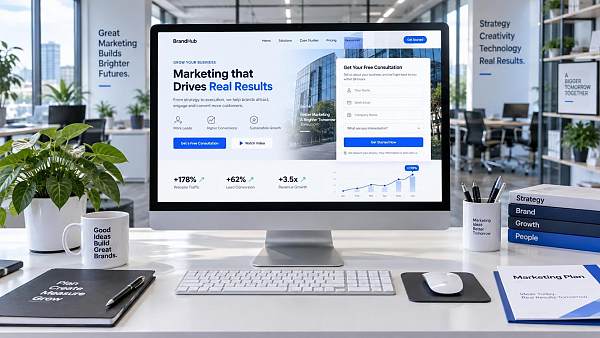
Ads are already running and content is being updated continuously. Traffic does not appear to be poor, yet form submissions, inquiries, and trial requests have shown no improvement—many operators encounter this dilemma of “people arrive, but do not stay” when building marketing landing pages.
This does not necessarily mean that traffic quality is poor. After users click through from search results, Google Ads, or social media posts, they often make a quick judgment: Is this what I need? Is it trustworthy? What should I do next? Any obstacle in this decision process may cause users to leave immediately. Therefore, rather than rushing to increase the budget or frequently change ad creatives, it is better to first review the landing page against the following six design areas.
I. The hero section does not clearly explain “what you can solve” within seconds
The hero section is not an area for displaying a company profile, nor is it a place for a slogan. When users enter a page, they care most about their own concerns: whether the product is suitable, whether the service can solve their current challenges, and whether it is worth continuing to read.
A common problem is that headlines are too broad, such as “Empowering enterprise digital development” or “Creating industry-leading solutions.” Such statements may work in brand communications, but on pages designed to receive advertising traffic, it is difficult for users to quickly establish relevance.
More effective hero-section messaging should consist of three elements: who it is for, what problem it solves, and what results can be achieved. For example, a page targeting export-oriented manufacturers can directly state, “Build an overseas marketing website that supports multiple languages and inquiry conversion”; a page for cross-border sellers can highlight independent website development, product management, or overseas customer acquisition scenarios. The subheading can further explain the scope of services, delivery method, or applicable regions, helping users confirm that they have reached the right page.
The primary button in the hero section should also be clear. Rather than simply writing “Learn More” or “Contact Us,” adapt it to the page objective, such as “Get a Website Development Plan,” “Book a Website Assessment,” or “View Multilingual Website Planning.” The closer the button text is to what users need to do next, the more likely they are to click.
II. The page promise is disconnected from the traffic source
Marketing landing page development cannot be carried out independently of traffic sources. Users who arrive after seeing “Google SEO Services” have completely different expectations from those who come through an ad for “B2B Foreign Trade Website Development.” If an ad emphasizes low-cost customer acquisition but the page starts with company history, or if social media content discusses pain points for a certain product type but the link opens to a generic service overview, users will quickly feel a disconnect.
When reviewing, place the ad headline, keywords, social media post, and page hero section side by side and ask yourself three questions: Does the page repeat the core need the user has just focused on? Does it provide a more specific explanation? Are the call-to-action buttons on the page consistent with the ad promise?
A practical principle is: one primary promotional theme should correspond to one clear landing page focus. There is no need to rebuild the entire website for every keyword, but headlines, case studies, selling-point order, and conversion entry points should be adjusted according to industry, product category, target market, or marketing stage.
III. There is a lot of information, but no readable decision-making path
Many pages seem content-rich, with feature lists, team introductions, process explanations, and customer testimonials all included. Yet as users scroll down, they still do not know what matters most. The issue is usually not insufficient content, but that the order in which information appears does not align with users’ decision-making habits.
For most service-oriented marketing pages, the user’s mental journey is generally: confirm relevance—understand the solution—assess credibility—eliminate concerns—take action. A page does not have to follow fixed modules, but it should progress along this path.
For example, after explaining the core value in the hero section, immediately show typical business scenarios so users can identify which category they belong to; then explain service content, delivery processes, or system capabilities; next, address credibility through case formats, project mechanisms, explanations of data sources, and similar content; finally, reduce the barrier to action through FAQs, engagement methods, and forms. If more than a dozen features are stacked at the beginning, users are instead forced to organize the information themselves, and their patience can easily run out.
Especially for combined services such as AI website building, multilingual websites, SEO optimization, and advertising, it is advisable to explain “website building,” “customer acquisition,” and “operations” separately, rather than cramming every capability into one long paragraph. Platforms such as Yiyingbao that cover website building, search optimization, advertising, and social media coordination are also better suited to presenting a path based on the company’s current stage, rather than simply listing product names.
IV. Trust-building content remains at the level of “self-validation”
Before submitting an inquiry, users usually have implicit concerns: Do you understand my market? Who will maintain the website after it goes live? Can advertising and the website work together? Will the form submission disappear without a response? If a page only says “extensive experience” and “professional service,” it is difficult to genuinely address these questions.
Trust-building design should be as specific as possible, but does not need to be exaggerated. Key stages in the service process can be displayed, such as requirements analysis, page planning, multilingual content configuration, launch testing, and data review; applicable audiences and unsuitable scenarios can also be explained, which can instead make boundaries and reliability easier to establish. For pages targeting overseas business, language versions, regional adaptation, inquiry management, privacy statements, and response mechanisms often have more influence on decisions than a list of honors.
Companies that require cross-departmental collaboration should also clearly explain their internal handoff methods in advance. If leads generated by marketing pages cannot be followed up promptly by sales, customer service, or business teams, they will be lost regardless of how high front-end conversion rates are. For ideas on shared processes and organizational coordination, you may also refer to the practical perspective in Exploration of Enterprise Financial Shared Service Model Practices Under the New Situation, and review “lead generation” and “lead handling” as part of the same chain.
V. Form design makes users feel that “the cost is too high”
More form fields do not necessarily mean more complete information. For first-time visitors, being asked to provide extensive information such as company size, budget, purchasing cycle, and detailed requirements can create pressure from anticipated sales follow-up, especially on mobile devices.
First, check whether the form retains only the information truly necessary at the current stage. If the goal is to obtain an initial consultation, name, contact information, and business needs are sufficient; questions such as industry, target country, and budget range can be optional or supplemented during later communication. It is best to explain what will happen after submission beside the form, for example, “Preliminary website development recommendations will be provided on business days,” so that users know what to expect.
At the same time, do not overlook error messages, verification codes, privacy statements, and submission-success pages. An unrecognizable error message or a thank-you page that fails to load may result in actual lead loss. After marketing landing page development is completed, submit the form once yourself on both a computer and a mobile phone to confirm that email, CRM, or the lead management backend can receive it properly.
VI. Focusing only on page launch without continuously observing user behavior
A landing page is not a one-time asset that is finished once published; it is a marketing asset that requires continuous adjustment. Many conversion issues can only be identified in the data: At which screen do users tend to leave? Which buttons are hardly clicked? Is mobile dwell time significantly lower? Do visitors from different countries and different ad groups show consistent conversion performance?
In practice, first determine one core conversion goal, such as submitting an inquiry, booking a demo, or downloading materials, and then observe page scroll depth, button clicks, form open rate, and form submission rate. Do not modify ten elements at once, otherwise it will be difficult to determine what actually made a difference. You can prioritize testing the hero-section headline, call-to-action button placement, number of form fields, and the presentation order of trust information.
For companies driving traffic simultaneously through Google Search, advertising, and overseas social media, it is even more important to analyze performance by channel. Social media users may need more intuitive scenarios and shorter content, while search users care more about service details, capability explanations, and comparison criteria. Pages do not necessarily need to be completely different, but the same message cannot be used to engage everyone.
Shift from “a good-looking page” to “users being willing to act”
Low conversion rates are rarely caused by a single factor. It may be unclear hero-section messaging, or inconsistency between ads and the page; it may be that users cannot find a basis for trust, or simply that the form contains several unnecessary fields. Rather than repeatedly redesigning based on intuition, review each of the six areas: “hero section—source matching—reading path—trust—form—data.”
When a page accurately addresses the questions users arrive with and makes the next step clear, easy, and trustworthy, marketing landing page development truly transforms from a display tool into an entry point for supporting growth.
Related Articles
 How Can Website UX Improvements Reduce Inquiry Form Abandonment?
 How to Evaluate Mobile Responsiveness for a B2C E-commerce Website
 How do you disable legacy TLS protocols in an HTTPS-compliant configuration?


Related Products
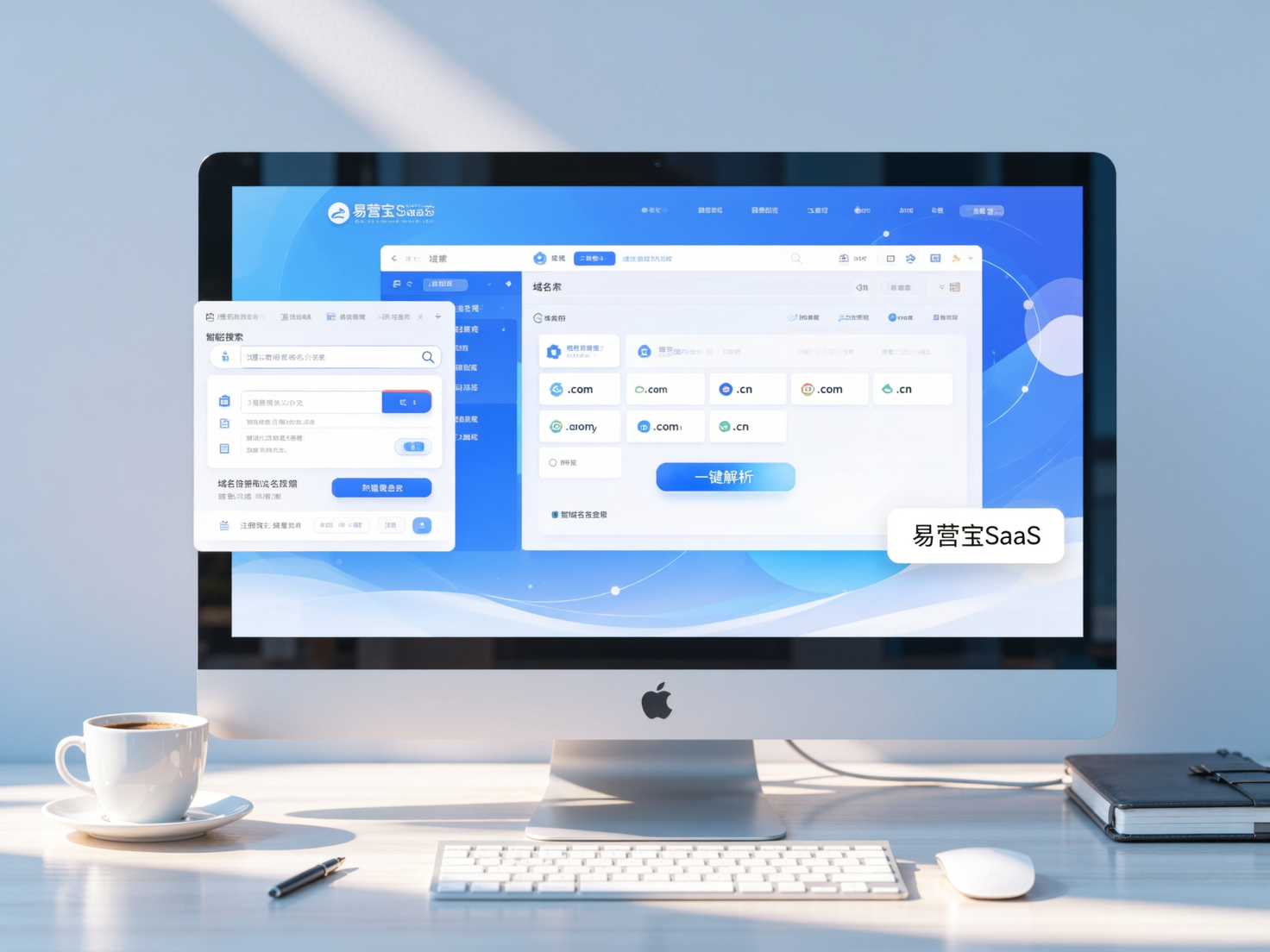
 Yiyingbao SaaS Intelligent Website Building and Marketing SystemYiyingbao SaaS Intelligent Website Building and Marketing System, AI-powered no-code website building, rapid creation of multilingual B2B international websites in 10 minutes, global server acceleration, AI-powered SEO optimization, helping businesses connect efficiently with global markets. The perfect integration of technology and operation makes building an international trade website remarkably simple
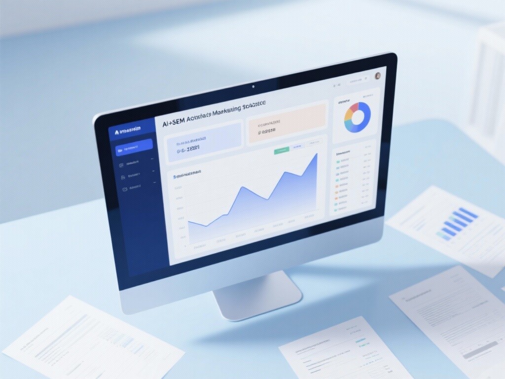
 AI+SEM Intelligent Advertising Marketing SystemAI+SEM drives intelligent ad creation, empowering full-funnel precision advertising marketing. The system automatically generates weekly/monthly reports, AI recommends keywords and target countries, monitors core metrics in real-time with intelligent alerts, and enables one-click high-conversion ad solutions to help quickly acquire customers and improve ROI.
 AI+SEO Dual-Engine System Optimization ServicesYiyingbao’s AI+SEO dual-engine optimization system helps foreign trade enterprises acquire high-quality organic traffic through AI-powered keyword research, content generation, and comprehensive technical optimization, significantly improving search rankings and conversion rates.
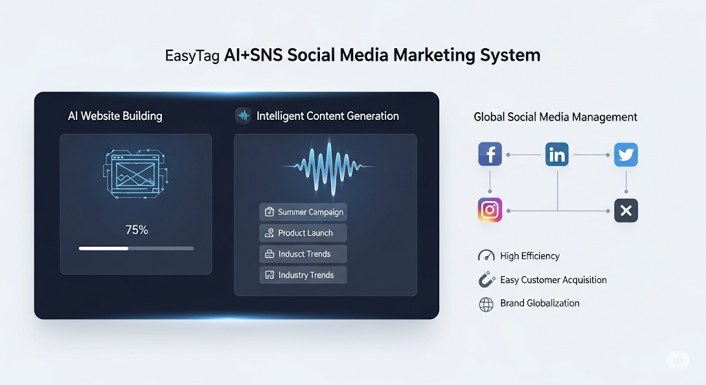
 AI+SNS Social Media Marketing SystemYingbao AI+SNS Social Media Marketing System - Precision social capture for the social media era. Supports one-click content synchronization across major platforms like Facebook and LinkedIn. AI intelligently rewrites posts for enhanced relevance. 24/7 AI customer service and user profiling analysis empower businesses to efficiently expand into global markets.
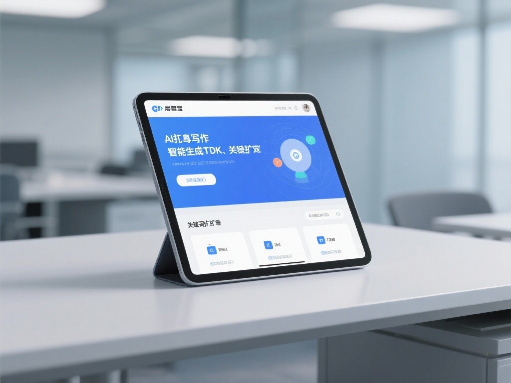
 AI+SEO营销解决方案易营宝AI+SEO营销解决方案,通过AI批量写作、智能生成TDK、精准关键词扩词等功能,全面优化网站SEO效果,提升流量与转化率。助力企业构建高效智能网站新生态。
 AI+SEM Advertising Marketing SolutionsAI+SEM Advertising Marketing Solution leverages AI technology to deeply empower SEM ad campaigns. It automatically generates weekly/monthly reports using AI, presenting account data across multiple dimensions for comprehensive insights into campaign performance and trends. The system precisely recommends keywords and target countries, intelligently generates high-conversion ad copy, and enables one-click activation of efficient campaign plans to help businesses rapidly acquire customers. Simultaneously, it monitors core metrics in real time, intelligently identifies abnormal fluctuations, and issues timely alerts to ensure stable, high-return advertising results.
 Domain Name ServicesEasyWin provides professional domain name services, including intelligent queries, one-stop registration, brand protection, and full lifecycle management, helping businesses build a digital brand image.
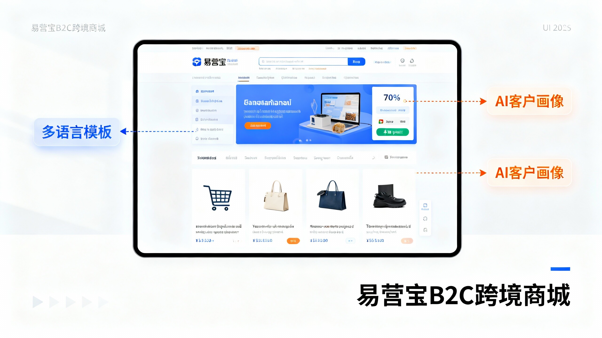
 EasyOperate B2C Cross-Border E-Commerce Platform & Independent WebsiteEasyStore B2C Cross-border E-commerce Independent Store is an intelligent website building and cross-border e-commerce integrated solution independently developed by EasyStore Information Technology (Beijing) Co., Ltd. The system is specially designed for small and medium-sized as well as large export enterprises, integrating 'website building, operation, marketing, advertising, and conversion' into one, helping enterprises quickly establish cross-border e-commerce independent stores to achieve brand globalization and global sales growth.
The platform supports multiple languages, multiple currencies, and multi-channel marketing, with built-in AI intelligent translation and SEO optimization systems, suitable for mainstream markets such as Southeast Asia, Europe and America, Latin America, and the Middle East, assisting Chinese manufacturing enterprises in efficiently deploying international e-commerce strategies. SSL证书易营宝提供专业SSL安全证书服务,包括单域名和泛域名证书,确保网站数据传输加密、身份验证和完整性保护,助力企业建立安全可信的在线业务环境。