








- The U.S. has ended the $800 de minimis exemption for non-postal shipments; express courier packages must be formally declared.Nov 16, 2026View details
- ASEAN Signs Digital Economy Framework Agreement, Moving Toward Harmonized Cross-Border E-Commerce RulesNov 15, 2026View details
- Shenzhen Becomes the First City in Mainland China to Exceed RMB 5 Trillion in Foreign TradeNov 15, 2026View details
- Fujian Announces the First Batch of Provincial-Level Cross-Border E-Commerce Industrial Parks and Key Brands for CultivationNov 14, 2026View details
- Amazon Global Store Announces the Launch of the 2026 Black Friday Global Shopping SeasonNov 14, 2026View details
- CCTV.com Examines APEC’s Role in China’s Foreign TradeNov 12, 2026View details
How Can Image Optimization Speed Up a Slow-Loading Mobile Website’s First Screen?
Slow loading of the mobile above-the-fold content may affect user experience and conversions. Support and maintenance staff can improve mobile site speed by addressing image formats, dimensions, and loading strategies. First, confirm whether large above-the-fold images are slowing down the page. Then compress them to fit their display dimensions, choose suitable formats, and adjust loading priorities. These steps are usually more effective than compressing images across the entire site in bulk.
How can you tell whether above-the-fold images are the main problem?

First, visit the affected page on a mobile phone and note the URL, device, network conditions, and when the slow loading occurs. Pay particular attention to whether the hero image, product image, or carousel image remains blank for a long time, and whether a large image is still loading after the text has appeared.
Next, test the URL with PageSpeed Insights. Check the mobile results for the Largest Contentful Paint (LCP) time and review the diagnostic information. The LCP element could be an image, text, or other content, so confirm it using the report rather than relying on how the page looks.
If the LCP element is an image, check whether the image request starts too late, the file is too large, or the server responds slowly. If most of the time is spent before the image download begins or after it finishes, image compression alone may have limited impact; also investigate page rendering and scripts.
It is also a good idea to use your browser’s developer tools Network panel to simulate a mobile device and a slower network, and record the above-the-fold images’ transfer sizes, request times, and loading order. Save the data and screenshots from before optimization so you can determine whether the changes were effective.
How much should you compress large above-the-fold images?
First, check the image’s actual display dimensions, then decide what size to upload. For example, if the main image is displayed at about 400 pixels wide on a mobile page, you could initially try providing an approximately 800-pixel-wide version for some high-pixel-density screens. The specific dimensions should still be checked against the devices and required image clarity.
If the website delivers an original image several thousand pixels wide directly to mobile devices, crop or resize it before compressing the file. Banners, product close-ups, and text-based graphics have different compositions. Before cropping, make sure the subject, product model, and button area will not be cut off on a narrow screen.
There is no single compression standard that works for every image. You could set an internal target for the main above-the-fold image, such as trying to keep it within a few hundred KB, then compare text edges, product details, and gradient areas. If the image quality is insufficient, increase it as needed; if the file is still too large, check the dimensions again.
When processing product images, keep the original files and save optimized versions separately, using consistent names to record their dimensions and intended use. This makes it easier to roll back and prevents repeated editing from compressing the same image over and over and gradually degrading its details.
How should you choose between WebP, AVIF, and existing formats?
For photos used as hero or product images, consider testing WebP or AVIF first. They can often reduce file size while maintaining similar visual quality. The actual results depend on the image content and encoding settings, so compare the resulting file sizes and image quality before choosing one.
If your site-building system supports multiple output formats, it can serve AVIF or WebP to supported browsers and provide JPEG or PNG as a compatibility fallback. After launch, spot-check with the phones and browsers commonly used by your target customers to make sure images do not appear blank or use an unsupported format.
For images with transparent backgrounds, check that the exported format preserves transparency. SVG may be suitable for icons and simple line art, but use a trusted source and check how it displays. Do not rely on the file extension alone: renaming a file to WebP does not convert it to the WebP format.
On overseas websites, multilingual pages may share the same hero images or maintain separate assets. When replacing images, check that the text, links, and images match in each language version to avoid showing promotional content in another language on the English page.
How can you prioritize above-the-fold images?
The browser should discover the main above-the-fold images as early as possible. Check the page source or site-building dashboard to make sure the main image has not been incorrectly set to lazy-load. For a confirmed critical image, you can set a higher loading priority if the system allows it, then verify the result in the Network panel.
Preloading is suitable for critical images that are certain to appear above the fold but that the browser may not discover promptly, such as some background images referenced in a stylesheet. Before using it, verify the image URL and responsive versions to avoid preloading an image that the mobile device will not actually use, which would add an unnecessary request.
Consider lazy-loading product images, case study images, and recommendation images below the fold so the browser requests them only when they are near the viewport. Carousel components also need checking: the first, critical image should load promptly, while other images can be deferred according to how they are displayed.
Setting an image’s width and height, or its aspect ratio, allows the browser to reserve space in advance and reduces layout shifts when the image appears. This mainly improves layout stability and does not directly reduce the image file size, but it can make mobile browsing and tapping more stable.
How can you use different image sizes on mobile and desktop?
When a desktop banner is scaled down to a phone screen, its subject may become too small and its text difficult to read. Support staff should first check whether the system supports responsive images and can serve different sizes based on screen width. If the compositions differ significantly, create a separate mobile image.
Technical staff can use responsive image capabilities to configure multiple candidate files, allowing the browser to choose based on display size and device pixel density. After configuring this, check which file is actually downloaded in a mobile viewport to make sure the rules are working and the desktop-sized image is not still being requested.
If the platform only allows one general-purpose image to be uploaded, choose a composition that works for both desktop and mobile, and reduce the file size as much as image clarity allows. For banners with a lot of text, consider making the text and buttons page elements instead, so they can adapt to different screens.
What else should you check after replacing images?
After optimizing images, validate them in a test environment or on a low-traffic page before publishing them according to the site’s release process. Check the above-the-fold appearance, image proportions, transparent backgrounds, button links, and multilingual content. Also make sure product images have not lost important details due to cropping.
If the old image still appears after replacement, the browser, content delivery network, or site-building platform cache may not have been updated. Refresh the relevant caches according to the platform’s process, or use a new URL for the file, then check the actual request to confirm that users are receiving the optimized version.
Overseas loading speeds are also affected by server location and network routes. For a website serving multiple regions, test image request times in target markets, assess whether to use a content delivery network covering those regions, and confirm that the caching strategy allows assets to be updated promptly.
Finally, retest under conditions as close as possible to those used before optimization, and compare LCP, above-the-fold image transfer sizes, and loading order. Individual tests can vary, so run them several times. If the website has real-user data, also use mobile performance over a period of time to inform your assessment.
Make image optimization part of routine maintenance
For support and maintenance staff, prioritizing large above-the-fold images on high-traffic homepages, advertising landing pages, and key product pages makes it easier to validate the results in a focused way. If the images are already small enough but the page is still slow, continue investigating server response, scripts, and page rendering rather than compressing the assets repeatedly.
You can establish routine upload guidelines covering image dimensions by use case, format and quality checks, above-the-fold loading priorities, and mobile spot checks after publishing. Users of site-building and marketing platforms such as 易营宝 should also first confirm which image processing and caching features are available in the dashboard, then make adjustments based on test results.
Related Articles
 How do I set up website navigation when building a site with Yingbao?
 How Can You Tell Whether a Company Website Is Truly Optimized for Mobile?
 How Can UX Optimization Reduce Form Abandonment?



Related Products
 Yiyingbao SaaS Intelligent Website Building and Marketing SystemYiyingbao SaaS Intelligent Website Building and Marketing System, AI-powered no-code website building, rapid creation of multilingual B2B international websites in 10 minutes, global server acceleration, AI-powered SEO optimization, helping businesses connect efficiently with global markets. The perfect integration of technology and operation makes building an international trade website remarkably simple
 AI+SEM Intelligent Advertising Marketing SystemAI+SEM drives intelligent ad creation, empowering full-funnel precision advertising marketing. The system automatically generates weekly/monthly reports, AI recommends keywords and target countries, monitors core metrics in real-time with intelligent alerts, and enables one-click high-conversion ad solutions to help quickly acquire customers and improve ROI.
 AI+SEO Dual-Engine System Optimization ServicesYiyingbao’s AI+SEO dual-engine optimization system helps foreign trade enterprises acquire high-quality organic traffic through AI-powered keyword research, content generation, and comprehensive technical optimization, significantly improving search rankings and conversion rates.
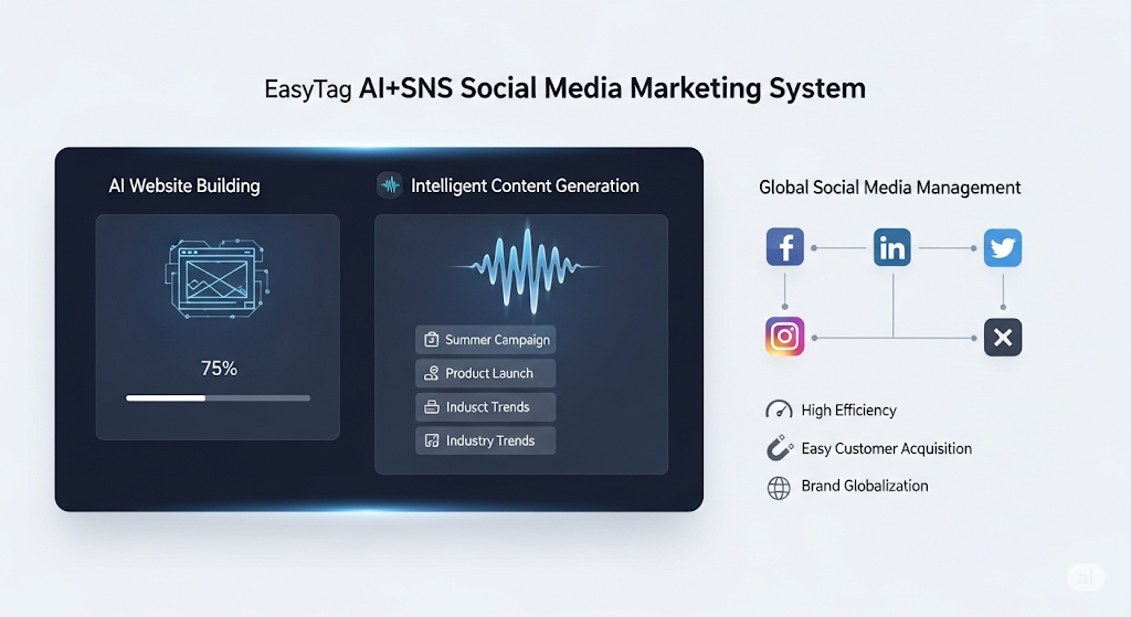
 AI+SNS Social Media Marketing SystemYingbao AI+SNS Social Media Marketing System - Precision social capture for the social media era. Supports one-click content synchronization across major platforms like Facebook and LinkedIn. AI intelligently rewrites posts for enhanced relevance. 24/7 AI customer service and user profiling analysis empower businesses to efficiently expand into global markets.
 AI+SEO营销解决方案易营宝AI+SEO营销解决方案,通过AI批量写作、智能生成TDK、精准关键词扩词等功能,全面优化网站SEO效果,提升流量与转化率。助力企业构建高效智能网站新生态。
 AI+SEM Advertising Marketing SolutionsAI+SEM Advertising Marketing Solution leverages AI technology to deeply empower SEM ad campaigns. It automatically generates weekly/monthly reports using AI, presenting account data across multiple dimensions for comprehensive insights into campaign performance and trends. The system precisely recommends keywords and target countries, intelligently generates high-conversion ad copy, and enables one-click activation of efficient campaign plans to help businesses rapidly acquire customers. Simultaneously, it monitors core metrics in real time, intelligently identifies abnormal fluctuations, and issues timely alerts to ensure stable, high-return advertising results.
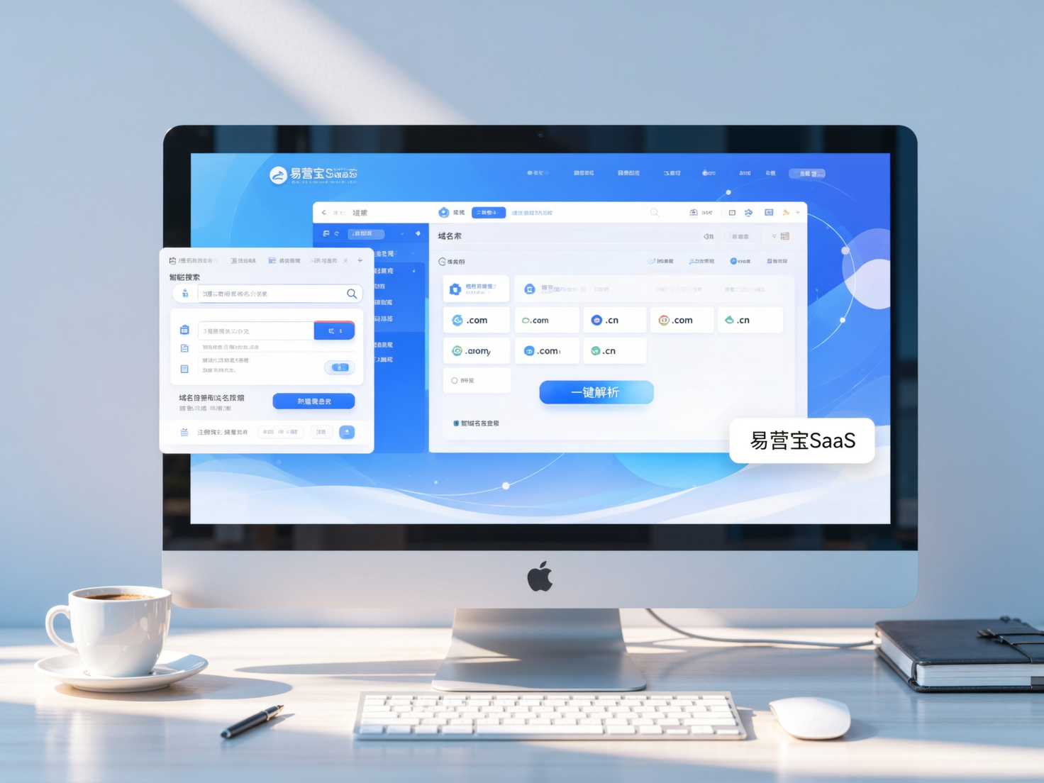
 Domain Name ServicesEasyWin provides professional domain name services, including intelligent queries, one-stop registration, brand protection, and full lifecycle management, helping businesses build a digital brand image.
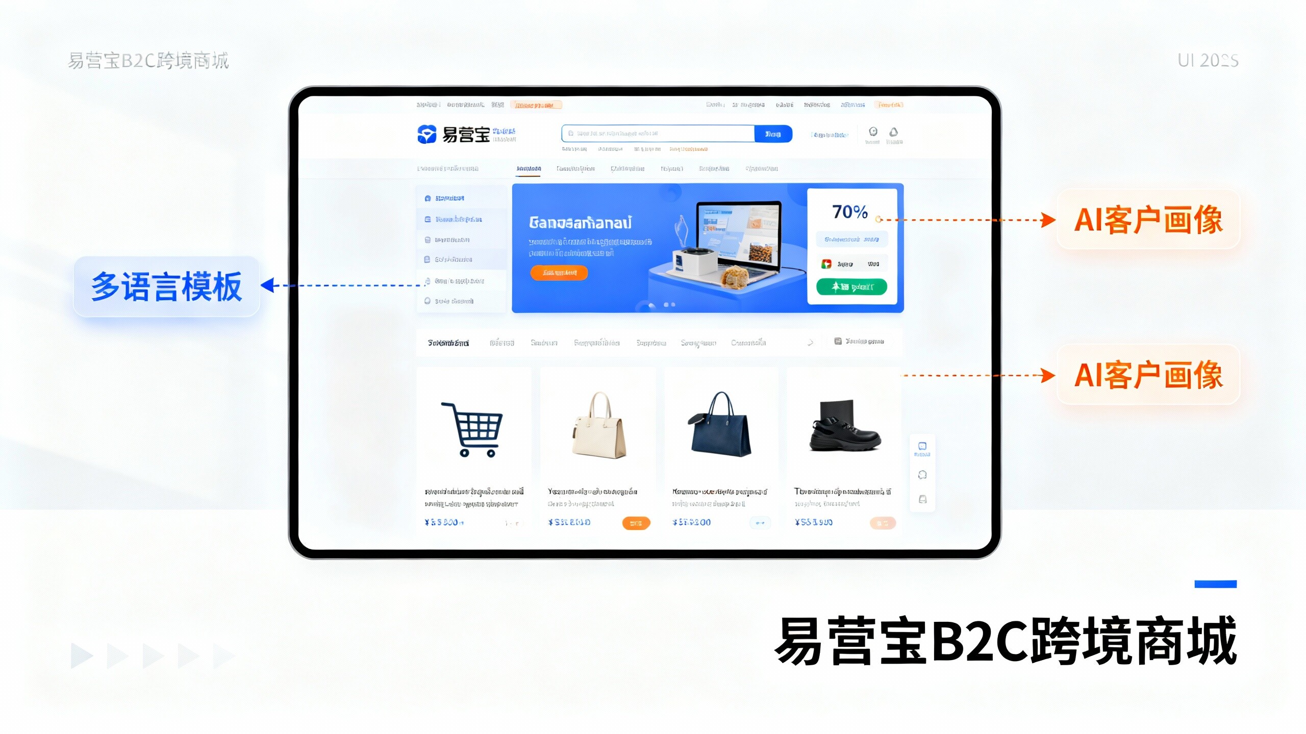
 EasyOperate B2C Cross-Border E-Commerce Platform & Independent WebsiteEasyStore B2C Cross-border E-commerce Independent Store is an intelligent website building and cross-border e-commerce integrated solution independently developed by EasyStore Information Technology (Beijing) Co., Ltd. The system is specially designed for small and medium-sized as well as large export enterprises, integrating 'website building, operation, marketing, advertising, and conversion' into one, helping enterprises quickly establish cross-border e-commerce independent stores to achieve brand globalization and global sales growth.
The platform supports multiple languages, multiple currencies, and multi-channel marketing, with built-in AI intelligent translation and SEO optimization systems, suitable for mainstream markets such as Southeast Asia, Europe and America, Latin America, and the Middle East, assisting Chinese manufacturing enterprises in efficiently deploying international e-commerce strategies. SSL证书易营宝提供专业SSL安全证书服务,包括单域名和泛域名证书,确保网站数据传输加密、身份验证和完整性保护,助力企业建立安全可信的在线业务环境。