








- Fujian Announces the First Batch of Provincial-Level Cross-Border E-Commerce Industrial Parks and Key Brands for CultivationNov 14, 2026View details
- Amazon Global Store Announces the Launch of the 2026 Black Friday Global Shopping SeasonNov 14, 2026View details
- CCTV.com Examines APEC’s Role in China’s Foreign TradeNov 12, 2026View details
- China’s Tariff Commission of the State Council Adjusts Additional Tariffs on U.S. Goods: 24% Tariff Suspended for Two MonthsNov 10, 2026View details
- APEC Shenzhen Spotlight: Cross-Border E-Commerce Orders Promote Asia-Pacific Trade and Economic CooperationNov 08, 2026View details
- China-Europe Railway Express and CIIE Hold Business Matchmaking Event, Focusing on Cross-Border E-commerce B2B ExportsNov 07, 2026View details
How Can Responsive Website Development Prevent Mobile Layout Issues?
The page looks orderly on desktop, but on a phone the navigation gets cramped, images overflow, buttons are obscured, or even the entire page can be scrolled horizontally. These issues are not uncommon in responsive website development, especially when a business website includes a product catalog, inquiry forms, and multilingual content. A single sizing issue in one area can affect both the user experience and conversions. The key to fixing a broken layout is not to keep applying patches for a particular phone model, but to identify where the viewport, containers, content, and breakpoints are out of sync.
Start by identifying the issue: Is the whole page misaligned, or is a component overflowing?
When troubleshooting, start by switching to a mobile device view in your browser’s developer tools, reproducing the issue, and noting the viewport width, browser, and page state. If the entire page appears shrunk, check the viewport settings first. If only one area extends beyond the screen, inspect the width, padding, and positioning rules of that component and its parent containers.
Horizontal scrolling deserves particular attention. Fixed-width tables, long URLs, product model numbers that do not wrap, or containers using width: 100vw with additional padding can all cause overflow. Do not rush to add overflow-x: hidden to the page. This may simply hide an overflowing button or other content without actually fixing the problem.
From viewport to container: Fixing the fundamentals of mobile layouts
Check the viewport settings and box model
The document head should include <meta name="viewport" content="width=device-width, initial-scale=1"> so the layout viewport matches the device width. Without this setting, a mobile browser may render the page using a wider layout viewport and then scale it down, making text and buttons difficult to use.
Also check the box model. Using box-sizing: border-box consistently makes the declared width include padding and borders, reducing the risk of containers becoming unintentionally wider. However, this will not automatically fix fixed widths or content that cannot wrap, so each component still needs to be checked in context.
Let containers adapt to available space instead of relying on fixed pixel values
It is usually more robust to design the main content area to be flexible in width while having a maximum width, rather than hard-coding its width. For example, use width: 100%; max-width: 1200px; with appropriate left and right padding. Two-column layouts can use Grid or Flex and switch to a single column when space is limited.
There is also an easy-to-miss detail with Flex items: their default minimum width can allow long text to stretch the container. If necessary, set min-width: 0 on the items and use overflow-wrap: anywhere to handle long links or product numbers. Tables can be placed in local containers that support horizontal scrolling, preventing them from widening the entire page. When there are only a few important fields, consider displaying them as cards on small screens.
Check images, videos, and embedded content separately
For regular images, set max-width: 100%; height: auto to prevent them from exceeding their containers at their original size. For product hero images and cover images, also check object-fit and the container’s aspect ratio to prevent important content from being cropped during resizing. Videos, maps, and third-party iframes do not necessarily inherit image rules, so constrain their width and set an appropriate aspect ratio.
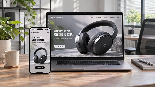
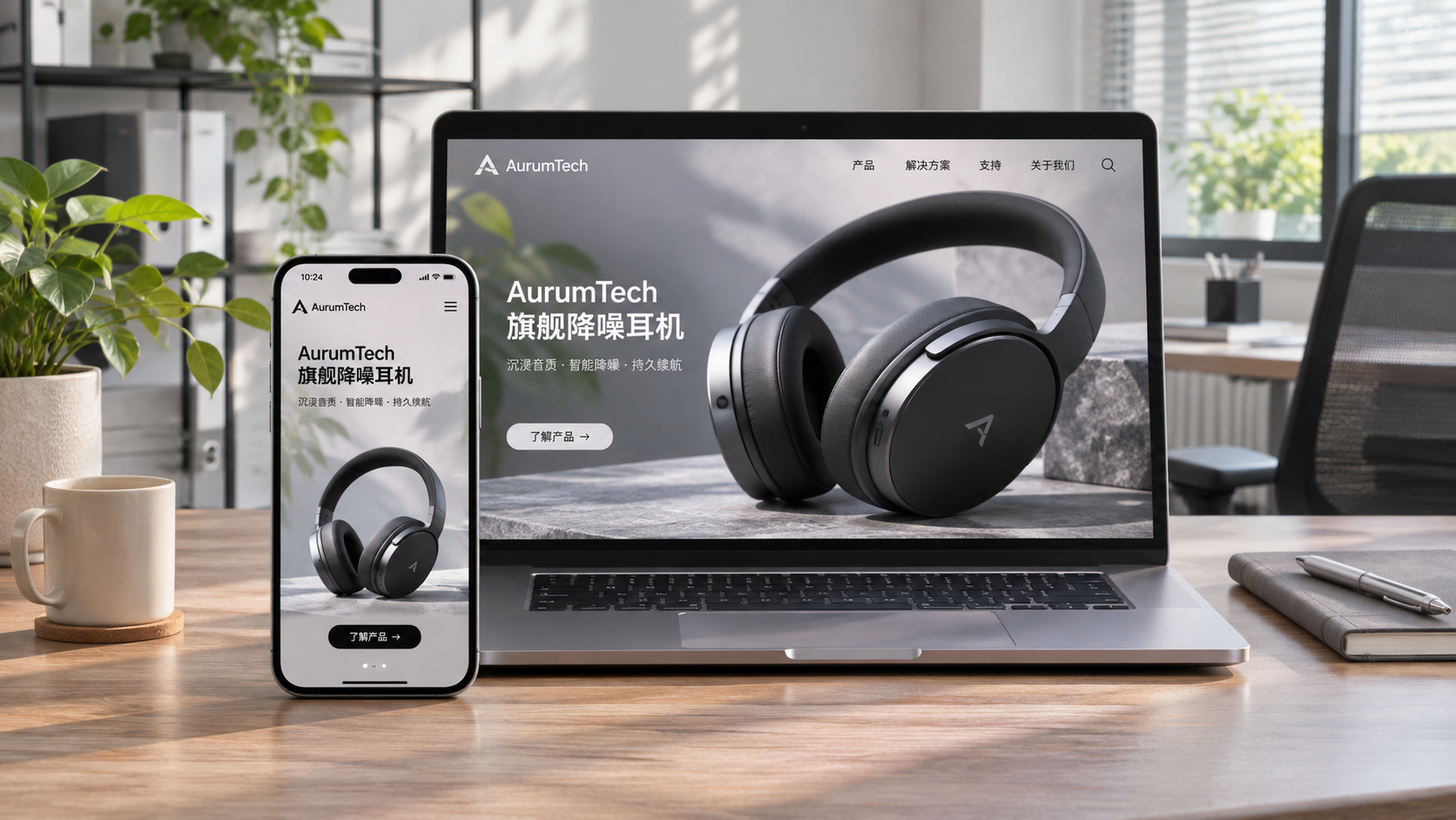
For a marketing landing page, it is not enough for the hero image simply to fit. Check the actual assets to ensure text does not cover the main subject and that call-to-action buttons remain visible on different screens.
Set breakpoints based on content, not just device models
Common phone, tablet, and desktop widths can be used as a starting point for testing, but should not be treated as the only standards. A more reliable approach is to gradually narrow the browser window, observe when the navigation wraps, product cards become too narrow, or form labels become cramped, and then set breakpoints where the layout starts to become unsuitable.
For example, a four-column product listing on desktop can first switch to two columns, then to one column depending on the card content. The navigation should switch to a mobile menu when it can no longer fit in full, rather than waiting for a specific device width. More breakpoints are not necessarily better: too many media queries can create conflicting overrides and make future maintenance difficult.
Organizing styles with a mobile-first approach—starting with a basic small-screen layout and progressively enhancing the experience on larger screens using min-width—can help reduce conflicts between overrides. However, if a project already has extensive desktop-first styles, there is no need to rewrite them immediately just for the sake of it. Reviewing the existing rules and their priorities first, then adjusting them module by module, is usually easier to manage.
Multilingual content and conversion components are high-risk areas for business websites
International business websites often have more than one language. A navigation label may become significantly longer when translated; long German words, right-to-left Arabic layouts, or different line-height requirements can all disrupt an existing layout. Do not assess only the English homepage. Check the menus, product details, pop-ups, and forms in the target languages, and allow enough space for text wrapping and container height.
For inquiry forms, focus on real-world use: Do input fields extend beyond their containers? Do error messages cover other content when they appear? Can users find the submit button when the mobile keyboard is open? Also check that fixed bottom consultation bars, cookie notices, and advertising pop-ups do not overlap one another, and account for device safe areas.
When using an intelligent website-building platform or templates to build an overseas website, technical evaluators can focus on whether breakpoints and component styles are adjustable, multilingual content can be previewed independently, third-party code is constrained by its containers, and future changes will affect other pages. YINGBANG provides intelligent website building, multilingual website, and overseas marketing services. When evaluating this type of integrated solution, mobile performance should still be validated against the specific pages and target markets rather than judged solely from a template preview.
How can you validate the site before launch to avoid fixing one issue and causing another?
Testing should not stop at screenshots of the homepage. At a minimum, cover the homepage, product listings, detail pages, inquiry forms, and advertising landing pages, and check interactive states such as open pop-ups, form errors, and expanded menus. Near breakpoints, test viewports that are slightly narrower and slightly wider to see whether the layout suddenly shifts or exhibits overflow at the threshold.
- Browsers and devices: Based on your target customers’ usage, spot-check the site in major mobile browsers and on real devices. Emulators are useful for quickly locating issues, but they cannot fully replace testing on actual devices.
- Content variations: Check long headings, multilingual copy, missing images, and different numbers of product cards to ensure the layout does not depend on ideal content lengths.
- Usability: Check button spacing, text readability, keyboard navigation, and form feedback. Content should also remain as accessible as possible when text is enlarged.
- Ongoing regression testing: Record the affected pages, viewport sizes, and reproduction steps, then retest the relevant breakpoints after fixing an issue. Where possible, add automated viewport screenshots or overflow detection.
Mobile layout stability ultimately comes down to real content and real interactions. By bringing together viewport settings, flexible containers, content-driven breakpoints, and testing across different scenarios, responsive website development can move beyond “it looks fine on one phone” toward a more reliable cross-device experience.
Related Articles
 How Can Responsive Website Development Prevent Mobile Layout Issues?
 How can a responsive corporate website adapt to mobile screens?
 How Does Website Loading Speed Affect Conversion Rates?

Related Products
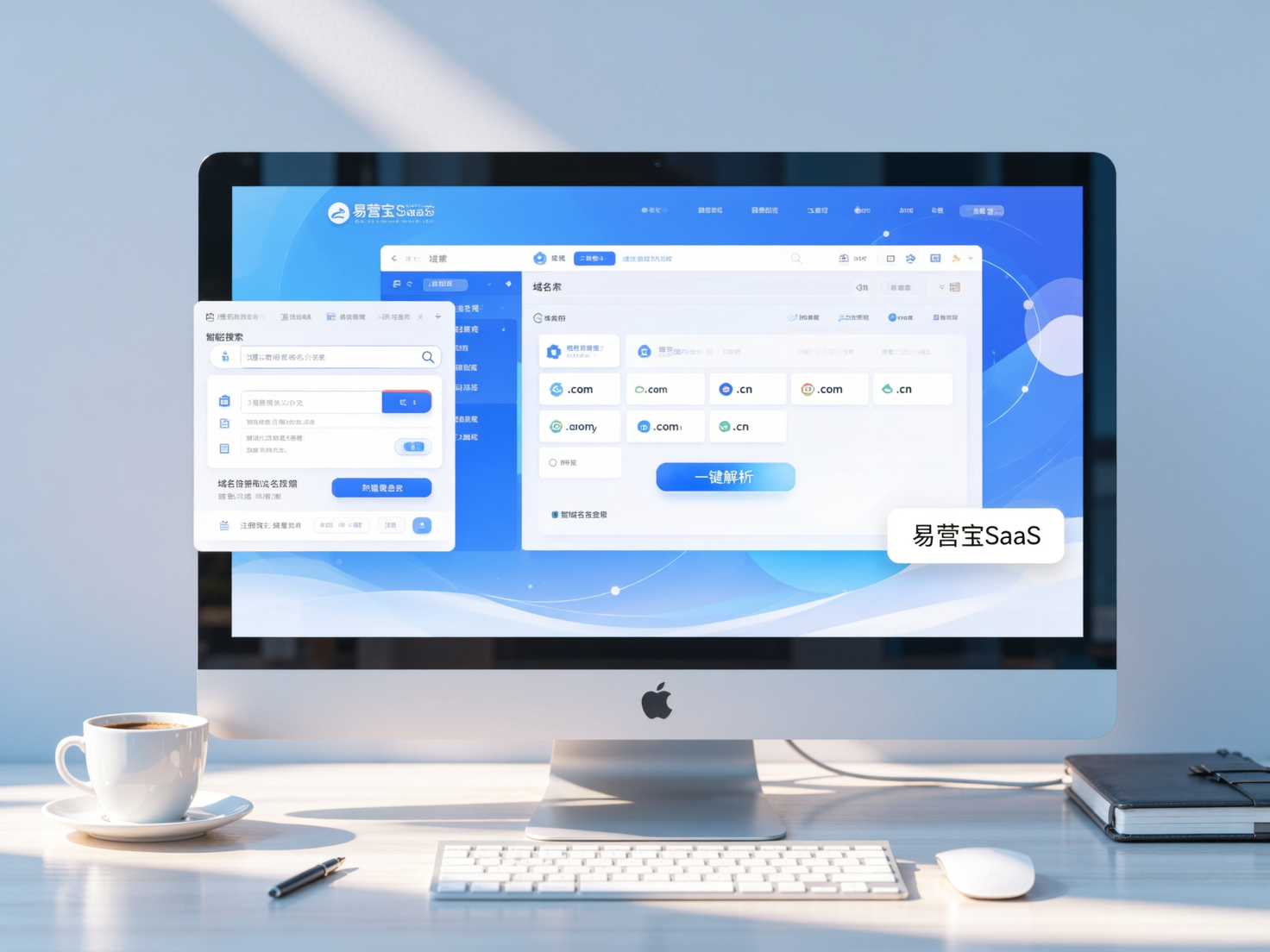
 Yiyingbao SaaS Intelligent Website Building and Marketing SystemYiyingbao SaaS Intelligent Website Building and Marketing System, AI-powered no-code website building, rapid creation of multilingual B2B international websites in 10 minutes, global server acceleration, AI-powered SEO optimization, helping businesses connect efficiently with global markets. The perfect integration of technology and operation makes building an international trade website remarkably simple
 AI+SEM Intelligent Advertising Marketing SystemAI+SEM drives intelligent ad creation, empowering full-funnel precision advertising marketing. The system automatically generates weekly/monthly reports, AI recommends keywords and target countries, monitors core metrics in real-time with intelligent alerts, and enables one-click high-conversion ad solutions to help quickly acquire customers and improve ROI.
 AI+SEO Dual-Engine System Optimization ServicesYiyingbao’s AI+SEO dual-engine optimization system helps foreign trade enterprises acquire high-quality organic traffic through AI-powered keyword research, content generation, and comprehensive technical optimization, significantly improving search rankings and conversion rates.
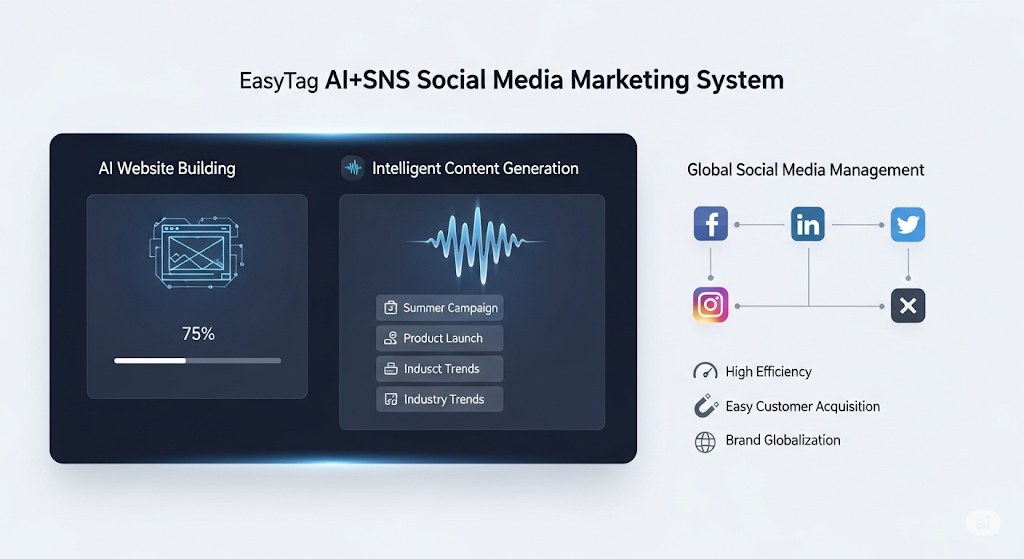
 AI+SNS Social Media Marketing SystemYingbao AI+SNS Social Media Marketing System - Precision social capture for the social media era. Supports one-click content synchronization across major platforms like Facebook and LinkedIn. AI intelligently rewrites posts for enhanced relevance. 24/7 AI customer service and user profiling analysis empower businesses to efficiently expand into global markets.
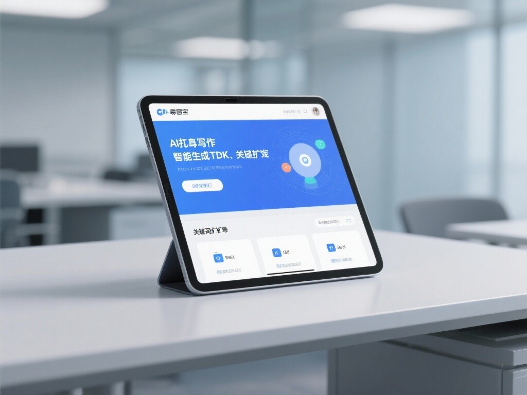
 AI+SEO营销解决方案易营宝AI+SEO营销解决方案,通过AI批量写作、智能生成TDK、精准关键词扩词等功能,全面优化网站SEO效果,提升流量与转化率。助力企业构建高效智能网站新生态。
 AI+SEM Advertising Marketing SolutionsAI+SEM Advertising Marketing Solution leverages AI technology to deeply empower SEM ad campaigns. It automatically generates weekly/monthly reports using AI, presenting account data across multiple dimensions for comprehensive insights into campaign performance and trends. The system precisely recommends keywords and target countries, intelligently generates high-conversion ad copy, and enables one-click activation of efficient campaign plans to help businesses rapidly acquire customers. Simultaneously, it monitors core metrics in real time, intelligently identifies abnormal fluctuations, and issues timely alerts to ensure stable, high-return advertising results.
 Domain Name ServicesEasyWin provides professional domain name services, including intelligent queries, one-stop registration, brand protection, and full lifecycle management, helping businesses build a digital brand image.
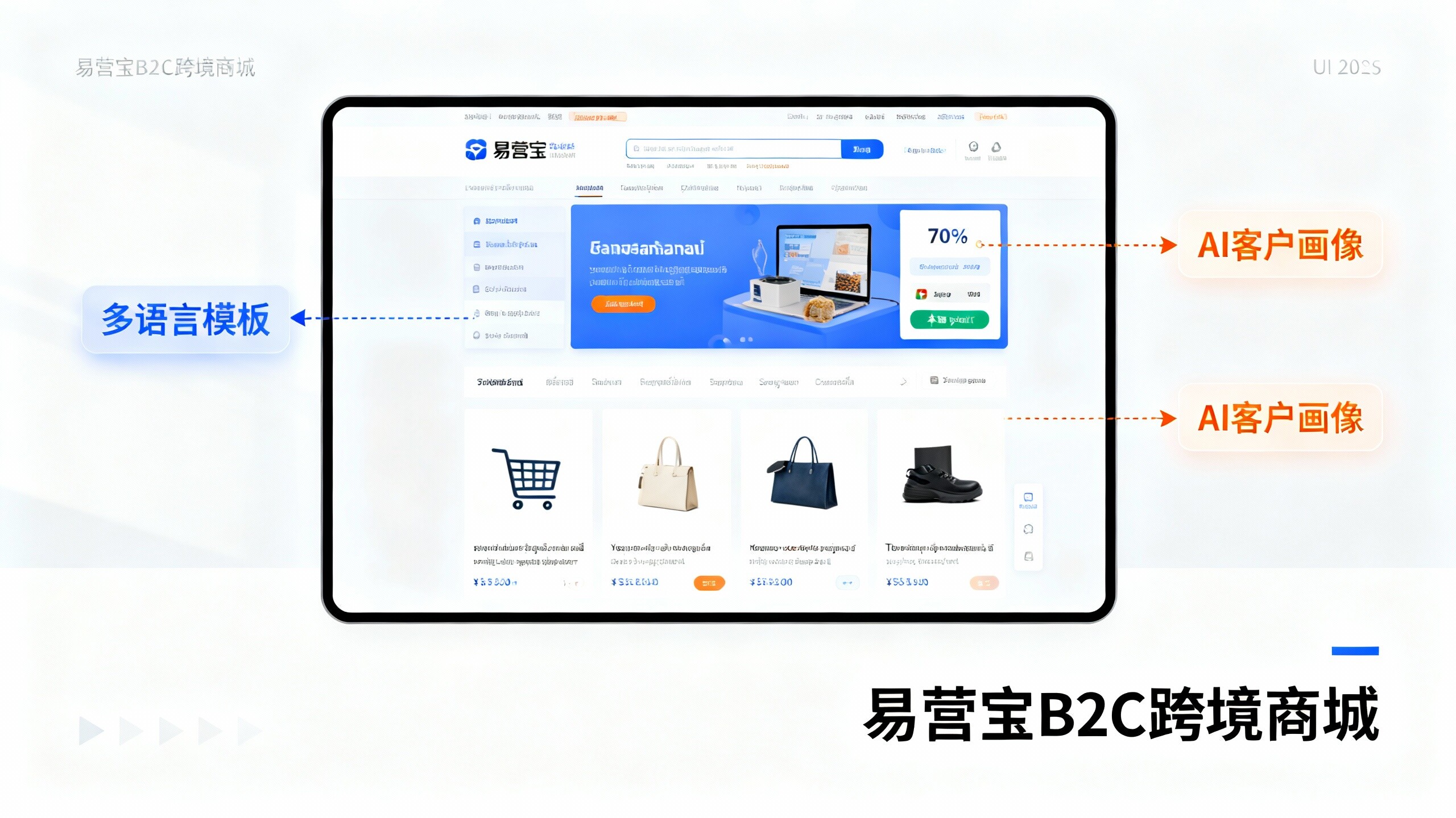
 EasyOperate B2C Cross-Border E-Commerce Platform & Independent WebsiteEasyStore B2C Cross-border E-commerce Independent Store is an intelligent website building and cross-border e-commerce integrated solution independently developed by EasyStore Information Technology (Beijing) Co., Ltd. The system is specially designed for small and medium-sized as well as large export enterprises, integrating 'website building, operation, marketing, advertising, and conversion' into one, helping enterprises quickly establish cross-border e-commerce independent stores to achieve brand globalization and global sales growth.
The platform supports multiple languages, multiple currencies, and multi-channel marketing, with built-in AI intelligent translation and SEO optimization systems, suitable for mainstream markets such as Southeast Asia, Europe and America, Latin America, and the Middle East, assisting Chinese manufacturing enterprises in efficiently deploying international e-commerce strategies. SSL证书易营宝提供专业SSL安全证书服务,包括单域名和泛域名证书,确保网站数据传输加密、身份验证和完整性保护,助力企业建立安全可信的在线业务环境。