








- CCTV.com Examines APEC’s Role in China’s Foreign TradeNov 12, 2026View details
- China’s Tariff Commission of the State Council Adjusts Additional Tariffs on U.S. Goods: 24% Tariff Suspended for Two MonthsNov 10, 2026View details
- APEC Shenzhen Spotlight: Cross-Border E-Commerce Orders Promote Asia-Pacific Trade and Economic CooperationNov 08, 2026View details
- China-Europe Railway Express and CIIE Hold Business Matchmaking Event, Focusing on Cross-Border E-commerce B2B ExportsNov 07, 2026View details
- China’s Ministry of Commerce Responds to Additional Charges on Low-Value Imports Imposed by the EUNov 06, 2026View details
- Two Internet Development Reports Released at the 2026 World Internet ConferenceNov 05, 2026View details
How can a responsive corporate website adapt to mobile screens?
How can a responsive corporate website adapt to different mobile screens? The key is not simply to shrink the page, but to adjust the layout, text, images, and interactive controls to the available space while maintaining loading speed and core functionality. This article covers layout, breakpoints, performance, and acceptance testing to help technical evaluators assess mobile adaptation solutions.
What results should you look at first to assess whether a mobile adaptation solution is reliable?

When evaluating a corporate website, first check whether mobile visitors can smoothly complete key tasks. For example, they should be able to read specifications on a product page, view images, switch languages, and submit an inquiry. Having no horizontal scrollbar is only a starting point; readable content, accessible controls, and usable forms are equally important.
Technically, a reliable solution typically uses the same content structure, adapting to different viewports through flexible layouts, relative units, and media queries. During evaluation, also confirm that product information, internal links, and structured data are retained on mobile, so that information on mobile and desktop pages does not become inconsistent over time.
For websites targeting overseas customers, tests should also account for long English words, long German sentences, right-to-left Arabic layouts, and varying network conditions. The languages and regions actually supported should be determined by the company's target markets and the specific capabilities of its website platform.
How can the layout adapt to mobile screen sizes instead of simply shrinking?
The page first needs a correctly configured viewport. For example, use a viewport setting in the page header with its width set to the device width, so the browser lays out the page according to the device's logical pixels. Without this setting, a phone may render the page as though it were a wider virtual page and then scale the whole page down, making text and buttons difficult to use.
The main layout can use Flexbox or Grid to adjust the number of columns according to the available container space. Product descriptions and images displayed side by side on desktop usually need to switch to a single column on mobile. Sidebars with filters and navigation menus can be collapsed, but their entry points should be clear and support both keyboard and touch interactions.
For widths, prioritize percentages, maximum widths, and flexible units. Avoid setting fixed widths on text containers, images, or forms that exceed the screen width. For long URLs, model numbers, and unbroken strings, set appropriate wrapping rules to prevent individual elements from breaking the layout.
Images and videos should stay within their containers and maintain suitable aspect ratios. Product images should preserve important details without leaving excessive blank space. Tables can be converted into cards, made horizontally scrollable within their own area, or presented in an equivalent format suited to small screens.
How should breakpoints be set to cover phones of different sizes?
Breakpoints should be determined by the content, not just by the screen sizes of a few specific phone models. Start with a narrow screen and gradually increase the viewport width. Observe when navigation becomes crowded, cards become too narrow, or headings wrap frequently, then set breakpoints where the layout genuinely needs to change.
For example, a product list can display multiple columns when space allows, then switch to one or two columns when the cards are too narrow to accommodate images and prices. The specific thresholds depend on the font, padding, and content length, so a fixed pixel value should not be treated as a universal standard for all websites.
Acceptance testing should cover narrow-screen phones, common phone sizes, landscape orientation, and widths close to those of tablets, with checks on either side of each breakpoint. Browser developer tools are useful for quick troubleshooting, but testing on real devices is still necessary to verify touch feedback, system font scaling, and changes in browser interface elements.
How can navigation, forms, and buttons be made suitable for touch interactions?
Mobile navigation should help users quickly find products, solutions, and contact information. Menus should be closable when expanded, and their hierarchy should not be too deep. Fixed navigation or bottom contact buttons must not cover body text or forms. When using pop-ups, also check that focus, scrolling, and closing work correctly.
Buttons and links need sufficiently large clickable areas and enough spacing to prevent accidental taps on adjacent controls. Refer to applicable target-size requirements in accessibility standards and supplement them with real-world usability tests. Color contrast, clear focus states, and readable font sizes should also be included in the checks.
Inquiry forms should retain only fields essential to the business. Set suitable input types for fields such as email addresses and phone numbers, and display clear error messages near the relevant fields. After submission, provide success or failure feedback to prevent users from submitting repeatedly or abandoning their inquiry because there is no response.
How can you balance mobile speed with search engine indexing?
Mobile performance directly affects how long visitors have to wait and whether they can continue browsing products. To optimize performance, first identify the main bottlenecks: large above-the-fold images, too many scripts, third-party plugins, and font files can all slow down a page, especially when accessed across regions or over unstable mobile networks.
Images can be served in different sizes to match their display dimensions, using modern formats supported by browsers. Consider lazy-loading images below the fold. Avoid inappropriately lazy-loading critical above-the-fold images, and reserve space for images to reduce page shifts during loading.
Remove unused code from scripts and stylesheets to reduce resources that block above-the-fold rendering. Also evaluate the loading costs of third-party analytics, live chat, and advertising scripts. Caching strategies and content delivery networks can improve access across regions, although results still depend on deployment locations and actual network conditions.
Search engines typically use mobile content for indexing, so mobile pages should provide access to the same core body text, product information, and internal links as desktop pages. Do not remove critical content just because it is displayed in a collapsed section. Also check canonical URLs, language-version tags, and structured data.
How should you test and approve a responsive corporate website before launch?
Start by creating a checklist of pages and tasks covering the homepage, product listings, product detail pages, news, contact pages, and advertising landing pages. Then check the layout, images, navigation, and forms at different screen widths. For multilingual websites, also sample pages with longer text and different reading directions.
For performance, use PageSpeed Insights to review mobile data and monitor metrics such as Largest Contentful Paint, Interaction to Next Paint, and Cumulative Layout Shift. If sufficient real-user data is available, analyze it alongside lab tests. A single score is not enough to represent the experience across all regions and devices.
Acceptance testing should also record the test device, browser, screen width, network conditions, and steps to reproduce issues, and specify who is responsible for fixes and the results of retesting. Perform end-to-end checks of inquiry buttons, phone links, file downloads, and form submissions to confirm both that the page works and that data actually reaches the business system.
If a company uses a website platform or service provider, it can ask to review real mobile projects, the range of template customization options, and how multilingual support works. Yiwangbao provides intelligent website building and overseas marketing-related services. Specific functions, performance, and delivery scope should be verified through demonstrations, contracts, and actual testing.
Summary: Use real tasks to assess adaptation quality
The goal of responsive design is to present content reliably across different screens and enable users to complete key tasks smoothly. Technical evaluators should assess flexible layouts, content-driven breakpoints, touch interactions, mobile performance, and search accessibility as a whole, then validate them on real devices and through business workflows rather than judging only by whether the page can be resized.
Related Articles
 How can a responsive corporate website adapt to mobile screens?
 How Does Website Loading Speed Affect Conversion Rates?
 What Should You Do When Your SEO Website Gets Traffic but No Inquiries?


Related Products
 Yiyingbao SaaS Intelligent Website Building and Marketing SystemYiyingbao SaaS Intelligent Website Building and Marketing System, AI-powered no-code website building, rapid creation of multilingual B2B international websites in 10 minutes, global server acceleration, AI-powered SEO optimization, helping businesses connect efficiently with global markets. The perfect integration of technology and operation makes building an international trade website remarkably simple
 AI+SEM Intelligent Advertising Marketing SystemAI+SEM drives intelligent ad creation, empowering full-funnel precision advertising marketing. The system automatically generates weekly/monthly reports, AI recommends keywords and target countries, monitors core metrics in real-time with intelligent alerts, and enables one-click high-conversion ad solutions to help quickly acquire customers and improve ROI.
 AI+SEO Dual-Engine System Optimization ServicesYiyingbao’s AI+SEO dual-engine optimization system helps foreign trade enterprises acquire high-quality organic traffic through AI-powered keyword research, content generation, and comprehensive technical optimization, significantly improving search rankings and conversion rates.
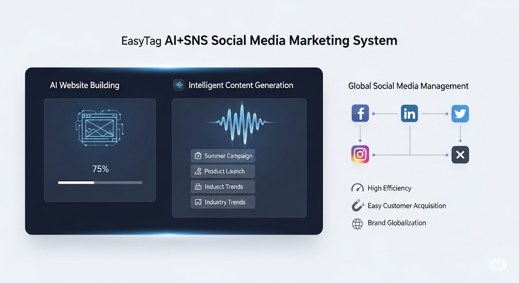
 AI+SNS Social Media Marketing SystemYingbao AI+SNS Social Media Marketing System - Precision social capture for the social media era. Supports one-click content synchronization across major platforms like Facebook and LinkedIn. AI intelligently rewrites posts for enhanced relevance. 24/7 AI customer service and user profiling analysis empower businesses to efficiently expand into global markets.
 AI+SEO营销解决方案易营宝AI+SEO营销解决方案,通过AI批量写作、智能生成TDK、精准关键词扩词等功能,全面优化网站SEO效果,提升流量与转化率。助力企业构建高效智能网站新生态。
 AI+SEM Advertising Marketing SolutionsAI+SEM Advertising Marketing Solution leverages AI technology to deeply empower SEM ad campaigns. It automatically generates weekly/monthly reports using AI, presenting account data across multiple dimensions for comprehensive insights into campaign performance and trends. The system precisely recommends keywords and target countries, intelligently generates high-conversion ad copy, and enables one-click activation of efficient campaign plans to help businesses rapidly acquire customers. Simultaneously, it monitors core metrics in real time, intelligently identifies abnormal fluctuations, and issues timely alerts to ensure stable, high-return advertising results.
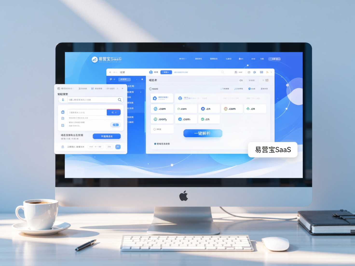
 Domain Name ServicesEasyWin provides professional domain name services, including intelligent queries, one-stop registration, brand protection, and full lifecycle management, helping businesses build a digital brand image.
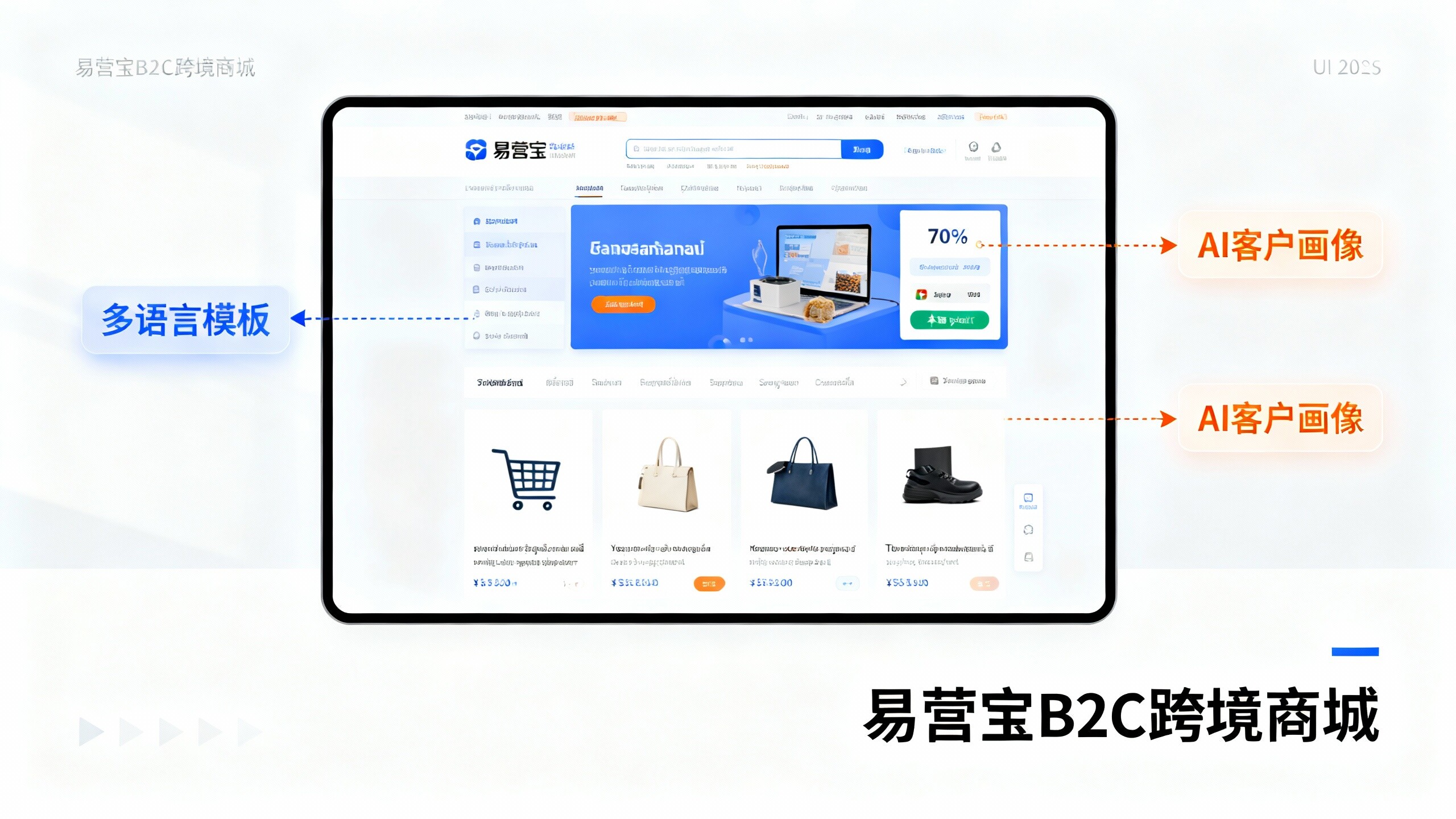
 EasyOperate B2C Cross-Border E-Commerce Platform & Independent WebsiteEasyStore B2C Cross-border E-commerce Independent Store is an intelligent website building and cross-border e-commerce integrated solution independently developed by EasyStore Information Technology (Beijing) Co., Ltd. The system is specially designed for small and medium-sized as well as large export enterprises, integrating 'website building, operation, marketing, advertising, and conversion' into one, helping enterprises quickly establish cross-border e-commerce independent stores to achieve brand globalization and global sales growth.
The platform supports multiple languages, multiple currencies, and multi-channel marketing, with built-in AI intelligent translation and SEO optimization systems, suitable for mainstream markets such as Southeast Asia, Europe and America, Latin America, and the Middle East, assisting Chinese manufacturing enterprises in efficiently deploying international e-commerce strategies. SSL证书易营宝提供专业SSL安全证书服务,包括单域名和泛域名证书,确保网站数据传输加密、身份验证和完整性保护,助力企业建立安全可信的在线业务环境。