









- Which customer acquisition channels will be affected by cross-border marketing trends in 2026?Sep 06, 2026View details
- Which homogenization risks should be considered in an analysis of the AI-powered website building industry?Aug 30, 2026View details
- How Will AI Marketing Trends 2026 Change Advertising Budget AllocationAug 28, 2026View details
- Is the EV SSL certificate market shrinking or upgrading? How should companies assess certificate procurement?Aug 11, 2026View details
- Why the old AMP SEO 2020 practices no longer work and what has changed in current optimization prioritiesAug 02, 2026View details
- How to Choose Topics for an Industry News Section to Attract More Organic Search TrafficJul 29, 2026View details
How Can a Responsive Website Design Solution Balance Mobile Conversion?
How Can a Responsive Website Development Solution Balance Mobile Conversion?
Mobile traffic is no longer a “supplementary channel”; it is the primary access point for many corporate websites and marketing websites. This also makes the question more specific: why do some responsive websites look normal on mobile but generate almost no inquiries, while others have relatively simple pages yet achieve significantly better mobile conversion? The difference often does not lie in whether the website can adapt to different screens, but in whether the responsive website development solution is truly designed around mobile browsing habits.
For corporate decision-makers, this cannot simply be left to the front-end team to handle visual adaptation. Mobile conversion involves loading speed, above-the-fold information, button placement, form length, page navigation, and content hierarchy. It also involves whether subsequent SEO, advertising landing pages, and multilingual pages can work together. If a website is merely “viewable after being scaled down,” it is usually difficult to capture genuine business opportunities from mobile traffic.
Poor Mobile Conversion Is Often a Pathway Problem Rather Than a Design Problem
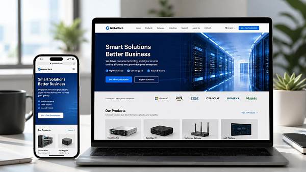
A common misconception among companies is to understand responsive websites as “PC pages that automatically become narrower.” This approach may be fine for display, but it creates several typical conversion bottlenecks: the above-the-fold information is too scattered, so users do not know what you do; CTA buttons are buried too deeply, so users have to scroll through several screens before finding them; there are too many form fields, making input too costly on mobile; and product categories are too complex, making it difficult for users to find the content they want.
Mobile visitors have less patience and more fragmented attention. Many B2B inquiries do not occur after users have “finished reading” a page. Instead, they happen immediately after users confirm three questions: Do you provide the business I need? Can you quickly understand my requirements? Will it be too troublesome to contact you now? A responsive website development solution should not only adapt the layout; it should also shorten the path to completing these three confirmations as much as possible.
These Details Usually Have the Greatest Impact on Mobile Conversion
The first is the above-the-fold section. Mobile screens are limited, so this section must answer “Who are you, what do you do, and who is it suitable for?” first. For international trade companies, manufacturing factories, or cross-border brands, the above-the-fold copy should not be overloaded with adjectives. Instead, it should directly explain the business scope and core strengths, such as the industry, application scenarios, service regions, and delivery capabilities. The buttons below the above-the-fold section should not be too numerous. Two or fewer are usually clearer: one guiding users to make an inquiry and the other guiding them to view cases or products.
The second is page loading. Mobile conversion is highly related to speed, but optimization cannot focus only on “compressing images.” Genuine optimization usually involves image formats, script size, the number of third-party plugins, the loading order of above-the-fold resources, and whether complex animations are placed in areas that do not affect conversion. Overseas visitors in particular face greater differences in network conditions. The heavier the page, the more obvious the disconnections and bounce rates.
The third is the form. Many companies want to collect more information, so they put the company name, job title, phone number, country, and requirement description into the form all at once. This may be acceptable on a PC, but it can significantly reduce conversion on mobile. A more reliable approach is to split the form into “submit an initial inquiry first, then provide additional details,” or move complex information to the subsequent communication stage. This is especially true for advertising landing pages, where mobile users are often willing to spend only a very short time completing the first action.
A Responsive Website Development Solution Should Serve Conversion Before Appearance
During design reviews, many projects tend to prioritize “looking consistent.” In actual business, however, consistency is not the most important factor; the ability to convert prospects into customers is. A mature responsive website development solution usually rearranges content priorities for different devices instead of simply scaling everything proportionally.
For example, a PC can accommodate more complete brand storytelling, product portfolios, and technical descriptions, while mobile is better suited to highlighting core selling points, popular products, quick contact options, and trust credentials. For B2B websites, mobile users are often more concerned with whether they can quickly determine if a company is reliable. Therefore, content such as certificates, factory capabilities, application scenarios, delivery capabilities, and service regions should be presented through shorter paths rather than hidden in multi-level menus.
If the website also supports SEO and advertising, this priority becomes even more important. Users arriving through search may be looking for a specific product, while users arriving through advertising may only want to see one clear promise. Neither type of traffic is well suited to complex navigation. In other words, responsive design does not mean making all pages look the same; it means enabling different traffic sources to find different conversion paths within the same framework.
Integrated Website and Marketing Services Address the Question of “Who Will Drive Conversion After the Website Is Built?”
If website development is carried out without marketing, the website often remains merely “usable.” What truly determines the quality of mobile conversion is often whether website development and subsequent marketing follow the same logic. Search traffic, advertising traffic, social media traffic, and AI search traffic do not have exactly the same requirements for pages: SEO pages place greater emphasis on content structure and indexability, advertising landing pages focus more on single-point conversion, and social media landing pages prioritize lightweight design and quick decision-making.
This is why integrated website and marketing services are better suited to corporate decision-making scenarios. Yiyingbao Information Technology (Beijing) Co., Ltd. was founded in 2013 and is headquartered in Beijing. It has long focused on the coordination of intelligent website development, SEO optimization, social media marketing, and advertising, rather than delivering websites as a standalone service. For international trade companies, manufacturing factories, cross-border e-commerce sellers, and brands expanding overseas, the value of this integrated solution does not lie in having “more functions,” but in allowing the page structure, content strategy, and promotion pathways to be aligned in advance, thereby reducing subsequent rework.
Especially when using AI website development, multilingual websites, B2B international trade marketing websites, or cross-border e-commerce platforms, mobile is not merely a display terminal; it is itself a customer acquisition entry point. An independent website must take into account Google SEO, advertising landing pages, overseas social media redirects, and AI search visibility at the same time. Therefore, its page structure cannot be designed solely from the perspective of a “corporate website.” A more practical approach is to continuously adjust content modules, inquiry entry points, language switching, product pages, and conversion components within the same operational framework.
These Factors Can Help Determine Whether a Solution Is Reliable
If these elements merely “exist” without being designed in line with business objectives, a responsive website often remains limited to the presentation layer. For companies, the evaluation standard should not be whether the page looks attractive, but whether mobile visitors can take effective action more quickly after accessing it.
Do Not Overlook Differences in Overseas Scenarios
If the website targets markets such as North America, Europe, Southeast Asia, Japan and South Korea, the Middle East, Russian-speaking regions, Latin America, or Africa, it is also necessary to consider differences in language, network conditions, and usage habits. Users in some regions are more accustomed to clicking the contact button directly, while users in others first review cases and certifications. Some markets are more sensitive to page loading, while others have higher requirements for language switching and localized expression. These differences are not suitable for handling with a single template.
Based on delivery experience, the more a responsive website development solution needs to balance mobile conversion, the less it should focus on “adapting to screen sizes” and the more it should focus on “adapting to decision-making paths.” How long users are willing to proceed on mobile, how much information they are willing to read, and what contact details they are willing to leave should all be considered before website development begins. Otherwise, adding conversion components after the website goes live is usually a relatively passive approach.
For companies planning an independent website or marketing-oriented corporate website, a more reliable approach is to first clarify the following: Is the website primarily intended to receive search traffic, advertising traffic, or social media traffic? Is the primary goal inquiries, orders, or accumulating brand leads? What action do mobile users most want to complete? Once these questions are clearly defined, decisions about page structure, form length, content priorities, and technical architecture will be much smoother to execute.
If a responsive website development solution only solves the problem of “looking normal,” its value is limited. If it also designs the mobile conversion path, the website becomes more than a presentation tool—it becomes a customer acquisition entry point capable of continuously capturing traffic. For corporate decision-makers, the difference is often not determined by the budget, but by whether the starting point of the solution is sufficiently close to the realities of the business.
Related Articles


Related Products
 Yiyingbao SaaS Intelligent Website Building and Marketing SystemYiyingbao SaaS Intelligent Website Building and Marketing System, AI-powered no-code website building, rapid creation of multilingual B2B international websites in 10 minutes, global server acceleration, AI-powered SEO optimization, helping businesses connect efficiently with global markets. The perfect integration of technology and operation makes building an international trade website remarkably simple
 AI+SEM Intelligent Advertising Marketing SystemAI+SEM drives intelligent ad creation, empowering full-funnel precision advertising marketing. The system automatically generates weekly/monthly reports, AI recommends keywords and target countries, monitors core metrics in real-time with intelligent alerts, and enables one-click high-conversion ad solutions to help quickly acquire customers and improve ROI.
 AI+SEO Dual-Engine System Optimization ServicesYiyingbao’s AI+SEO dual-engine optimization system helps foreign trade enterprises acquire high-quality organic traffic through AI-powered keyword research, content generation, and comprehensive technical optimization, significantly improving search rankings and conversion rates.
 AI+SNS Social Media Marketing SystemYingbao AI+SNS Social Media Marketing System - Precision social capture for the social media era. Supports one-click content synchronization across major platforms like Facebook and LinkedIn. AI intelligently rewrites posts for enhanced relevance. 24/7 AI customer service and user profiling analysis empower businesses to efficiently expand into global markets.
 AI+SEO营销解决方案易营宝AI+SEO营销解决方案,通过AI批量写作、智能生成TDK、精准关键词扩词等功能,全面优化网站SEO效果,提升流量与转化率。助力企业构建高效智能网站新生态。
 AI+SEM Advertising Marketing SolutionsAI+SEM Advertising Marketing Solution leverages AI technology to deeply empower SEM ad campaigns. It automatically generates weekly/monthly reports using AI, presenting account data across multiple dimensions for comprehensive insights into campaign performance and trends. The system precisely recommends keywords and target countries, intelligently generates high-conversion ad copy, and enables one-click activation of efficient campaign plans to help businesses rapidly acquire customers. Simultaneously, it monitors core metrics in real time, intelligently identifies abnormal fluctuations, and issues timely alerts to ensure stable, high-return advertising results.
 Domain Name ServicesEasyWin provides professional domain name services, including intelligent queries, one-stop registration, brand protection, and full lifecycle management, helping businesses build a digital brand image.
 EasyOperate B2C Cross-Border E-Commerce Platform & Independent WebsiteEasyStore B2C Cross-border E-commerce Independent Store is an intelligent website building and cross-border e-commerce integrated solution independently developed by EasyStore Information Technology (Beijing) Co., Ltd. The system is specially designed for small and medium-sized as well as large export enterprises, integrating 'website building, operation, marketing, advertising, and conversion' into one, helping enterprises quickly establish cross-border e-commerce independent stores to achieve brand globalization and global sales growth.
The platform supports multiple languages, multiple currencies, and multi-channel marketing, with built-in AI intelligent translation and SEO optimization systems, suitable for mainstream markets such as Southeast Asia, Europe and America, Latin America, and the Middle East, assisting Chinese manufacturing enterprises in efficiently deploying international e-commerce strategies. SSL证书易营宝提供专业SSL安全证书服务,包括单域名和泛域名证书,确保网站数据传输加密、身份验证和完整性保护,助力企业建立安全可信的在线业务环境。









