








- Fujian Announces the First Batch of Provincial-Level Cross-Border E-Commerce Industrial Parks and Key Brands for CultivationNov 14, 2026View details
- Amazon Global Store Announces the Launch of the 2026 Black Friday Global Shopping SeasonNov 14, 2026View details
- CCTV.com Examines APEC’s Role in China’s Foreign TradeNov 12, 2026View details
- China’s Tariff Commission of the State Council Adjusts Additional Tariffs on U.S. Goods: 24% Tariff Suspended for Two MonthsNov 10, 2026View details
- APEC Shenzhen Spotlight: Cross-Border E-Commerce Orders Promote Asia-Pacific Trade and Economic CooperationNov 08, 2026View details
- China-Europe Railway Express and CIIE Hold Business Matchmaking Event, Focusing on Cross-Border E-commerce B2B ExportsNov 07, 2026View details
How a conversion optimization landing page works without more traffic
The advertising budget has not increased, and organic traffic has not changed significantly, yet form submissions, quote inquiries, or order rates are declining—such issues often lie not at the traffic end, but in the decision-making process after visitors enter the page. The core of landing page conversion optimization is not making the page more complex, but reducing the friction visitors encounter when understanding the product, building trust, and taking action.
Here is the initial assessment: when traffic is relatively stable but target actions are limited, or when visitors from different sources leave after staying on the first screen, prioritize checking the landing page's message match, action path, and form friction rather than immediately increasing ad spend. Even without more traffic, existing visitors can first be made more likely to complete the next step.
First confirm: is the page stuck because visitors “do not understand” or “do not want to leave their information”?
Do not focus only on the overall conversion rate during analysis. A decline in landing page conversions may occur at entirely different stages: visitors do not continue reading, they finish reading but do not click a button, or they click a button but abandon the form. Each requires a different approach. Breaking down the issue by page behavior is usually more effective than directly changing the copy.
One easily overlooked point is that a page will not convert simply by placing complete company information on it. First-time visitors usually make a quick judgment based on only three things: whether this is relevant to their needs, whether the other party is credible, and how much it will cost them to act now. Any content that does not help with these three judgments may slow down the page.
Start with the promise in the campaign, not with page beautification
A common landing page mismatch occurs when an ad or search snippet says “Get a customized solution,” “View product pricing,” or “Solve a specific pain point,” but users first see a long brand introduction, broad slogans, or product categories unrelated to the entry point after clicking through. Visitors do have a need; they simply have to search for the entry point again, so they leave.
First list the sentence users see before entering the page, then let the first screen respond to it directly. For example, if the entry point emphasizes “Get a sample solution,” the first screen should clearly explain what type of sample support is available, which needs it applies to, and what information needs to be submitted. If the entry point highlights a particular service capability, users should not have to scroll through several screens before seeing the relevant content.
The first screen usually only needs to perform one task: let target visitors confirm, “I have come to the right place.” It can consist of a clear headline, a brief supporting description, one relevant visual element, and a primary action button. Avoid generic headlines such as “Quality Service” or “Professional Manufacturing”; instead, describe the target audience, capability, and scope of results. Buttons should not all say “Submit Now” either. Expressions that better match the action, such as “Get Selection Advice,” “View the Cooperation Process,” or “Schedule a Product Consultation,” can reduce psychological pressure.
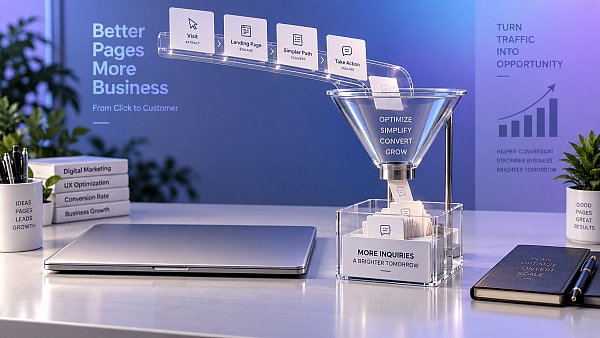
Reorder information according to the visitor's decision-making sequence
The issue with many pages is not insufficient content, but reversed order. Content considered important internally—such as company history, number of equipment units, and office environment—is often placed first, while the specifications, application scenarios, delivery methods, differentiators, and contact options visitors actually want to confirm first are pushed to the back.
A smoother page path can follow the rhythm of “need confirmation—solution understanding—trust reinforcement—action.” First clarify what problem the product or service can help solve, then use modules to explain features, processes, or options, followed by details that support decision-making, and finally guide visitors to contact you. B2B pages are particularly suited to clearly specifying the customization scope, communication steps, and information requirements, avoiding visitors' concerns that “I do not know what will happen after submission.”
For fragrance and lifestyle companies, for example, visitors typically care about both visual tone and whether product presentation, OEM processes, and manufacturing standards are clear. In this case, page solutions such as fragrance, personal care, beauty can use a first screen with ample whitespace to convey brand quality, then transition smoothly to a grid-based product matrix. Packaging details and process information help establish perception, a horizontal timeline explains the OEM customization process, and data dashboards or advantage comparison cards supplement manufacturing scale and quality standards. This arrangement is not intended to stack visual effects, but to enable buyers and partners to make decisions at a lower cost.
Reduce action buttons that compete with one another on the same page
When conversion rates are low, pages often display multiple equally prominent buttons at once, such as “Consult Now,” “Download Brochure,” “View Products,” “Get a Quote,” and “Follow Us on Social Media.” More choices may seem beneficial, but they actually scatter attention. A landing page should first determine its primary conversion goal: generating inquiries, booking a demo, downloading materials, or making a direct purchase. Keep the primary button consistent, and reduce other actions to text links or secondary entry points.
The primary button does not necessarily need to appear only once, but every appearance should have a valid reason. The first screen is suitable for visitors already prepared to act; after introducing key advantages, it can serve those who have understood the solution; and before the form, it should clarify once again what visitors will receive after submitting. A brief explanation can be added near the button, such as “Used to confirm your requirements after submission” or “You can obtain materials first and then decide whether to communicate.” Do not use exaggerated countdowns or urgency prompts unrelated to reality to force clicks.
Keep form fields based on what is necessary for the first communication
Forms are the most common point of visitor drop-off. To facilitate subsequent lead assignment, operators sometimes require users to fill in company name, job title, purchase volume, budget, region, product preferences, phone number, email address, and other information all at once. For first-time visitors, this is equivalent to asking for too much commitment before trust has been established.
- First retain the fields needed to make contact and conduct an initial assessment, such as name, contact information, and requirement description.
- Information such as product model, budget, and purchasing cycle can be made optional or confirmed during subsequent communication.
- Field labels should be clear. Do not simply write “Notes”; you can prompt users with “Please describe the required product category or intended use.”
- Explain how the information will be used below the submit button to prevent visitors from worrying about frequent marketing outreach.
- For mobile devices, ensure input fields, dropdown options, and verification codes are not too small or require too many operational redirects.
Do not mistake a visual upgrade for conversion optimization
Visual quality affects trust, but a high-converting page is not simply one with larger images, more animations, or extremely compressed text. Especially for categories that emphasize aesthetics and product details, immersive large images can indeed create a first impression, but images must serve understanding: they should showcase packaging texture, usage scenarios, formulation concepts, or process differences, rather than occupying the first screen without explaining the product's value.
A simple standard can be used during review: after muting the page and removing dynamic effects, can visitors understand within a few seconds what the page offers, who it is suitable for, and how to get in touch next? If the answer is no, prioritize supplementing the information hierarchy rather than continuing to add decorative elements. Fully responsive layouts must also be checked in practice, not merely by scaling the page width; mobile versions should avoid horizontal scrolling, floating buttons blocking content, and truncated text on product cards.
Use small-scale validation instead of a one-time redesign
Landing page conversion optimization is not a one-time task of making changes and waiting for results. A more reliable approach is to adjust only one key hypothesis at a time. For example, first replace the first-screen headline and observe continued browsing after the first screen and primary button clicks; then simplify the form and observe the submission rate after opening it; only then consider adjusting the module order of a long page. If the headline, images, price presentation, buttons, and form are all changed at once, it is difficult to determine which factor actually produced the result, even if results change.
Before each round of adjustments, record the baseline status of the original page: primary traffic sources, device distribution, target events, and clicks and exits at key page nodes. The observation period should cover normal business cycles, avoiding conclusions based only on short-term fluctuations. If advertising traffic, search traffic, and social media traffic enter the same page, their performance should also be reviewed separately; visitors from different sources have different expectations, and when necessary, page versions with entry messages that better match each source should be created.
Once the first-screen promise is clear, the information sequence aligns with the decision-making process, the primary action is sufficiently focused, and form friction is controlled, existing traffic is more likely to be effectively received. Repairing drop-off within the page before discussing traffic expansion usually makes subsequent promotion efforts easier to assess and avoids continuing to send budget to a page that is not yet ready to convert.
Related Articles
 How Can Responsive Website Development Prevent Mobile Layout Issues?
 How can a responsive corporate website adapt to mobile screens?
 How Does Website Loading Speed Affect Conversion Rates?
Related Products
 Yiyingbao SaaS Intelligent Website Building and Marketing SystemYiyingbao SaaS Intelligent Website Building and Marketing System, AI-powered no-code website building, rapid creation of multilingual B2B international websites in 10 minutes, global server acceleration, AI-powered SEO optimization, helping businesses connect efficiently with global markets. The perfect integration of technology and operation makes building an international trade website remarkably simple
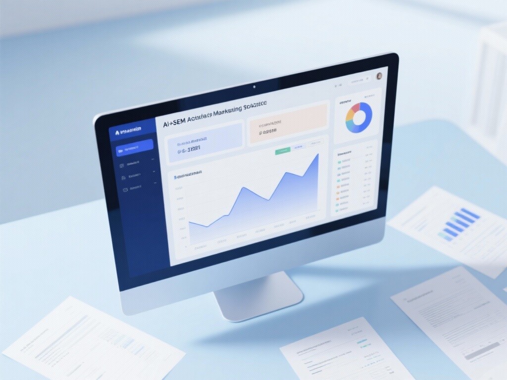
 AI+SEM Intelligent Advertising Marketing SystemAI+SEM drives intelligent ad creation, empowering full-funnel precision advertising marketing. The system automatically generates weekly/monthly reports, AI recommends keywords and target countries, monitors core metrics in real-time with intelligent alerts, and enables one-click high-conversion ad solutions to help quickly acquire customers and improve ROI.
 AI+SEO Dual-Engine System Optimization ServicesYiyingbao’s AI+SEO dual-engine optimization system helps foreign trade enterprises acquire high-quality organic traffic through AI-powered keyword research, content generation, and comprehensive technical optimization, significantly improving search rankings and conversion rates.
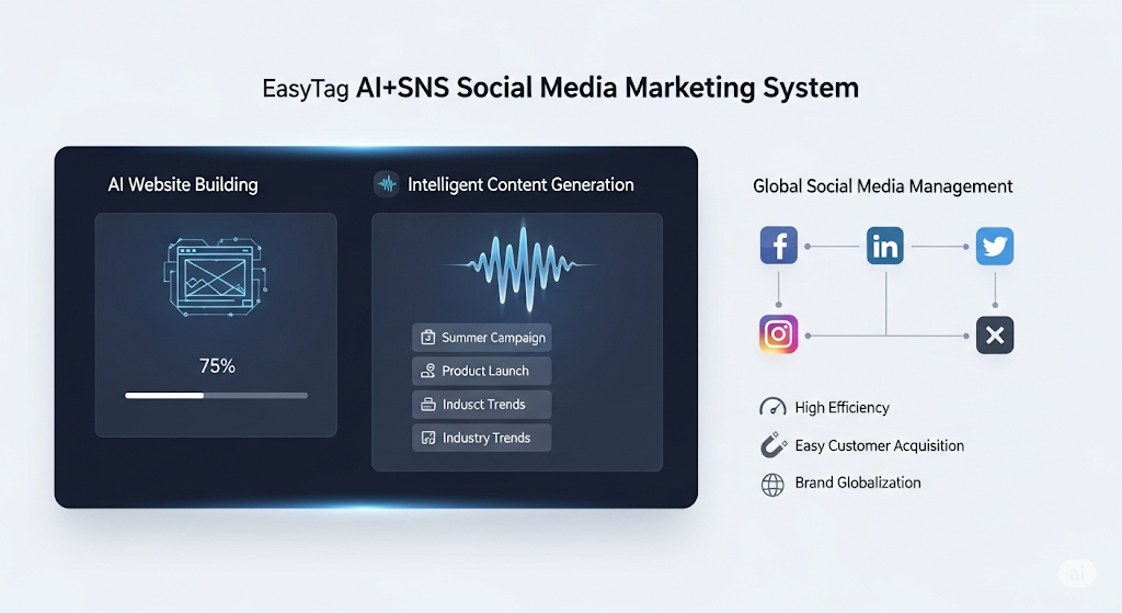
 AI+SNS Social Media Marketing SystemYingbao AI+SNS Social Media Marketing System - Precision social capture for the social media era. Supports one-click content synchronization across major platforms like Facebook and LinkedIn. AI intelligently rewrites posts for enhanced relevance. 24/7 AI customer service and user profiling analysis empower businesses to efficiently expand into global markets.
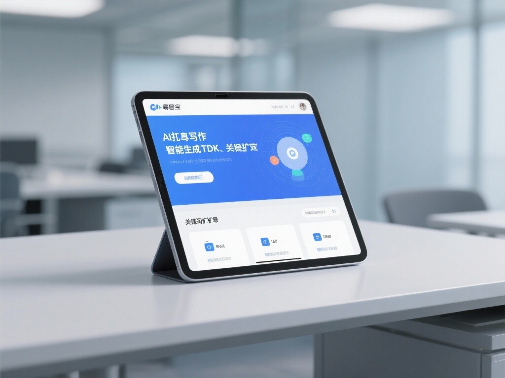
 AI+SEO营销解决方案易营宝AI+SEO营销解决方案,通过AI批量写作、智能生成TDK、精准关键词扩词等功能,全面优化网站SEO效果,提升流量与转化率。助力企业构建高效智能网站新生态。
 AI+SEM Advertising Marketing SolutionsAI+SEM Advertising Marketing Solution leverages AI technology to deeply empower SEM ad campaigns. It automatically generates weekly/monthly reports using AI, presenting account data across multiple dimensions for comprehensive insights into campaign performance and trends. The system precisely recommends keywords and target countries, intelligently generates high-conversion ad copy, and enables one-click activation of efficient campaign plans to help businesses rapidly acquire customers. Simultaneously, it monitors core metrics in real time, intelligently identifies abnormal fluctuations, and issues timely alerts to ensure stable, high-return advertising results.
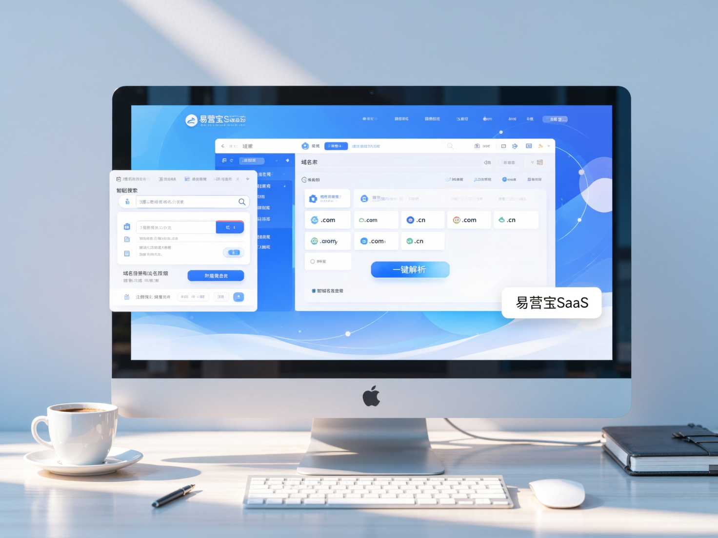
 Domain Name ServicesEasyWin provides professional domain name services, including intelligent queries, one-stop registration, brand protection, and full lifecycle management, helping businesses build a digital brand image.
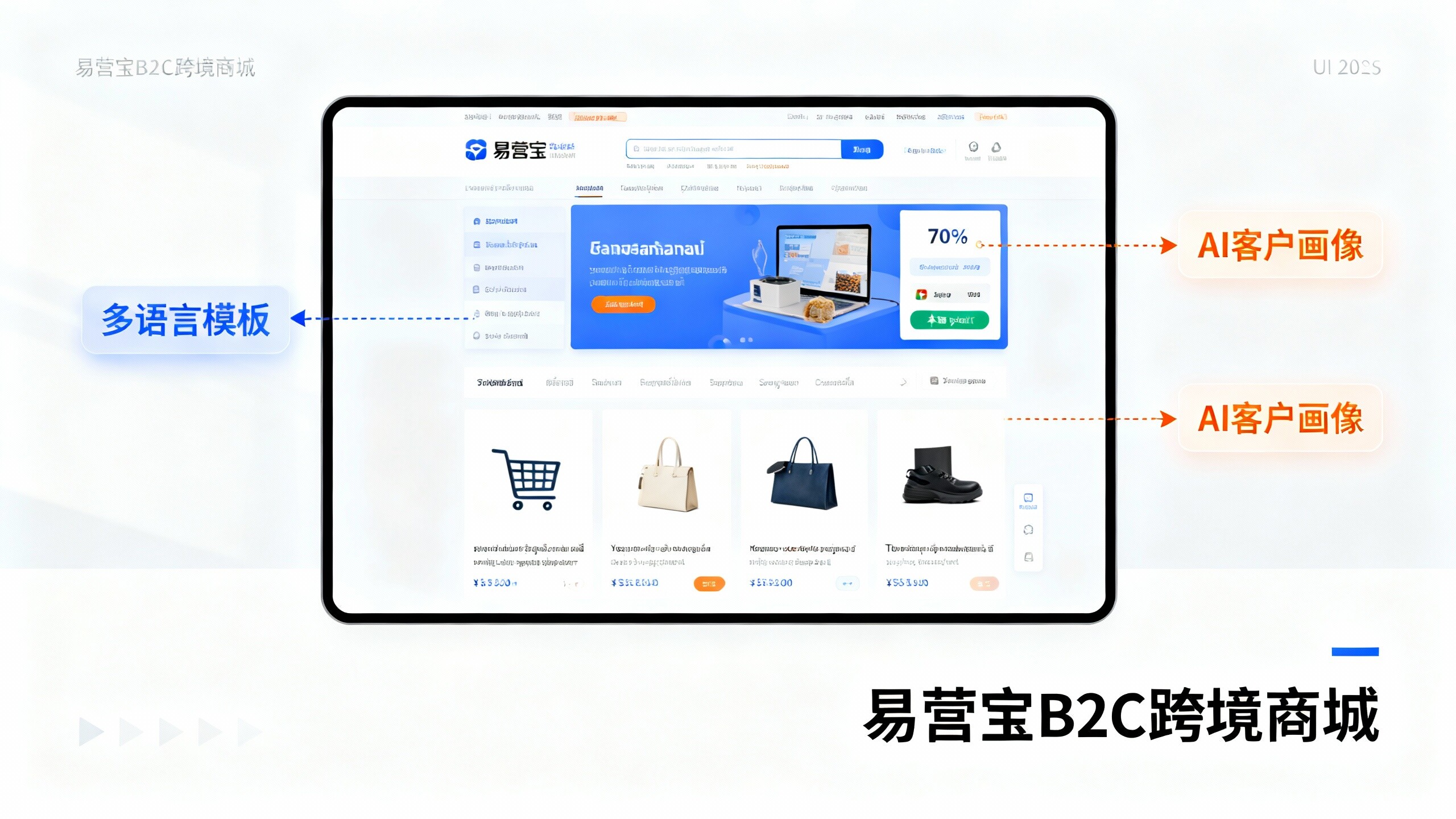
 EasyOperate B2C Cross-Border E-Commerce Platform & Independent WebsiteEasyStore B2C Cross-border E-commerce Independent Store is an intelligent website building and cross-border e-commerce integrated solution independently developed by EasyStore Information Technology (Beijing) Co., Ltd. The system is specially designed for small and medium-sized as well as large export enterprises, integrating 'website building, operation, marketing, advertising, and conversion' into one, helping enterprises quickly establish cross-border e-commerce independent stores to achieve brand globalization and global sales growth.
The platform supports multiple languages, multiple currencies, and multi-channel marketing, with built-in AI intelligent translation and SEO optimization systems, suitable for mainstream markets such as Southeast Asia, Europe and America, Latin America, and the Middle East, assisting Chinese manufacturing enterprises in efficiently deploying international e-commerce strategies. SSL证书易营宝提供专业SSL安全证书服务,包括单域名和泛域名证书,确保网站数据传输加密、身份验证和完整性保护,助力企业建立安全可信的在线业务环境。