









- Can the average annual growth rate reflect real opportunities in overseas markets?Oct 07, 2026View details
- Which customer acquisition channels will be affected by cross-border marketing trends in 2026?Sep 06, 2026View details
- Which homogenization risks should be considered in an analysis of the AI-powered website building industry?Aug 30, 2026View details
- How Will AI Marketing Trends 2026 Change Advertising Budget AllocationAug 28, 2026View details
- Is the EV SSL certificate market shrinking or upgrading? How should companies assess certificate procurement?Aug 11, 2026View details
- Why the old AMP SEO 2020 practices no longer work and what has changed in current optimization prioritiesAug 02, 2026View details
When reviewing website design examples, should you focus on visuals or the conversion path?
When reviewing website design examples, project managers often face the same dilemma: one website looks polished, with an impressive hero image, animations, and brand colors; another is more restrained visually, but presents its products, applications, and inquiry options with great clarity. Which one should you choose?
The answer is not that “visual design doesn’t matter,” but that it should be given its proper role: visual design builds trust and conveys brand character, while the conversion path reduces the effort required to understand the offer and encourages visitors to take the next step. For businesses seeking inquiries from overseas markets, showcasing engineering capabilities, or handling cross-border orders, website design examples should be judged not only by whether they “look like a major brand,” but also by whether visitors can find the information they need within a limited time and become qualified leads that the team can follow up with.
Start with the visitor’s goal, not the impact of the homepage
When project managers evaluate website development providers, they often need to balance the owner’s expectations for brand image, the sales team’s goals for lead volume, and the technical team’s concerns about content maintenance and system stability. Judging website design examples on aesthetics alone can lead to a site that is “impressive at launch but neglected once it is in operation.”
A case worth considering should first answer these questions: Who is the website designed to serve? Is it a purchasing manager looking for a supplier, a distributor seeking a partnership, or an end consumer placing an order? Each goal calls for a different page structure.
- B2B manufacturing and engineering services websites typically focus on demonstrating capabilities, product specifications, industry applications, delivery processes, certifications, and inquiry handling;
- Cross-border brand websites need to emphasize product benefits, customer reviews, payment and shipping information, and the purchasing process;
- Advertising landing pages place greater emphasis on focused messaging, low-friction forms, and conversion event tracking;
- Multilingual corporate websites should be assessed not only for translation accuracy, but also for whether their content, contact details, and calls to action are tailored to each market.
If a case shows only visual designs but cannot explain what visitors see, click, or submit after arriving from search, it is closer to a portfolio piece than a website solution designed to generate leads.
Evaluate website design examples by following the customer decision journey
Rather than quickly flipping through a few homepage screenshots, put yourself in the shoes of a real customer. Suppose an overseas buyer lands on a product page through a Google search. They will typically want to confirm, in order, whether the company meets their needs, whether the product is suitable, whether there is credible evidence to support the claims, and how to get in touch or request a quote.
A good conversion path does not mean filling every page with “Contact us now” prompts. It is more like a route laid out in advance: visitors first understand the value, then build trust, and finally receive low-barrier options to take action at the right point, such as downloading a catalog, viewing specifications, submitting project requirements, booking a meeting, or starting a WhatsApp conversation.
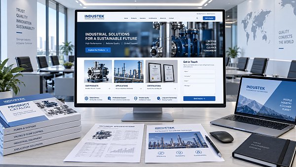
When evaluating a website, pay particular attention to how these pages connect:
- Does the landing page match the search intent? Someone searching for a specific piece of equipment, material, or solution should quickly find the relevant products and applications, rather than being directed first to a generic corporate overview.
- Can the product page handle the initial sales conversation? Model numbers, key specifications, suitable applications, customization options, FAQs, and related products often do more to generate B2B inquiries than polished brand copy.
- Does trust-building information appear naturally? Information about factory capabilities, project experience, testing processes, certifications, and team responsiveness should be provided where visitors are likely to have questions, rather than being confined to the “About Us” page.
- Is it easy to submit an inquiry? Too many form fields, hard-to-find buttons, forms that are difficult to complete on mobile devices, and a lack of clear confirmation after submission can all drive away visitors who are already interested.
What to look for in visual design: not “flash,” but whether it makes information easier to understand
Visual design is not at odds with the conversion path. The right layout, images, and animations can help users make decisions more quickly. The problem is that some website design examples devote too many resources to hero animations, full-screen videos, and complex interactions. The result is slower loading, less prominent key information, and a compromised mobile experience.
Project managers can use four details to judge whether visual design serves the business. First, does the hero section explain within a few seconds what the company offers and which markets it serves? Second, is the information hierarchy clear, so users can easily distinguish products, case studies, support, and contact details? Third, do the images genuinely support the business—for example, by showing product details, production settings, or real-world applications—instead of relying on large numbers of unrelated stock images? Fourth, does the layout work across languages, avoiding broken line breaks and overflowing buttons when text is replaced with English, Arabic, or Russian?
For engineering and industrial companies in particular, a professional, well-organized design is often more convincing than chasing trends. Buyers do not need to be entertained by an over-stylized page; they need to quickly assess a supplier’s capabilities, technical scope, and the risks of working together.
Three signs that an attractive example may not be right for your business
Sign 1: Different industries have different decision-making processes. A consumer brand example may be excellent at creating an emotional response and encouraging impulse purchases, but it may not suit project-based businesses that require multiple rounds of evaluation, technical confirmation, and quote approval. Rather than copying its page layouts, learn from how it organizes information.
Sign 2: The example does not demonstrate content management capabilities. A website’s work does not end at launch. If your company plans to publish products, technical articles, project case studies, and multilingual content on an ongoing basis, consider how easy the back end is to use, whether page modules can be reused, and whether the platform supports basic SEO settings and data tracking.
Sign 3: It discusses design but not traffic sources. Even a well-designed page may require extensive rework later if it does not account for Google SEO indexing, ad landing page performance, social media referrals, and visibility in AI-powered search. Website architecture, URL rules, page speed, structured content, and conversion tracking should ideally be included in the project scope at the design stage.
Turn “visual design” and “conversion” into project acceptance criteria
For project managers, the most practical approach is not to ask the provider for more mockups, but to define acceptance criteria before the project begins: What are the key pages for each target customer type? What action should users take on each page? Can key product pages be optimized independently for SEO? Can traffic from ads, organic search, and social media be distinguished and tracked? After launch, will the internal team be able to update content on its own?
When serving export-oriented businesses, manufacturing facilities, and brands expanding overseas, Easibao typically considers smart website development, multilingual content, SEO/GEO optimization, advertising landing pages, and social media referrals as part of the same growth journey. This does not mean making every website complex. Rather, it means ensuring that design choices support future promotion methods: pages intended to attract long-term organic traffic should have content structures that can be indexed; pages handling ad traffic should organize information around a single objective; and pages targeting different countries should allow room to adapt local messaging and contact details.
Ultimately, a website design example worth shortlisting should stand up to two questions: “Does it make the brand look credible?” and “Does it make it easier for customers to start a conversation?” The first shapes the initial impression; the second creates business opportunities. For project managers, the soundest choice is not to pick either visual design or conversion, but to choose a website solution that makes them work together and can be operated over the long term.
Related Articles
Related Products
 Yiyingbao SaaS Intelligent Website Building and Marketing SystemYiyingbao SaaS Intelligent Website Building and Marketing System, AI-powered no-code website building, rapid creation of multilingual B2B international websites in 10 minutes, global server acceleration, AI-powered SEO optimization, helping businesses connect efficiently with global markets. The perfect integration of technology and operation makes building an international trade website remarkably simple
 AI+SEM Intelligent Advertising Marketing SystemAI+SEM drives intelligent ad creation, empowering full-funnel precision advertising marketing. The system automatically generates weekly/monthly reports, AI recommends keywords and target countries, monitors core metrics in real-time with intelligent alerts, and enables one-click high-conversion ad solutions to help quickly acquire customers and improve ROI.
 AI+SEO Dual-Engine System Optimization ServicesYiyingbao’s AI+SEO dual-engine optimization system helps foreign trade enterprises acquire high-quality organic traffic through AI-powered keyword research, content generation, and comprehensive technical optimization, significantly improving search rankings and conversion rates.
 AI+SNS Social Media Marketing SystemYingbao AI+SNS Social Media Marketing System - Precision social capture for the social media era. Supports one-click content synchronization across major platforms like Facebook and LinkedIn. AI intelligently rewrites posts for enhanced relevance. 24/7 AI customer service and user profiling analysis empower businesses to efficiently expand into global markets.
 AI+SEO营销解决方案易营宝AI+SEO营销解决方案,通过AI批量写作、智能生成TDK、精准关键词扩词等功能,全面优化网站SEO效果,提升流量与转化率。助力企业构建高效智能网站新生态。
 AI+SEM Advertising Marketing SolutionsAI+SEM Advertising Marketing Solution leverages AI technology to deeply empower SEM ad campaigns. It automatically generates weekly/monthly reports using AI, presenting account data across multiple dimensions for comprehensive insights into campaign performance and trends. The system precisely recommends keywords and target countries, intelligently generates high-conversion ad copy, and enables one-click activation of efficient campaign plans to help businesses rapidly acquire customers. Simultaneously, it monitors core metrics in real time, intelligently identifies abnormal fluctuations, and issues timely alerts to ensure stable, high-return advertising results.
 Domain Name ServicesEasyWin provides professional domain name services, including intelligent queries, one-stop registration, brand protection, and full lifecycle management, helping businesses build a digital brand image.
 EasyOperate B2C Cross-Border E-Commerce Platform & Independent WebsiteEasyStore B2C Cross-border E-commerce Independent Store is an intelligent website building and cross-border e-commerce integrated solution independently developed by EasyStore Information Technology (Beijing) Co., Ltd. The system is specially designed for small and medium-sized as well as large export enterprises, integrating 'website building, operation, marketing, advertising, and conversion' into one, helping enterprises quickly establish cross-border e-commerce independent stores to achieve brand globalization and global sales growth.
The platform supports multiple languages, multiple currencies, and multi-channel marketing, with built-in AI intelligent translation and SEO optimization systems, suitable for mainstream markets such as Southeast Asia, Europe and America, Latin America, and the Middle East, assisting Chinese manufacturing enterprises in efficiently deploying international e-commerce strategies. SSL证书易营宝提供专业SSL安全证书服务,包括单域名和泛域名证书,确保网站数据传输加密、身份验证和完整性保护,助力企业建立安全可信的在线业务环境。









