









- Which customer acquisition channels will be affected by cross-border marketing trends in 2026?Sep 06, 2026View details
- Which homogenization risks should be considered in an analysis of the AI-powered website building industry?Aug 30, 2026View details
- How Will AI Marketing Trends 2026 Change Advertising Budget AllocationAug 28, 2026View details
- Is the EV SSL certificate market shrinking or upgrading? How should companies assess certificate procurement?Aug 11, 2026View details
- Why the old AMP SEO 2020 practices no longer work and what has changed in current optimization prioritiesAug 02, 2026View details
- How to Choose Topics for an Industry News Section to Attract More Organic Search TrafficJul 29, 2026View details
Why Isn’t Mobile Ranking Improving Even When Responsive Website SEO Is Done Right?
Why Is Mobile Ranking Still Not Improving When Responsive Website SEO Is Done Correctly?
When working on responsive website SEO, many teams tend to regard “the page can adapt to a mobile screen” as the end of a project phase. The desktop version works well, the site can be opened on mobile, and the menu can be resized, so they assume that search performance should improve accordingly. However, in actual projects, a very typical situation often occurs: rankings remain stable on PC, mobile pages are indexed normally, but rankings simply fail to improve, while click-through rates and time on page remain weak for a long time.
The problem is often not whether the site is responsive, but whether the page is genuinely faster, clearer, easier to click, and more effective at helping users complete their tasks in a mobile search environment. From a technical evaluation perspective, responsive website SEO is not merely a front-end styling issue. It involves coordination among page architecture, resource loading, content organization, tracking, and the conversion journey.
When Mobile Rankings Fail to Improve, Do Not Blame the Keywords Too Quickly
The first reaction of many websites is to continue modifying titles, adding internal links, and supplementing content. However, when mobile rankings stagnate, the keywords themselves may not be the core issue. Search engines evaluate the overall page experience, and mobile access has a much lower tolerance for problems than desktop access. If a page loads slowly above the fold on a phone, has buttons that are difficult to tap, pop-ups that block the screen, or forms that are too long, even highly relevant keywords will struggle to generate sustained positive feedback.
This is particularly true for B2B foreign trade websites. Many decision-makers initially screen suppliers on their phones while commuting, between meetings, or after being redirected from social media. At this stage, they are not conducting an in-depth comparison of specifications. They are first deciding whether “this company seems like a reliable potential partner.” If the first screen cannot quickly establish trust, even if the mobile page gains exposure, it may not retain its ranking.
Therefore, to determine whether responsive website SEO has truly been implemented correctly, it is not enough to check whether the site uses a shared URL or adapts to different screen resolutions. You must also check whether the mobile version meets three basic conditions: sufficiently fast loading, sufficiently focused key information, and sufficiently convenient conversion actions.
A Responsive Layout Does Not Necessarily Mean a Qualified Mobile Experience
Technically, “responsive design” solves layout adaptation, but it does not automatically solve performance issues. Many corporate websites look complete and refined on desktop, but on mobile they are essentially just displaying resources originally prepared for large screens at a smaller size: large images still load, scripts still execute, carousels still make all requests, and third-party tracking tools are still loaded in large numbers. The page may appear to open successfully, but what search engines and users experience is quite different.
Common symptoms include an oversized above-the-fold Banner, redundant font files, multiple marketing plugins loading simultaneously, videos that autoplay, uncompressed images on product detail pages, and language sites sharing a template without trimming modules according to each market. These issues may not be obvious in desktop network environments, but once users access the site through mobile networks or overseas nodes, the latency is magnified.
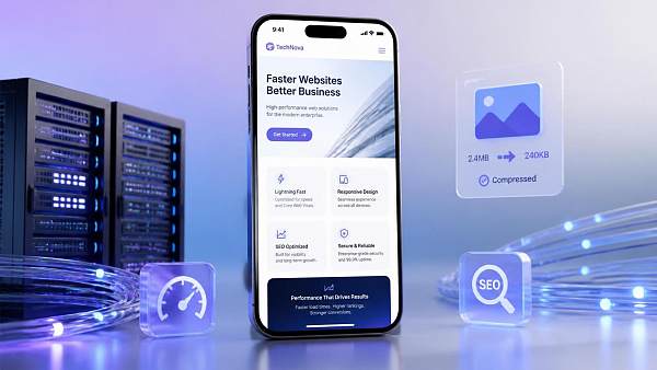
If the website also serves an overseas customer acquisition function, the situation becomes more complex. Network quality varies considerably between regions, and mobile users do not always access the site under ideal network conditions. Teams such as 易营宝, which have long provided integrated website and marketing delivery, typically evaluate website development, acceleration, SEO, tracking, and conversion paths as one system rather than treating “front-end adaptation completed” as the end of the project. This approach is particularly important for mobile rankings because search performance is often the result of both technical and operational factors.
The Differences Often Come Down to These Four Types of Details
First: Speed, Not Just the Testing Score
Mobile speed may seem like a basic requirement, but the problem with many websites is not that they lack optimization. It is that they optimize in the wrong direction. Technical teams may implement caching, compression, and CDN delivery while overlooking whether the most important above-the-fold content is loaded first. For a B2B website, the mobile first screen usually only needs brand identification, core capabilities, and one clear action entry point, rather than every module being loaded at once.
If the business covers multilingual markets, you must also check whether each language version shares high-load resources and whether content is distributed from locations close to each region. For example, some multilingual independent websites have a sound page structure, but once translation scripts, image resources, and analytics tools are combined, the mobile experience declines noticeably. Solutions such as multilingual foreign trade website solutions are suitable for foreign trade companies not only because they enable language switching, but also because they integrate multilingual SEO, localized meta tags, AWS global node acceleration, GA4, and GTM into the same delivery framework, reducing the mobile burden caused by adding functions later.
Second: Structure; A Long Page Does Not Automatically Mean Complete Content
User intent in mobile search is usually more focused. Some users want to view the product range, some want to check certification capabilities, and others only want to know whether customization is supported, how long delivery takes, or whether they can reach a real person. If this information is hidden deep within the page or placed inside numerous horizontal tabs, accordion modules, and carousel components, search engines may be able to crawl it, but users will find it difficult to make an efficient judgment.
During a technical evaluation, several points deserve particular attention: whether the first-screen H tags correspond to the actual topic, whether the mobile navigation has too many levels, whether product page specifications can be displayed directly, whether the FAQ answers purchasing and technical questions rather than simply talking about itself, and whether the contact entry remains accessible at all times. Many websites experience stalled mobile rankings not because they lack content, but because their content is not friendly to mobile reading.
Third: Content; Insufficient Localization Weakens Mobile Relevance
In multilingual projects, responsive website SEO is easily misunderstood as “keep the page structure consistent and complete the translation.” In reality, mobile search relies more heavily on semantic matching and immediate judgment. If the target market’s wording habits, measurement units, industry terminology, or even privacy notices are not localized, the page may be indexed but still struggle to achieve ideal clicks and time on page.
This is also why many companies later move from pure website development to integrated website and marketing services. Since 2013, 易营宝 has provided long-term services for globalized business scenarios. Its core function is not simply to “build a website,” but to place intelligent website development, SEO, social media, advertising, and AI search visibility within the same growth framework. For mobile rankings, if page copy, meta tags, local legal notices, tracking configuration, and inquiry paths are handled by different suppliers, structural gaps often appear in the final result.
Fourth: The Conversion Journey; Even One Extra Step Can Harm Ranking Performance
Search engines do not automatically assume that a page is user-friendly just because it contains a form. Too many mobile form fields, inconvenient attachment uploads, unclear button placement, and unclear WhatsApp or email entries can all obstruct real conversions. B2B websites are especially prone to one mistake: transferring the complete PC inquiry process directly to mobile, resulting in a higher bounce rate.
If the technical team can integrate GA4, event tracking, and step-by-step form analysis, it can usually identify more quickly whether the problem lies in traffic, the first screen, the form, or insufficiently visible contact information. When mobile rankings fail to improve over the long term, the issue is often not that “search is not providing enough traffic,” but that user behavior feedback has consistently been inadequate.
Recommended Troubleshooting Steps for Technical Evaluation
If you are evaluating why a website performs weakly on mobile, start with the following sequence instead of modifying content immediately:
First, check resource loading. Confirm whether above-the-fold images, scripts, fonts, and third-party code are too heavy, and whether modules that are unnecessary on mobile are being forced to load.
Next, review the template logic. Many website problems do not occur on a single page but within the site-wide template: disorganized heading levels, missing breadcrumbs, repetitive product page structures, and imprecise canonical or hreflang configurations across language versions. These issues cannot be solved simply by having an editor revise the copy.
Then review the conversion design for mobile scenarios. Can phone, email, and instant messaging entries be reached directly? Can form fields be reduced? Are attachment uploads compatible with mobile operating systems? Do privacy notices interfere with submission?
Only after that should you supplement the content. Content is important, but you should determine what to add or modify after the technical foundation is stable. For multilingual websites in particular, if content updates cannot be synchronized automatically, subsequent maintenance costs will be high, and inconsistencies between language versions may easily occur. In practice, platforms with AI translation, localization optimization, content synchronization, and multilingual diagnostics capabilities require less maintenance, provided that they can also maintain performance rather than simply accumulating features.
Why Is Integrated Delivery More Effective at Solving These Problems?
Mobile ranking problems often become stuck because “no one is responsible for the entire journey.” The website provider says the page has been delivered, the advertising team only looks at lead costs, the SEO team only monitors rankings, and the content team only handles updates. In the end, everyone has done their part, but the problem is never truly resolved.
This is why integrated website and marketing services have received increasing attention in recent years. For foreign trade companies, manufacturing factories, and brands expanding overseas, website development is not merely a visual project; it is part of a customer acquisition system. The practical value of platform-based service providers such as 易营宝 lies in handling intelligent website development, multilingual websites, SEO, advertising, and AI-driven optimization on a unified foundation, reducing the execution losses caused by repeated communication between teams. When a multilingual website needs synchronized updates, conversion-rate monitoring for each language, and compliance with GDPR-related data requirements, decentralized delivery is more likely to cause problems.
Of course, integrated delivery does not mean that every project is suitable for a standard template. What truly deserves evaluation is whether the provider supports tailoring pages by market, controlling mobile resources, balancing SEO with advertising landing page requirements, and enabling subsequent teams to continue operating the site conveniently. This is closer to the actual outcome than simply comparing website development quotes.
Do Not Confuse “Mobile-Compatible” with “Suitable for Mobile Search”
When responsive website SEO is done correctly but mobile rankings still fail to improve, the problem usually goes beyond front-end adaptation. It may be a speed bottleneck, a page structure that is unfavorable for mobile reading, or multilingual content, localization details, and conversion design that have not kept pace.
If you are conducting a technical evaluation, the most effective approach is not to keep asking whether “the website is responsive,” but to break the issue into several verifiable areas: what exactly is loaded in the mobile first screen, whether users can quickly complete their evaluation, whether versions for different markets are truly localized, and whether conversion behavior is fully tracked. Once these points are clear, you can decide whether to make localized fixes or switch to a system more suitable for long-term operation, leading to a much more reliable decision.
Related Articles



Related Products
 Yiyingbao SaaS Intelligent Website Building and Marketing SystemYiyingbao SaaS Intelligent Website Building and Marketing System, AI-powered no-code website building, rapid creation of multilingual B2B international websites in 10 minutes, global server acceleration, AI-powered SEO optimization, helping businesses connect efficiently with global markets. The perfect integration of technology and operation makes building an international trade website remarkably simple
 AI+SEM Intelligent Advertising Marketing SystemAI+SEM drives intelligent ad creation, empowering full-funnel precision advertising marketing. The system automatically generates weekly/monthly reports, AI recommends keywords and target countries, monitors core metrics in real-time with intelligent alerts, and enables one-click high-conversion ad solutions to help quickly acquire customers and improve ROI.
 AI+SEO Dual-Engine System Optimization ServicesYiyingbao’s AI+SEO dual-engine optimization system helps foreign trade enterprises acquire high-quality organic traffic through AI-powered keyword research, content generation, and comprehensive technical optimization, significantly improving search rankings and conversion rates.
 AI+SNS Social Media Marketing SystemYingbao AI+SNS Social Media Marketing System - Precision social capture for the social media era. Supports one-click content synchronization across major platforms like Facebook and LinkedIn. AI intelligently rewrites posts for enhanced relevance. 24/7 AI customer service and user profiling analysis empower businesses to efficiently expand into global markets.
 AI+SEO营销解决方案易营宝AI+SEO营销解决方案,通过AI批量写作、智能生成TDK、精准关键词扩词等功能,全面优化网站SEO效果,提升流量与转化率。助力企业构建高效智能网站新生态。
 AI+SEM Advertising Marketing SolutionsAI+SEM Advertising Marketing Solution leverages AI technology to deeply empower SEM ad campaigns. It automatically generates weekly/monthly reports using AI, presenting account data across multiple dimensions for comprehensive insights into campaign performance and trends. The system precisely recommends keywords and target countries, intelligently generates high-conversion ad copy, and enables one-click activation of efficient campaign plans to help businesses rapidly acquire customers. Simultaneously, it monitors core metrics in real time, intelligently identifies abnormal fluctuations, and issues timely alerts to ensure stable, high-return advertising results.
 Domain Name ServicesEasyWin provides professional domain name services, including intelligent queries, one-stop registration, brand protection, and full lifecycle management, helping businesses build a digital brand image.
 EasyOperate B2C Cross-Border E-Commerce Platform & Independent WebsiteEasyStore B2C Cross-border E-commerce Independent Store is an intelligent website building and cross-border e-commerce integrated solution independently developed by EasyStore Information Technology (Beijing) Co., Ltd. The system is specially designed for small and medium-sized as well as large export enterprises, integrating 'website building, operation, marketing, advertising, and conversion' into one, helping enterprises quickly establish cross-border e-commerce independent stores to achieve brand globalization and global sales growth.
The platform supports multiple languages, multiple currencies, and multi-channel marketing, with built-in AI intelligent translation and SEO optimization systems, suitable for mainstream markets such as Southeast Asia, Europe and America, Latin America, and the Middle East, assisting Chinese manufacturing enterprises in efficiently deploying international e-commerce strategies. SSL证书易营宝提供专业SSL安全证书服务,包括单域名和泛域名证书,确保网站数据传输加密、身份验证和完整性保护,助力企业建立安全可信的在线业务环境。









