









- Can the average annual growth rate reflect real opportunities in overseas markets?Oct 07, 2026View details
- Which customer acquisition channels will be affected by cross-border marketing trends in 2026?Sep 06, 2026View details
- Which homogenization risks should be considered in an analysis of the AI-powered website building industry?Aug 30, 2026View details
- How Will AI Marketing Trends 2026 Change Advertising Budget AllocationAug 28, 2026View details
- Is the EV SSL certificate market shrinking or upgrading? How should companies assess certificate procurement?Aug 11, 2026View details
- Why the old AMP SEO 2020 practices no longer work and what has changed in current optimization prioritiesAug 02, 2026View details
Which pages should be prioritized when optimizing a corporate website for mobile devices?
When adapting a corporate website for mobile devices, there is no need to tear down and rebuild every page across the entire site from the outset. The factors that truly affect visitor experience and inquiry conversion are usually concentrated on the homepage, core product pages, inquiry pages, and key landing pages that receive traffic from advertising and social media. Get these pages working properly on real mobile phones first, then address long-tail pages such as news and case studies. This will keep the project on a steadier track and make it easier to see whether the redesign is effective.
Many corporate websites appear to have complete layouts on desktop computers, but encounter issues on mobile devices, such as oversized above-the-fold images, hard-to-find menu levels, horizontally overflowing specification tables, and forms that cannot be submitted. Mobile adaptation is not complete simply by “shrinking” the desktop version. It requires reconfirming whether users can quickly understand the business, find products, and complete contact actions.
For mobile adaptation of a corporate website, focus first on four types of high-value pages
When determining priorities, it is advisable to consider not only page traffic, but also how close the page is to a conversion action. A page with low monthly traffic that is responsible for receiving advertising traffic is often more worthwhile to optimize first than an ordinary news page.
Homepage: First check whether users can understand who you are above the fold
The homepage is the entry point to the brand and also the page most likely to lose control on mobile because of “too much content.” A common issue is that all desktop banners, business modules, achievement data, and videos are retained, turning into continuous scrolling on mobile, while users still do not know what products or services the company offers after viewing several screens.
There are three priorities to check on the homepage: whether the core above-the-fold information is fully visible; whether users can reach product or contact pages from the top navigation within two or three steps; and whether the primary call-to-action button is clear and clickable. For manufacturing, foreign trade, and engineering companies, the first screen does not necessarily need complex animations. It should more clearly state product categories, application scenarios, or core capabilities. Button text should also be specific. For example, “Get a Quote,” “View Product Specifications,” and “Submit Purchasing Requirements” reduce the decision-making effort for the next step more effectively than a generic “Learn More.”
Also pay attention to carousels. Multi-slide carousels commonly used on desktop may not be suitable for mobile: text may be cropped, and users may not be willing to wait for automatic transitions. If there is no clear data proving that a carousel generates effective conversions, keeping one above-the-fold image with complete information and controllable loading is usually better for readability and speed.
Product pages: Do not let specification tables and detailed images become obstacles
Product pages are often the most labor-intensive part of mobile adaptation for corporate websites, especially for websites involving equipment, materials, components, and customized solutions. Desktop layouts can accommodate large images, model comparisons, and tables with more than ten columns, but mobile screens cannot naturally display this content.
First confirm that the product name, key selling points, critical specifications, applicable industries, and contact details appear in a logical order on mobile. Specification tables may be retained, but avoid shrinking the entire table until it becomes unreadable. They can be displayed in groups or made horizontally scrollable, with a clear indication that scrolling is available. Images should support zooming, and not all high-resolution original images should be loaded at once. Engineering procurement personnel need to view details, but that does not mean users are willing to wait a long time for them.
Another easily overlooked point is product variants. After switching colors, models, sizes, or language versions, verify one by one whether images, parameters, inventory notifications, and inquiry content are synchronized. A page that looks visually normal does not necessarily submit information correctly.
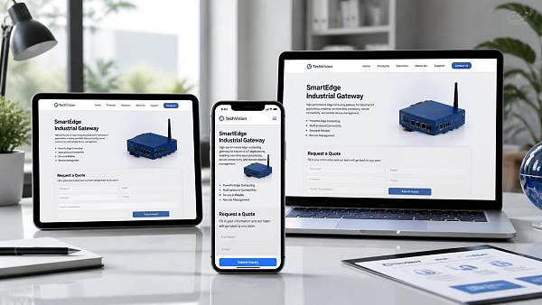
Inquiry pages and forms: Verify not only that they “open,” but that inquiries can be “received”
The most regrettable mobile drop-off scenario is when users are ready to contact you but are blocked by a form. Too many form fields, input boxes that are too small, obstructive verification codes, difficulty selecting country dialing codes, and no feedback after submission can all cause high-intent visitors to abandon the process immediately.
It is recommended to retain only necessary fields such as name, email or phone number, and requirement description. Information needed to assess project value can be added after the initial communication. Phone number, email, and company name fields should invoke suitable mobile input methods to reduce manual keyboard switching. The submit button should be located where it is easy to reach. There should be a clear status prompt after successful submission, and you should confirm that emails, the CRM, or the inquiry management backend can actually receive the content.
If the website serves overseas markets, multilingual forms should not be checked for translation alone. Also confirm whether pages in different languages lead to the corresponding forms, whether country dialing codes can be selected, whether privacy statement links function properly, and whether thank-you pages can be used for advertising conversion tracking. A frontend message showing “Submission Successful” while the backend receives no lead is one of the issues most important to avoid before launch.
Advertising landing pages often need adaptation priority more than ordinary section pages
Users who enter a website through Google Ads, Facebook Ads, short videos, or overseas social media usually do not browse the full navigation first. They arrive at a single page with a specific question, stay briefly, and are more sensitive to loading speed and information relevance.
For these pages, focus on checking whether the products, price ranges, or service commitments in the ad copy are reflected in the first half of the page; whether pop-ups or full-screen customer service tools obscure the main content after arrival; whether images, videos, and third-party scripts slow down the first screen on mobile networks; and whether consultation entry points on the page are always available.
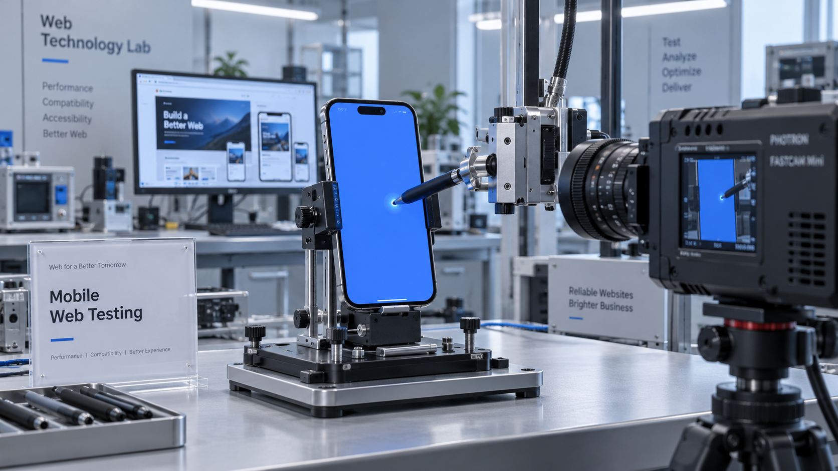
Many teams make advertising landing pages very “rich” by adding autoplay videos, maps, multiple carousels, and several external analytics scripts. The more functions there are, the more essential real-world testing becomes. Test on real devices from different brands, common browsers, and ordinary mobile network conditions, rather than confirming only through responsive previews in desktop browsers. Preview tools are suitable for identifying layout issues, but cannot identify real issues such as keyboard obstruction, accidental touch input, network latency, and third-party component loading failures.
When troubleshooting, do not focus only on page width
Changing a page from a fixed width to a responsive layout solves only the first level of the problem. An actionable acceptance test should follow the user journey: enter from a search result or advertising link, view the first screen, open the menu, enter product details, review key content, fill out the form, and then confirm that the backend receives the lead.
The following issues are common and are also the easiest to miss during visual acceptance testing:
- A fixed bottom consultation bar blocks the form submit button, product specifications, or language switcher.
- Pop-ups are difficult to close on mobile devices, repeatedly appear, and interfere with reading.
- Dropdown menus rely on mouse hover and cannot expand properly on touch-screen devices.
- Attachments such as PDFs, drawings, and certificates load slowly on mobile devices, or users cannot return to the original page after opening them.
- Multilingual pages are adapted only for English, while longer text in German, Russian, and other languages causes misplaced line breaks or button overflow.
- Cookie notices, privacy pop-ups, and online customer service appear at the same time, occupying more than half of the screen.
There is one principle here: do not simply remove key content because “adaptation costs are high.” For complex products, parameters, certification documents, and technical materials remain important. A more appropriate approach is to change how they are presented, for example, by splitting large tables, collapsing lengthy descriptions, converting attachments into clear download entry points, and keeping the primary inquiry entry point visible.
Schedule the redesign according to traffic and business paths to avoid starting the entire site at once
If the website has many pages, it is recommended to first organize recent traffic sources, landing pages, conversion pages, and bounce performance, then classify pages by priority. The first batch usually includes the homepage, the highest-traffic product pages, inquiry pages, and advertising landing pages. The second batch addresses key industry pages, solution pages, and brand case study pages. Pages such as news, event archives, and old announcements can be placed in later batches.
This arrangement does not mean ignoring long-tail content, but rather fixing the exits for existing traffic first. Especially for websites already running ads or conducting search optimization, revising a large number of low-traffic pages without solving form and landing-page issues makes it difficult for investment to translate into visible results.
For companies requiring multilingual capabilities, cross-border online stores, or ongoing promotional campaigns, the website-building platform itself will also affect subsequent maintenance costs. Yiyingbao provides AI-powered website building, multilingual websites, cross-border online stores, SEO, advertising marketing, and other services, making it more suitable for scenarios where companies want to manage website construction, promotional pages, and lead handling within the same operational workflow. When selecting such services, the key is not how long the feature list is, but whether the service supports continuous iteration by market, language, and business page, and whether mobile regression testing can be conveniently completed after changes.
Before launch, use a checklist to reduce risks
Final acceptance should not be completed by development or design alone. Business personnel are more likely to notice that “product information is not clearly communicated,” operations personnel can identify “advertising links do not match,” and technical personnel can check performance, compatibility, and submission workflows. When all three parties follow the same test path, efficiency is usually higher than repeatedly describing issues in group chats.
At a minimum, confirm that key pages do not have horizontal scrolling on common mobile screen sizes; text, buttons, and images do not overlap; navigation, language switching, search, and click-to-call functions are available; core forms can be submitted and leads are traceable; pages do not become completely blank when loading fails; and analytics and conversion events are configured according to actual campaign requirements. For content involving privacy terms, Cookie consent, and data collection, relevant professionals must also verify compliance based on target-market requirements.
FAQ
Should mobile adaptation start with all website pages?
It is not recommended. Complete the homepage, core product pages, inquiry pages, and key landing pages first, then expand gradually according to traffic and business value. Simultaneous site-wide redesign takes a long time and can easily obscure the issues that truly affect conversion.
Does a responsive website still require separate mobile testing?
Yes. Responsiveness only means that the layout can adjust; it does not mean that forms, pop-ups, navigation, attachments, and third-party tools will all work properly on real mobile phones.
Is a simpler mobile page always better?
Not necessarily. Pages for low-value, quick-decision purchases can be simpler; technical and customized products still need to retain key parameters and supporting materials, but they should be organized in a way that is more suitable for mobile reading.
How can you determine whether mobile adaptation of a corporate website has truly improved after a redesign?
In addition to reviewing page loading and layout, compare form completion rates, consultation clicks, phone clicks, and qualified lead quality for core landing pages. Metrics should be evaluated in conjunction with the original measurement criteria, rather than looking only at changes in traffic volume.
Ultimately, the mobile experience of a corporate website is not a one-time design acceptance task, but a business journey from entering a page to submitting requirements. By first focusing on high-value pages, verifying key actions on real devices, and then arranging subsequent optimization based on data, adapting a corporate website for mobile devices can move from “the page has been improved” to “traffic has a smoother path to conversion.”
Related Articles

Related Products
 Yiyingbao SaaS Intelligent Website Building and Marketing SystemYiyingbao SaaS Intelligent Website Building and Marketing System, AI-powered no-code website building, rapid creation of multilingual B2B international websites in 10 minutes, global server acceleration, AI-powered SEO optimization, helping businesses connect efficiently with global markets. The perfect integration of technology and operation makes building an international trade website remarkably simple
 AI+SEM Intelligent Advertising Marketing SystemAI+SEM drives intelligent ad creation, empowering full-funnel precision advertising marketing. The system automatically generates weekly/monthly reports, AI recommends keywords and target countries, monitors core metrics in real-time with intelligent alerts, and enables one-click high-conversion ad solutions to help quickly acquire customers and improve ROI.
 AI+SEO Dual-Engine System Optimization ServicesYiyingbao’s AI+SEO dual-engine optimization system helps foreign trade enterprises acquire high-quality organic traffic through AI-powered keyword research, content generation, and comprehensive technical optimization, significantly improving search rankings and conversion rates.
 AI+SNS Social Media Marketing SystemYingbao AI+SNS Social Media Marketing System - Precision social capture for the social media era. Supports one-click content synchronization across major platforms like Facebook and LinkedIn. AI intelligently rewrites posts for enhanced relevance. 24/7 AI customer service and user profiling analysis empower businesses to efficiently expand into global markets.
 AI+SEO营销解决方案易营宝AI+SEO营销解决方案,通过AI批量写作、智能生成TDK、精准关键词扩词等功能,全面优化网站SEO效果,提升流量与转化率。助力企业构建高效智能网站新生态。
 AI+SEM Advertising Marketing SolutionsAI+SEM Advertising Marketing Solution leverages AI technology to deeply empower SEM ad campaigns. It automatically generates weekly/monthly reports using AI, presenting account data across multiple dimensions for comprehensive insights into campaign performance and trends. The system precisely recommends keywords and target countries, intelligently generates high-conversion ad copy, and enables one-click activation of efficient campaign plans to help businesses rapidly acquire customers. Simultaneously, it monitors core metrics in real time, intelligently identifies abnormal fluctuations, and issues timely alerts to ensure stable, high-return advertising results.
 Domain Name ServicesEasyWin provides professional domain name services, including intelligent queries, one-stop registration, brand protection, and full lifecycle management, helping businesses build a digital brand image.
 EasyOperate B2C Cross-Border E-Commerce Platform & Independent WebsiteEasyStore B2C Cross-border E-commerce Independent Store is an intelligent website building and cross-border e-commerce integrated solution independently developed by EasyStore Information Technology (Beijing) Co., Ltd. The system is specially designed for small and medium-sized as well as large export enterprises, integrating 'website building, operation, marketing, advertising, and conversion' into one, helping enterprises quickly establish cross-border e-commerce independent stores to achieve brand globalization and global sales growth.
The platform supports multiple languages, multiple currencies, and multi-channel marketing, with built-in AI intelligent translation and SEO optimization systems, suitable for mainstream markets such as Southeast Asia, Europe and America, Latin America, and the Middle East, assisting Chinese manufacturing enterprises in efficiently deploying international e-commerce strategies. SSL证书易营宝提供专业SSL安全证书服务,包括单域名和泛域名证书,确保网站数据传输加密、身份验证和完整性保护,助力企业建立安全可信的在线业务环境。









