- What Does a Global Traffic Ecosystem Service Provider Do? What Are the Differences from a Single Advertising AgencyJul 16, 2026View details
- What should you focus on in the latest enterprise SaaS report? From renewal rates and delivery costs to overseas growth opportunitiesJul 12, 2026View details
- What signals are worth paying attention to in a cross-border marketing trend report? B2B companies should look at these 6 signalsJul 11, 2026View details
- How to Read a Cross-Border Marketing Trends Report? Five Key Dimensions for Evaluating Channel OpportunitiesJul 11, 2026View details
- Which channel has the highest ROI in the global traffic ecosystem? Comparative analysis of search, social media, and advertisingJul 10, 2026View details
- What multilingual website services are available in Sanya? Which model is more suitable for local businesses going global?Jul 08, 2026View details
- How to view the complete list of China SaaS companies in the top 100? Practical methods for screening website-building and marketing service providersJul 08, 2026View details
- How to view pricing in the global traffic ecosystem? Cost comparison of search, social media, and content channel advertisingJul 06, 2026View details
Are mobile adaptation and responsive design the same thing?
When revamping a corporate website, many companies ask: Are mobile adaptation and responsive design the same thing? Although they may seem similar, they differ significantly in user experience, development costs, and SEO performance. Choosing the wrong solution may directly affect lead generation and conversion.
For foreign trade companies, manufacturing factories, cross-border sellers, and brands expanding overseas, a corporate website is no longer just a showcase. It is a core platform for handling advertising traffic, search traffic, and social media traffic. If a page cannot load reliably within 3 seconds, or if it has misaligned elements, undersized buttons, difficult-to-complete forms, or similar issues on different screens, the loss of inquiries will often become directly evident within 7 to 30 days.
Therefore, the discussion of whether mobile adaptation and responsive design are the same thing should not remain at the conceptual level. It should also be considered in the context of website development, SEO optimization, advertising landing page conversion, and ongoing maintenance costs. For integrated website and marketing service projects, the technology selection determines not only the page style, but also indexing efficiency, content management methods, and the execution efficiency of subsequent global promotion.
What Is the Core Difference Between Mobile Adaptation and Responsive Design?
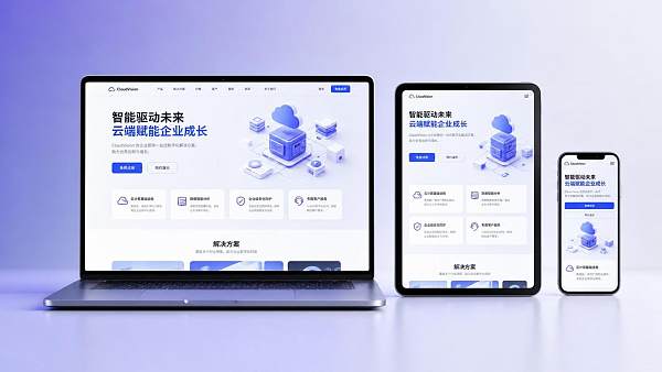
First, the conclusion: mobile adaptation and responsive design are not the same thing. Both can make a website usable on mobile phones, but their implementation logic, page structure, maintenance methods, and SEO performance are different. In simple terms, mobile adaptation is more like “creating a separate set of display rules for mobile phones,” while responsive design means that “the same code automatically adapts to multiple screen sizes.”
What Is Mobile Adaptation?
Mobile adaptation usually refers to separately handling the layout, image sizes, navigation styles, and even independent URLs for mobile devices on the basis of a PC website. There are three common approaches: an independent mobile site, front-end adaptive scripts, and different templates delivered according to device type. Its advantage is that it can quickly solve mobile access issues on existing older websites, making it especially suitable for companies with complex legacy systems that are not convenient to restructure in the short term.
What Is Responsive Design?
Responsive design adjusts the layout based on the same URL, the same HTML structure, and different breakpoint rules. Common breakpoints are set at ranges such as 320px, 768px, 1024px, and 1440px. Through grid systems, flexible images, and media queries, the page can maintain consistent content logic across mobile phones, tablets, laptops, and desktop devices.
The Differences Can Be Evaluated from 4 Dimensions
If a company is preparing to build a multilingual website, a B2B marketing site, or an advertising landing page, it is recommended to evaluate the solution from four dimensions: development cycle, maintenance costs, SEO structure, and conversion path, rather than focusing only on whether “the site can be opened on a phone.” The table below is more suitable for decision-makers to make a quick assessment.
From the perspective of actual operations, if a company updates more than 8 pieces of content per month, or runs Google Ads and social media advertising while continuously conducting SEO, responsive design is usually more efficient in the long term. Mobile adaptation is not unusable, but it is more suitable as a transitional solution for an old website rather than the preferred architecture for a long-term growth-oriented corporate website.
Why Does This Directly Affect SEO and Inquiry Conversion?
Many companies mistakenly believe that as long as a page can be viewed on a mobile phone, it will not affect promotional results. In reality, whether mobile adaptation and responsive design are the same thing ultimately depends on their combined impact on crawling, loading, interaction, and conversion. In overseas lead-generation scenarios, these four factors are often consecutive steps in the same process.
Impact on Search Indexing
If mobile adaptation uses independent URLs, such as an m site or parameterized pages, issues such as improper Canonical settings, confused Hreflang mapping, and duplicate sitemap submissions may easily occur. For multilingual websites, once the number of language versions exceeds 3, management complexity increases significantly. Because responsive design uses unified URLs, it is more conducive to concentrating page authority and continuously indexing content.
Impact on User Experience
The most common points of mobile-user loss are concentrated in five areas: slow above-the-fold loading, deep navigation hierarchies, accidental button taps, overly long forms, and oversized images. For B2B inquiry pages in particular, if the mobile form contains more than 6 fields, the submission rate will usually decline significantly. With proper early planning, responsive design makes it easier to keep above-the-fold content and CTA positions consistent, reducing a fragmented experience.
Impact on Advertising
Advertising landing pages are more sensitive to the mobile experience. In many industries, mobile traffic already accounts for more than 50%, and some B2C cross-border websites even reach over 70%. If an ad click leads to a secondary redirect to a mobile page, or if the content is inconsistent with the PC version, both the bounce rate and cost per conversion will be affected. For advertising teams, a unified page structure is more conducive to A/B testing and data attribution.
Common Risk Checklist
- The titles and descriptions on the PC and mobile versions are inconsistent, affecting how the page appears in search results.
- Images have not been compressed, and above-the-fold resources exceed 2MB, extending loading time.
- Button spacing is less than 8px, increasing the rate of accidental taps on mobile devices.
- Content is missing from multilingual pages on certain devices, affecting inquiry credibility.
- The advertising page and corporate website use two sets of templates, increasing subsequent maintenance costs.
For corporate websites aimed at global lead generation, the technical architecture should not serve only the purpose of “going live.” It should support traffic growth over the subsequent 12 to 24 months. This is also why website development must be considered together with SEO, advertising, and social media lead generation within the same growth framework.
How Should Companies Choose? Consider the Stage, Goals, and Budget
Whether mobile adaptation and responsive design are the same thing has now been clearly answered. The next key question is how a company should choose. Different company sizes, business models, and promotion stages call for different solutions. When making an assessment, it is recommended to first consider three factors: the foundation of the existing website, the future promotion cycle, and the content update frequency.
Situations Suitable for Prioritizing Mobile Adaptation
- The existing corporate website contains a large amount of historical content and is not convenient to restructure in the short term.
- The current primary goal is to fix mobile access issues as quickly as possible within 1—2 months.
- The budget is primarily allocated to advertising, while website technology upgrades are handled as a transitional measure.
Situations Suitable for Directly Implementing Responsive Design
- The company plans to build a new corporate website, brand website, B2B inquiry website, or cross-border online store.
- The company will continue investing in SEO, Google Ads, and social media lead generation over the next 6—12 months.
- Multilingual versions are required, or the company plans to cover multiple markets such as North America, Europe, Japan and South Korea, and the Middle East.
If a company wants its website to become a long-term asset rather than a one-time page delivery, responsive design is usually more suitable as the underlying architecture. Especially when AI website development, multilingual expansion, continuous content publishing, and improved search visibility are being advanced simultaneously, a unified structure can reduce repeated future investment.
To make the decision more intuitive, the following common project scenarios can be used as a reference.
The decision logic in the table is clear: as long as a company regards its website as a long-term lead-generation tool rather than a temporary online business card, responsive design usually offers greater overall value. Even if the initial investment is slightly higher, the cost can gradually be recovered through subsequent maintenance, data analysis, and traffic accumulation.
What Details Should Be Considered When Implementing an Integrated Website and Marketing Service Project?
What truly determines the success or failure of a project is not only the choice between mobile adaptation and responsive design, but also page planning, content architecture, technical delivery, and promotional coordination. For companies expanding overseas, a website that can be promoted, indexed, and converted usually requires at least four areas to move forward simultaneously.
1. Build the Information Architecture Before Visual Development
The reason many projects fail is not that the technology selection is wrong, but that visual mockups are created first and the conversion path is considered later. The correct sequence is usually: market and keyword research, page hierarchy planning, core CTA setup, content template definition, and then UI and front-end development. At least the roles of five core page types should be clearly defined: the homepage, product pages, case study pages, about page, and contact page.
2. Include Basic SEO Capabilities in the Website Development Requirements
Regardless of which solution is adopted, confirm that basic capabilities are complete, such as customizable URLs, independently configurable titles and descriptions, editable image Alt text, callable breadcrumbs, automatically generated sitemaps, and configurable 301 redirects. At least 6 or more items should be checked; otherwise, subsequent optimization will be significantly restricted.
3. Plan Multilingual and Multi-Regional Requirements as a Whole
If the target markets cover North America, Europe, Southeast Asia, Japan and South Korea, the Middle East, or Latin America, the multilingual structure should be determined at the initial website development stage. A common problem is to launch an English website first and then temporarily add Spanish, French, or Arabic 3 months later. As a result, the URL, navigation, and form rules have to be redesigned, increasing secondary development costs.
Recommended 5-Step Process
- Clarify the target markets, user roles, and conversion goals.
- Confirm whether to use responsive design or transitional mobile adaptation.
- Plan the SEO structure, advertising tracking, and form logic simultaneously.
- Complete multi-device testing, covering at least three types of devices: mobile phones, tablets, and desktops.
- Continuously monitor the website for 14—30 days after launch and optimize the above-the-fold area and conversion path.
Based on the delivery logic of an integrated website and marketing service platform such as 易营宝, website development should not be separated from promotion. Through the coordination of AI-driven intelligent website development, multilingual management, SEO/GEO optimization, and advertising marketing, companies can complete content publishing, traffic acquisition, and lead conversion within the same website architecture, reducing the repeated investment caused by scattered systems.
If a company is currently upgrading its corporate website, launching overseas promotion, or restructuring its independent website, the most reliable approach is not to ask only “Which option is cheaper?” Instead, it should assess whether it plans to continuously invest in SEO, advertising, and multilingual expansion over the next 12 months. If the answer is yes, responsive design often provides greater long-term value. If the goal is only to fix problems with an old website in the short term, mobile adaptation can serve as a transitional option.
Ultimately, mobile adaptation and responsive design are not the same thing. What truly matters is enabling the website to be accessed smoothly by users, understood efficiently by search systems, and continuously support the company’s global lead generation. If you would like to obtain a more suitable website development and marketing solution based on your industry, market, and budget, please contact us now to receive a customized solution and learn more about our solutions.
Related Articles

Related Products
 EasyCamp SaaS Smart Website Marketing SystemE-Yingbao SaaS Smart Website Marketing System: AI-powered, zero-code website building. Rapidly launch multilingual independent e-commerce sites in just 10 minutes. Global server acceleration and AI-driven SEO optimization empower businesses to efficiently connect with global markets. The seamless integration of technology and user-friendly operation makes building e-commerce sites incredibly simple.
 AI+SEM Intelligent Advertising Marketing SystemAI+SEM drives intelligent ad creation, empowering full-funnel precision advertising marketing. The system automatically generates weekly/monthly reports, AI recommends keywords and target countries, monitors core metrics in real-time with intelligent alerts, and enables one-click high-conversion ad solutions to help quickly acquire customers and improve ROI.
 AI+SEO Dual Engine Optimization ServiceEasyWin AI+SEO Dual Engine Optimization System leverages AI-powered keyword mining, content generation, and comprehensive technical optimization to help foreign trade enterprises acquire high-quality organic traffic, significantly improving search rankings and conversion rates.
 AI+SNS Social Media Marketing SystemYingbao AI+SNS Social Media Marketing System - Precision social capture for the social media era. Supports one-click content synchronization across major platforms like Facebook and LinkedIn. AI intelligently rewrites posts for enhanced relevance. 24/7 AI customer service and user profiling analysis empower businesses to efficiently expand into global markets.
 AI+SEO营销解决方案易营宝AI+SEO营销解决方案,通过AI批量写作、智能生成TDK、精准关键词扩词等功能,全面优化网站SEO效果,提升流量与转化率。助力企业构建高效智能网站新生态。
 AI+SEM Advertising Marketing SolutionsAI+SEM Advertising Marketing Solution leverages AI technology to deeply empower SEM ad campaigns. It automatically generates weekly/monthly reports using AI, presenting account data across multiple dimensions for comprehensive insights into campaign performance and trends. The system precisely recommends keywords and target countries, intelligently generates high-conversion ad copy, and enables one-click activation of efficient campaign plans to help businesses rapidly acquire customers. Simultaneously, it monitors core metrics in real time, intelligently identifies abnormal fluctuations, and issues timely alerts to ensure stable, high-return advertising results.
 Domain Name ServicesEasyWin provides professional domain name services, including intelligent queries, one-stop registration, brand protection, and full lifecycle management, helping businesses build a digital brand image.
 EasyOperate B2C Cross-Border E-Commerce Platform & Independent WebsiteEasyStore B2C Cross-border E-commerce Independent Store is an intelligent website building and cross-border e-commerce integrated solution independently developed by EasyStore Information Technology (Beijing) Co., Ltd. The system is specially designed for small and medium-sized as well as large export enterprises, integrating 'website building, operation, marketing, advertising, and conversion' into one, helping enterprises quickly establish cross-border e-commerce independent stores to achieve brand globalization and global sales growth.
The platform supports multiple languages, multiple currencies, and multi-channel marketing, with built-in AI intelligent translation and SEO optimization systems, suitable for mainstream markets such as Southeast Asia, Europe and America, Latin America, and the Middle East, assisting Chinese manufacturing enterprises in efficiently deploying international e-commerce strategies. SSL证书易营宝提供专业SSL安全证书服务,包括单域名和泛域名证书,确保网站数据传输加密、身份验证和完整性保护,助力企业建立安全可信的在线业务环境。