








- What multilingual website services are available in Sanya? Which model is more suitable for local businesses going global?Jul 08, 2026View details
- How to view the complete list of China SaaS companies in the top 100? Practical methods for screening website-building and marketing service providersJul 08, 2026View details
- How to view pricing in the global traffic ecosystem? Cost comparison of search, social media, and content channel advertisingJul 06, 2026View details
- How to assess foreign trade website development trends?Looking at 2026 changes from multilingual,AI content to conversion pathsJul 04, 2026View details
- What are the new trends in multilingual marketing data analytics tools in 2026? Focus on attribution、automation and complianceJul 04, 2026View details
- Is Brand Globalization Marketing Consulting Worth Buying? At What Stage Should Companies Bring It InJul 01, 2026View details
- Cross-Border Marketing Trend Research: Why More and More Companies Are Starting to Deploy AI Search and GEO OptimizationJun 30, 2026View details
- Cross-Border Marketing Trend Research: How Independent Sites, AI Content, and Short-Video Customer Acquisition Are ChangingJun 30, 2026View details
What are the key performance indicators for responsive design of B2B foreign trade websites? Mobile user experience is not just about responsiveness.
When evaluating the responsiveness of a B2B international trade website, the real focus is never just on whether the page can scale with the screen. For websites focused on overseas customer acquisition, mobile access now covers key entry points such as search, ad clicks, social media redirects, and initial inquiries. If a page loads slowly, buttons are difficult to click, or forms are hard to fill out, traffic will be lost before business communication even begins. Therefore, responsiveness for B2B international trade websites is not just a design issue, but a fundamental capability that requires the joint efforts of website construction, SEO, campaign conversion, and subsequent operations.
Why has responsive design become a prerequisite for e-commerce websites?
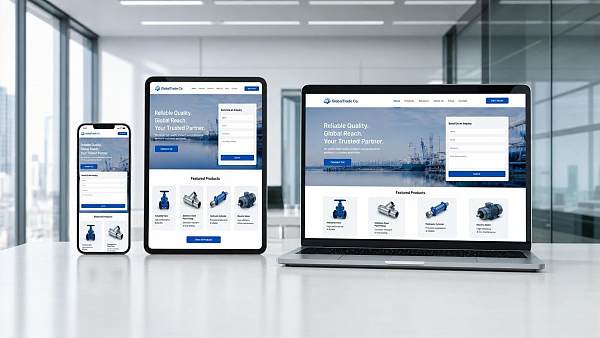
Many companies initially understood responsive design as meaning the same webpage could display completely on computers, tablets, and mobile phones. This standard is no longer sufficient. Overseas users' paths to brands are more fragmented; search results pages, ad landing pages, and social media content pages often lead to their first encounter on a mobile device.
If a B2B foreign trade website's responsive design only solves the problem of "visibility" but not "clear visibility, accurate targeting, and rapid response," then the website's performance in the marketing chain will be dragged down. This is especially true for industries with long decision-making chains, such as industrial products, equipment, parts, and OEM customization, where mobile devices often serve as the first step in screening and building trust.
From the perspective of integrated website and marketing, responsive design also directly impacts search performance. Search engines are increasingly emphasizing user experience; page stability, loading efficiency, content layout, and usability are all factors considered in ranking and conversion assessments.
Understanding responsive design for B2B e-commerce websites goes beyond simply focusing on page scaling.
Simply put, responsive design for B2B e-commerce websites ensures that content, structure, interaction, and conversion paths remain usable, readable, and operable across different terminal environments. The focus is not on the style changes themselves, but on whether core business information can still be conveyed smoothly.
In practice, foreign trade websites typically serve multiple purposes: showcasing products, building brand credibility, attracting advertising traffic, generating inquiries, and supporting multilingual indexing. If responsive design lacks an overall strategic vision, it can easily result in complete content on desktop but a loss of focus on key elements on mobile devices.
More importantly, mobile devices are not simply scaled-down versions of desktop devices. Their usage environment is more complex, network fluctuations are more pronounced, reading time is shorter, and operation relies on touch controls. Therefore, the evaluation criteria must be more stringent.
Several key performance indicators that are truly worth keeping an eye on
If you were to establish an evaluation framework for the responsiveness of B2B foreign trade websites, it should at least cover the following dimensions. These indicators do not exist in isolation, but rather collectively determine inquiry efficiency.
1. First screen loading speed
The speed at which content appears on the first screen directly impacts the user's willingness to stay on the page. This is especially true for overseas users, where cross-regional network latency, image size, and excessive script calls can all slow down page loading speed.
For foreign trade websites, large homepage images, product catalogs, and video modules are common. However, without compression strategies, delayed loading, and reasonable resource allocation, even the most visually appealing responsive pages will lose their value due to excessive waiting time.
2. Is the touch interaction convenient?
Issues such as excessively small button sizes, overly deep navigation layers, and reliance on mouse-based hover interactions are not noticeable on desktop devices but become immediately apparent on mobile devices. The size of the touch area and its susceptibility to accidental touches determine the smoothness of the user experience.
3. Readability of core content
Product selling points, application scenarios, qualifications, delivery capabilities, and contact information must all be clearly presented on mobile devices. Overly dense text, disorganized hierarchical structures, and unfocused titles will all cause mobile viewers to lose their sense of direction.
4. Forms and Inquiry Path
The value of responsive design for B2B foreign trade websites ultimately lies in generating inquiries. Too many fields, complex input boxes, complicated CAPTCHAs, and unclear feedback are all conversion obstacles, not simply front-end details.
5. Multi-terminal consistency and stability
Whether a page displays stably across different mobile phone brands, browsers, and language environments is an aspect often overlooked during evaluation. Layout misalignment, malfunctioning buttons, and abnormal image cropping can all directly damage brand credibility.
Why would this affect SEO and ad performance?
Many companies treat website building, SEO optimization, and advertising separately, resulting in traffic but poor page performance. In reality, responsive design is an integral part of the marketing foundation for B2B foreign trade websites.
Search engines assess page value not only by keyword coverage but also by real-world user experience. Poor mobile usability, often accompanied by short dwell times, low return rates, and high bounce rates, all weaken long-term SEO performance.
The same applies to advertising. With the cost per click constantly rising, if the landing page is inaccessible, unreadable, or unfillable on mobile devices, even the most precise front-end targeting will struggle to generate effective leads. For independent websites focused on customer acquisition, responsive design directly determines the efficiency of converting traffic into inquiries.
The focus is not entirely the same in different business scenarios.
Even among B2B foreign trade websites, responsive design can have different priorities depending on the business model. The decision should be made based on the website's mission, not just visual uniformity.
- Product showcase websites place greater emphasis on the readability of parameter tables, application pages, and downloadable materials on mobile devices.
- For inquiry-based customer acquisition websites, the focus is more on contact entry points, form paths, button layouts, and the exposure of trust information.
- For multilingual official websites, the stability of the layout is more important after the length of different languages changes.
- For ad landing pages, priority is given to first-screen speed, conversion block order, and form completion rate.
In other words, responsive design is not just a single front-end action, but rather a restructuring of content priorities around actual customer acquisition goals. Which content must be visible on the first screen, which modules are suitable for collapsing, and which buttons should be displayed permanently should all serve the conversion logic.
Based on practical construction experience, the assessment can be implemented in the following ways.
For projects that aim to balance website building efficiency and marketing effectiveness, a more prudent approach is to implement responsive design standards upfront, rather than adding them after launch. This is especially true for websites with multi-regional, multi-language, and multi-channel traffic generation; the initial architecture determines the later maintenance costs.
Platforms like YiYingBao, which integrate intelligent website building, SEO optimization, advertising, and overseas marketing, offer value by unifying page creation, speed optimization, indexing, and conversion rates within a single implementation logic. The benefit of this approach isn't simply a more comprehensive concept, but rather the reduction of inter-stage bottlenecks.
Drawing on over a decade of experience in digital services for foreign trade, and with accumulated technical expertise across multiple languages and market scenarios, these platforms typically place greater emphasis on the following fundamental operations:
- Mobile architecture should be considered during the website development phase, rather than being adapted later.
- Images, scripts, forms, and tracing code are all integrated into performance control.
- Ensure consistent page standards for SEO indexing, ad reception, and social media redirects.
- Perform compatibility verification in different countries and terminal environments.
For the next step in making a judgment, it might be helpful to first create a concise list.
If you are currently selecting a website building plan or preparing to rebuild your foreign trade website, you don't need to rush to look at the visual design. Instead, you should first check four things: whether the mobile loading speed is stable, whether the first screen clearly conveys the value, whether the inquiry entry is easy to use, and whether the multilingual pages are consistent.
A well-designed responsive B2B foreign trade website doesn't just optimize a single page; it improves search visibility, ad engagement, and lead generation efficiency. Understanding these key metrics before comparing website building systems, service processes, and subsequent operational capabilities will lead to a more accurate assessment of real business results.
Related Articles
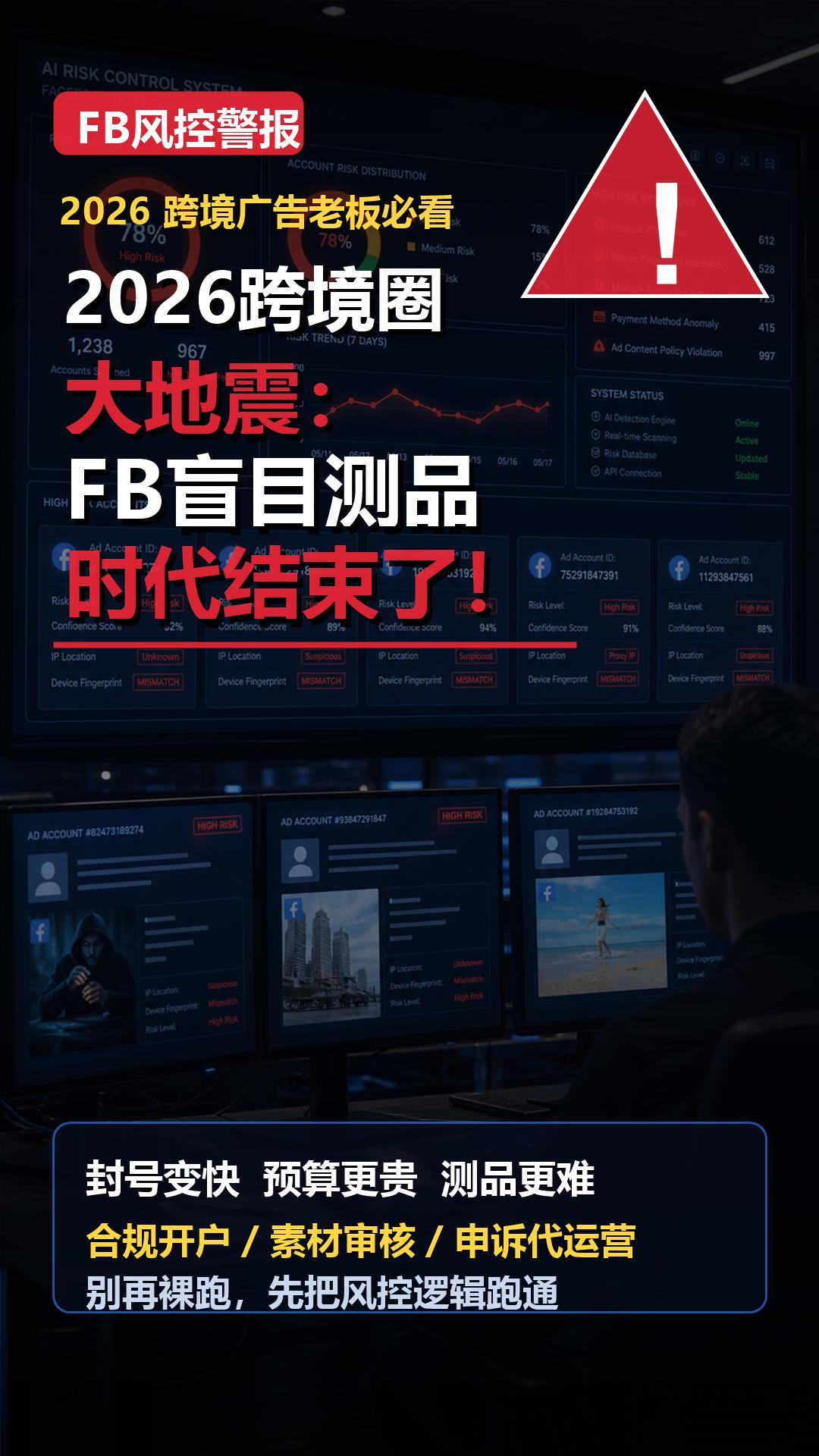
 The Era of Cross-Border Earthquakes in 2026: The Era of Blindly Testing FB Products Has Ended!
 Three key points of domestic-to-foreign trade most important, see if you really did your homework! Don’t take shortcuts.
 Note for dealers exporting cars: overseas customers are “quietly screening” you on Google


Related Products
 EasyCamp SaaS Smart Website Marketing SystemE-Yingbao SaaS Smart Website Marketing System: AI-powered, zero-code website building. Rapidly launch multilingual independent e-commerce sites in just 10 minutes. Global server acceleration and AI-driven SEO optimization empower businesses to efficiently connect with global markets. The seamless integration of technology and user-friendly operation makes building e-commerce sites incredibly simple.
 AI+SEM Intelligent Advertising Marketing SystemAI+SEM drives intelligent ad creation, empowering full-funnel precision advertising marketing. The system automatically generates weekly/monthly reports, AI recommends keywords and target countries, monitors core metrics in real-time with intelligent alerts, and enables one-click high-conversion ad solutions to help quickly acquire customers and improve ROI.
 AI+SEO Dual Engine Optimization ServiceEasyWin AI+SEO Dual Engine Optimization System leverages AI-powered keyword mining, content generation, and comprehensive technical optimization to help foreign trade enterprises acquire high-quality organic traffic, significantly improving search rankings and conversion rates.
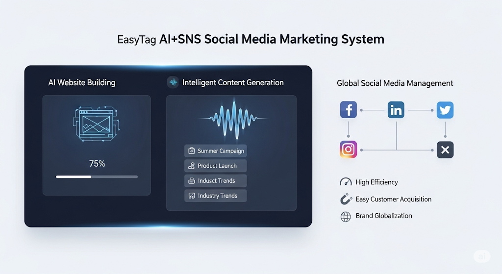
 AI+SNS Social Media Marketing SystemYingbao AI+SNS Social Media Marketing System - Precision social capture for the social media era. Supports one-click content synchronization across major platforms like Facebook and LinkedIn. AI intelligently rewrites posts for enhanced relevance. 24/7 AI customer service and user profiling analysis empower businesses to efficiently expand into global markets.
 AI+SEO营销解决方案易营宝AI+SEO营销解决方案,通过AI批量写作、智能生成TDK、精准关键词扩词等功能,全面优化网站SEO效果,提升流量与转化率。助力企业构建高效智能网站新生态。
 AI+SEM Advertising Marketing SolutionsAI+SEM Advertising Marketing Solution leverages AI technology to deeply empower SEM ad campaigns. It automatically generates weekly/monthly reports using AI, presenting account data across multiple dimensions for comprehensive insights into campaign performance and trends. The system precisely recommends keywords and target countries, intelligently generates high-conversion ad copy, and enables one-click activation of efficient campaign plans to help businesses rapidly acquire customers. Simultaneously, it monitors core metrics in real time, intelligently identifies abnormal fluctuations, and issues timely alerts to ensure stable, high-return advertising results.
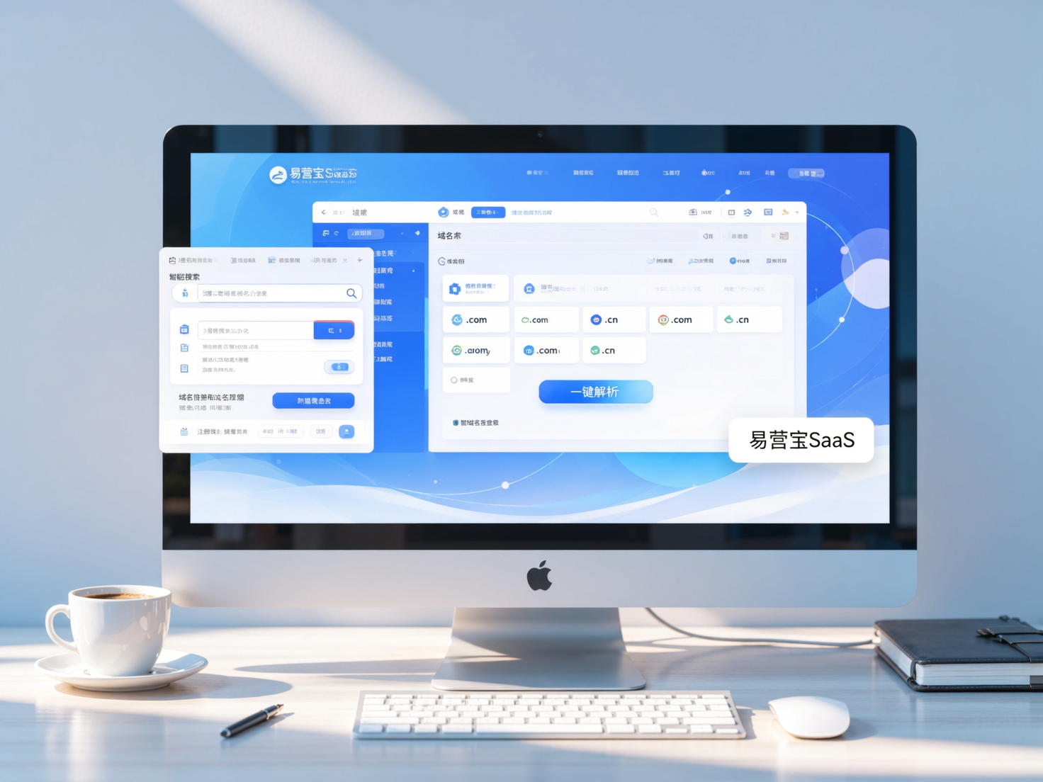
 Domain Name ServicesEasyWin provides professional domain name services, including intelligent queries, one-stop registration, brand protection, and full lifecycle management, helping businesses build a digital brand image.
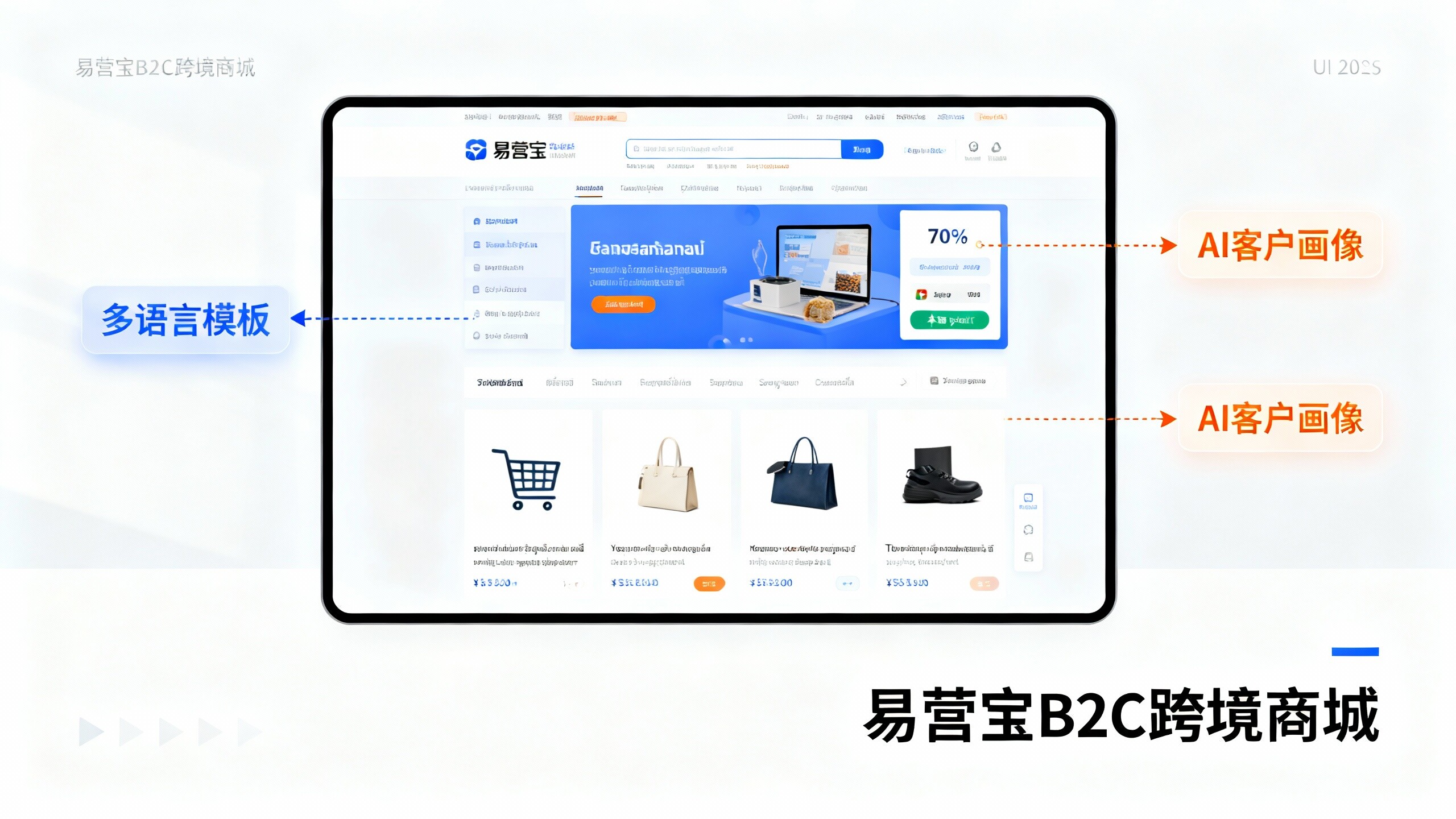
 EasyOperate B2C Cross-Border E-Commerce Platform & Independent WebsiteEasyStore B2C Cross-border E-commerce Independent Store is an intelligent website building and cross-border e-commerce integrated solution independently developed by EasyStore Information Technology (Beijing) Co., Ltd. The system is specially designed for small and medium-sized as well as large export enterprises, integrating 'website building, operation, marketing, advertising, and conversion' into one, helping enterprises quickly establish cross-border e-commerce independent stores to achieve brand globalization and global sales growth.
The platform supports multiple languages, multiple currencies, and multi-channel marketing, with built-in AI intelligent translation and SEO optimization systems, suitable for mainstream markets such as Southeast Asia, Europe and America, Latin America, and the Middle East, assisting Chinese manufacturing enterprises in efficiently deploying international e-commerce strategies. SSL证书易营宝提供专业SSL安全证书服务,包括单域名和泛域名证书,确保网站数据传输加密、身份验证和完整性保护,助力企业建立安全可信的在线业务环境。