- What Does a Global Traffic Ecosystem Service Provider Do? What Are the Differences from a Single Advertising AgencyJul 16, 2026View details
- What should you focus on in the latest enterprise SaaS report? From renewal rates and delivery costs to overseas growth opportunitiesJul 12, 2026View details
- What signals are worth paying attention to in a cross-border marketing trend report? B2B companies should look at these 6 signalsJul 11, 2026View details
- How to Read a Cross-Border Marketing Trends Report? Five Key Dimensions for Evaluating Channel OpportunitiesJul 11, 2026View details
- Which channel has the highest ROI in the global traffic ecosystem? Comparative analysis of search, social media, and advertisingJul 10, 2026View details
- What multilingual website services are available in Sanya? Which model is more suitable for local businesses going global?Jul 08, 2026View details
What should be considered when designing a B2B international trade website in a European and American style?
When creating a B2B foreign trade website, many companies interpret “European and American style” as a matter of color schemes and layouts. However, what overseas customers truly perceive is professionalism, credibility, and communication efficiency. The core of using European and American style references for B2B foreign trade website design is not to copy overseas page styles, but to make the website easier for European and American buyers to understand, trust, and use to submit inquiries based on their browsing habits.
For foreign trade business owners, marketing managers, and execution teams, the most important question is not whether the website “looks like a foreign website,” but whether it meets the aesthetic preferences of European and American markets, quickly communicates the company’s capabilities, and provides a clear conversion path. Only when design, content, and marketing objectives are aligned can a website truly deliver business value.
What Should Companies Refer to When Creating a European and American Style Website?
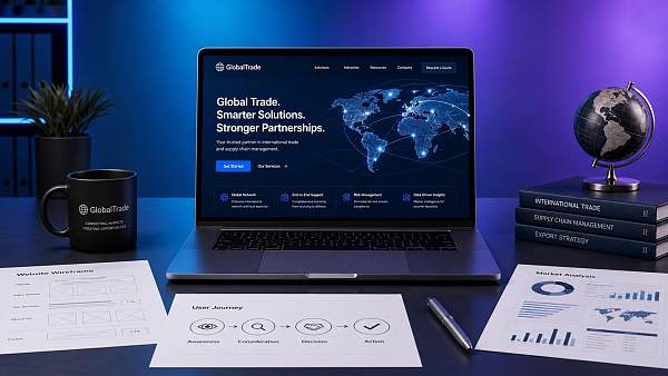
When many companies search for European and American style references for B2B foreign trade website design, they are essentially looking for an actionable evaluation standard: what type of website is more likely to gain recognition from European and American customers, and what kind of design can better support brand expansion into overseas markets, rather than simply looking for several page templates to imitate superficially.
In terms of actual results, European and American style websites typically share several characteristics: clear information architecture, ample visual whitespace, direct brand messaging, standardized product presentation, transparent business information, and clearly displayed contact details. These characteristics reflect not a mere “style preference,” but European and American users’ expectations for efficiency, credibility, and convenient decision-making.
Therefore, when using references, companies should focus on three aspects: first, how the page builds trust; second, how the content helps customers quickly evaluate the supplier; and third, whether the conversion path is smooth. These aspects are more important than simply referring to colors, fonts, or banner formats.
Why Do Many Foreign Trade Websites Look Refined but Still Fail to Generate Inquiries?
Many company websites are visually appealing, yet still receive few inquiries. The problem is usually not a lack of aesthetics, but inaccurate communication. Some websites fill their homepages with corporate slogans without explaining their core products, target customers, or differentiating advantages. Others have many product pages, but their specifications are disorganized, making it difficult for buyers to form a quick assessment.
Another common issue is the excessive use of localized communication styles. For example, some pages are filled with self-promotional copy, excessive dynamic effects, complex navigation, and unnecessary pop-ups. Although these elements may be common in China, they often reduce the sense of professionalism in the eyes of European and American B2B customers and discourage them from continuing to browse.
When visiting a company website, European and American customers typically want to confirm several points within a short period of time: who you are, what you can provide, whether you are reliable, whether you have relevant cases, and how they can contact you quickly. If the homepage and key landing pages do not answer these questions promptly, even a large amount of website traffic will be difficult to convert into qualified inquiries.
Which Design Details Matter Most to European and American Customers?
From a user experience perspective, European and American buyers are not seeking flashy design. They place greater importance on whether the website is “easy to understand.” This means that page layouts should be as concise as possible, visual hierarchies should be clear, and key information should be presented naturally above the fold and in important modules, rather than forcing users to search repeatedly.
In terms of visual presentation, European and American style generally tends to be clean, restrained, and professional. Common practices include using high-quality real-life photographs, a consistent brand color palette, simple sans-serif fonts, standardized button styles, and module layouts with sufficient whitespace. These treatments can significantly enhance the modern feel and credibility of a page.
In terms of content presentation, European and American markets are more receptive to fact-based communication. Compared with vague claims such as “industry-leading” and “outstanding quality,” customers are more willing to see specific information, including product applications, certifications, production capacity, delivery processes, service regions, and cooperation cases. The more specific the content, the easier it is to build trust.
How Should the Homepage, Product Pages, and About Us Page Be Designed?
The homepage is the key page where European and American customers form their first impression. An effective homepage usually first explains what the company does, whom it serves, and what its core advantages are. It then guides customers to learn more through product categories, industry applications, case studies, and contact options, rather than presenting all information with equal emphasis.
The product page is the core inquiry-generating page of a B2B foreign trade website. European and American customers expect to quickly obtain information about models, specifications, materials, applications, certifications, packaging, customization capabilities, and delivery. The design should avoid presenting only a few images and a brief introduction. Instead, the product page should function as a business page that supports customer decision-making.
The About Us page is an important location for building trust. It should do more than introduce the company’s founding date and size. It should also demonstrate factory capabilities, R&D strength, international certifications, export experience, quality control systems, and service processes. For European and American customers, this page often determines whether you are viewed as an ordinary supplier or as a potential partner worthy of further communication.
When Referring to European and American Style, Which Content Matters More Than Visual Design?
If a company has a limited budget, its priorities should often be information architecture, content planning, and conversion design rather than complex visual design. This is because the core competitiveness of a European and American style website essentially comes from “communication efficiency,” not decorative effects. The clearer the page, the easier it is for customers to submit inquiries.
Specifically, a website should at least handle four types of content well: the company’s value proposition, product solutions, trust signals, and calls to action. The value proposition tells customers what makes you different; solutions help customers understand which needs the products address; trust signals reduce concerns about cooperation; and calls to action encourage customers to take the next step.
The reason many websites fail is that their content hierarchy is disorganized. Companies write from an internal perspective, resulting in content that lacks a customer perspective. Although the information may be extensive, it is not user-friendly for overseas customers. The European and American websites truly worth referencing are often not longer, but offer greater value for decision-making and communicate in a way that is closer to the logic of procurement decisions.
How Can Companies Determine Whether Their Websites Truly Fit European and American Markets?
Whether a website has a European and American style should not be judged solely by subjective visual impressions. Instead, it should be evaluated from several more practical perspectives. For example, can the above-the-fold area clearly explain the business within 5 seconds? Is the navigation sufficiently clear? Does the product page support decision-making? Are the cases and certifications authentic and credible? Is the inquiry entry clearly visible and easy to use?
Companies can also further evaluate design quality based on marketing results. If the website has a high bounce rate, short visit duration, no conversions after product page visits, or a poor mobile experience, this usually indicates problems with the page structure or content communication. A website truly designed for European and American markets should not only look good, but also be easy to understand and capable of supporting customer acquisition.
In addition, companies need to consider coordination with SEO and subsequent promotion. A foreign trade website is not finished once it is launched. It must continuously support Google search, advertising, social media traffic acquisition, and AI search visibility. Therefore, when referring to European and American style, companies should also take page loading speed, structured layouts, multilingual standards, and search engine friendliness into account.
The Right Approach for Foreign Trade Companies Is Localization, Not Copying
When using European and American style references for B2B foreign trade website design, the most reliable approach is not to copy the website of an overseas competitor. Instead, companies should extract communication methods that are suitable for overseas customers and then restructure them locally based on their own products, industry, and sales objectives. After all, the page priorities differ across industries, average order values, and market regions.
For example, manufacturing websites need to highlight production capacity, certifications, delivery, and customization capabilities. Brand-oriented overseas expansion websites need to emphasize brand stories, visual consistency, and product experience. Cross-border B2B project-based websites should place greater emphasis on solutions, case studies, and technical communication capabilities. The prerequisite for using references is to first clarify your own business objectives.
For companies seeking long-term customer acquisition in overseas markets, a website is not merely a display window, but also marketing infrastructure. Unifying European and American aesthetics, procurement logic, SEO structure, and inquiry conversion mechanisms in the design is a more effective direction. This is also why an increasing number of companies are choosing integrated website development and marketing solutions.
Conclusion: The Focus of European and American Style References Is to Make Websites Easier to Trust and Convert
The aspects truly worth learning from European and American style references for B2B foreign trade website design are not limited to making pages look concise and sophisticated. More importantly, they reflect the underlying user logic: helping customers understand the company faster, build trust faster, and enter into communication faster. For foreign trade companies, this is more practically meaningful than simply pursuing a “foreign look.”
If a website can achieve professional visuals, clear content, a reasonable structure, smooth conversion, and compatibility with SEO and overseas promotion requirements at the same time, it will truly possess the competitiveness required for European and American markets. When upgrading their websites, companies should also use this standard to assess whether an investment is worthwhile, rather than remaining focused on superficial style imitation.
Related Articles
Related Products
 EasyCamp SaaS Smart Website Marketing SystemE-Yingbao SaaS Smart Website Marketing System: AI-powered, zero-code website building. Rapidly launch multilingual independent e-commerce sites in just 10 minutes. Global server acceleration and AI-driven SEO optimization empower businesses to efficiently connect with global markets. The seamless integration of technology and user-friendly operation makes building e-commerce sites incredibly simple.
 AI+SEM Intelligent Advertising Marketing SystemAI+SEM drives intelligent ad creation, empowering full-funnel precision advertising marketing. The system automatically generates weekly/monthly reports, AI recommends keywords and target countries, monitors core metrics in real-time with intelligent alerts, and enables one-click high-conversion ad solutions to help quickly acquire customers and improve ROI.
 AI+SEO Dual Engine Optimization ServiceEasyWin AI+SEO Dual Engine Optimization System leverages AI-powered keyword mining, content generation, and comprehensive technical optimization to help foreign trade enterprises acquire high-quality organic traffic, significantly improving search rankings and conversion rates.
 AI+SNS Social Media Marketing SystemYingbao AI+SNS Social Media Marketing System - Precision social capture for the social media era. Supports one-click content synchronization across major platforms like Facebook and LinkedIn. AI intelligently rewrites posts for enhanced relevance. 24/7 AI customer service and user profiling analysis empower businesses to efficiently expand into global markets.
 AI+SEO营销解决方案易营宝AI+SEO营销解决方案,通过AI批量写作、智能生成TDK、精准关键词扩词等功能,全面优化网站SEO效果,提升流量与转化率。助力企业构建高效智能网站新生态。
 AI+SEM Advertising Marketing SolutionsAI+SEM Advertising Marketing Solution leverages AI technology to deeply empower SEM ad campaigns. It automatically generates weekly/monthly reports using AI, presenting account data across multiple dimensions for comprehensive insights into campaign performance and trends. The system precisely recommends keywords and target countries, intelligently generates high-conversion ad copy, and enables one-click activation of efficient campaign plans to help businesses rapidly acquire customers. Simultaneously, it monitors core metrics in real time, intelligently identifies abnormal fluctuations, and issues timely alerts to ensure stable, high-return advertising results.
 Domain Name ServicesEasyWin provides professional domain name services, including intelligent queries, one-stop registration, brand protection, and full lifecycle management, helping businesses build a digital brand image.
 EasyOperate B2C Cross-Border E-Commerce Platform & Independent WebsiteEasyStore B2C Cross-border E-commerce Independent Store is an intelligent website building and cross-border e-commerce integrated solution independently developed by EasyStore Information Technology (Beijing) Co., Ltd. The system is specially designed for small and medium-sized as well as large export enterprises, integrating 'website building, operation, marketing, advertising, and conversion' into one, helping enterprises quickly establish cross-border e-commerce independent stores to achieve brand globalization and global sales growth.
The platform supports multiple languages, multiple currencies, and multi-channel marketing, with built-in AI intelligent translation and SEO optimization systems, suitable for mainstream markets such as Southeast Asia, Europe and America, Latin America, and the Middle East, assisting Chinese manufacturing enterprises in efficiently deploying international e-commerce strategies. SSL证书易营宝提供专业SSL安全证书服务,包括单域名和泛域名证书,确保网站数据传输加密、身份验证和完整性保护,助力企业建立安全可信的在线业务环境。