








- 21st Century Business Herald: AI and CTV Become Core Growth Engines for Digital Marketing in Overseas MarketsNov 18, 2026View details
- China Presents 25 Cooperation Outcomes in Areas Including Cross-Border E-Commerce During APECNov 18, 2026View details
- AI Products Drive Hong Kong Exports Up 64.9% in September, Fastest Growth in Over 40 YearsNov 17, 2026View details
- National Bureau of Statistics: Foreign trade grew rapidly in October, providing stable support for global tradeNov 17, 2026View details
- The U.S. has ended the $800 de minimis exemption for non-postal shipments; express courier packages must be formally declared.Nov 16, 2026View details
- ASEAN Signs Digital Economy Framework Agreement, Moving Toward Harmonized Cross-Border E-Commerce RulesNov 15, 2026View details
How Should Landing Pages for Overseas Social Media Traffic Generation Be Designed?
Overseas social media lead-generation landing pages must first address whether the experience remains coherent after the click. Social media content often sparks interest through short videos, single images, carousel posts, or creator recommendations. Users arrive on the page with specific questions: Is the product suitable for their use case? Are the price or minimum order requirements reasonable? Is the brand trustworthy? What should they do next? If the page begins with a broad company introduction or uses language and visual priorities that differ from the ad creative, visitors are likely to leave on the first screen.
Therefore, overseas social media lead-generation landing pages should be designed around a single conversion task. B2B inquiry pages, sample request pages, demo booking pages, and direct purchase pages can share brand guidelines, but should not share the same information sequence. Only by immediately carrying forward the promise, use case, or product feature from the social media post that attracted the click can information gaps be reduced.
Assess traffic temperature first, then determine the page's task
Visits from overseas social media do not necessarily mean visitors are at the same decision-making stage. Visitors clicking for the first time after seeing a product-use clip need more help understanding what it is and what problem it solves. Visitors who have seen content multiple times and clicked on a pricing ad will look more quickly for specifications, delivery scope, and contact options. If both types of traffic are directed to a complex official website homepage, the page may contain abundant information but will struggle to drive a clear action.
The page objective also changes the required information density. For high-ticket, customized, or long-procurement-cycle products, the first screen does not need to force a complete inquiry; it can first offer specification materials, selection guidance, or a sample consultation option. For highly standardized products with clear delivery terms, the distance from key selling points to price, inventory, and delivery coverage should be shortened. Combining different objectives on one page—for example, asking visitors to subscribe, add to cart, book an appointment, and download materials at the same time—often dilutes the purpose of the primary button.
The first screen should align the source, audience, and action
The first screen does not need to contain every selling point, but it must answer three questions within a limited space: What does the page offer? In what situation does it apply? What will happen after clicking? The headline should continue the key message of the social media creative rather than merely using an abstract slogan. If an ad emphasizes a certain material, size, compatibility, or usage result, the first screen should directly explain the application associated with that parameter and avoid elevating broad promises not mentioned in the ad into the main headline.
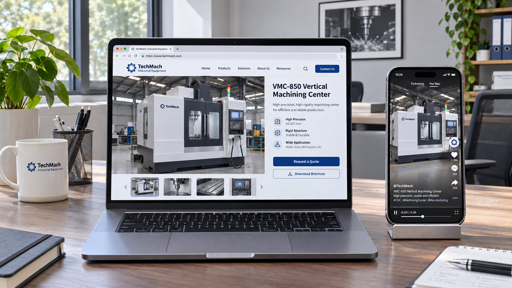
The main visual should preferably show the product itself, its actual installation state, the user interface, or clear before-and-after differences. For industrial products and complex services, purely atmospheric images are difficult to support decision-making; for consumer goods, overly polished assets may create a gap from the original social media video. Images, headlines, and descriptions near buttons should use the same product category names, unit systems, and language variants, avoiding pages with awkward or mixed terminology after users click an English ad.

Button text should reflect the actual path. “Get the specification sheet,” “View compatible models,” and “Request sample information” are more likely to establish expectations than a generic “Submit.” If inventory, shipping costs, or technical feasibility require manual confirmation after submission, this should also be briefly explained near the button rather than leading visitors to believe they will receive a quote immediately. On mobile devices, first-screen buttons need to be within easy thumb reach; floating buttons may be retained, but must not obscure product specifications, privacy notices, or form fields.
Trust information should be placed close to where hesitation occurs
Overseas visitors do not usually leave their contact details simply because of a lengthy brand story. A more effective approach is to place verifiable information at every point where hesitation may arise. When reviewing performance, provide test conditions, material composition, dimensional tolerances, or compatibility ranges; when considering shipping, specify the shipping origin, packaging format, and expected handling process; when preparing to submit a form, explain the purpose of the required contact information and the response method.
This content must distinguish between “product capability” and “usage results.” For example, when stating the temperature range a component can withstand, also specify the test environment, duration, or contact medium; a software feature supporting multiple languages does not mean the page content is inherently suitable for all regions. Absolute statements without conditions can easily lead to rework in subsequent communication and prevent visitors familiar with procurement processes from determining whether the product can be used in their existing projects.
Make technical information easy to scan for decision-making
The specification section should not simply copy an entire data sheet onto the page. Prioritize items that determine compatibility, such as model, material, dimensions, interfaces, input conditions, packaging units, or delivery lead time ranges; secondary parameters can be collapsed or placed in downloadable materials. Units should be consistent, with necessary conversion guidance provided. If different configurations are available, visitors should be able to understand where the basic version differs from the extended version, rather than using vague labels such as “high-end configuration” or “professional edition” in place of actual differences.
Interest generated by social media content is often emotional, while the landing page is responsible for turning that interest into information visitors can evaluate. Customer reviews, on-site photos, or application displays may be included, but they should clearly indicate the corresponding product, industry context, or configuration, avoiding piles of unattributed short statements. For projects that cannot yet be made public, explaining the boundaries through typical application conditions is more reliable than fabricating results.
Form design determines lead quality and abandonment rate
More fields do not necessarily result in higher-quality leads. First-time social media visitors are generally willing to provide their name, email address, country or region, and one field that explains their needs; requesting complete company information, purchasing budget, detailed address, and similar details without sufficient value exchange beforehand can easily cause abandonment. Conversely, for pages involving custom manufacturing or project quotations that require technical confirmation, collecting only an email address makes it difficult to determine the direction of the requirement afterward.
Fields can be divided into two levels: the first level collects contact details and requirement type, while the second level expands dynamically based on the selected product, application field, or purchasing stage. This avoids irrelevant questions while allowing submissions to enter a more suitable follow-up process. Dropdown options should cover common situations while retaining “Other” and supplementary explanations to prevent complex requirements from being categorized incorrectly.
- Quote request forms may ask about quantity range, destination, and target model, as this information directly affects subsequent calculations.
- Sample-related pages should clearly state whether an application description, sample purpose, and potential shipping restrictions are required.
- Software download or document download pages should collect only the information needed to complete delivery; setting multiple barriers before downloading will weaken the lead-generation value of the content.
Localization for different regions goes beyond translation
A common cause of rework in overseas social media lead-generation landing page design is that “the ad language has been translated, but the page logic is still written for the original market.” Localization should at least verify that currency, units of measurement, date formats, telephone numbers, delivery coverage, business-day wording, and privacy notices are consistent. When targeting multiple languages, it is not enough to replace text while retaining the original layout; longer words in languages such as German, the right-to-left reading direction of Arabic, and button lengths in different languages all affect the usability of the first screen and forms.
Regional versions should also avoid displaying all irrelevant products. If a market is not yet served by delivery, lacks the relevant certification materials, or uses a different after-sales approach, this should be made clear before visitors proceed to purchase or request a quote. Hiding restrictions until after form submission creates invalid leads and unnecessary communication costs.
Use data to identify drop-off points, rather than focusing only on click volume
A high ad click-through rate combined with low landing page conversion does not necessarily indicate a visual design issue. First, verify that the ad promise, targeted region, loading speed, and post-click language are consistent; then observe whether visitors exit on the first screen, in the specifications section, in the pricing section, or at form fields. Short time spent on the first screen is often related to mismatched information, slow loading, or distorted main visuals; abandonment after entering the form calls for checking the number of fields, required-field logic, error messages, and whether post-submission expectations are clear.
When testing, change only one key variable at a time, such as how the main headline corresponds to the social media creative, button copy, form field hierarchy, or the placement of trust information. If images, copy, and paths are replaced at the same time, it is difficult to determine the factor that actually made a difference even if results change. The page should ultimately maintain a clear route: carry forward interest from social media content, eliminate concerns with verifiable information, and then match the cost of action to the visitor's current decision-making stage.
Related Articles
 How Can Facebook Content Management Improve Post Engagement?
 How can you avoid duplicate content when distributing it across multiple social media platforms?
 What Types of Traffic Can Social Media Marketing Bring to a Cross-Border Independent Website?


Related Products
 Yiyingbao SaaS Intelligent Website Building and Marketing SystemYiyingbao SaaS Intelligent Website Building and Marketing System, AI-powered no-code website building, rapid creation of multilingual B2B international websites in 10 minutes, global server acceleration, AI-powered SEO optimization, helping businesses connect efficiently with global markets. The perfect integration of technology and operation makes building an international trade website remarkably simple
 AI+SEM Intelligent Advertising Marketing SystemAI+SEM drives intelligent ad creation, empowering full-funnel precision advertising marketing. The system automatically generates weekly/monthly reports, AI recommends keywords and target countries, monitors core metrics in real-time with intelligent alerts, and enables one-click high-conversion ad solutions to help quickly acquire customers and improve ROI.
 AI+SEO Dual-Engine System Optimization ServicesYiyingbao’s AI+SEO dual-engine optimization system helps foreign trade enterprises acquire high-quality organic traffic through AI-powered keyword research, content generation, and comprehensive technical optimization, significantly improving search rankings and conversion rates.
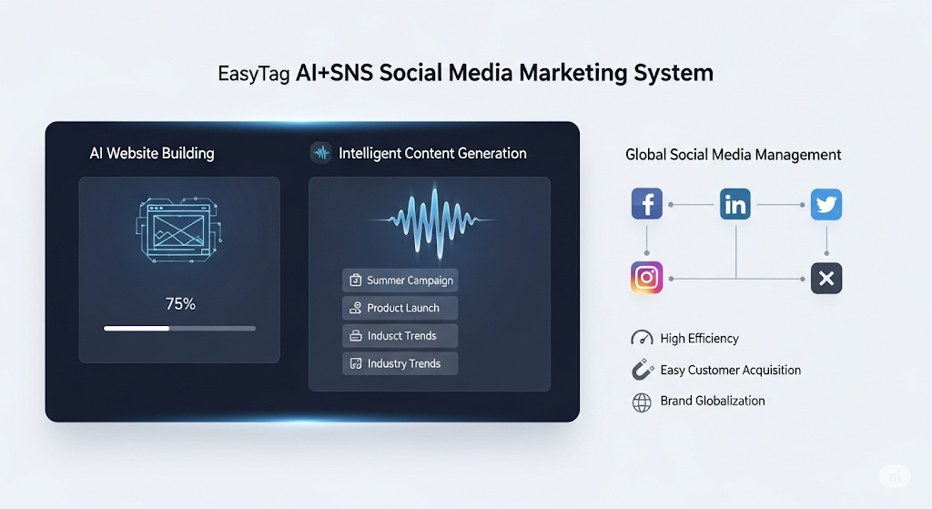
 AI+SNS Social Media Marketing SystemYingbao AI+SNS Social Media Marketing System - Precision social capture for the social media era. Supports one-click content synchronization across major platforms like Facebook and LinkedIn. AI intelligently rewrites posts for enhanced relevance. 24/7 AI customer service and user profiling analysis empower businesses to efficiently expand into global markets.
 AI+SEO营销解决方案易营宝AI+SEO营销解决方案,通过AI批量写作、智能生成TDK、精准关键词扩词等功能,全面优化网站SEO效果,提升流量与转化率。助力企业构建高效智能网站新生态。
 AI+SEM Advertising Marketing SolutionsAI+SEM Advertising Marketing Solution leverages AI technology to deeply empower SEM ad campaigns. It automatically generates weekly/monthly reports using AI, presenting account data across multiple dimensions for comprehensive insights into campaign performance and trends. The system precisely recommends keywords and target countries, intelligently generates high-conversion ad copy, and enables one-click activation of efficient campaign plans to help businesses rapidly acquire customers. Simultaneously, it monitors core metrics in real time, intelligently identifies abnormal fluctuations, and issues timely alerts to ensure stable, high-return advertising results.
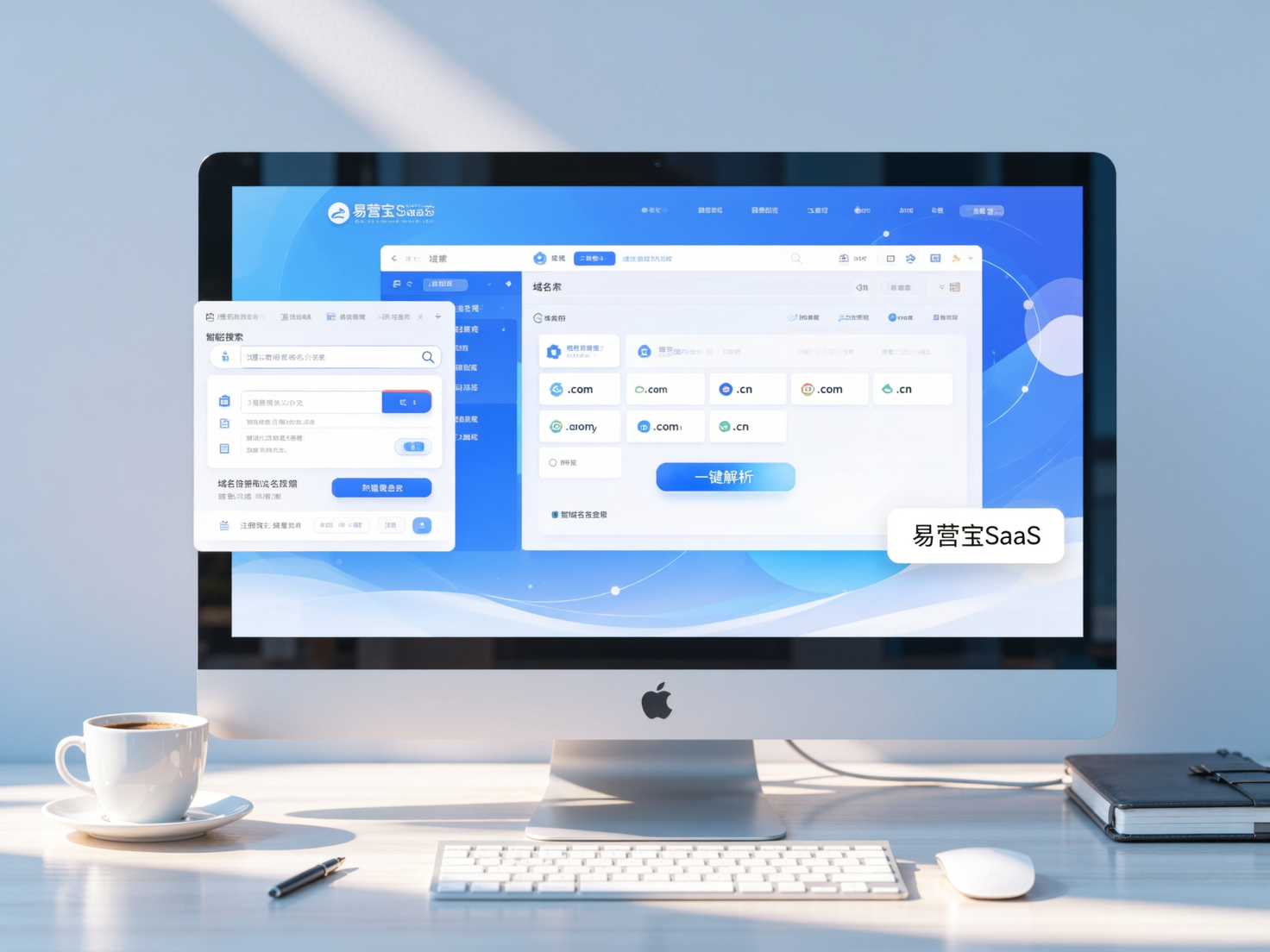
 Domain Name ServicesEasyWin provides professional domain name services, including intelligent queries, one-stop registration, brand protection, and full lifecycle management, helping businesses build a digital brand image.
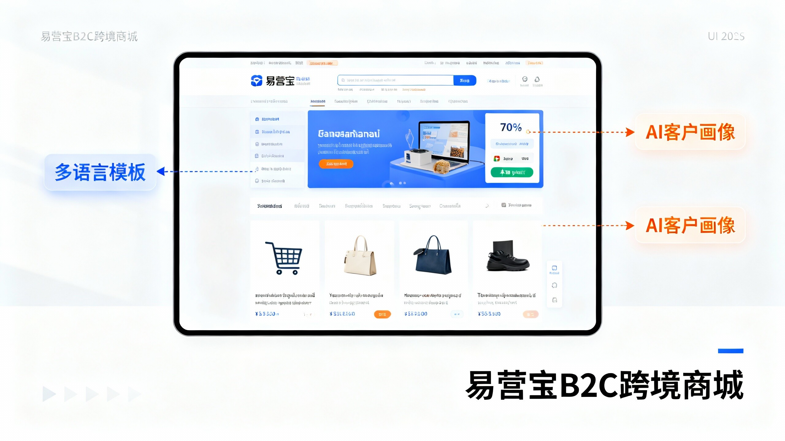
 EasyOperate B2C Cross-Border E-Commerce Platform & Independent WebsiteEasyStore B2C Cross-border E-commerce Independent Store is an intelligent website building and cross-border e-commerce integrated solution independently developed by EasyStore Information Technology (Beijing) Co., Ltd. The system is specially designed for small and medium-sized as well as large export enterprises, integrating 'website building, operation, marketing, advertising, and conversion' into one, helping enterprises quickly establish cross-border e-commerce independent stores to achieve brand globalization and global sales growth.
The platform supports multiple languages, multiple currencies, and multi-channel marketing, with built-in AI intelligent translation and SEO optimization systems, suitable for mainstream markets such as Southeast Asia, Europe and America, Latin America, and the Middle East, assisting Chinese manufacturing enterprises in efficiently deploying international e-commerce strategies. SSL证书易营宝提供专业SSL安全证书服务,包括单域名和泛域名证书,确保网站数据传输加密、身份验证和完整性保护,助力企业建立安全可信的在线业务环境。