









- Is the EV SSL certificate market shrinking or upgrading? How should companies assess certificate procurement?Aug 11, 2026View details
- Why the old AMP SEO 2020 practices no longer work and what has changed in current optimization prioritiesAug 02, 2026View details
- How to Choose Topics for an Industry News Section to Attract More Organic Search TrafficJul 29, 2026View details
- Digital Marketing Shenzhen Market Insights: Why Are Companies Expanding Overseas Looking for Growth Teams in Shenzhen?Jul 31, 2026View details
- Can Zhejiang foreign trade independent websites still be developed today? Look at changes in traffic and lead generationJul 28, 2026View details
- What New Signals Are Emerging in Enterprise Services SaaS Marketing ReportsJul 27, 2026View details
RTL Website Best Practices: Key Details of Navigation, Layout, and Form Interactions
For Arabic, Hebrew, and other RTL websites, simply flipping the page is far from sufficient. Focusing on rtl website best practices, this article examines key details in navigation, layout, and form interactions to help operations teams reduce accidental actions, improve reading efficiency, and turn international websites into genuinely usable and conversion-oriented business entry points.
First, determine this: RTL website issues are usually not about “whether content can be displayed,” but about “whether it can be used smoothly”
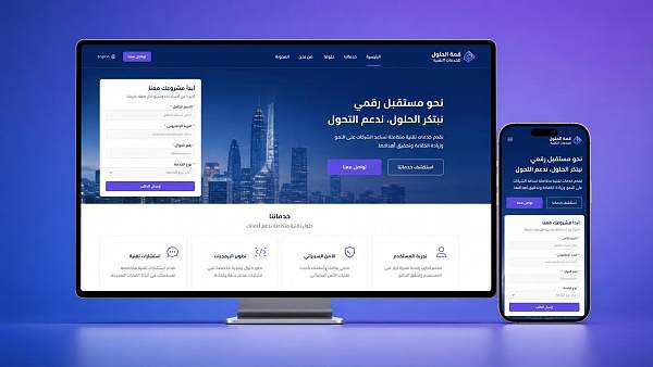
Users searching for rtl website best practices are generally not trying to understand the concept. They want to know how RTL websites should be designed so that browsing, form submission, and final conversions are not affected. For implementation teams, the focus should be on actionable standards rather than abstract definitions.
These readers are usually most concerned about whether the navigation direction feels natural, whether the text is easy to read, whether buttons and input fields could cause operational errors, and whether pages look cluttered when Chinese and English text, numbers, and other elements are mixed. If these details are not handled properly, bounce rates, time on page, and inquiry quality may all be affected.
Therefore, the main content does not need to give equal attention to every theory. Instead, it should focus on answering three questions: How should menus be arranged for the smoothest operation? How should content be laid out for maximum clarity? How should forms be designed to minimize errors? By comparison, general information such as the historical background of RTL and language classifications should be given less emphasis.
Why is navigation design the first threshold for the RTL experience?
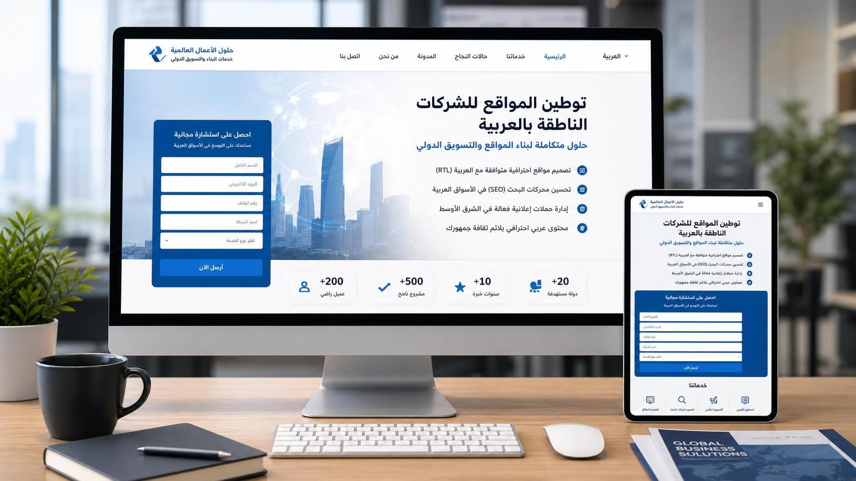
In an RTL context, users scan pages from right to left by default. Therefore, the positions of the main navigation, brand entry points, and primary buttons should follow this visual path. Many websites simply mirror the page without reorganizing the information hierarchy. As a result, they look like RTL websites but still function like LTR websites.
For operations teams, the most direct evaluation standard is this: after opening the homepage, can users find the main sections, contact information, and call-to-action buttons within two or three seconds? If key information remains in positions that do not match local habits, users must think more than necessary, which directly increases the likelihood of abandonment.
In practice, the main menu in the header is generally recommended to begin on the right. The Logo and homepage entry should also be adjusted according to the brand strategy rather than mechanically retaining the original structure. Breadcrumbs, dropdown menus, sidebar expansion directions, carousel arrows, and back buttons should all be recalibrated according to RTL logic.
This is especially important for multilingual websites. After switching languages, it is not enough to change only the text; the navigation layout, icon directions, and page flow must also be switched accordingly. Otherwise, users may feel that “the text is in the local language, but the interaction feels like a foreign product.” This inconsistency can significantly weaken brand trust.
Layout is not about flipping text; it is about rebuilding the reading rhythm
When understanding rtl website best practices, many teams tend to focus on right-aligning text. However, what truly affects readability is the hierarchy of headings, paragraph width, whitespace, list structure, and the stability of mixed Arabic or Hebrew text with numbers, English, and URLs.
First, the body text should not always fill the entire line width. Longer lines in RTL languages can more easily increase the burden of rereading, so paragraph width should be controlled to maintain a stable reading rhythm. Headings, summaries, and key-point lists should form a clear hierarchy, allowing users to scan quickly instead of facing a page filled with dense blocks of text.
Second, numbers, currencies, dates, telephone numbers, email addresses, and product models generally retain LTR writing conventions. If developers and operations teams do not handle bidirectional text rules in advance, symbols may become misaligned, parentheses may face the wrong direction, and numbering sequences may become disordered. In serious cases, this can even affect the understanding of information.
For example, when companies display technical parameters, logistics numbers, or network configurations in Middle Eastern markets, they often encounter mixed English abbreviations and RTL text. Content such as 128-bit address lengths, protocol names, and model codes should ideally be tested specifically at both the styling and field levels to avoid interruptions in reading.
On pages involving infrastructure or enterprise network upgrades, if technical products such as Internet Protocol Version 6 (IPV6) need to be introduced, attention should also be paid to the order and alignment of parameter displays. Information such as a “128-bit” address length or sample addresses is better presented using clear grouping and separate fields.
If form interactions are poorly designed, all the traffic and content generated earlier will lose value
For marketing websites, forms are the step closest to conversion and also one of the areas most likely to cause problems on RTL websites. Whether users are willing to submit a form depends not only on the number of fields, but also on whether input is convenient, prompts are clear, and error feedback matches local reading habits.
Field labels, placeholder prompts, error messages, required-field indicators, and submit buttons should all be arranged around the RTL reading direction. Common errors include placing labels on the left and input fields on the right, forcing users’ eyes to move back and forth; using the local language for button text while keeping icons oriented for LTR; and displaying error messages in inconspicuous positions.
If a form includes mobile phone numbers, email addresses, URLs, company numbers, verification codes, or similar content, bidirectional input must be tested particularly carefully. These fields usually contain numbers and Latin characters, making them especially prone to cursor jumps, misaligned selections, and copy-and-paste errors in RTL environments, directly affecting the successful submission rate.
In actual implementation, it is recommended to prioritize four common types of forms: inquiry forms, registration and login forms, checkout pages, and short forms on advertising landing pages. These scenarios are closest to conversion, and even a minor obstacle can cause users to leave. Compared with optimizing visual effects, it is more valuable to first stabilize field order, error messages, and the mobile click experience.
Mobile devices and component details determine whether an RTL website is “truly localized”
Many teams handle desktop interfaces reasonably well, but problems become apparent as soon as users switch to mobile devices. Mobile screens are narrower, and navigation drawers, filter panels, tab switches, date pickers, and pagination components on RTL pages rely more heavily on directional cues. Once these elements are handled inconsistently, users will clearly feel that something is awkward.
For example, which side the hamburger menu expands from, the direction of the arrow for returning to the previous level, whether a floating chat button blocks the main operating area, and whether the sliding direction of product images and text matches expectations are all common details. Users may not explicitly identify the problem, but they may express their dissatisfaction by leaving or not submitting a form.
Icons also do not all need to be mirrored. Elements such as play buttons, download icons, brand marks, social media Logos, and map directions need to be distinguished between components with cultural directionality and components with universal semantics. Blindly flipping them not only fails to improve the experience, but may instead cause misunderstandings and confusion in brand recognition.
If the website also includes a member center, online store, or technical documentation pages, it is recommended to create an RTL component checklist and verify buttons, pagination, filters, pop-ups, breadcrumbs, rich text, tables, and search boxes one by one. This is more efficient and cost-effective than repairing issues based on user feedback after launch.
How can implementation teams put this into practice? Replace “it feels about right” with a checklist
For operations teams responsible for website content and page launches, the most practical approach is not to memorize every standard, but to establish a pre-launch inspection process. Conducting a quick review before each release across four dimensions—navigation, layout, forms, and mobile devices—can significantly reduce basic errors.
An actionable inspection framework may include the following: Does the first screen follow the RTL visual flow? Are the directions of menus, back buttons, and arrows consistent? Are paragraphs, lists, and headings clear and easy to scan? Are numbers and English text displayed normally when mixed? Are form inputs, error messages, and buttons easy to use? Are there any obstructions or accidental taps on mobile devices?
If a company’s website is also responsible for lead generation and brand building, an RTL website should not be treated merely as a “translated version.” Instead, it should be operated as a formal business presence in the local market. Technology, content, advertising, and SEO need to work together so that local-language pages can genuinely participate in rankings, receive traffic, and generate conversions.
In the longer term, when expanding into Middle Eastern and other markets, companies often upgrade their network and digital infrastructure at the same time. Technologies such as Internet Protocol Version 6 (IPV6), which supports a larger address space, higher transmission efficiency, and stronger security mechanisms, also frequently appear in global enterprise deployment scenarios. The consistency of presenting such technical information on multilingual pages likewise deserves advance planning.
Conclusion: Truly effective RTL best practices put the operating habits of local users first
Returning to the topic of rtl website best practices, the most important conclusion is clear: the challenge for RTL websites is not whether pages can be flipped, but whether navigation is convenient, content is easy to read, forms are easy to complete, and these details remain consistent on mobile devices and in multilingual environments.
For implementation-level readers, the most valuable step is not to hear the concepts explained once again, but to put practical, verifiable, and optimizable tasks into action. By continuously refining the user’s actual operating path, an RTL website can do more than simply “look correct”; it can also deliver better engagement, trust, and conversion results.
Related Articles

Related Products
 Yiyingbao SaaS Intelligent Website Building and Marketing SystemYiyingbao SaaS Intelligent Website Building and Marketing System, AI-powered no-code website building, rapid creation of multilingual B2B international websites in 10 minutes, global server acceleration, AI-powered SEO optimization, helping businesses connect efficiently with global markets. The perfect integration of technology and operation makes building an international trade website remarkably simple
 AI+SEM Intelligent Advertising Marketing SystemAI+SEM drives intelligent ad creation, empowering full-funnel precision advertising marketing. The system automatically generates weekly/monthly reports, AI recommends keywords and target countries, monitors core metrics in real-time with intelligent alerts, and enables one-click high-conversion ad solutions to help quickly acquire customers and improve ROI.
 AI+SEO Dual-Engine System Optimization ServicesYiyingbao’s AI+SEO dual-engine optimization system helps foreign trade enterprises acquire high-quality organic traffic through AI-powered keyword research, content generation, and comprehensive technical optimization, significantly improving search rankings and conversion rates.
 AI+SNS Social Media Marketing SystemYingbao AI+SNS Social Media Marketing System - Precision social capture for the social media era. Supports one-click content synchronization across major platforms like Facebook and LinkedIn. AI intelligently rewrites posts for enhanced relevance. 24/7 AI customer service and user profiling analysis empower businesses to efficiently expand into global markets.
 AI+SEO营销解决方案易营宝AI+SEO营销解决方案,通过AI批量写作、智能生成TDK、精准关键词扩词等功能,全面优化网站SEO效果,提升流量与转化率。助力企业构建高效智能网站新生态。
 AI+SEM Advertising Marketing SolutionsAI+SEM Advertising Marketing Solution leverages AI technology to deeply empower SEM ad campaigns. It automatically generates weekly/monthly reports using AI, presenting account data across multiple dimensions for comprehensive insights into campaign performance and trends. The system precisely recommends keywords and target countries, intelligently generates high-conversion ad copy, and enables one-click activation of efficient campaign plans to help businesses rapidly acquire customers. Simultaneously, it monitors core metrics in real time, intelligently identifies abnormal fluctuations, and issues timely alerts to ensure stable, high-return advertising results.
 Domain Name ServicesEasyWin provides professional domain name services, including intelligent queries, one-stop registration, brand protection, and full lifecycle management, helping businesses build a digital brand image.
 EasyOperate B2C Cross-Border E-Commerce Platform & Independent WebsiteEasyStore B2C Cross-border E-commerce Independent Store is an intelligent website building and cross-border e-commerce integrated solution independently developed by EasyStore Information Technology (Beijing) Co., Ltd. The system is specially designed for small and medium-sized as well as large export enterprises, integrating 'website building, operation, marketing, advertising, and conversion' into one, helping enterprises quickly establish cross-border e-commerce independent stores to achieve brand globalization and global sales growth.
The platform supports multiple languages, multiple currencies, and multi-channel marketing, with built-in AI intelligent translation and SEO optimization systems, suitable for mainstream markets such as Southeast Asia, Europe and America, Latin America, and the Middle East, assisting Chinese manufacturing enterprises in efficiently deploying international e-commerce strategies. SSL证书易营宝提供专业SSL安全证书服务,包括单域名和泛域名证书,确保网站数据传输加密、身份验证和完整性保护,助力企业建立安全可信的在线业务环境。









