









Related recommendations
- Which customer acquisition channels will be affected by cross-border marketing trends in 2026?Sep 06, 2026View details
- Which homogenization risks should be considered in an analysis of the AI-powered website building industry?Aug 30, 2026View details
- How Will AI Marketing Trends 2026 Change Advertising Budget AllocationAug 28, 2026View details
- Is the EV SSL certificate market shrinking or upgrading? How should companies assess certificate procurement?Aug 11, 2026View details
- Why the old AMP SEO 2020 practices no longer work and what has changed in current optimization prioritiesAug 02, 2026View details
- How to Choose Topics for an Industry News Section to Attract More Organic Search TrafficJul 29, 2026View details
Why Japanese Website Development Requires More Than Translation: First Understand Japanese Users’ Reading Habits
Publish date:Aug 17, 2026
Author:Easy Yingbao (Eyingbao)
Page views:
Japanese website development cannot rely on translation alone. It also requires an understanding of Japanese users’ reading habits and trust-building logic. This article breaks down key aspects of Japanese website localization, common pitfalls, and optimization methods to help you improve click-through rates and inquiry conversions in the Japanese market.
Inquire now : 4006552477
# Why Can't Japanese Website Construction Just Be a Translation? First Understand Japanese Users' Reading Habits
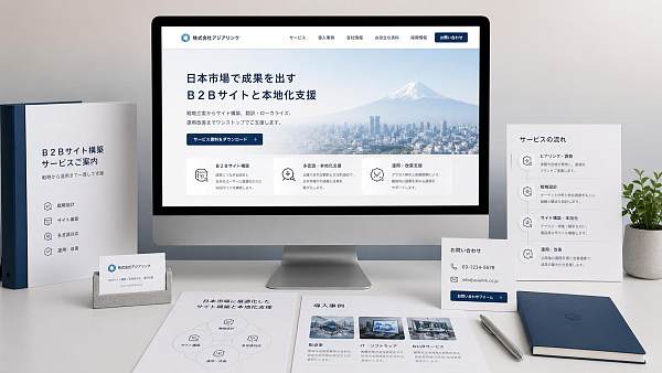
Many companies, when building a **Japanese website** for the first time, instinctively assume that simply translating their Chinese website into Japanese and adjusting the layout to Japanese typography is enough to go live.
However, those who have actually worked in the Japanese market find that the problem often lies not in the language, but in the "reading experience"—the same content, when viewed by Japanese users, may seem awkward, lack focus, and fail to build trust, leading to noticeably weaker conversions.
For Japanese users, a website is not just about "whether the translation is correct"; it's about "whether it looks like a brand that truly understands the Japanese market." This is why many companies create multilingual websites, but only the Japanese version sees traffic without generating many inquiries. To solve this, you first need to understand Japanese users' reading habits.
## Japanese Users Don't Ignore Content; They Care More About "Whether It's Hassle-Free"
When browsing a website, Japanese users typically pay more attention to whether the page is clear, standardized, calm, and trustworthy. They don't necessarily dislike information-dense pages, but they are particularly concerned about a few points:
Who is this company? What do they do? Where is the contact information? Is there sufficient explanation? Does the page look sloppy?
Unlike some page styles that emphasize strong stimulation and promotion, Japanese users tend to confirm before taking action. Especially in B2B scenarios, they will repeatedly review company introductions, service scopes, case studies, FAQs, and contact information until they are convinced that this company is "worth further communication."
In other words, the core of Japanese website construction is not just about getting the words right, but about organizing the information into a format that Japanese users are willing to read, trust, and continue exploring.
## The Three Most Common Problems with Simple Translation
### 1. Literal Translation Makes Content Sound "Robot-Generated"
Common big words and slogan-like expressions in Chinese pages, when directly translated into Japanese, can sound stiff and even inappropriate for Japanese business contexts. For example, expressions emphasizing "best," "first choice," or "one-stop" can weaken credibility in a Japanese site without contextual support.
### 2. Incorrect Information Order Makes Users Miss the Point
Chinese websites often follow a logic of presenting advantages first, then features, and finally contact information. However, Japanese users are more accustomed to seeing basic information first, followed by explanations, evidence, and contact details.
If the homepage starts with a long promotional message without company background, service scope, or delivery methods, users will quickly leave.
### 3. Page Style Doesn't Match Local Aesthetics
Japanese users are very sensitive to details: fonts, white space, button copy, image style, and page cleanliness all influence their judgment. It's not necessarily about being "minimalist," but about feeling clear, restrained, and reliable.
Some websites, after translation, have Japanese text but an overall feel that still follows a "Chinese website logic," creating a sense of distance for local users.
## How Japanese Users Prefer to Read Websites
Japanese users typically don't "glance and buy" but rather "judge while reading." They are more receptive to content structures with clear hierarchy, such as:
- First, know who you are
- Then, know what problems you can solve
- Next, see the process and scope
- Finally, confirm the contact path
Therefore, when building a **Japanese website**, the content layout should minimize the "judgment cost." Headings should be clear, paragraphs not too long, key information placed upfront, contact details clear, and page transitions smooth.
Additionally, Japanese users have high expectations for accuracy in expression. Rather than using many adjectives, it's better to state facts clearly: who the service is for, what scenarios it suits, what the delivery includes, and what precautions to take. The more specific the information, the easier it is to build trust. ## An Effective Japanese Website Is Not Just a Translation, But a Localization Rewrite
Many companies easily confuse "translation" with "localization." In reality, the difference is significant.
Translation solves the language problem; localization solves the comprehension problem.
For example, with "Contact Us," a Japanese website often designs the inquiry entry, company address, business hours, and form fields more meticulously, letting users know what will happen after submission. Similarly, a product page doesn't just explain features but also supplements applicable industries, specifications, common questions, and after-sales methods.
If your website is a B2B official site targeting Japanese clients, it is recommended to focus on these areas:
- Homepage above the fold: Explain who you are and what you do in one sentence
- Company introduction: Supplement qualifications, team, location, and history
- Service page: Break down services in a way Japanese users can quickly understand
- Case study page: Show the process, results, and applicable scenarios as much as possible
- FAQ: Address common concerns in advance
- Contact page: Reduce form burden and provide clear communication paths
These details may seem trivial, but they determine whether users are willing to continue reading.
## Keywords Are Not the Problem; The Problem Is Whether the Content Has a "Japanese Feel"
When doing SEO, many people focus only on how to place the keyword "Japanese website construction," but overlook the long-tail questions that Japanese search users actually care about, such as:
- What to pay attention to in Japanese website construction
- How to enter the Japanese market with a foreign trade website
- What kind of websites do Japanese users like
- How to improve inquiries on a Japanese official website
- How to optimize Japanese pages on a multilingual website
Behind these searches, the core question is essentially the same: After the website is built, will Japanese clients find it professional, trustworthy, and easy to communicate with?
Therefore, in the content of a Japanese site, keywords can appear naturally, but it's more important to write based on the user's decision-making path. The page is not for search engines to "read words," but for real customers to "make judgments."
## If You Already Have a Chinese Official Website, What to Pay Attention to When Adapting It to a Japanese Site
Many companies directly adapt their Chinese official website, which is common but also the easiest way to fall into pitfalls. It is recommended to at least check these points:
1. **Whether the title and meta description match Japanese search expressions**
Don't just do language replacement; see how local users would search and click.
2. **Whether the page hierarchy is too deep**
Japanese users generally prefer clear navigation and dislike searching for key content.
3. **Whether images and icons convey the correct impression**
Some Chinese website styles are busy and lively, which can appear less stable in a Japanese site.
4. **Whether the conversion path is clear**
Not all users are willing to leave their information immediately. Offering more natural methods like consultation, resource downloads, or email contact is often more effective.
When doing this step, you can also leverage content resources like The Realistic Dilemmas and Countermeasures of Fintech Promoting Enterprise Innovation and Development to help the team more systematically organize the website content structure, information expression methods, and localization strategies. For many companies, the issue isn't a lack of pages, but a lack of a logic that allows content to truly land.
## Websites Suitable for the Japanese Market Usually Share These Characteristics
If you want to judge whether a Japanese website looks like a "Japanese site," check if it has these features:
- The homepage is not noisy, but the information is complete
- The copy is not exaggerated, but it's clear
- The navigation is not complicated, but the path is clear
- The tone is not stiff, and it reads naturally
- The contact information is not hidden, and users can find it
These details often have a greater impact on results than "whether the translation is accurate." Because what truly drives conversions is not just language, but trust.
For companies preparing to enter the Japanese market, **Japanese website construction** is not a simple language conversion, but a re-expression for local users. The more you understand Japanese users' reading habits, the easier it is for your website to be understood and accepted, and the more likely it is to generate real inquiries and collaborations.
If your Japanese site is already online but not performing well, the problem may not be "not enough content," but rather "it still doesn't look like a website a Japanese user would stop to read.
## An Effective Japanese Website Is Not Just a Translation, But a Localization Rewrite
Many companies easily confuse "translation" with "localization." In reality, the difference is significant.
Translation solves the language problem; localization solves the comprehension problem.
For example, with "Contact Us," a Japanese website often designs the inquiry entry, company address, business hours, and form fields more meticulously, letting users know what will happen after submission. Similarly, a product page doesn't just explain features but also supplements applicable industries, specifications, common questions, and after-sales methods.
If your website is a B2B official site targeting Japanese clients, it is recommended to focus on these areas:
- Homepage above the fold: Explain who you are and what you do in one sentence
- Company introduction: Supplement qualifications, team, location, and history
- Service page: Break down services in a way Japanese users can quickly understand
- Case study page: Show the process, results, and applicable scenarios as much as possible
- FAQ: Address common concerns in advance
- Contact page: Reduce form burden and provide clear communication paths
These details may seem trivial, but they determine whether users are willing to continue reading.
## Keywords Are Not the Problem; The Problem Is Whether the Content Has a "Japanese Feel"
When doing SEO, many people focus only on how to place the keyword "Japanese website construction," but overlook the long-tail questions that Japanese search users actually care about, such as:
- What to pay attention to in Japanese website construction
- How to enter the Japanese market with a foreign trade website
- What kind of websites do Japanese users like
- How to improve inquiries on a Japanese official website
- How to optimize Japanese pages on a multilingual website
Behind these searches, the core question is essentially the same: After the website is built, will Japanese clients find it professional, trustworthy, and easy to communicate with?
Therefore, in the content of a Japanese site, keywords can appear naturally, but it's more important to write based on the user's decision-making path. The page is not for search engines to "read words," but for real customers to "make judgments."
## If You Already Have a Chinese Official Website, What to Pay Attention to When Adapting It to a Japanese Site
Many companies directly adapt their Chinese official website, which is common but also the easiest way to fall into pitfalls. It is recommended to at least check these points:
1. **Whether the title and meta description match Japanese search expressions**
Don't just do language replacement; see how local users would search and click.
2. **Whether the page hierarchy is too deep**
Japanese users generally prefer clear navigation and dislike searching for key content.
3. **Whether images and icons convey the correct impression**
Some Chinese website styles are busy and lively, which can appear less stable in a Japanese site.
4. **Whether the conversion path is clear**
Not all users are willing to leave their information immediately. Offering more natural methods like consultation, resource downloads, or email contact is often more effective.
When doing this step, you can also leverage content resources like The Realistic Dilemmas and Countermeasures of Fintech Promoting Enterprise Innovation and Development to help the team more systematically organize the website content structure, information expression methods, and localization strategies. For many companies, the issue isn't a lack of pages, but a lack of a logic that allows content to truly land.
## Websites Suitable for the Japanese Market Usually Share These Characteristics
If you want to judge whether a Japanese website looks like a "Japanese site," check if it has these features:
- The homepage is not noisy, but the information is complete
- The copy is not exaggerated, but it's clear
- The navigation is not complicated, but the path is clear
- The tone is not stiff, and it reads naturally
- The contact information is not hidden, and users can find it
These details often have a greater impact on results than "whether the translation is accurate." Because what truly drives conversions is not just language, but trust.
For companies preparing to enter the Japanese market, **Japanese website construction** is not a simple language conversion, but a re-expression for local users. The more you understand Japanese users' reading habits, the easier it is for your website to be understood and accepted, and the more likely it is to generate real inquiries and collaborations.
If your Japanese site is already online but not performing well, the problem may not be "not enough content," but rather "it still doesn't look like a website a Japanese user would stop to read.
Related Articles
 What are the fundamental differences between B2B website translation and B2C website translation?
 Website Localization Is More Than Translation: What Else Should Be Adjusted Before Entering a New Market?
 How Can Multilingual Website Translation Avoid Machine Translation Distortion and Brand Messaging Inconsistencies


Related Products
 Yiyingbao SaaS Intelligent Website Building and Marketing SystemYiyingbao SaaS Intelligent Website Building and Marketing System, AI-powered no-code website building, rapid creation of multilingual B2B international websites in 10 minutes, global server acceleration, AI-powered SEO optimization, helping businesses connect efficiently with global markets. The perfect integration of technology and operation makes building an international trade website remarkably simple
 AI+SEM Intelligent Advertising Marketing SystemAI+SEM drives intelligent ad creation, empowering full-funnel precision advertising marketing. The system automatically generates weekly/monthly reports, AI recommends keywords and target countries, monitors core metrics in real-time with intelligent alerts, and enables one-click high-conversion ad solutions to help quickly acquire customers and improve ROI.
 AI+SEO Dual-Engine System Optimization ServicesYiyingbao’s AI+SEO dual-engine optimization system helps foreign trade enterprises acquire high-quality organic traffic through AI-powered keyword research, content generation, and comprehensive technical optimization, significantly improving search rankings and conversion rates.
 AI+SNS Social Media Marketing SystemYingbao AI+SNS Social Media Marketing System - Precision social capture for the social media era. Supports one-click content synchronization across major platforms like Facebook and LinkedIn. AI intelligently rewrites posts for enhanced relevance. 24/7 AI customer service and user profiling analysis empower businesses to efficiently expand into global markets.
 AI+SEO营销解决方案易营宝AI+SEO营销解决方案,通过AI批量写作、智能生成TDK、精准关键词扩词等功能,全面优化网站SEO效果,提升流量与转化率。助力企业构建高效智能网站新生态。
 AI+SEM Advertising Marketing SolutionsAI+SEM Advertising Marketing Solution leverages AI technology to deeply empower SEM ad campaigns. It automatically generates weekly/monthly reports using AI, presenting account data across multiple dimensions for comprehensive insights into campaign performance and trends. The system precisely recommends keywords and target countries, intelligently generates high-conversion ad copy, and enables one-click activation of efficient campaign plans to help businesses rapidly acquire customers. Simultaneously, it monitors core metrics in real time, intelligently identifies abnormal fluctuations, and issues timely alerts to ensure stable, high-return advertising results.
 Domain Name ServicesEasyWin provides professional domain name services, including intelligent queries, one-stop registration, brand protection, and full lifecycle management, helping businesses build a digital brand image.
 EasyOperate B2C Cross-Border E-Commerce Platform & Independent WebsiteEasyStore B2C Cross-border E-commerce Independent Store is an intelligent website building and cross-border e-commerce integrated solution independently developed by EasyStore Information Technology (Beijing) Co., Ltd. The system is specially designed for small and medium-sized as well as large export enterprises, integrating 'website building, operation, marketing, advertising, and conversion' into one, helping enterprises quickly establish cross-border e-commerce independent stores to achieve brand globalization and global sales growth.
The platform supports multiple languages, multiple currencies, and multi-channel marketing, with built-in AI intelligent translation and SEO optimization systems, suitable for mainstream markets such as Southeast Asia, Europe and America, Latin America, and the Middle East, assisting Chinese manufacturing enterprises in efficiently deploying international e-commerce strategies. SSL证书易营宝提供专业SSL安全证书服务,包括单域名和泛域名证书,确保网站数据传输加密、身份验证和完整性保护,助力企业建立安全可信的在线业务环境。









