








- Fujian Announces the First Batch of Provincial-Level Cross-Border E-Commerce Industrial Parks and Key Brands for CultivationNov 14, 2026View details
- Amazon Global Store Announces the Launch of the 2026 Black Friday Global Shopping SeasonNov 14, 2026View details
- CCTV.com Examines APEC’s Role in China’s Foreign TradeNov 12, 2026View details
- China’s Tariff Commission of the State Council Adjusts Additional Tariffs on U.S. Goods: 24% Tariff Suspended for Two MonthsNov 10, 2026View details
- APEC Shenzhen Spotlight: Cross-Border E-Commerce Orders Promote Asia-Pacific Trade and Economic CooperationNov 08, 2026View details
- China-Europe Railway Express and CIIE Hold Business Matchmaking Event, Focusing on Cross-Border E-commerce B2B ExportsNov 07, 2026View details
How to Balance Responsive Design Essentials for Multilingual Standalone Websites with Less Common Language Typography
The challenge of responsive design for multilingual standalone websites is not simply shrinking desktop pages to fit mobile screens. It lies in whether the same set of components, content models, and interaction rules can accommodate text expansion across languages, changes in writing direction, differences in font coverage, and search engines’ regional recognition. Validating only Chinese and English pages is often insufficient to demonstrate that a design system is capable of global delivery once German, Russian, Arabic, Thai, or Vietnamese versions go live.
During technical evaluation, it is not enough to check whether screenshots at several common breakpoints show “no misalignment.” More importantly, whether pages allow content to expand naturally; whether RTL languages are genuinely mirrored; whether content remains readable when font loading fails; whether key conversion information is retained on mobile; and whether different language versions have page structures that are crawlable, indexable, and semantically clear. Together, these conditions determine the stability of responsive design for multilingual standalone websites.
The core of small-language typesetting is not translation length, but layout flexibility
English phrases often become long compound words in languages such as German, Finnish, and Dutch; inflection in Russian and Polish can also lengthen buttons, menus, and table fields. If components use fixed widths, fixed heights, or rely on single-line text, issues quickly emerge: navigation wrapping and crowding, CTA button overflow, inconsistent card heights, and truncated price or specification fields.
A more reliable approach is to leave room for content expansion and contraction within components, rather than using the copy length of a single language as the design baseline. Frequently used elements such as navigation items, tags, filters, and form buttons should allow wrapping or truncation under clearly defined rules; card titles should be limited to a reasonable number of lines, with predictable handling of overflow; descriptive content should not rely on absolute positioning to maintain visual relationships. For product specification tables, avoid locking field names and values into an overly narrow two-column structure; mobile layouts can use vertically stacked key-value displays instead.
In CSS, min-width: 0, flexbox shrinking rules, Grid’s minmax(), text-wrapping properties, and container queries are all fundamental tools for resolving such issues. The key is not which technology is used, but whether components define their behavior after text grows: when content doubles, triples, or wraps across multiple lines, do the information hierarchy and clickable areas still remain valid?
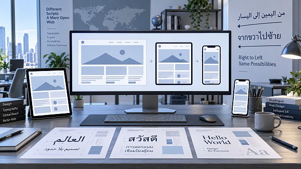
Changing reading direction changes interface logic, not just text alignment
RTL (right-to-left) languages such as Arabic and Hebrew require pages to be direction-aware. Simply setting body text to text-align: right cannot resolve issues involving navigation order, icon placement, carousel direction, breadcrumb arrows, form controls, floating tooltips, and animation movement. What truly needs to change is the semantics of the layout.
The HTML root element should use the correct lang and dir attributes based on the language. For example, an Arabic page can use lang="ar" dir="rtl". At the styling level, logical properties such as margin-inline-start, padding-inline-end, and inset-inline should be prioritized over physical direction properties that rely heavily on left and right. This allows the same component to adjust automatically according to writing direction, reducing override conflicts caused by separately maintaining RTL stylesheets.
However, not all content should be reversed as a whole. Phone numbers, email addresses, URLs, model numbers, SKUs, numeric ranges, code snippets, and some international brand names may still follow LTR display rules. Without isolation handling, bidirectional text can cause misplaced punctuation, incorrect number order, or broken model numbers. Dynamically inserted product data, default form values, and third-party components must be verified item by item in real language environments rather than relying solely on static page previews.
Font strategy should balance glyph coverage, performance, and layout stability
“Being able to display characters” does not mean a font solution is adequate. Common issues on multilingual pages include fonts lacking glyphs for certain languages and falling back to system fonts; significant differences in visual height across writing systems at the same font size; and font replacement after loading causing headings to wrap, which in turn results in cumulative layout shift. Scripts with combining characters or cursive characteristics, such as Thai and Arabic, are also more sensitive to font rendering quality.
Font selection should first confirm Unicode coverage, then evaluate font weights, file size, licensing conditions, and rendering consistency. Packaging all languages into one large font file may seem easy to manage, but it increases above-the-fold request overhead; splitting font resources by language or character set and matching them through unicode-range is usually more effective for controlling transfer volume. For body copy, a system font stack can serve as a reliable fallback; for branded heading fonts, line-height and wrapping behavior should be tested when fonts fail to load, load slowly, or fall back.
Line height should not completely follow English design values. Chinese, Thai, Arabic, and Latin languages containing diacritics can easily appear visually crowded or even have glyph collisions with tight line spacing. Typography tokens should treat font family, font size, line height, letter spacing, and word-breaking rules as configurable options rather than scattering them across page-level styles. This makes the impact of adding languages or replacing fonts easier to track.
Responsive breakpoints should be determined by content failure points
A common approach is to set fixed breakpoints by device category, but multilingual websites should instead observe where content begins to fail. The same four-column product card layout may remain usable at narrower widths in English, while titles may become crowded earlier in the German version; a horizontal desktop navigation bar may need to collapse sooner in Arabic due to changes in menu order and text width.
Therefore, breakpoint design should not refer only to screen size, but also examine the minimum usable width of components. Test content can be categorized into short text, long text, text containing numbers and units, RTL text, and bidirectional text. The following areas are especially easy to overlook: top announcement bars, primary navigation, filter criteria, form validation messages, product specifications, download document names, Cookie consent pop-ups, and fixed floating buttons. These elements usually have limited space, yet directly affect browsing, inquiries, or ordering paths.
Mobile layouts should also avoid using “hiding content” as the only compression method. If certification information, delivery scope, specification notes, or contact entry points available on desktop are removed on mobile, the page may look cleaner but lose information that influences decision-making. A more reasonable approach is to reorganize priorities: collapse lengthy content, convert side-by-side information into vertical layouts, place secondary actions in menus, while retaining key facts and primary action entry points.
SEO crawlability must not be weakened by front-end language-switching mechanisms
Multilingual versions need to be understood by search engines as separate pages targeting different languages or regions, rather than relying on browser scripts to replace text dynamically within the same URL. If language content is generated only after front-end execution, or users are forcibly redirected based on IP addresses or browser language, crawling, indexing, and user sharing may all become uncertain.
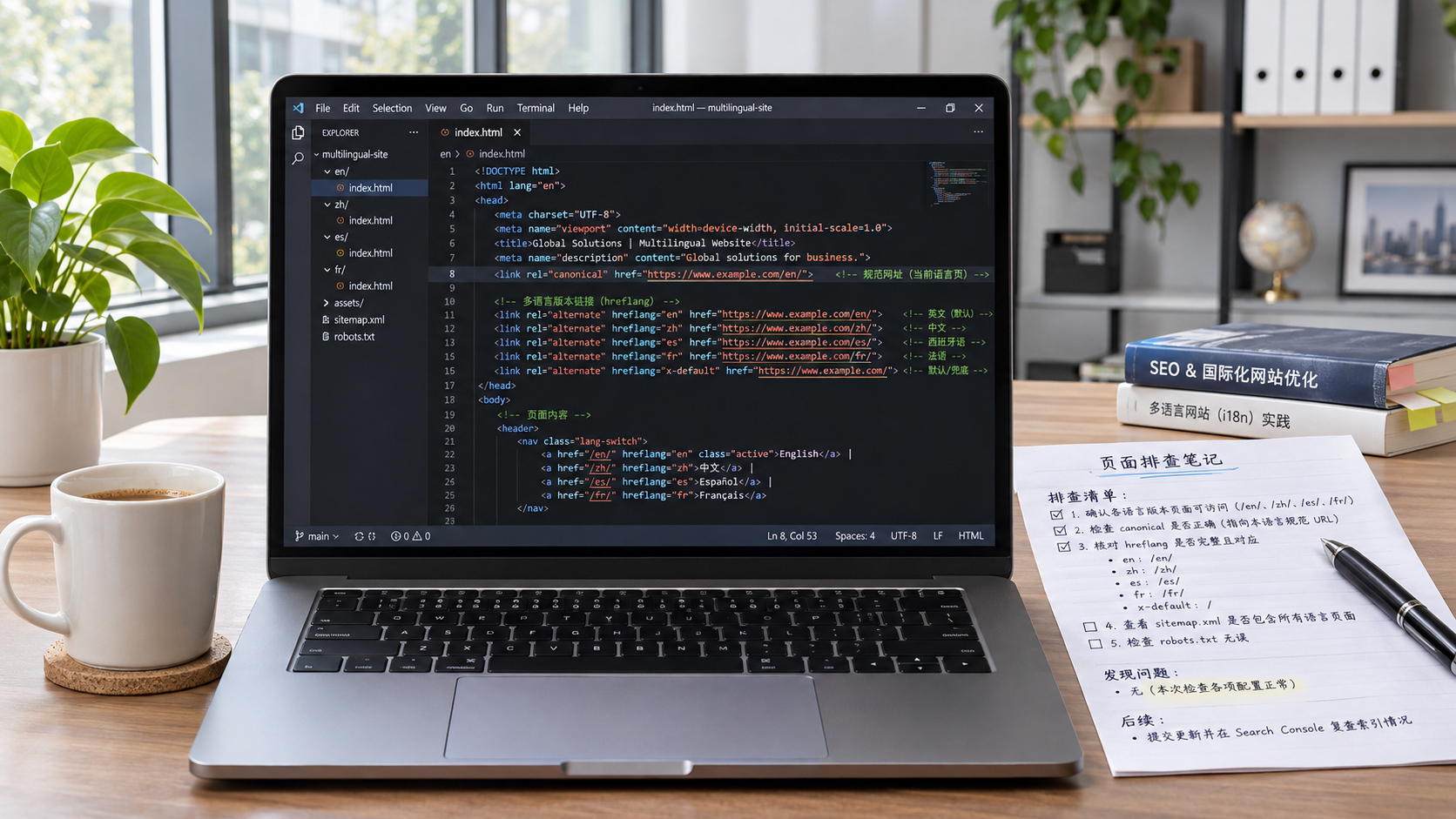
Each language version should have a stable, accessible URL and use the corresponding lang attribute on the page root element. Language versions can use hreflang annotations to help search engines identify alternate pages; however, this requires each page to genuinely provide visible content for the corresponding language or region and maintain consistent reciprocal references. Do not directly include machine-translated placeholder content, unfinished pages, or highly repetitive pages in language mappings.
Responsive implementation also affects crawl quality. Key body content, product attributes, heading hierarchy, and internal links should not exist only in the desktop DOM or be injected only after a click. Images should use a resource strategy with appropriate dimensions while retaining meaningful alternative text; language switchers should use accessible links rather than visual controls with script events only. For B2B websites, PDFs, specification sheets, and inquiry forms must also be checked to ensure that link targets and field languages are consistent across language paths.
Acceptance testing should cover “extreme content,” rather than checking only default pages
An acceptance standard suitable for multilingual standalone websites should include at least five dimensions: language, direction, fonts, breakpoints, and crawlability. Check whether long text overflows or overlaps; whether RTL pages contain incorrect mirroring; whether target-language glyphs are complete and line height is normal; whether reflow from narrow to wide screens preserves core information; and whether language versions have independent URLs, correct language declarations, and accessible internal links.
Keyboard focus order, screen-reader reading order, and visual order should also be checked for consistency. Particularly on RTL pages, if only CSS visual reversal is used without adjusting the DOM structure or interaction logic, focus movement may run opposite to the page’s reading direction. Details such as form error messages, dropdown menus, and close buttons on pop-ups often provide a better test than homepage banners of whether a responsive system has truly been internationalized.
The standard for evaluating responsive design on multilingual standalone websites should not be “the page can open on a mobile phone,” but whether different languages remain readable, operable, understandable, and indexable across different devices. Only by incorporating language length, writing direction, and font rendering into component design and launch acceptance can later reliance on page-by-page patches to resolve layout problems be avoided.
Related Articles
 Why Might a Page Not Be Indexed Even When hreflang Is Configured Correctly?
 How Should a B2C Multilingual Website Set Currencies for Different Regions?
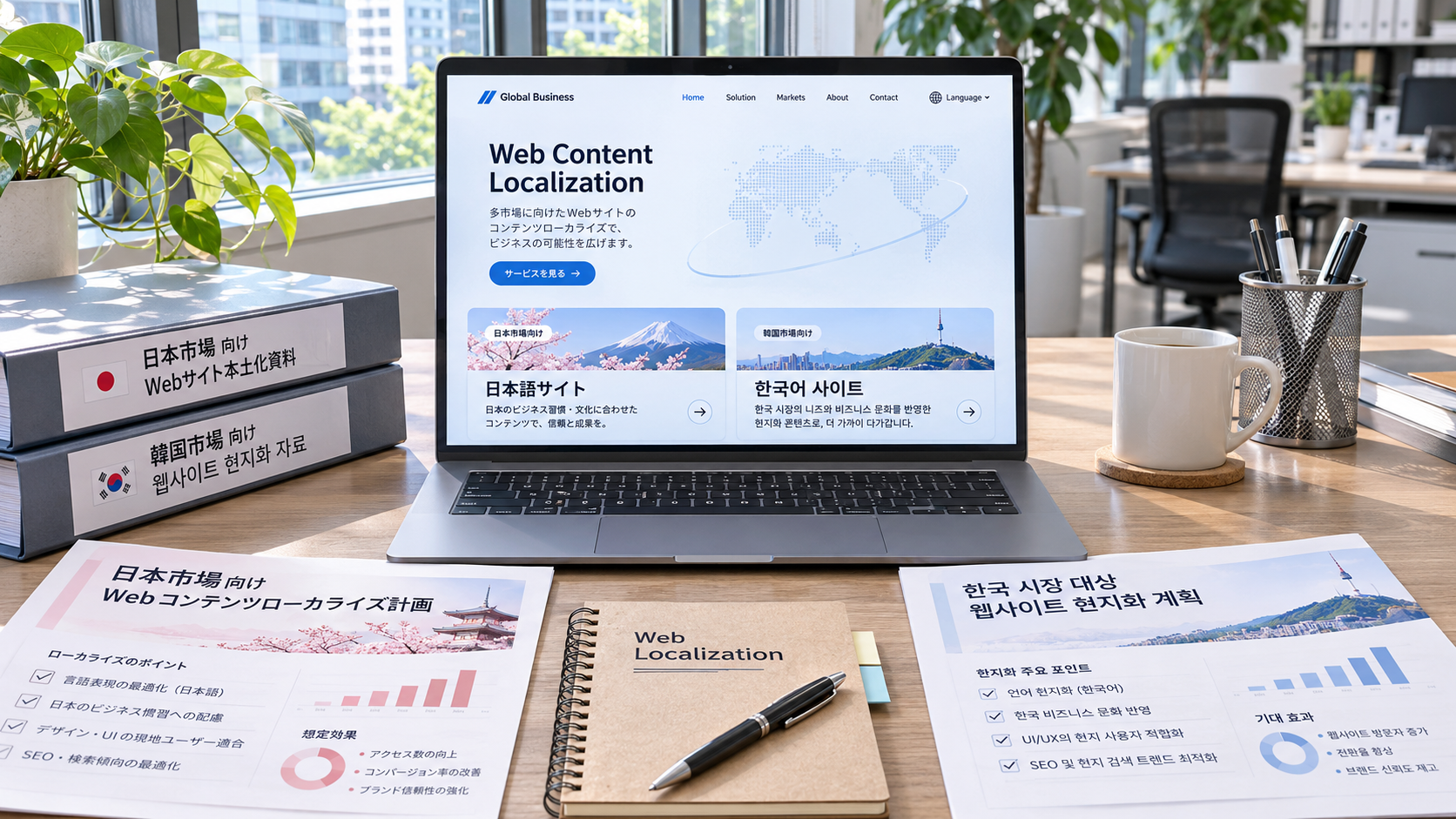
 Can a Korean-language website reach Japanese customers when expanding into the Japanese and South Korean markets?

Related Products
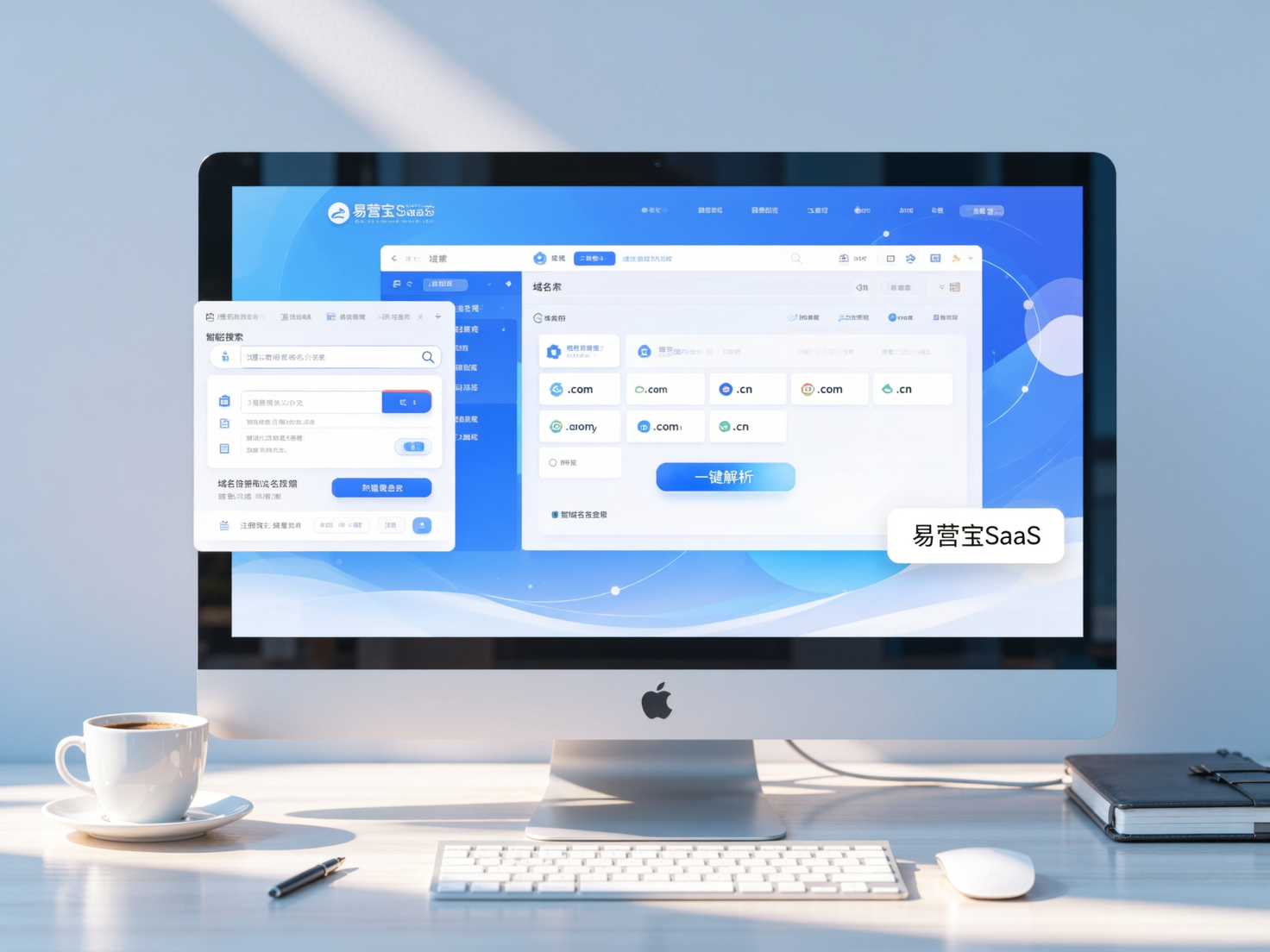
 Yiyingbao SaaS Intelligent Website Building and Marketing SystemYiyingbao SaaS Intelligent Website Building and Marketing System, AI-powered no-code website building, rapid creation of multilingual B2B international websites in 10 minutes, global server acceleration, AI-powered SEO optimization, helping businesses connect efficiently with global markets. The perfect integration of technology and operation makes building an international trade website remarkably simple
 AI+SEM Intelligent Advertising Marketing SystemAI+SEM drives intelligent ad creation, empowering full-funnel precision advertising marketing. The system automatically generates weekly/monthly reports, AI recommends keywords and target countries, monitors core metrics in real-time with intelligent alerts, and enables one-click high-conversion ad solutions to help quickly acquire customers and improve ROI.
 AI+SEO Dual-Engine System Optimization ServicesYiyingbao’s AI+SEO dual-engine optimization system helps foreign trade enterprises acquire high-quality organic traffic through AI-powered keyword research, content generation, and comprehensive technical optimization, significantly improving search rankings and conversion rates.
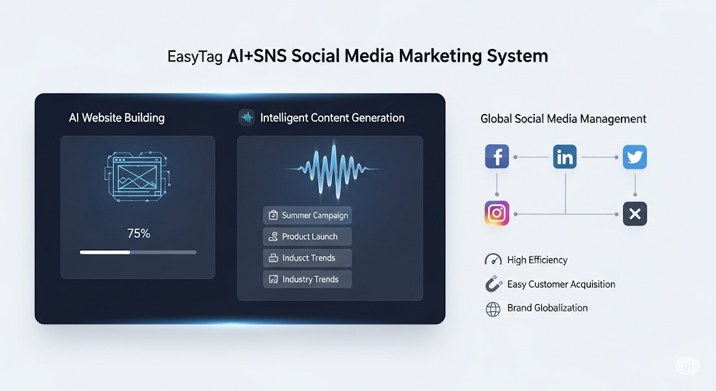
 AI+SNS Social Media Marketing SystemYingbao AI+SNS Social Media Marketing System - Precision social capture for the social media era. Supports one-click content synchronization across major platforms like Facebook and LinkedIn. AI intelligently rewrites posts for enhanced relevance. 24/7 AI customer service and user profiling analysis empower businesses to efficiently expand into global markets.
 AI+SEO营销解决方案易营宝AI+SEO营销解决方案,通过AI批量写作、智能生成TDK、精准关键词扩词等功能,全面优化网站SEO效果,提升流量与转化率。助力企业构建高效智能网站新生态。
 AI+SEM Advertising Marketing SolutionsAI+SEM Advertising Marketing Solution leverages AI technology to deeply empower SEM ad campaigns. It automatically generates weekly/monthly reports using AI, presenting account data across multiple dimensions for comprehensive insights into campaign performance and trends. The system precisely recommends keywords and target countries, intelligently generates high-conversion ad copy, and enables one-click activation of efficient campaign plans to help businesses rapidly acquire customers. Simultaneously, it monitors core metrics in real time, intelligently identifies abnormal fluctuations, and issues timely alerts to ensure stable, high-return advertising results.
 Domain Name ServicesEasyWin provides professional domain name services, including intelligent queries, one-stop registration, brand protection, and full lifecycle management, helping businesses build a digital brand image.
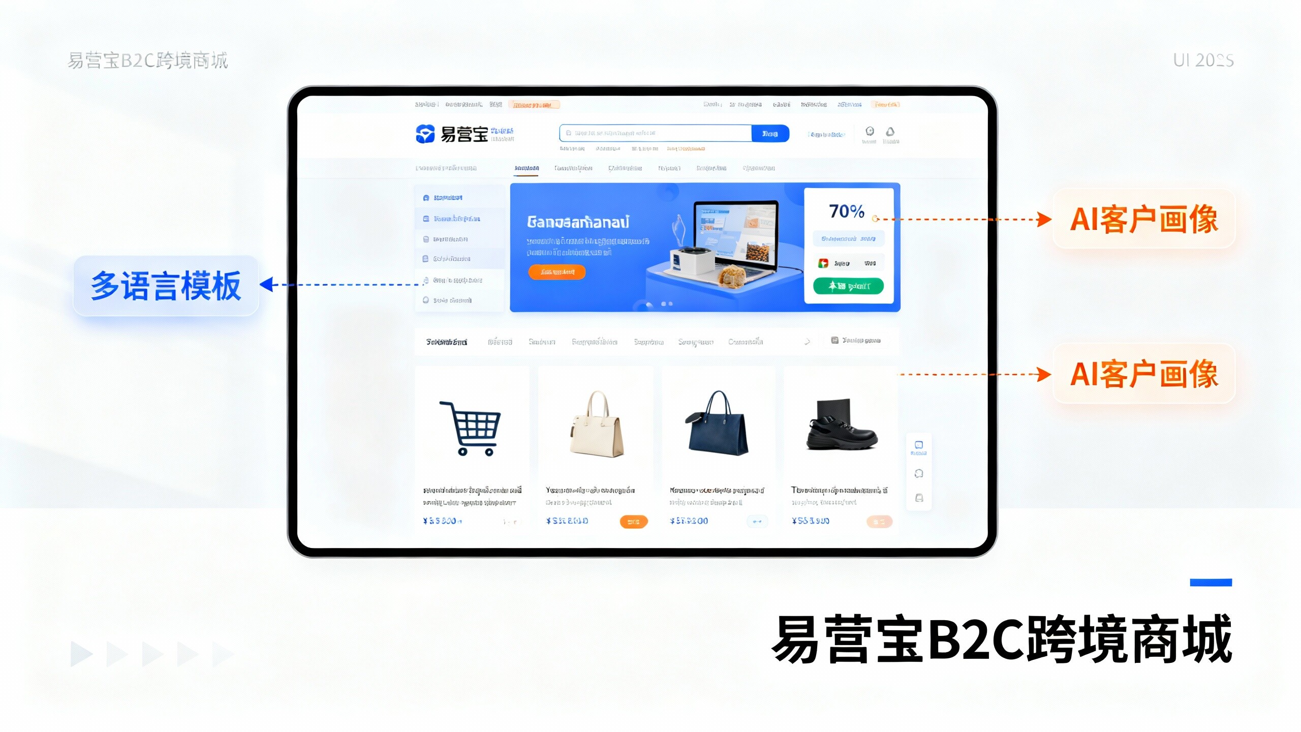
 EasyOperate B2C Cross-Border E-Commerce Platform & Independent WebsiteEasyStore B2C Cross-border E-commerce Independent Store is an intelligent website building and cross-border e-commerce integrated solution independently developed by EasyStore Information Technology (Beijing) Co., Ltd. The system is specially designed for small and medium-sized as well as large export enterprises, integrating 'website building, operation, marketing, advertising, and conversion' into one, helping enterprises quickly establish cross-border e-commerce independent stores to achieve brand globalization and global sales growth.
The platform supports multiple languages, multiple currencies, and multi-channel marketing, with built-in AI intelligent translation and SEO optimization systems, suitable for mainstream markets such as Southeast Asia, Europe and America, Latin America, and the Middle East, assisting Chinese manufacturing enterprises in efficiently deploying international e-commerce strategies. SSL证书易营宝提供专业SSL安全证书服务,包括单域名和泛域名证书,确保网站数据传输加密、身份验证和完整性保护,助力企业建立安全可信的在线业务环境。