








- China’s Tariff Commission of the State Council Adjusts Additional Tariffs on U.S. Goods: 24% Tariff Suspended for Two MonthsNov 10, 2026View details
- APEC Shenzhen Spotlight: Cross-Border E-Commerce Orders Promote Asia-Pacific Trade and Economic CooperationNov 08, 2026View details
- China-Europe Railway Express and CIIE Hold Business Matchmaking Event, Focusing on Cross-Border E-commerce B2B ExportsNov 07, 2026View details
- China’s Ministry of Commerce Responds to Additional Charges on Low-Value Imports Imposed by the EUNov 06, 2026View details
- Two Internet Development Reports Released at the 2026 World Internet ConferenceNov 05, 2026View details
- Internet Business Revenue of Enterprises Above the Designated Size Reached RMB 1.716 Trillion in the First Three Quarters, with Profits Up 17.6%Nov 05, 2026View details
Does a Poor Mobile Experience Affect Google Rankings?
It can have an impact, but it is important to distinguish between the specific causes: if search engines cannot properly access the content, links, and resources on mobile pages, this may directly affect indexing and rankings. Experience issues such as slow loading, layout shifts, and sluggish interactions may also affect search performance. However, page experience is just one of many factors. Content relevance and quality still matter, and fixing a particular metric does not guarantee an immediate ranking increase.
For international trade websites, you should also consider the visitor’s location, network conditions, and device performance. A page that loads smoothly on a local mobile phone may not provide the same experience for visitors overseas. Likewise, a low score from a single test does not, on its own, prove that a ranking drop was caused by the mobile experience.
How mobile issues can affect search performance
Search engines primarily use the mobile version of a website’s content for indexing. If the desktop version includes complete product descriptions, specifications, and navigation links, but the mobile version hides or removes them because of adaptation—or requires user interaction before they load—search engines may see incomplete content. The key is to confirm that the content is actually present and accessible on the mobile version, rather than simply checking whether the page looks good on a phone.
Displaying product specifications in expandable panels is common in responsive layouts. As long as the content loads and is accessible, presenting it in a collapsed panel does not, by itself, mean it is excluded from indexing. However, if the data is requested from an interface only after a click, check whether that request succeeds and whether search engines can retrieve the content. Navigation menus, pagination links, and language-switching options should be checked in the same way.
Slow loading and difficult interactions can also affect real visits: visitors may leave while waiting for images, or click an inquiry button only to hit another element that has suddenly shifted into place. This may reduce qualified visits and conversions. Such behavior should not be simplistically treated as a fixed ranking penalty, but it can point to experience issues that need to be fixed.
Start with the real user experience, then identify page issues
Core Web Vitals provide a common framework for troubleshooting mobile experience. When evaluating performance, prioritize real-user data and look at differences across pages, regions, and devices. Lab tests are useful for reproducing issues in a controlled environment and comparing results before and after changes. The two types of data are collected under different conditions, so it is not unusual for their results to differ.
- Largest Contentful Paint (LCP): Reflects how quickly the main content appears. A large hero image above the fold on a product detail page, a slow server response, and render-blocking resources can all make it slower. The good threshold in the standard is 2.5 seconds or less.
- Interaction to Next Paint (INP): Reflects how quickly a page responds to interactions, such as opening a menu, switching specifications, or receiving feedback after submitting a form. The good threshold is 200 milliseconds or less.
- Cumulative Layout Shift (CLS): Reflects the extent to which visible page elements move unexpectedly. Images without reserved dimensions and banners that appear late can cause buttons to shift. The good threshold is 0.1 or less.
These thresholds are used to assess experience; meeting them does not mean a page will be rewarded with higher rankings. Real-user data is generally evaluated at the 75th percentile of visits: in other words, whether at least 75% of visits meet the relevant standards. A good result from a single test cannot replace an assessment of real visits over a period of time.

Start by checking the mobile Core Web Vitals report in the webmaster tools used to monitor search performance. Identify the affected page groups, then use a web performance testing tool to analyze representative URLs. Page groups in the report can help reveal common issues, but not every page in a group will necessarily perform the same way. If there is not enough traffic to provide real-user data, simulate tests on a mobile device over a restricted network, and plan to review real-user data later.
The same “slow to load on a phone” issue can have different causes
The main content takes a long time to appear: First determine whether the server response is slow or whether resources are taking a long time to download and render. If the time to first byte is high, investigate the server, caching, and network access in the target region. If the page framework has appeared but the main image has not, check the image’s file size, format, dimensions, and loading priority. Lazy-loading the main image above the fold can actually delay the appearance of the primary content.
The page does not respond to clicks after appearing: A common cause is scripts occupying the main thread. For example, chat widgets, analytics code, and multiple marketing plugins may all start at once, making the page appear fully loaded while menus and forms remain unresponsive. Use a performance analysis tool to identify long tasks, then remove unnecessary scripts, defer non-critical code, and verify each feature still works as expected.
Content suddenly shifts up or down: Check whether dimensions have been reserved for images, videos, and embedded content; whether text layout changes as fonts load; and whether banners are inserted asynchronously above the content. Setting explicit dimensions or aspect ratios for media allows the browser to reserve space in advance. Pop-ups and notification bars should also be designed to avoid pushing page content away just as users are about to click.
Mobile usability does not mean search engines can read the content
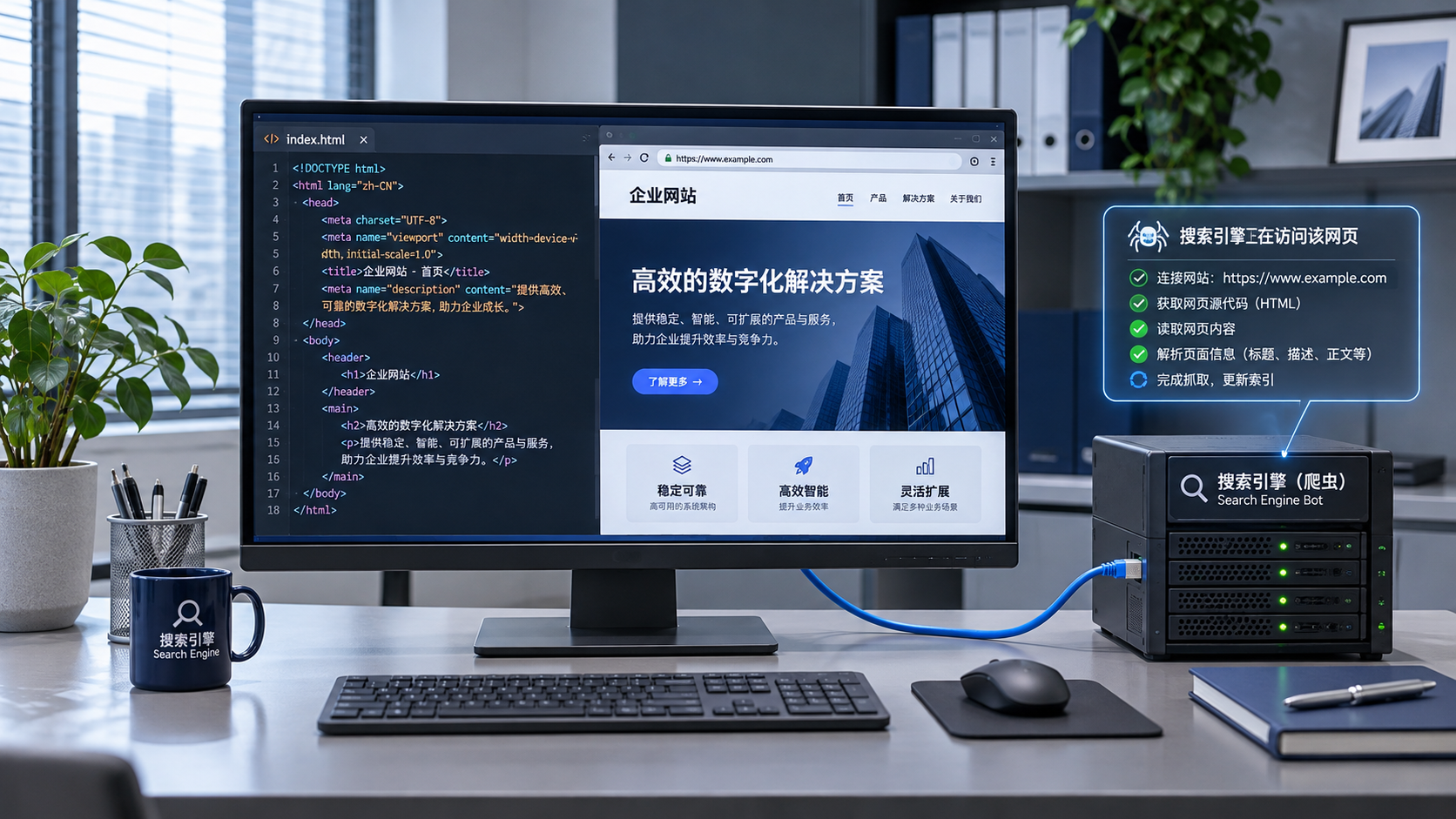
After opening a page in a mobile browser, also check what search engines actually retrieve. Use a URL inspection tool to view the crawl results and rendered page, and confirm that the main text, product information, and important links are present. If content is visible in the browser but missing from the rendered result, focus on script errors, restrictions on interface access, and cases where stylesheets or script resources are blocked from crawling.
For multilingual websites, check the language versions on mobile as well. Automatic redirects or region detection that show different content to different visitors may prevent search engines from discovering the intended versions. Important language pages should have accessible URLs and standard links. Also confirm that the canonical URL and language-version annotations on mobile correspond to the actual page.
Lazy loading is suitable for content outside the viewport, but avoid relying on complex scroll events to display key information. To test, disable the cache, reopen the page, and scroll through it section by section. Check whether images, specifications, and inquiry options load. Also check whether the text is too small, whether horizontal scrolling is required, and whether buttons are spaced far enough apart to avoid accidental taps.
How to determine whether changes were effective
Changing too many things at once makes it difficult to tell which change actually helped. Start with pages that receive a lot of traffic or have obvious issues. Record the metrics and test conditions before making changes, then adjust the main bottleneck. For example, address the above-the-fold image first, retest, and then investigate third-party scripts. If you only compressed the image and interactions are still sluggish, continue by checking main-thread tasks rather than repeatedly adjusting the image.
After publishing changes, use a real phone to verify key processes such as the menu, language switching, forms, and payment. Then monitor crawling, indexing, and mobile experience data in webmaster tools. Real-user data takes time to accumulate, and search results are also affected by content relevance, competing pages, and crawl updates. Assess the results in light of page changes and the observation period, and avoid directly attributing short-term ranking fluctuations to a single performance optimization.
Related Articles
 How Should You Strategically Place Inquiry-Generating Keywords on Your Export Website to Attract Potential Customers?
 Does a Poor Mobile Experience Affect Google Rankings?
 How does search engine crawling affect website SEO rankings?


Related Products
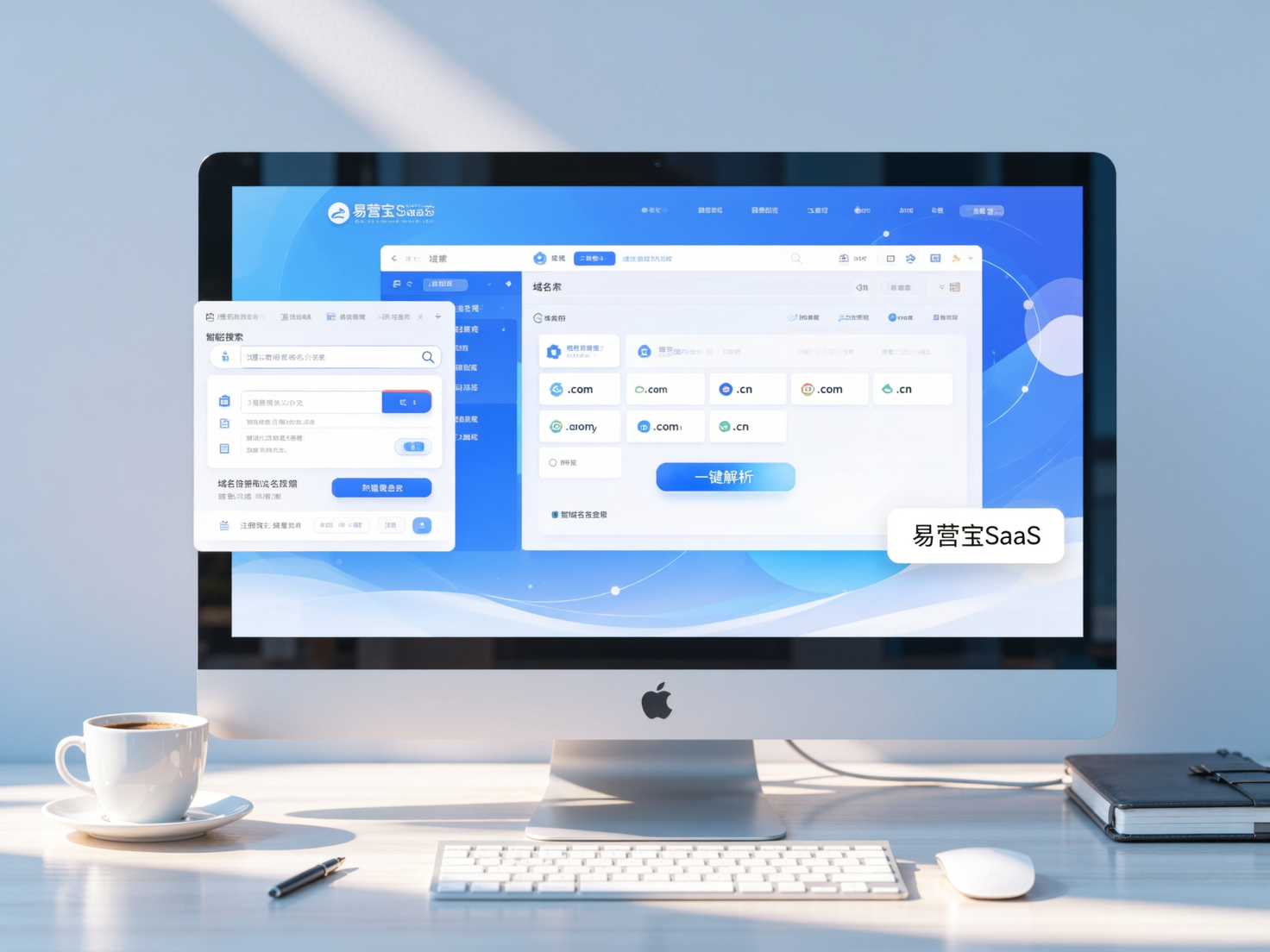
 Yiyingbao SaaS Intelligent Website Building and Marketing SystemYiyingbao SaaS Intelligent Website Building and Marketing System, AI-powered no-code website building, rapid creation of multilingual B2B international websites in 10 minutes, global server acceleration, AI-powered SEO optimization, helping businesses connect efficiently with global markets. The perfect integration of technology and operation makes building an international trade website remarkably simple
 AI+SEM Intelligent Advertising Marketing SystemAI+SEM drives intelligent ad creation, empowering full-funnel precision advertising marketing. The system automatically generates weekly/monthly reports, AI recommends keywords and target countries, monitors core metrics in real-time with intelligent alerts, and enables one-click high-conversion ad solutions to help quickly acquire customers and improve ROI.
 AI+SEO Dual-Engine System Optimization ServicesYiyingbao’s AI+SEO dual-engine optimization system helps foreign trade enterprises acquire high-quality organic traffic through AI-powered keyword research, content generation, and comprehensive technical optimization, significantly improving search rankings and conversion rates.
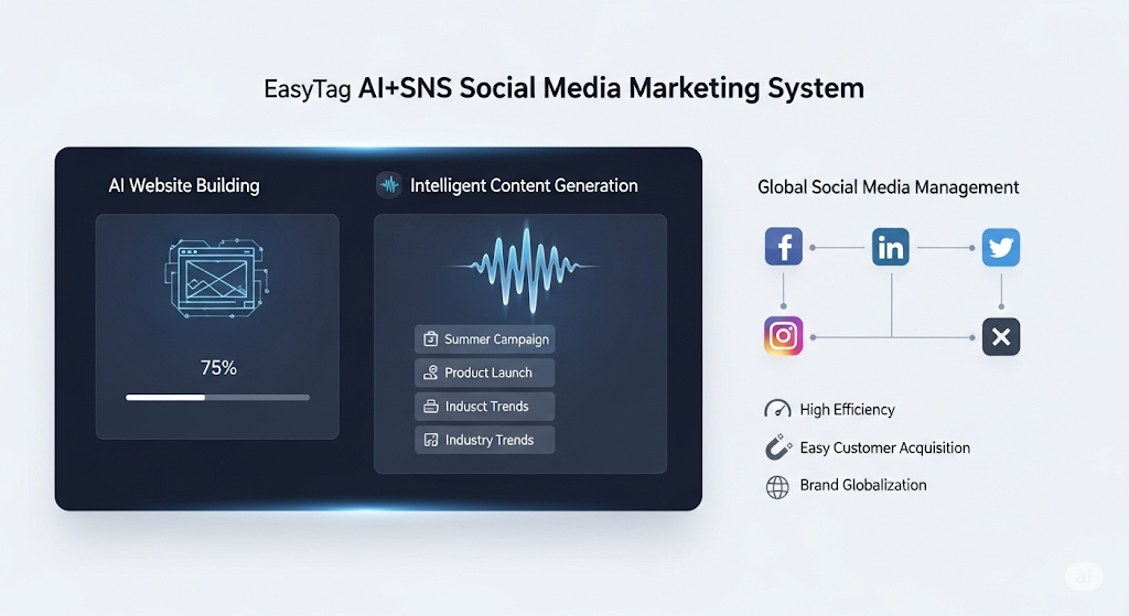
 AI+SNS Social Media Marketing SystemYingbao AI+SNS Social Media Marketing System - Precision social capture for the social media era. Supports one-click content synchronization across major platforms like Facebook and LinkedIn. AI intelligently rewrites posts for enhanced relevance. 24/7 AI customer service and user profiling analysis empower businesses to efficiently expand into global markets.
 AI+SEO营销解决方案易营宝AI+SEO营销解决方案,通过AI批量写作、智能生成TDK、精准关键词扩词等功能,全面优化网站SEO效果,提升流量与转化率。助力企业构建高效智能网站新生态。
 AI+SEM Advertising Marketing SolutionsAI+SEM Advertising Marketing Solution leverages AI technology to deeply empower SEM ad campaigns. It automatically generates weekly/monthly reports using AI, presenting account data across multiple dimensions for comprehensive insights into campaign performance and trends. The system precisely recommends keywords and target countries, intelligently generates high-conversion ad copy, and enables one-click activation of efficient campaign plans to help businesses rapidly acquire customers. Simultaneously, it monitors core metrics in real time, intelligently identifies abnormal fluctuations, and issues timely alerts to ensure stable, high-return advertising results.
 Domain Name ServicesEasyWin provides professional domain name services, including intelligent queries, one-stop registration, brand protection, and full lifecycle management, helping businesses build a digital brand image.
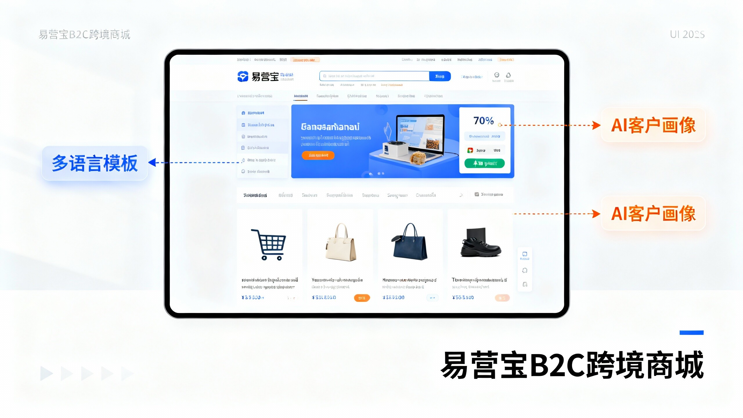
 EasyOperate B2C Cross-Border E-Commerce Platform & Independent WebsiteEasyStore B2C Cross-border E-commerce Independent Store is an intelligent website building and cross-border e-commerce integrated solution independently developed by EasyStore Information Technology (Beijing) Co., Ltd. The system is specially designed for small and medium-sized as well as large export enterprises, integrating 'website building, operation, marketing, advertising, and conversion' into one, helping enterprises quickly establish cross-border e-commerce independent stores to achieve brand globalization and global sales growth.
The platform supports multiple languages, multiple currencies, and multi-channel marketing, with built-in AI intelligent translation and SEO optimization systems, suitable for mainstream markets such as Southeast Asia, Europe and America, Latin America, and the Middle East, assisting Chinese manufacturing enterprises in efficiently deploying international e-commerce strategies. SSL证书易营宝提供专业SSL安全证书服务,包括单域名和泛域名证书,确保网站数据传输加密、身份验证和完整性保护,助力企业建立安全可信的在线业务环境。