








- Fujian Announces the First Batch of Provincial-Level Cross-Border E-Commerce Industrial Parks and Key Brands for CultivationNov 14, 2026View details
- Amazon Global Store Announces the Launch of the 2026 Black Friday Global Shopping SeasonNov 14, 2026View details
- CCTV.com Examines APEC’s Role in China’s Foreign TradeNov 12, 2026View details
- China’s Tariff Commission of the State Council Adjusts Additional Tariffs on U.S. Goods: 24% Tariff Suspended for Two MonthsNov 10, 2026View details
- APEC Shenzhen Spotlight: Cross-Border E-Commerce Orders Promote Asia-Pacific Trade and Economic CooperationNov 08, 2026View details
- China-Europe Railway Express and CIIE Hold Business Matchmaking Event, Focusing on Cross-Border E-commerce B2B ExportsNov 07, 2026View details
Can Responsive Design Really Adapt to All Mobile Devices?
Responsive design cannot guarantee compatibility with “all mobile devices,” but it remains the foundational solution for covering mainstream smartphones, tablets, and different screen orientations. It addresses layout reflow across different viewport widths; it does not automatically eliminate all differences caused by device performance, browser engines, input methods, network conditions, and system interfaces. For mobile website development, compatibility cannot be judged merely by whether a page has been scaled down to fit a phone screen.
A product detail page that displays properly on desktop may encounter issues on mobile, such as an excessively tall hero image, horizontally overflowing specification tables, inquiry buttons obscured by the bottom browser bar, or difficult-to-use filter menus. Even if there is no obvious misalignment, these situations should still be considered incomplete adaptation. Websites intended for overseas audiences must also account for display differences caused by commonly used device models in different regions, language length, network fluctuations, and browser versions.
What Responsive Design Specifically Solves
Responsive design typically uses flexible layouts, relative units, breakpoint rules, and media queries to allow the same page code to change its arrangement based on screen width. For example, three-column desktop content becomes a single column on narrow screens, horizontal navigation collapses into a menu, images scale according to container width, and form fields change from side-by-side to vertically stacked.
This mechanism reduces the workload of maintaining separate sets of pages for phones, tablets, and desktops, while also centralizing content, links, and search indexing signals under the same URL. However, “screen width” is only one variable among device differences. Two phones with similar widths may provide entirely different user experiences because of differences in pixel density, system font scaling, browser toolbar height, or performance levels.
Therefore, the proper goal of responsive design is to ensure that key information is readable, key actions can be completed, and page loading and interactions remain stable within predefined mainstream viewport ranges. It is not an unconditional guarantee for all sizes, all system versions, and all extreme usage conditions.
Why the Same Responsive Page Can Still Have Problems on Mobile
The most common misconception is treating device previews in browser developer tools as real compatibility testing. Preview modes primarily simulate width and height and cannot accurately reflect touch delays, soft keyboard pop-ups, real network conditions, enlarged system fonts, rendering on low-performance devices, or page changes after third-party scripts load.
For example, a page may use a fixed-height hero banner that looks well arranged in the design mockup. However, when the address bar in a mobile browser expands or collapses, the visible viewport height changes, and headings, forms, or buttons may be pushed out of the initial screen. Similarly, an image may use a very large original file and rely on front-end scaling. While its visual size may be appropriate, the download size is not reduced on mobile networks, so the initial page load remains slow.
Multilingual pages can also easily reveal the limitations of responsive design. An English button may display normally on one line, but longer German, Russian, or French translations may cause button text to wrap, overflow, or even compress adjacent icons. Right-to-left languages such as Arabic involve more than text replacement; they also affect navigation order, arrow direction, form alignment, and text-image layouts.

Key Factors That Affect Adaptation Results
Viewport breakpoints should not be set solely by device names. “Mobile” and “tablet” are not stable size categories. There are overlapping ranges between folded and unfolded foldable devices, portrait and landscape orientations, small tablets, and large phones. A more reliable approach is to observe at which width content starts to become crowded and set layout adjustment rules there. Breakpoints should serve the content rather than mechanically correspond to a particular device.
Touch interactions have their own requirements. Secondary menus, image enlargement prompts, and floating actions that rely on mouse hover on desktop may not be discovered or triggered on touchscreens. Clickable areas that are too small, buttons placed too close together, and dropdown layers that cannot be closed can directly affect form submission, product filtering, and page navigation. Mobile interactions require clear tap feedback, and key actions should not rely solely on hover states.
Content components determine layout risks. Long specification parameters, comparison tables, address information, verification code input fields, embedded maps, video players, and floating chat windows are all more likely than standard text-and-image content to cause issues on narrow screens. Tables in particular often become difficult to read when the font size is simply reduced; converting important fields into grouped cards, collapsible items, or horizontally scrollable areas usually better suits mobile browsing behavior.
Performance and visual adaptation need to be validated together. The absence of a horizontal scrollbar does not mean the mobile experience is acceptable. When large images, videos, advertising analytics scripts, and multiple font files load simultaneously in the initial viewport, slow networks may first display a blank screen and then cause layout shifts. Images should be provided in sizes suitable for different screens and network conditions, below-the-fold resources should load later, and dynamic modules should reserve adequate space to prevent loaded content from pushing displayed buttons away from their original positions.
The Difference Between “Displayable” and “Usable”
This difference is particularly evident on marketing-oriented pages. Visitors entering from search results, advertising landing pages, or social media links often first filter information on their phones. If the initial viewport cannot quickly explain the product range, contact details are covered by floating components, or the language version after navigation does not match the entry point, the user journey will be interrupted even if the subsequent page content is complete.
Real Scenarios to Cover Before Launch
Testing does not need to exhaust every device model, but it should cover combinations that can change page behavior: narrow-screen and large-screen phones, portrait and landscape orientations, common mobile browsers, different language versions, and first-time visits under slower network conditions. Testing should focus on key paths such as the homepage initial viewport, product listings, detail pages, filter pages, inquiry forms, login, or checkout, rather than only checking static informational pages.
- After system fonts are enlarged, headings, prices, parameters, and button text should remain complete and must not be clipped because of fixed heights.
- When opening the soft keyboard to fill in a form, the page should scroll to the active field, and the submission entry point and error messages should not fall into an invisible area.
- When entering a deep page directly from an advertisement or social media link, images, tracking scripts, and redirect rules must not delay the appearance of core content.
- Horizontal tables, carousels, and video components require separate checks because they are most likely to create overflow or accidental taps near breakpoints.
Testing should also be performed after content is close to its final live state. When placeholder text is short, images are lightweight, and product names are highly consistent, pages can appear stable; hidden problems emerge only after replacing them with real long titles, multi-specification parameters, descriptions in different languages, and actual assets. Without this round of coordination among content entry, visual design, and front-end development, concentrated rework often occurs before launch.
How Adaptation Boundaries Should Be Defined
Can responsive design for mobile website development cover all devices? The answer is no; however, this does not mean that each device needs to be developed separately. A reasonable boundary is to determine the screen ranges, browser environments, language versions, and interaction scenarios to prioritize based on traffic sources and business paths, then verify on real devices whether key tasks can be completed smoothly.
For very old browsers, unusually small screens, non-standard in-app browsers, or special system settings, a graceful degradation strategy can be used: prioritize ensuring that content can be read, links can be accessed, and forms can be submitted, rather than requiring every animation, complex filter, or visual effect to be completely consistent. Including the compatibility scope in requirements and acceptance criteria is more effective at avoiding gaps between timeline and results than judging a page to be problem-free after launch simply because “responsive design has been completed.”
Related Articles
 Can an AI website builder demo show how pages look on mobile?
 Is Your AI-Generated Website Not Being Indexed by Search Engines? Follow These Steps to Troubleshoot SEO Issues
 What Website Maintenance Tasks Can AI Handle? Automated Monitoring, Updates, and Human Review



Related Products
 Yiyingbao SaaS Intelligent Website Building and Marketing SystemYiyingbao SaaS Intelligent Website Building and Marketing System, AI-powered no-code website building, rapid creation of multilingual B2B international websites in 10 minutes, global server acceleration, AI-powered SEO optimization, helping businesses connect efficiently with global markets. The perfect integration of technology and operation makes building an international trade website remarkably simple
 AI+SEM Intelligent Advertising Marketing SystemAI+SEM drives intelligent ad creation, empowering full-funnel precision advertising marketing. The system automatically generates weekly/monthly reports, AI recommends keywords and target countries, monitors core metrics in real-time with intelligent alerts, and enables one-click high-conversion ad solutions to help quickly acquire customers and improve ROI.
 AI+SEO Dual-Engine System Optimization ServicesYiyingbao’s AI+SEO dual-engine optimization system helps foreign trade enterprises acquire high-quality organic traffic through AI-powered keyword research, content generation, and comprehensive technical optimization, significantly improving search rankings and conversion rates.
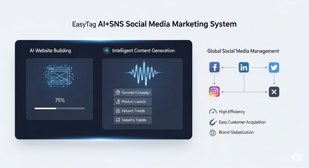
 AI+SNS Social Media Marketing SystemYingbao AI+SNS Social Media Marketing System - Precision social capture for the social media era. Supports one-click content synchronization across major platforms like Facebook and LinkedIn. AI intelligently rewrites posts for enhanced relevance. 24/7 AI customer service and user profiling analysis empower businesses to efficiently expand into global markets.
 AI+SEO营销解决方案易营宝AI+SEO营销解决方案,通过AI批量写作、智能生成TDK、精准关键词扩词等功能,全面优化网站SEO效果,提升流量与转化率。助力企业构建高效智能网站新生态。
 AI+SEM Advertising Marketing SolutionsAI+SEM Advertising Marketing Solution leverages AI technology to deeply empower SEM ad campaigns. It automatically generates weekly/monthly reports using AI, presenting account data across multiple dimensions for comprehensive insights into campaign performance and trends. The system precisely recommends keywords and target countries, intelligently generates high-conversion ad copy, and enables one-click activation of efficient campaign plans to help businesses rapidly acquire customers. Simultaneously, it monitors core metrics in real time, intelligently identifies abnormal fluctuations, and issues timely alerts to ensure stable, high-return advertising results.
 Domain Name ServicesEasyWin provides professional domain name services, including intelligent queries, one-stop registration, brand protection, and full lifecycle management, helping businesses build a digital brand image.
 EasyOperate B2C Cross-Border E-Commerce Platform & Independent WebsiteEasyStore B2C Cross-border E-commerce Independent Store is an intelligent website building and cross-border e-commerce integrated solution independently developed by EasyStore Information Technology (Beijing) Co., Ltd. The system is specially designed for small and medium-sized as well as large export enterprises, integrating 'website building, operation, marketing, advertising, and conversion' into one, helping enterprises quickly establish cross-border e-commerce independent stores to achieve brand globalization and global sales growth.
The platform supports multiple languages, multiple currencies, and multi-channel marketing, with built-in AI intelligent translation and SEO optimization systems, suitable for mainstream markets such as Southeast Asia, Europe and America, Latin America, and the Middle East, assisting Chinese manufacturing enterprises in efficiently deploying international e-commerce strategies. SSL证书易营宝提供专业SSL安全证书服务,包括单域名和泛域名证书,确保网站数据传输加密、身份验证和完整性保护,助力企业建立安全可信的在线业务环境。