









- Amazon Raises Fulfillment Fees Twice, Yet the Median Platform Fee Remains Around 40%Oct 22, 2026View details
- AliExpress and YouTube Partner to Expand Marketing Opportunities for Chinese Brands Going GlobalOct 22, 2026View details
- Publicis says AI marketing is developing at two speeds, with agentic AI helping win clientsOct 21, 2026View details
- Salesforce Plans to Acquire Braze for $5.66 Billion to Enhance AI Marketing CapabilitiesOct 21, 2026View details
- Levanta’s Inaugural China Summit Held in Shenzhen, Focusing on AI and Cross-Border Brand GrowthOct 20, 2026View details
- The October Edition of the 2026 GGE Shenzhen Cross-Border E-Commerce Expo OpensOct 20, 2026View details
Does a mobile-friendly corporate website affect inquiry conversion?
Does a mobile-friendly corporate website affect inquiry conversion? The answer is yes, and the impact is usually not limited to whether it “looks comfortable.” When customers visit a website on their phones but encounter text that is too small, slow-loading images, difficult-to-read product specifications, or forms that cannot be completed smoothly, many will not wait patiently. Instead, they will simply close the page and move on to the next supplier.
This is especially true in foreign trade inquiry scenarios, where buyers, distributors, or project managers often conduct their initial screening on mobile devices: searching for products, reviewing company capabilities, confirming certifications, and deciding whether a supplier is worth contacting. If basic trust is not established on mobile, even the best quotations and strongest sales follow-up will struggle to make up for the loss at the first stage.
A mobile-friendly corporate website affects the pace of customer decision-making
Many companies still view their official website as a “display window”: as long as the desktop version looks impressive and the mobile version can open, the job is considered complete. However, from the perspective of the lead-generation journey, a website is more like a sales entry point that works continuously. After visitors arrive through search, advertisements, social media links, or emails, they typically take only a short time to assess three things: what you sell, whether you are professional, and how to contact you.
Once the mobile page makes these three things difficult, inquiries will naturally decline. For example, the first screen may feature an oversized banner, pushing the actual product information below the fold; the navigation menu may have too many layers, making it hard for customers to find application scenarios or product models; WhatsApp, phone, and email buttons may not remain fixed, requiring customers to repeatedly scroll through pages when they want to inquire. These issues may not make the website “unavailable,” but they will continuously reduce the conversion efficiency from visits to inquiries.
A mobile inquiry can be understood as a very short path: understand the content, build trust, and take action. The value of mobile adaptation is to reduce hesitation and operational costs along this path, rather than simply shrinking desktop content to fit a phone screen.
Which mobile issues are most likely to cause inquiry loss
When evaluating a website in practice, it is not advisable to simply open the homepage on your own phone in the office and take a quick look. What truly needs to be examined is the complete experience across different entry points, pages, and network environments.
The first type is ineffective information hierarchy. Desktop screens are wide, allowing the homepage to display key visuals, product categories, factory capabilities, and multiple entry points at the same time. On mobile, however, if the same sequence is still stacked in place, visitors often need to scroll for a long time before seeing the core products. For B2B websites, the first mobile screen should quickly address product categories, core capabilities, and contact options, rather than leading with a lengthy brand statement.
The second type is content that is “visible but unclear.” Common issues include parameter tables overflowing horizontally, unreadable embedded PDFs, blurry certification images, buttons placed too close together, and hidden language-switching options. When procurement customers need to verify materials, specifications, minimum order requirements, delivery times, or qualifications, these details directly affect their perception of a company's professionalism.
The third type is incomplete conversion action design. Some websites place “Contact Us” at the bottom of the page and require more than ten fields in the form. This threshold is too high for visitors who are still in the initial comparison stage. A more appropriate approach is to provide layered options: quick chat, email inquiries, short forms, sample requests, or catalog downloads, allowing customers to proceed according to their own preferences.
The fourth type is loading issues. Mobile networks, overseas access nodes, and device performance can all affect speed. Autoplay videos, uncompressed large images, excessive plugins, and duplicate loading of tracking code can all slow down pages. Slow speed is not merely a technical issue; it can cause customers to lose patience before they even see the products. Specific performance should be verified based on actual network environments and data tools in the target market, rather than judged solely by local test results.
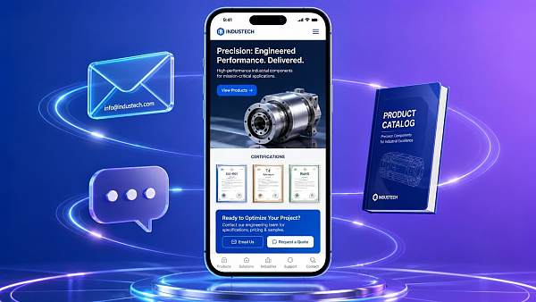
Do not treat “responsive design” as the entirety of mobile conversion
Many service providers say their websites use responsive design, allowing them to adapt to mobile phones, tablets, and computers. This is a basic capability, but it does not mean mobile adaptation for the corporate website has already been done well. Responsive design addresses whether a page can be laid out properly; conversion adaptation addresses whether customers can quickly complete decision-making actions.
Here is a common example: a desktop product detail page for an industrial equipment company contains extensive technical descriptions, which is not a problem in itself. On mobile, however, users are more likely to first care about equipment applications, key specifications, application cases, certifications, and inquiry methods. If dozens of technical text sections are presented exactly as they are, the information may be complete, but it is not easy to read. A better approach is to retain the complete materials while reorganizing the page with expandable modules, parameter summaries, scenario tags, and clear inquiry entry points.
Some companies go to the other extreme, believing that mobile content should be as limited as possible, and therefore hide factory introductions, certificates, case studies, and technical capabilities. This can also harm conversion. For businesses with high order values and long decision cycles, customers need sufficient evidence to establish trust. What mobile should do is make that evidence easier to access, rather than simply remove it.
Ask these questions before choosing a website development service provider
When preparing to build a new website or redesign an existing one, the easiest mistake is to compare only template styles, page quantities, and quotations. What truly affects subsequent inquiries is often whether the service provider understands traffic sources and the conversion journey.
- Will the mobile version separately organize first-screen information, product page structure, and inquiry entry points, rather than merely resize the layout?
- Can navigation, forms, customer service phone numbers, or instant communication tools on multilingual pages be configured according to the usage habits of the target market?
- Is the website convenient for continuously updating products, case studies, content pages, and landing pages later on, avoiding the need to rely on developers for every change?
- Can it integrate visit analytics, form source tracking, and advertising conversion monitoring to distinguish between “low traffic” and “poor page conversion”?
- Do images, code, and third-party components have clear performance optimization mechanisms, rather than being handled passively after the website goes live?
If a company also carries out Google SEO, advertising campaigns, or overseas social media traffic generation, the website should not be built solely according to the standards of a “brand website.” Visits generated by advertisements typically involve faster decisions, and landing pages need to align with advertising keywords, product selling points, and regional language. Organic traffic from SEO, meanwhile, relies more on content coverage, page crawlability, and long-term experience. When both types of traffic enter the same mobile page that is not properly adapted, advertising budgets and content investments are both wasted.
Yiyingbao provides integrated services for foreign trade companies, manufacturing factories, and businesses expanding overseas, including AI-powered website development, multilingual website development, SEO, advertising, and social media marketing. For companies that need to address both website development and customer acquisition, the evaluation should not stop at “whether a mobile website can be built.” Instead, they should confirm whether the website, promotional pages, and lead data can form a closed loop. Management topics involving coordination between website investment and operational data may also be used as supplementary reading: Research on the Path to Enterprise Financial Management Informatization Construction in the Context of the Digital Economy.
Which companies should prioritize a mobile redesign
Not every website needs to be completely rebuilt immediately. If the corporate website primarily serves existing customers, has limited traffic, and the business relies heavily on offline bidding or fixed channels, addressing key issues such as forms, contact information, and product detail readability may be more appropriate than a comprehensive redesign.
However, when the following situations occur, mobile optimization should usually be prioritized: mobile visits account for a high proportion but inquiries are low; advertising clicks are substantial but produce no valid leads; overseas visitors have short dwell times; sales teams are frequently forced to repeatedly send materials in chats that should already be available on the website; or product pages make it difficult to view specifications, certificates, or case studies on mobile. In such cases, the issue may not lie entirely in the advertising strategy; the landing page may also have insufficient conversion capacity.
When making a decision, first review recent data on the share of visits by device, primary entry pages, mobile bounce performance, form completion rates, and inquiry button clicks. Incomplete data is not a problem; at a minimum, test one real customer journey: enter from a search term or advertising link and complete the entire process on a phone, from “finding a product—confirming capabilities—initiating an inquiry.” Whether internal staff can complete the process smoothly does not mean overseas customers will not encounter language, network, and device-related barriers.
FAQ
If mobile traffic accounts for a low proportion, is optimization still necessary?
The source matters more than the proportion alone. Even if mobile traffic is not the majority, it may affect high-value inquiries as long as it comes from advertising, social media, or overseas search and serves an initial screening function. Prioritizing optimization of core landing pages is sufficient; it is not necessary to update every page at once.
Would a separate mobile website be better than a responsive website?
Not necessarily. A separate mobile website has higher maintenance costs and can easily lead to content inconsistencies. Most companies are better suited to a responsive architecture, with key pages and conversion entry points reorganized specifically for mobile. Only when business processes and content formats differ greatly from the desktop version should a more in-depth separate design be considered.
How many fields should be retained in a mobile form?
For the first inquiry, it is recommended to retain only the information necessary to obtain a lead, such as name, contact details, requirement description, or product selection. For businesses involving high project values and strict qualification reviews, additional information can be collected after sales follow-up begins.
Will inquiries definitely increase after a website redesign?
This cannot be guaranteed. Inquiries are also affected by product competitiveness, traffic quality, pricing, market demand, and sales response speed. However, making a corporate website mobile-friendly can reduce ineffective loss of existing traffic, giving promotional investment a better opportunity to convert into genuine business opportunities.
A corporate website should not merely “look good” on a computer; it should also explain, demonstrate, and guide customers on the mobile phones they use most often. When evaluating a mobile-friendly corporate website, the focus is not on whether the page is visually dazzling, but on whether customers can quickly understand your value, verify your capabilities, and leave an inquiry with ease.
Related Articles
 How Can You Prevent a Video News Module from Slowing Down Page Loading?
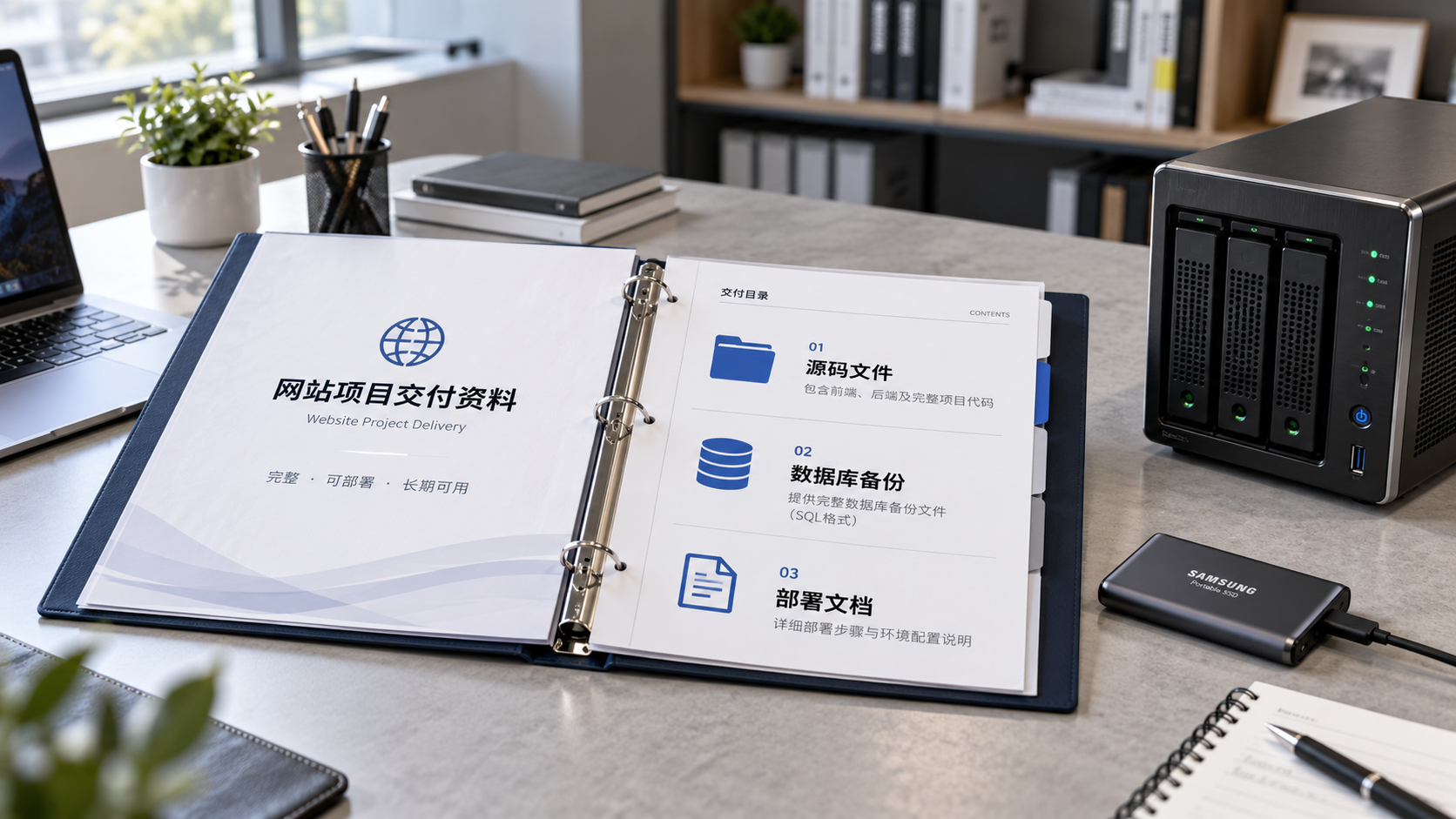
 When choosing a website development company in Xiamen, how should you agree on source code delivery?
 How can you identify what to optimize when the first screen of your B2B website loads slowly?

Related Products
 Yiyingbao SaaS Intelligent Website Building and Marketing SystemYiyingbao SaaS Intelligent Website Building and Marketing System, AI-powered no-code website building, rapid creation of multilingual B2B international websites in 10 minutes, global server acceleration, AI-powered SEO optimization, helping businesses connect efficiently with global markets. The perfect integration of technology and operation makes building an international trade website remarkably simple
 AI+SEM Intelligent Advertising Marketing SystemAI+SEM drives intelligent ad creation, empowering full-funnel precision advertising marketing. The system automatically generates weekly/monthly reports, AI recommends keywords and target countries, monitors core metrics in real-time with intelligent alerts, and enables one-click high-conversion ad solutions to help quickly acquire customers and improve ROI.
 AI+SEO Dual-Engine System Optimization ServicesYiyingbao’s AI+SEO dual-engine optimization system helps foreign trade enterprises acquire high-quality organic traffic through AI-powered keyword research, content generation, and comprehensive technical optimization, significantly improving search rankings and conversion rates.
 AI+SNS Social Media Marketing SystemYingbao AI+SNS Social Media Marketing System - Precision social capture for the social media era. Supports one-click content synchronization across major platforms like Facebook and LinkedIn. AI intelligently rewrites posts for enhanced relevance. 24/7 AI customer service and user profiling analysis empower businesses to efficiently expand into global markets.
 AI+SEO营销解决方案易营宝AI+SEO营销解决方案,通过AI批量写作、智能生成TDK、精准关键词扩词等功能,全面优化网站SEO效果,提升流量与转化率。助力企业构建高效智能网站新生态。
 AI+SEM Advertising Marketing SolutionsAI+SEM Advertising Marketing Solution leverages AI technology to deeply empower SEM ad campaigns. It automatically generates weekly/monthly reports using AI, presenting account data across multiple dimensions for comprehensive insights into campaign performance and trends. The system precisely recommends keywords and target countries, intelligently generates high-conversion ad copy, and enables one-click activation of efficient campaign plans to help businesses rapidly acquire customers. Simultaneously, it monitors core metrics in real time, intelligently identifies abnormal fluctuations, and issues timely alerts to ensure stable, high-return advertising results.
 Domain Name ServicesEasyWin provides professional domain name services, including intelligent queries, one-stop registration, brand protection, and full lifecycle management, helping businesses build a digital brand image.
 EasyOperate B2C Cross-Border E-Commerce Platform & Independent WebsiteEasyStore B2C Cross-border E-commerce Independent Store is an intelligent website building and cross-border e-commerce integrated solution independently developed by EasyStore Information Technology (Beijing) Co., Ltd. The system is specially designed for small and medium-sized as well as large export enterprises, integrating 'website building, operation, marketing, advertising, and conversion' into one, helping enterprises quickly establish cross-border e-commerce independent stores to achieve brand globalization and global sales growth.
The platform supports multiple languages, multiple currencies, and multi-channel marketing, with built-in AI intelligent translation and SEO optimization systems, suitable for mainstream markets such as Southeast Asia, Europe and America, Latin America, and the Middle East, assisting Chinese manufacturing enterprises in efficiently deploying international e-commerce strategies. SSL证书易营宝提供专业SSL安全证书服务,包括单域名和泛域名证书,确保网站数据传输加密、身份验证和完整性保护,助力企业建立安全可信的在线业务环境。









