









- Which customer acquisition channels will be affected by cross-border marketing trends in 2026?Sep 06, 2026View details
- Which homogenization risks should be considered in an analysis of the AI-powered website building industry?Aug 30, 2026View details
- How Will AI Marketing Trends 2026 Change Advertising Budget AllocationAug 28, 2026View details
- Is the EV SSL certificate market shrinking or upgrading? How should companies assess certificate procurement?Aug 11, 2026View details
- Why the old AMP SEO 2020 practices no longer work and what has changed in current optimization prioritiesAug 02, 2026View details
- How to Choose Topics for an Industry News Section to Attract More Organic Search TrafficJul 29, 2026View details
Which Visitors Are Lost Due to Poor Mobile Compatibility?
Poor mobile adaptation does not only result in the loss of “mobile visitors,” but also of some of the hardest-to-reacquire visitors for a business: potential customers who have just discovered the company in search results, visitors arriving from social content or advertising landing pages, procurement professionals screening suppliers while traveling, and returning users who are interested in the products and ready to submit an inquiry.
For websites that rely on acquiring overseas customers, the losses caused by mobile issues often occur before an inquiry is made. Users do not fill out forms, download catalogs, or leave obvious negative feedback; they simply exit at some point during page loading, product searching, or information verification. If management looks only at total site traffic or desktop conversion rates, this type of loss can easily be underestimated.
New visitors from search results are the first to be lost
Mobile users from organic search are often at a clear information-seeking stage. They may be searching for specific models, application solutions, certification capabilities, delivery regions, or supplier information. At this point, the search results page offers only one opportunity to enter the website. Whether the landing page can quickly show “whether this company is relevant” determines whether the visit will continue.
If a mobile page has above-the-fold content crowded out by large images, pop-ups, or blank areas, making product names and core capabilities difficult to identify quickly; or if text is too small, navigation levels are too deep, or the page requires horizontal scrolling, users will struggle to make even the most basic assessment. For search users, this is not an aesthetic issue, but a case where the cost of obtaining information exceeds the value of continuing to browse.
Especially in B2B scenarios, mobile search users may not submit requirements immediately, but they will first confirm the product range, manufacturing or service capabilities, target market coverage, contact details, and trust-related information. If these basic details cannot be presented clearly on mobile devices, what a company loses may not be just one page view, but the opportunity to be included on the shortlist of potential suppliers.
Ad-click users have the lowest tolerance for friction
Visits generated by paid advertising and social media advertising share one common characteristic: users are redirected from external platforms and have no pre-existing patience for the website itself. The ad copy promises a type of product, solution, or price-related information, and the landing page must quickly deliver on that promise. If the mobile page loads slowly, redirects to a generic homepage, or requires repeated zooming and clicking to view key content, the cost of ad clicks will be wasted without results.
A common misconception is to regard “the page can open on a mobile phone” as completion of mobile adaptation. In reality, advertising landing pages need to pay greater attention to path continuity: whether product terms from the ad appear above the fold, whether the main image obstructs core information, whether call-to-action buttons are easy to reach, whether form fields are suitable for mobile input, and whether contact options such as phone, WhatsApp, and email can be used directly.
Mobile forms are particularly likely to cause the loss of high-intent users. Filling in more than ten fields may still be acceptable on a desktop device, but a mobile keyboard occupying the screen, difficult-to-select dropdown options, repeated verification code failures, and unclear required fields can all cause users to give up when they are close to conversion. For bulk procurement and industrial product inquiries, reducing the barrier to contact during the initial engagement stage is more important than collecting all sales lead information at once.
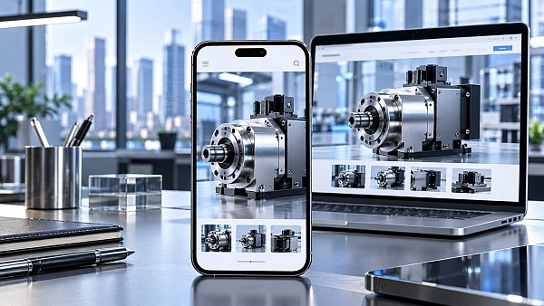
Social media visitors need to establish trust quickly
Users who enter a website from LinkedIn, Facebook, YouTube, or industry communities browse differently from search users. They are often first attracted by a piece of content, a video, a project image, or a technical topic, and then visit the official website to verify the company background. A high proportion of these users access the site on mobile devices and often browse during fragmented periods of time.
They may not study the complete product catalog immediately, but they will quickly look for whether the company is real, whether it has relevant capabilities, which regions it serves, whether its products are professional, and whether there is a clear consultation channel. If company profiles, qualification information, product categories, and customer or project displays are compressed to the point of being difficult to read on mobile devices, interest generated by social content will be difficult to convert into trust.
Taking industrial overseas expansion scenarios such as heavy vehicles and logistics as an example, a website needs not only to display product images, but also to enable visitors to understand the supply scope, business coverage, and inquiry path on a small screen. Making overseas business maps, product search, customer identifiers, and data-driven information into touch-friendly, readable components is more effective than proportionally shrinking a long desktop page. Digital portal designs for industries such as heavy vehicles and logistics are valuable not because they add visual elements, but because they help visitors complete basic supplier verification within a limited screen space.
Losing returning users means the website fails to support the continuity of purchasing decisions
Many visits are not first-time contacts. Users may have viewed products on a computer, then use a mobile phone to check models, forward links to colleagues, or revisit the site while traveling. If the information structures of the desktop and mobile versions differ too greatly, product links fail, filter criteria are lost, or downloaded materials cannot be opened, the returning visit experience will be interrupted.
This type of loss deserves attention because return visits usually indicate that users have entered the comparison or internal communication stage. Poor mobile adaptation prevents the company from continuing to participate in the other party's purchasing decision process, while competitors may gain opportunities for follow-up communication simply by providing easier-to-search model pages, clearer parameter information, and smoother contact channels.
Multilingual websites also have additional issues: text in some languages is longer and can easily cause button wrapping, navigation obstruction, and table overflow on mobile screens; network environments in different regions can also amplify the loading burden of large images, autoplay videos, and complex scripts. Testing only Chinese or a single English page on local devices is not sufficient to conclude that the global visitor experience has no issues.
Assessing mobile issues cannot rely solely on “whether it is responsive”
Responsive layout is only the foundation. What truly affects visitor retention is whether content, performance, and interaction are all adapted together. Companies can inspect their websites at several points that directly affect business: whether the mobile above-the-fold area can clearly communicate the page topic; whether product categories and on-site search can be operated with one hand; whether images, PDFs, and specification tables can be read properly; whether inquiry, phone, and instant messaging channels are available at all times; and whether key pages require long waiting times under common mobile network conditions.
Data analysis should also avoid looking only at the overall bounce rate. It is more valuable to segment mobile traffic by source: which pages are reached through organic search, advertising, social media, and direct visits; whether time on page and page depth differ significantly; at which stage users leave; and whether inquiries are concentrated on desktop devices. If certain product pages have high mobile traffic but almost no subsequent actions, the problem may not be traffic quality, but that the pages fail to support mobile browsing needs.
The essence of mobile adaptation is to allow users to complete a key assessment regardless of device: whether the company has relevant products and capabilities, whether the information is credible, and whether it is convenient to make contact next. Pages that cannot enable these three assessments will find it difficult to generate real customer acquisition value, even if they bring in visits.
Related Articles



Related Products
 Yiyingbao SaaS Intelligent Website Building and Marketing SystemYiyingbao SaaS Intelligent Website Building and Marketing System, AI-powered no-code website building, rapid creation of multilingual B2B international websites in 10 minutes, global server acceleration, AI-powered SEO optimization, helping businesses connect efficiently with global markets. The perfect integration of technology and operation makes building an international trade website remarkably simple
 AI+SEM Intelligent Advertising Marketing SystemAI+SEM drives intelligent ad creation, empowering full-funnel precision advertising marketing. The system automatically generates weekly/monthly reports, AI recommends keywords and target countries, monitors core metrics in real-time with intelligent alerts, and enables one-click high-conversion ad solutions to help quickly acquire customers and improve ROI.
 AI+SEO Dual-Engine System Optimization ServicesYiyingbao’s AI+SEO dual-engine optimization system helps foreign trade enterprises acquire high-quality organic traffic through AI-powered keyword research, content generation, and comprehensive technical optimization, significantly improving search rankings and conversion rates.
 AI+SNS Social Media Marketing SystemYingbao AI+SNS Social Media Marketing System - Precision social capture for the social media era. Supports one-click content synchronization across major platforms like Facebook and LinkedIn. AI intelligently rewrites posts for enhanced relevance. 24/7 AI customer service and user profiling analysis empower businesses to efficiently expand into global markets.
 AI+SEO营销解决方案易营宝AI+SEO营销解决方案,通过AI批量写作、智能生成TDK、精准关键词扩词等功能,全面优化网站SEO效果,提升流量与转化率。助力企业构建高效智能网站新生态。
 AI+SEM Advertising Marketing SolutionsAI+SEM Advertising Marketing Solution leverages AI technology to deeply empower SEM ad campaigns. It automatically generates weekly/monthly reports using AI, presenting account data across multiple dimensions for comprehensive insights into campaign performance and trends. The system precisely recommends keywords and target countries, intelligently generates high-conversion ad copy, and enables one-click activation of efficient campaign plans to help businesses rapidly acquire customers. Simultaneously, it monitors core metrics in real time, intelligently identifies abnormal fluctuations, and issues timely alerts to ensure stable, high-return advertising results.
 Domain Name ServicesEasyWin provides professional domain name services, including intelligent queries, one-stop registration, brand protection, and full lifecycle management, helping businesses build a digital brand image.
 EasyOperate B2C Cross-Border E-Commerce Platform & Independent WebsiteEasyStore B2C Cross-border E-commerce Independent Store is an intelligent website building and cross-border e-commerce integrated solution independently developed by EasyStore Information Technology (Beijing) Co., Ltd. The system is specially designed for small and medium-sized as well as large export enterprises, integrating 'website building, operation, marketing, advertising, and conversion' into one, helping enterprises quickly establish cross-border e-commerce independent stores to achieve brand globalization and global sales growth.
The platform supports multiple languages, multiple currencies, and multi-channel marketing, with built-in AI intelligent translation and SEO optimization systems, suitable for mainstream markets such as Southeast Asia, Europe and America, Latin America, and the Middle East, assisting Chinese manufacturing enterprises in efficiently deploying international e-commerce strategies. SSL证书易营宝提供专业SSL安全证书服务,包括单域名和泛域名证书,确保网站数据传输加密、身份验证和完整性保护,助力企业建立安全可信的在线业务环境。









