









- Which customer acquisition channels will be affected by cross-border marketing trends in 2026?Sep 06, 2026View details
- Which homogenization risks should be considered in an analysis of the AI-powered website building industry?Aug 30, 2026View details
- How Will AI Marketing Trends 2026 Change Advertising Budget AllocationAug 28, 2026View details
- Is the EV SSL certificate market shrinking or upgrading? How should companies assess certificate procurement?Aug 11, 2026View details
- Why the old AMP SEO 2020 practices no longer work and what has changed in current optimization prioritiesAug 02, 2026View details
- How to Choose Topics for an Industry News Section to Attract More Organic Search TrafficJul 29, 2026View details
Does a Cross-Border Website Need to Be Rebuilt for Mobile Adaptation?
When many teams prepare to promote their business overseas, the first issue they encounter is often not traffic, but a more fundamental decision: the existing website looks awkward on mobile, so should they rebuild the pages from scratch? This question is difficult not because the technology itself is complicated, but because it affects too many subsequent activities. Once the pages are rebuilt, design, development, content migration, fluctuations in search indexing, and the performance of advertising landing pages may all change. If they do not rebuild, they may worry that the mobile experience is too poor and that hard-won visits will be wasted.
This is especially true for cross-border business, where traffic sources are more dispersed and devices are more diverse. Some visitors arrive through Google Search, some click links on social media, and others open pages directly from WhatsApp or email. In this situation, mobile optimization for a cross-border website is not simply a matter of shrinking the desktop version. It requires determining whether the current problem lies in the styling, structure, content, or the underlying approach of the entire site, which may no longer be suitable for further expansion. A wrong decision usually does not merely result in unattractive pages, but may lead to unstable indexing, high bounce rates, and contact forms that receive no inquiries.
Do not rush to rebuild; many problems do not require starting over
A common misconception is to equate an uncomfortable mobile viewing experience with the need to rebuild the pages. In reality, mobile issues vary in severity. Problems such as buttons being too small, oversized above-the-fold images, overflowing tables, and excessively deep navigation hierarchies usually belong to the adaptation layer. They can often be resolved through front-end styling, module reordering, image cropping, and interaction optimization, without reconstructing the entire site.
What truly requires rebuilding is often not a visual issue of simply looking awkward, but the fact that the way the site was built has already limited its mobile performance. For example, page modules may have been assembled entirely with fixed desktop widths, so changing one section affects the entire site. Multilingual content may have been created by manually duplicating pages, meaning that any mobile adjustment must be synchronized across multiple copies. Alternatively, the same product page may be responsible for both brand introduction and advertising landing page conversion, ultimately making the mobile content too heavy and the conversion actions too scattered. If these situations are addressed only through ongoing patchwork, the cost will continue to rise over time.
When making a decision, look at these four signals first
If you are dealing with a similar issue, start with four practical signals instead of first asking a designer whether a new version can be created.
First, can users still complete key actions smoothly on mobile?
Key actions usually do not include reading the entire page. They include finding products, viewing core selling points, clicking to contact you, submitting a form, sending an inquiry, and switching languages. If these actions can all be completed and the layout is merely somewhat crowded, localized optimization should be the priority. If even basic operations are obstructed, such as by pop-ups, overly long forms, or confusing button placement, then the issue cannot be fully resolved by simply adjusting styles.
Second, is the content structure inherently desktop-oriented?
Many cross-border websites were initially created based on the logic of trade show materials or corporate brochures. They appear comprehensive on a computer, but on mobile devices they present large blocks of text squeezed together, lengthy product specification tables, and deeply buried download entrances. These sites are not necessarily unattractive; rather, their information organization is unsuitable for mobile reading. Even if the entire site is not rebuilt, the information order of core pages should at least be restructured.
Third, is the existing technical framework becoming increasingly difficult to modify?
Some websites use outdated templates, and in some cases each page has its own separately written styles. They may be easy to modify in the short term but difficult to maintain over time. Once multilingual content, SEO page expansion, or regional landing pages are involved, adapting the site for mobile devices from scratch each time can drag the team into repeated rework. When this signal becomes clear, you should seriously evaluate a rebuild rather than continue patching.
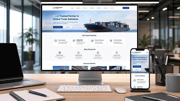
Fourth, do your traffic sources now require stronger mobile performance?
If the website is mainly used to support the brand, most visitors already know who you are and visit the website to verify information. In that case, mobile performance is important, but there is slightly more room for error. However, once you begin relying on search, advertising, or social media traffic, the page takes on the task of first contact and conversion. Mobile loading speed, reading flow, and action entrances will directly affect customer acquisition efficiency. At this point, mobile optimization for a cross-border website cannot stop at ensuring that the page displays correctly; it must also consider whether the conversion path is convenient.
When are no rebuild, partial restructuring, and a full-site rebuild appropriate?
In practice, the decision is usually not limited to two options: change or do not change.
Situations suitable for not rebuilding
The page structure is basically reasonable, and the main issues are concentrated in details such as image compression, font size, button spacing, module order, horizontal scrolling, and form experience. The website already has stable search indexing and a certain flow of inquiries, and you do not want major changes to affect the performance of existing pages. The team also needs to work on advertising, SEO, or new multilingual pages in the short term and does not have the capacity to rebuild everything. In this situation, a dedicated round of mobile optimization is more appropriate, starting with organizing the core user journeys.
Situations suitable for partial restructuring
The homepage, product pages, landing pages, and contact page perform very differently on mobile devices. Some pages of the old site can still be used, but the pages responsible for conversion are no longer suitable for current promotion needs. Alternatively, you may be preparing to launch multilingual content and content marketing, while the existing page system does not provide sufficient support. In these situations, it is appropriate to retain usable existing content and part of the URL structure, while prioritizing the rebuilding of key templates and updating the pages that affect conversion first.
Situations suitable for a full-site rebuild
When the underlying site is too old, the content system is disorganized, mobile and desktop versions have long been separated, and ongoing maintenance depends on manual workarounds, continuing with localized fixes may actually be the most expensive option. Cross-border businesses often need to add SEO content, advertising landing pages, social media redirects, and regional language versions later. If there is no unified responsive framework and maintainable page system from the beginning, the cost of every subsequent step will increase.
Do not focus only on the design draft; what really matters is whether future operations can be supported
Many decisions stall because the discussion remains focused on whether to redraw the pages. However, a cross-border website is not a one-time deliverable. Products will continue to be updated, advertisements launched, keyword pages created, tracking code added, and CTA copy adjusted. If solving an immediate adaptation issue results in a new site that is difficult to expand later, it is not a worthwhile trade-off.
A more practical approach is to evaluate mobile optimization and future marketing activities together: Will multilingual content be added in the future? Will new landing pages be created continuously? Is Google SEO planned? Will advertising pages need to be built quickly? Must both B2B inquiries and B2C transactions be supported? Will the primary products frequently change? If two or three of these activities are already planned, the website should not be modified merely according to the standards for a display-oriented site.
This is also why some teams later turn to website-building systems with content management, responsive templates, and marketing extension capabilities. Systems that support multilingual content, SEO structural settings, landing page creation, and subsequent advertising coordination do not necessarily mean that the entire site must be rebuilt. However, when making mobile adjustments, they can reduce the situation in which one change disrupts everything else. For those who need to consider website development and overseas marketing at the same time, this approach is more about addressing long-term maintenance issues than simply fixing a page display error.
If you need to make a decision now, proceed in this order
First, select the three to five most important pages instead of evaluating the entire site at once. These are usually the homepage, product detail page, About page, contact page, and one or two primary landing pages. Open each page on an actual mobile device and complete the entire user journey: enter the page, understand the business, find the key content, and take the contact action. This process should not be conducted only in the internal network environment, nor should it be tested on just one mobile phone.
Then divide the issues into three categories: display issues, information structure issues, and system capability issues. Adjust styles for display issues; modify modules and copy order for information structure issues; and determine whether the website-building approach needs to be changed for system capability issues. This helps prevent tasks that could have been completed in one day from becoming large projects lasting one or two months.
Next, review search indexing and link-related risks. If the existing website already performs well in search, you must consider whether URLs will change, whether content will be migrated, and whether redirects can be controlled before rebuilding. Many people worry that their old site is not user-friendly and immediately replace it with new pages, only to discover after launch that pages previously recognized by search engines have disappeared. For sites that rely on organic traffic, this is a step that must not be overlooked.
Only then should resources be allocated: Who will organize the content? Who will confirm the language versions? Who will test mobile forms and buttons? Who will check tracking codes and advertising redirects? The quality of mobile optimization is often not a question of technical capability, but of whether someone has clearly distinguished between a page that can be viewed and a page that can convert.
A more reliable conclusion
Mobile optimization for a cross-border website does not necessarily require rebuilding the pages, nor is rebuilding as early as possible always better. A more reasonable approach is to first assess the level of the problem: if it is merely an experience detail, carry out dedicated optimization; if key pages are already obstructing conversion, perform partial restructuring; if the underlying framework is clearly incompatible with future marketing needs, consider adjusting the entire site.
For most teams working on overseas customer acquisition, what truly deserves attention is not whether the site has been rebuilt, but whether it can help visitors quickly understand the business and contact you easily on mobile devices, without creating obstacles for future SEO, advertising, and multilingual expansion. Viewed against this standard, mobile optimization for a cross-border website is no longer merely a design issue, but a selection process more closely related to business operations.
Related Articles



Related Products
 Yiyingbao SaaS Intelligent Website Building and Marketing SystemYiyingbao SaaS Intelligent Website Building and Marketing System, AI-powered no-code website building, rapid creation of multilingual B2B international websites in 10 minutes, global server acceleration, AI-powered SEO optimization, helping businesses connect efficiently with global markets. The perfect integration of technology and operation makes building an international trade website remarkably simple
 AI+SEM Intelligent Advertising Marketing SystemAI+SEM drives intelligent ad creation, empowering full-funnel precision advertising marketing. The system automatically generates weekly/monthly reports, AI recommends keywords and target countries, monitors core metrics in real-time with intelligent alerts, and enables one-click high-conversion ad solutions to help quickly acquire customers and improve ROI.
 AI+SEO Dual-Engine System Optimization ServicesYiyingbao’s AI+SEO dual-engine optimization system helps foreign trade enterprises acquire high-quality organic traffic through AI-powered keyword research, content generation, and comprehensive technical optimization, significantly improving search rankings and conversion rates.
 AI+SNS Social Media Marketing SystemYingbao AI+SNS Social Media Marketing System - Precision social capture for the social media era. Supports one-click content synchronization across major platforms like Facebook and LinkedIn. AI intelligently rewrites posts for enhanced relevance. 24/7 AI customer service and user profiling analysis empower businesses to efficiently expand into global markets.
 AI+SEO营销解决方案易营宝AI+SEO营销解决方案,通过AI批量写作、智能生成TDK、精准关键词扩词等功能,全面优化网站SEO效果,提升流量与转化率。助力企业构建高效智能网站新生态。
 AI+SEM Advertising Marketing SolutionsAI+SEM Advertising Marketing Solution leverages AI technology to deeply empower SEM ad campaigns. It automatically generates weekly/monthly reports using AI, presenting account data across multiple dimensions for comprehensive insights into campaign performance and trends. The system precisely recommends keywords and target countries, intelligently generates high-conversion ad copy, and enables one-click activation of efficient campaign plans to help businesses rapidly acquire customers. Simultaneously, it monitors core metrics in real time, intelligently identifies abnormal fluctuations, and issues timely alerts to ensure stable, high-return advertising results.
 Domain Name ServicesEasyWin provides professional domain name services, including intelligent queries, one-stop registration, brand protection, and full lifecycle management, helping businesses build a digital brand image.
 EasyOperate B2C Cross-Border E-Commerce Platform & Independent WebsiteEasyStore B2C Cross-border E-commerce Independent Store is an intelligent website building and cross-border e-commerce integrated solution independently developed by EasyStore Information Technology (Beijing) Co., Ltd. The system is specially designed for small and medium-sized as well as large export enterprises, integrating 'website building, operation, marketing, advertising, and conversion' into one, helping enterprises quickly establish cross-border e-commerce independent stores to achieve brand globalization and global sales growth.
The platform supports multiple languages, multiple currencies, and multi-channel marketing, with built-in AI intelligent translation and SEO optimization systems, suitable for mainstream markets such as Southeast Asia, Europe and America, Latin America, and the Middle East, assisting Chinese manufacturing enterprises in efficiently deploying international e-commerce strategies. SSL证书易营宝提供专业SSL安全证书服务,包括单域名和泛域名证书,确保网站数据传输加密、身份验证和完整性保护,助力企业建立安全可信的在线业务环境。









