









- Which customer acquisition channels will be affected by cross-border marketing trends in 2026?Sep 06, 2026View details
- Which homogenization risks should be considered in an analysis of the AI-powered website building industry?Aug 30, 2026View details
- How Will AI Marketing Trends 2026 Change Advertising Budget AllocationAug 28, 2026View details
- Is the EV SSL certificate market shrinking or upgrading? How should companies assess certificate procurement?Aug 11, 2026View details
- Why the old AMP SEO 2020 practices no longer work and what has changed in current optimization prioritiesAug 02, 2026View details
- How to Choose Topics for an Industry News Section to Attract More Organic Search TrafficJul 29, 2026View details
For High-Converting B2B Landing Page Design, Should You Optimize the Above-the-Fold Section or the Form First?
When optimizing a B2B landing page, many teams instinctively frame the decision as a choice between two options: the above-the-fold section is not compelling enough, or the form is too long and difficult to complete. However, what truly affects conversion is usually not the act of deciding what to change first, but whether you have first identified where users are dropping off. This issue deserves attention from operations-focused team members because it directly affects optimization priorities, collaboration costs, and short-term results. If the diagnosis is wrong, you may make extensive page changes without necessarily generating more inquiries.
In high-converting B2B landing page design, both the above-the-fold section and the form are important, but they address two completely different questions. The above-the-fold section answers, “Why should I continue reading?” while the form answers, “Why am I willing to submit my information now?” The former affects retention and continued browsing, while the latter affects the final action. Which one should be changed first depends on whether the current problem is that “too few visitors continue downward” or that “visitors who reach the end are unwilling to fill out the form.”
Before Making Changes, First Identify Where the Drop-Off Occurs
If a landing page receives a considerable number of clicks, but visitors stay only briefly, scroll very little below the above-the-fold section, and show a weak CTA click-through rate, the problem is usually more likely to lie in the above-the-fold section. Users have not yet established basic trust or quickly understood who you are, what problem you solve, and whether it is relevant to them. In this case, even changing the form from 8 fields to 3 fields may produce limited improvement, because many visitors have not even reached the stage of deciding whether to submit their information.
Conversely, if page depth is good, the button click-through rate is also high, and users have even started filling out the form, but the completion rate is low—or sales feedback shows that the number of leads is acceptable but lead quality is poor—it is more appropriate to examine the form first. The problem may not simply be the number of fields. It could be the timing of the information request, poorly designed questions, unclear commitments, or even a failure to explain what users should expect after submission.
In practice, the most common misconception is to attribute all conversion problems to form length. This judgment may sometimes be valid in B2C scenarios, but B2B is not exactly the same. When B2B users submit their information, they are essentially exchanging it for access to a business conversation. They care not only about whether it is troublesome, but also whether it is worthwhile, whether they will be contacted too frequently, whether the other party is reliable, and what process their submission will initiate. Therefore, a low form conversion rate does not necessarily mean that the form itself is poorly designed.
When Should the Above-the-Fold Section Be Changed First?
Prioritizing the above-the-fold section is usually appropriate in three situations.
- The traffic source is relatively cold, and users have little or no prior awareness of the brand or product.
- The page receives traffic from search ads, SEO, or overseas promotion, and users arrive with a clear question, but the above-the-fold section does not quickly address their search intent.
- The product decision is complex, and visitors need to determine within a very short time whether “this is intended for a company like mine.”
The problem with many B2B above-the-fold sections is not that the design is unattractive, but that the information density is unbalanced. Some only present broad and empty value slogans, such as “Empowering Business Growth,” without explaining the industry, application scenarios, or boundaries of the results. Others place all selling points together, making it difficult for users to grasp the main message within three seconds. For typical B2B businesses such as manufacturing, foreign trade, cross-border commerce, and industrial products, the core task of the above-the-fold section is actually straightforward: explain whom you serve, what you solve, and why visitors should continue reading.
A qualified above-the-fold section should at least allow target users to quickly confirm four things: whether you operate in this field; whether you can solve their specific problem; whether you provide a service, a system, or an overall solution; and whether it is worthwhile to continue reading. The word “worthwhile” is critical here. Many pages do not lack information; they lack an arrangement that presents the information in the order users make decisions.
If your landing page serves scenarios such as companies expanding overseas, multilingual websites, foreign-trade inquiry generation, or ad traffic conversion, the above-the-fold section often also needs to filter traffic. It should not merely pursue “more people clicking to inquire”; it should help mismatched visitors leave quickly and matched visitors explore further. High conversion is not simply about increasing the number of form submissions, but about increasing the proportion of qualified inquiries.
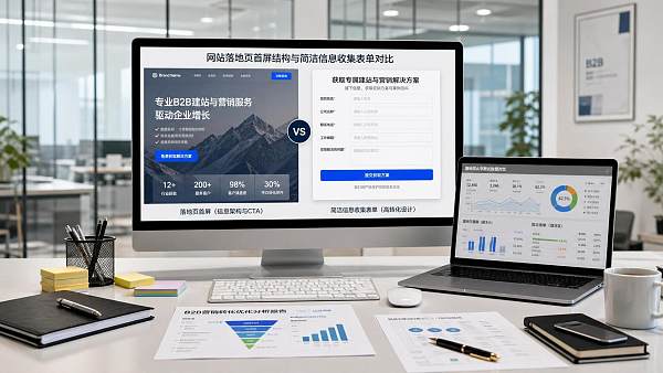
When Should the Form Be Changed First?
When the above-the-fold section has already brought visitors to the conversion point, the form becomes the final source of friction. At this stage, optimization is not simply about “reducing the number of fields,” but about redesigning the exchange of information.
Start by examining the field logic. Many teams put everything sales wants to ask into the form at once: name, phone number, email, company, job title, country, requirements, budget, purchasing timeline, product type, and traffic source. Sales may find this convenient, but users are being asked to provide too much business information before any trust has been established. The result is often a lower submission rate, and some users may even enter random information, leaving the backend with poorer-quality data.
A more effective approach for B2B forms is usually to obtain information in stages. In the first step, collect only the key fields needed to establish contact and make an initial assessment of lead quality. More detailed information, such as budget, project stage, and purchasing volume, can be obtained during subsequent communication. You are not conducting a one-time data collection exercise; you are lowering the barrier to the first conversation.
Next, examine the motivation to submit. Why should users fill out the form? If the button copy only says “Submit” or “Contact Us Now,” while the page does not explain what will happen after submission, users will naturally hesitate. By contrast, clear expectations are often more effective. For example, users may receive a solution assessment, page diagnosis, advertising recommendations, case-study matching, or feasibility feedback after submitting. This is not about relying on promotional wording; it is about helping users understand what they will receive in exchange for their time.
Another frequently overlooked issue is the form’s position. Placing the form on the right side of the above-the-fold section does not necessarily make it more effective. For high-value, long-cycle businesses, users need to first develop understanding and trust. Placing the form too early may instead become a distraction. On mobile devices in particular, the above-the-fold space is already limited, and allowing the form to occupy the visible area may weaken the presentation of the core value proposition. Whether the form should appear above the fold should be determined jointly by traffic temperature, user familiarity, and the conversion objective.
Priorities Should Be Determined by Data, Not Preference
Many internal debates over whether to change the above-the-fold section or the form first are ultimately debates about aesthetics and experience. At this stage, what is most needed is a simple, actionable decision framework—not a longer meeting.
There is also a practical issue: many small and medium-sized teams do not have complete data, mature tracking, or strict lead attribution. Even so, do not revert to changing pages based on intuition. At a minimum, clarify the basic funnel: traffic volume, above-the-fold dwell time, scroll depth, CTA clicks, form starts, form submissions, sales follow-up, and qualified inquiries. Even rough data is better than making changes blindly.
Between the Above-the-Fold Section and the Form, What Really Needs to Be Fixed First Is the “Handoff”
From a practical perspective, the above-the-fold section and the form are not two isolated modules. On many pages, the problem is not that either section is individually poor, but that the transition between them is broken.
For example, the above-the-fold section may say “Helping Businesses Achieve Global Growth,” followed immediately by a set of complex fields asking users to submit detailed project requirements. The page has not established a relevant scenario, yet it directly asks users to make a commitment. That is a break in the journey. Similarly, a page may spend its first half discussing brand strength, technical capabilities, and service coverage, then suddenly ask users at the form to fill in “Which customer acquisition channel are you currently most concerned about?” This can also feel abrupt because the preceding content has not gradually introduced the user’s problem.
The key to high-converting B2B landing page design often lies not in getting a particular module to 90 points, but in ensuring that the entire path flows smoothly. After viewing the above-the-fold section, users should naturally move to “Is this suitable for me?” After reading the middle section, they should move to “Is this company worth contacting?” Near the form, they should then reach the question, “Is it worthwhile for me to submit this now?” This is a continuous cognitive path, not an assembly of disconnected components.
Do Not Overlook Lead Quality—It Matters More Than the Conversion Rate Itself
At the operational level, it is easy to be led astray by KPIs. When form submissions increase, the page may appear to have been successfully optimized. However, if the sales team reports higher follow-up costs and more invalid inquiries, overall efficiency may actually decline. B2B pages are not simply pursuing a lower CPL [specific definition to be verified], but a higher likelihood of converting leads into business opportunities.
This is also why some pages need to “restrict the target audience” more clearly in the above-the-fold section—for example, by specifying applicable industries, service regions, project types, and cooperation models—while some forms need to retain a small number of key identification fields instead of being simplified indiscriminately. This is especially true for businesses offering integrated overseas marketing, intelligent website building, and SEO/advertising services, because customer needs vary widely. If front-end filtering fails, the operational and sales pressure on the backend can quickly increase.
Platforms such as 易营宝, which cover website building, SEO, advertising, social media operations, and multilingual overseas expansion scenarios, can theoretically serve a broad range of needs. However, this also means that their landing pages must not be vague. The more complex the solution, the more clearly the page must segment users between the above-the-fold section and the form: are you serving a foreign-trade factory or a cross-border brand; are you receiving a website-building requirement or a customer-acquisition requirement; are you seeking an exploratory consultation or a clearly defined project lead? If the page does not distinguish these needs first, it will be difficult for the backend to handle them efficiently.
Practical Advice for Operations Teams: Build a Small Closed Loop Before a Major Redesign
If you need to decide what to do next, do not start by rebuilding the entire page. A more practical approach is to first identify the most obvious bottleneck in the funnel and create a small closed loop that can validate your judgment.
- If the above-the-fold section is suspected to be the problem: first revise the main headline, subheadline, industry targeting, and first CTA instead of immediately redesigning the entire site visually.
- If the form is suspected to be the problem: first test the number and order of fields, the submission promise, and the button copy instead of directly replacing the entire form system.
- If lead quality is suspected to be the problem: first add or adjust 1 to 2 qualifying fields and observe changes in the proportion of qualified inquiries.
- If channel differences are significant: first create channel-specific versions instead of using one page to handle every type of intent.
Truly mature optimization does not ask, “Is the above-the-fold section more important than the form?” It asks, “At which step are this type of visitors most likely to drop off?” Once this question is answered correctly, the order of changes becomes clear. In many cases, changing the above-the-fold section first is intended to encourage users to proceed to the form; changing the form first is intended to avoid wasting users who have already been persuaded. The two are not opposing choices, but priorities for different stages.
Therefore, do not turn this into a question of taking sides. For B2B landing pages, where to make changes first ultimately depends on whether you are trying to fix a comprehension problem, a trust problem, or an action barrier. As long as the point of drop-off is accurately identified, optimization is unlikely to go off course.
Related Articles



Related Products
 Yiyingbao SaaS Intelligent Website Building and Marketing SystemYiyingbao SaaS Intelligent Website Building and Marketing System, AI-powered no-code website building, rapid creation of multilingual B2B international websites in 10 minutes, global server acceleration, AI-powered SEO optimization, helping businesses connect efficiently with global markets. The perfect integration of technology and operation makes building an international trade website remarkably simple
 AI+SEM Intelligent Advertising Marketing SystemAI+SEM drives intelligent ad creation, empowering full-funnel precision advertising marketing. The system automatically generates weekly/monthly reports, AI recommends keywords and target countries, monitors core metrics in real-time with intelligent alerts, and enables one-click high-conversion ad solutions to help quickly acquire customers and improve ROI.
 AI+SEO Dual-Engine System Optimization ServicesYiyingbao’s AI+SEO dual-engine optimization system helps foreign trade enterprises acquire high-quality organic traffic through AI-powered keyword research, content generation, and comprehensive technical optimization, significantly improving search rankings and conversion rates.
 AI+SNS Social Media Marketing SystemYingbao AI+SNS Social Media Marketing System - Precision social capture for the social media era. Supports one-click content synchronization across major platforms like Facebook and LinkedIn. AI intelligently rewrites posts for enhanced relevance. 24/7 AI customer service and user profiling analysis empower businesses to efficiently expand into global markets.
 AI+SEO营销解决方案易营宝AI+SEO营销解决方案,通过AI批量写作、智能生成TDK、精准关键词扩词等功能,全面优化网站SEO效果,提升流量与转化率。助力企业构建高效智能网站新生态。
 AI+SEM Advertising Marketing SolutionsAI+SEM Advertising Marketing Solution leverages AI technology to deeply empower SEM ad campaigns. It automatically generates weekly/monthly reports using AI, presenting account data across multiple dimensions for comprehensive insights into campaign performance and trends. The system precisely recommends keywords and target countries, intelligently generates high-conversion ad copy, and enables one-click activation of efficient campaign plans to help businesses rapidly acquire customers. Simultaneously, it monitors core metrics in real time, intelligently identifies abnormal fluctuations, and issues timely alerts to ensure stable, high-return advertising results.
 Domain Name ServicesEasyWin provides professional domain name services, including intelligent queries, one-stop registration, brand protection, and full lifecycle management, helping businesses build a digital brand image.
 EasyOperate B2C Cross-Border E-Commerce Platform & Independent WebsiteEasyStore B2C Cross-border E-commerce Independent Store is an intelligent website building and cross-border e-commerce integrated solution independently developed by EasyStore Information Technology (Beijing) Co., Ltd. The system is specially designed for small and medium-sized as well as large export enterprises, integrating 'website building, operation, marketing, advertising, and conversion' into one, helping enterprises quickly establish cross-border e-commerce independent stores to achieve brand globalization and global sales growth.
The platform supports multiple languages, multiple currencies, and multi-channel marketing, with built-in AI intelligent translation and SEO optimization systems, suitable for mainstream markets such as Southeast Asia, Europe and America, Latin America, and the Middle East, assisting Chinese manufacturing enterprises in efficiently deploying international e-commerce strategies. SSL证书易营宝提供专业SSL安全证书服务,包括单域名和泛域名证书,确保网站数据传输加密、身份验证和完整性保护,助力企业建立安全可信的在线业务环境。









