








- What multilingual website services are available in Sanya? Which model is more suitable for local businesses going global?Jul 08, 2026View details
- How to view the complete list of China SaaS companies in the top 100? Practical methods for screening website-building and marketing service providersJul 08, 2026View details
- How to view pricing in the global traffic ecosystem? Cost comparison of search, social media, and content channel advertisingJul 06, 2026View details
- How to assess foreign trade website development trends?Looking at 2026 changes from multilingual,AI content to conversion pathsJul 04, 2026View details
- What are the new trends in multilingual marketing data analytics tools in 2026? Focus on attribution、automation and complianceJul 04, 2026View details
- Is Brand Globalization Marketing Consulting Worth Buying? At What Stage Should Companies Bring It InJul 01, 2026View details
- Cross-Border Marketing Trend Research: Why More and More Companies Are Starting to Deploy AI Search and GEO OptimizationJun 30, 2026View details
- Cross-Border Marketing Trend Research: How Independent Sites, AI Content, and Short-Video Customer Acquisition Are ChangingJun 30, 2026View details
The most common issues in user experience optimization case studies
When reviewing user experience optimization case studies, many people tend to attribute problems to pages not looking good, buttons not being eye-catching, or features not being abundant enough. But the truly frequent pain points usually lie in incomplete user journey design, misjudgment of conversion points, and optimization actions lacking data validation.
For information researchers, what matters most is not how many “successful cases” they have seen, but whether they can identify which problems are most common in those cases, why they recur repeatedly, and how they can be avoided. Only by grasping these underlying patterns can subsequent website and marketing coordination ensure that optimization does not remain superficial.
Why many user experience optimization cases seem effective, but are actually difficult to replicate

Many cases “seem successful” because they only emphasize the results when presented, such as a lower bounce rate, longer dwell time, and increased inquiries, but fail to explain traffic sources, user types, testing periods, and business context. What readers see is the conclusion, not the basis for judgment.
This leads many companies, when referencing user experience optimization cases, to directly copy page styles, content structures, or interaction layouts, while overlooking that their own industry, audience maturity, and conversion paths are not the same. As a result, time and budget are invested, but experience metrics do not improve accordingly.
Cases truly worth referencing are not focused on “what was changed,” but on “why it was changed, what the basis was, and how it was validated after the change.” If these three layers of information are missing, then even the most polished case can only serve as inspiration, not as a basis for decision-making.
Most common problem 1: Focusing only on local page elements instead of the complete user journey
In a large number of user experience optimization cases, the most common misunderstanding is optimizing only a single page without connecting the entire process from when users enter the website to when they complete conversion. Once the homepage, landing page, form page, and customer service page are disconnected, no matter how refined each part is, it is still difficult to form overall efficiency.
For example, users brought in through advertising are often first-time visitors who care more about credibility and information clarity; while organic search users often arrive with specific questions and care more about content relevance and action guidance. If traffic sources are not distinguished by journey, the direction of page optimization can easily go off track.
Therefore, when analyzing user experience optimization cases, the first question should not be whether a certain button color is effective, but where the users came from, what they want to do, at which step they dropped off, and why they did not continue. A journey-based perspective is closer to the real problem than a single-point perspective.
Most common problem 2: Mistaking “good-looking” for “easy to use”
Quite a few cases equate interface upgrades with experience upgrades, assuming that if the visuals are more modern, the motion effects are richer, and the layout is cleaner, users will definitely be more willing to convert. In fact, visual optimization is certainly important, but it is only one part of the experience and does not equal usability or decision-making efficiency.
If the navigation logic is unclear, key information is buried too deeply, and button copy is vague, then even if users think the page design looks good, they may still not know what to do next. For corporate websites and marketing landing pages, “reducing comprehension cost” is often more important than “pursuing a sense of design.”
Truly effective experience optimization helps users find answers faster, build trust more easily, and complete inquiries, submissions, or purchases more smoothly, rather than simply pursuing visual novelty.
Most common problem 3: Lack of clear conversion goals, causing optimization direction to lose focus
When many teams work on user experience optimization, they propose goals such as improving brand perception, enhancing interaction, and optimizing browsing experience, but these statements are too broad and difficult to turn into actionable steps. Without clear goals, it is hard to judge whether a redesign can truly be considered successful.
A mature case should at least clearly define what the core conversion is: form submission, online consultation, phone calls, material downloads, or return visits. Different goals correspond to completely different page structures, content priorities, and guidance methods, and cannot be discussed as if they were the same thing.
This is also why many user experience optimization cases ultimately end up with situations where “the data looks better, but the business has not grown significantly.” That is because the optimization tracks surface-level behavior rather than key outcomes, so in the end it naturally struggles to support business judgment.
Most common problem 4: Relying on subjective judgment while ignoring data feedback
What user experience optimization fears most is not having no ideas, but relying entirely on experience-based decisions. Team members may all feel that a certain version looks better, feels more premium, and aligns more with the brand tone, but whether users actually find it easier to understand and are more willing to act still requires data to verify.
Common reference data includes click heatmaps, page scroll depth, dwell time, form abandonment rate, bounce rate, and conversion rate. Only by looking at this data together with the user journey can you discover whether the problem lies in insufficient information, lack of trust, or an excessively high operational threshold.
For integrated website and marketing service scenarios, data feedback is especially important. Because traffic acquisition, page engagement, and conversion results are connected, front-end experience problems often directly amplify customer acquisition costs, so adjustments cannot be made based on intuition alone.
Most common problem 5: Content expression stands from the company’s perspective rather than the user’s perspective
The problem with many corporate websites is not a lack of content, but that the content is written too much like a “self-introduction.” Pages are filled with company history, technical strength, and service philosophy, yet fail to quickly answer the questions users care about most: what you can solve, who it is suitable for, how to get started, and why you are trustworthy.
This type of issue appears very frequently in user experience optimization cases. Companies believe they have already explained themselves clearly, but after entering the page, users still cannot quickly extract the value proposition, so they leave after only a short stay. A lot of information does not mean effective information.
A truly good content structure should be organized around the user’s decision-making sequence: first provide the conclusion, then explain the value, then add supporting evidence, and finally provide the next action. Only in this way can a page have both information density and no added comprehension burden.
Most common problem 6: Mobile experience is underestimated
Many cases are presented using desktop pages, but in reality a considerable portion of traffic comes from mobile devices. If the mobile font is too small, the above-the-fold information is crowded, buttons are hard to tap, and forms are cumbersome to fill out, then even users with real needs may exit midway because the operation is inconvenient.
Especially in marketing scenarios, the mobile experience directly affects lead acquisition efficiency. Whether the first screen can quickly establish trust, whether the core selling points are visible at a glance, and whether the inquiry entry point is always accessible all influence results more than complex visual presentation.
Therefore, when evaluating user experience optimization cases, you cannot only look at design mockups or PC-side presentations; you must pay even more attention to the actual mobile browsing experience. Many seemingly minor issues are often precisely the main source of conversion loss.
How to judge whether an optimization case truly has reference value
For information researchers, when looking at cases, it is not enough to look only at the “results”; it is also necessary to see whether they have verifiable logic. A case with reference value usually explains the original problem, user behavior characteristics, optimization hypothesis, execution method, and data changes after launch.
If a case only tells you that “the effect improved after the page redesign,” but does not explain which type of users improved, through which entry point, or at which conversion step, then it is more like promotional material than a methodology that can be learned from.
In addition, it is also necessary to see whether the optimization actions are aligned with business goals. For example, when some companies upgrade their websites, they care not only about interface experience, but also about network environment and access stability. In enterprise network upgrade scenarios, underlying capabilities such as Internet Protocol Version 6(IPV6) may also indirectly affect access speed, security, and the overall user experience.
From a practical perspective, which priorities should user experience optimization focus on more
If you want to improve optimization efficiency, it is recommended to first look at four things: first, whether users can quickly understand the value of the page; second, whether users know what to do next; third, whether the conversion action is smooth enough; fourth, whether the data supports the current judgment.
These four items are more worthy of priority investment than simply changing fonts, adjusting color schemes, or replacing Banner. Because they directly determine whether users can move from “seeing the page” to “taking action,” and they are also the parts most likely to have problems in the majority of user experience optimization cases.
For companies, truly valuable experience optimization is not about pursuing one major redesign, but about continuously iterating around key paths. Websites, content, marketing, and technical support need to advance in coordination so that experience improvements can be transformed into more stable growth results.
Conclusion: Understanding common problems is more important than blindly imitating cases
Returning to the beginning, the most common problems in user experience optimization cases are often not insufficiently advanced technology or unattractive pages, but rather ignoring the user journey, confusing optimization goals, lacking data validation, and failing to express content from the user’s side.
For readers conducting research, the key to judging whether a case is worth referencing lies not in how many impressive achievements it presents, but in whether it clearly explains the source of the problem, the basis for optimization, and the logic behind the results. Understanding these points is the only way to avoid turning optimization into a superficial project.
Whether it is a corporate website, a marketing landing page, or a more complex digital touchpoint, user experience optimization should serve real business goals. Only by combining user needs, conversion processes, and continuous validation can optimization truly generate long-term value.
Related Articles
 What multilingual website services are available in Sanya? Which model is more suitable for local businesses going global?
 How to view the complete list of China SaaS companies in the top 100? Practical methods for screening website-building and marketing service providers
 There are so many used heavy-duty construction machines for foreign trade. How exactly should we acquire customers?

Related Products
 EasyCamp SaaS Smart Website Marketing SystemE-Yingbao SaaS Smart Website Marketing System: AI-powered, zero-code website building. Rapidly launch multilingual independent e-commerce sites in just 10 minutes. Global server acceleration and AI-driven SEO optimization empower businesses to efficiently connect with global markets. The seamless integration of technology and user-friendly operation makes building e-commerce sites incredibly simple.
 AI+SEM Intelligent Advertising Marketing SystemAI+SEM drives intelligent ad creation, empowering full-funnel precision advertising marketing. The system automatically generates weekly/monthly reports, AI recommends keywords and target countries, monitors core metrics in real-time with intelligent alerts, and enables one-click high-conversion ad solutions to help quickly acquire customers and improve ROI.
 AI+SEO Dual Engine Optimization ServiceEasyWin AI+SEO Dual Engine Optimization System leverages AI-powered keyword mining, content generation, and comprehensive technical optimization to help foreign trade enterprises acquire high-quality organic traffic, significantly improving search rankings and conversion rates.
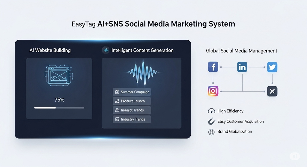
 AI+SNS Social Media Marketing SystemYingbao AI+SNS Social Media Marketing System - Precision social capture for the social media era. Supports one-click content synchronization across major platforms like Facebook and LinkedIn. AI intelligently rewrites posts for enhanced relevance. 24/7 AI customer service and user profiling analysis empower businesses to efficiently expand into global markets.
 AI+SEO营销解决方案易营宝AI+SEO营销解决方案,通过AI批量写作、智能生成TDK、精准关键词扩词等功能,全面优化网站SEO效果,提升流量与转化率。助力企业构建高效智能网站新生态。
 AI+SEM Advertising Marketing SolutionsAI+SEM Advertising Marketing Solution leverages AI technology to deeply empower SEM ad campaigns. It automatically generates weekly/monthly reports using AI, presenting account data across multiple dimensions for comprehensive insights into campaign performance and trends. The system precisely recommends keywords and target countries, intelligently generates high-conversion ad copy, and enables one-click activation of efficient campaign plans to help businesses rapidly acquire customers. Simultaneously, it monitors core metrics in real time, intelligently identifies abnormal fluctuations, and issues timely alerts to ensure stable, high-return advertising results.
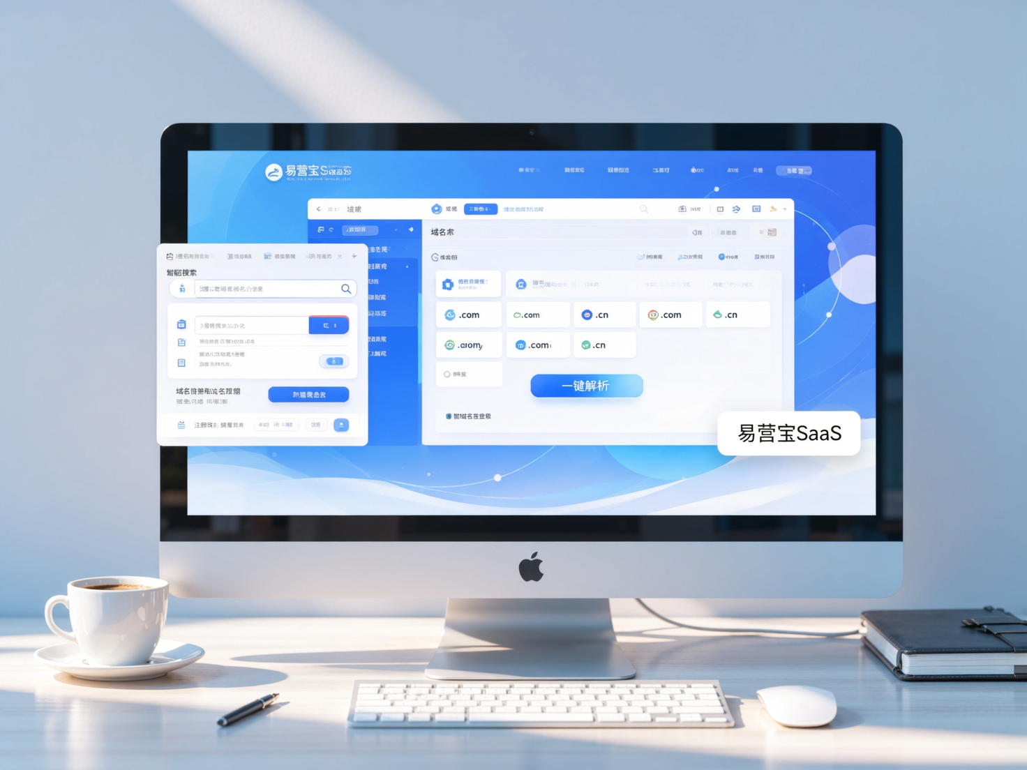
 Domain Name ServicesEasyWin provides professional domain name services, including intelligent queries, one-stop registration, brand protection, and full lifecycle management, helping businesses build a digital brand image.
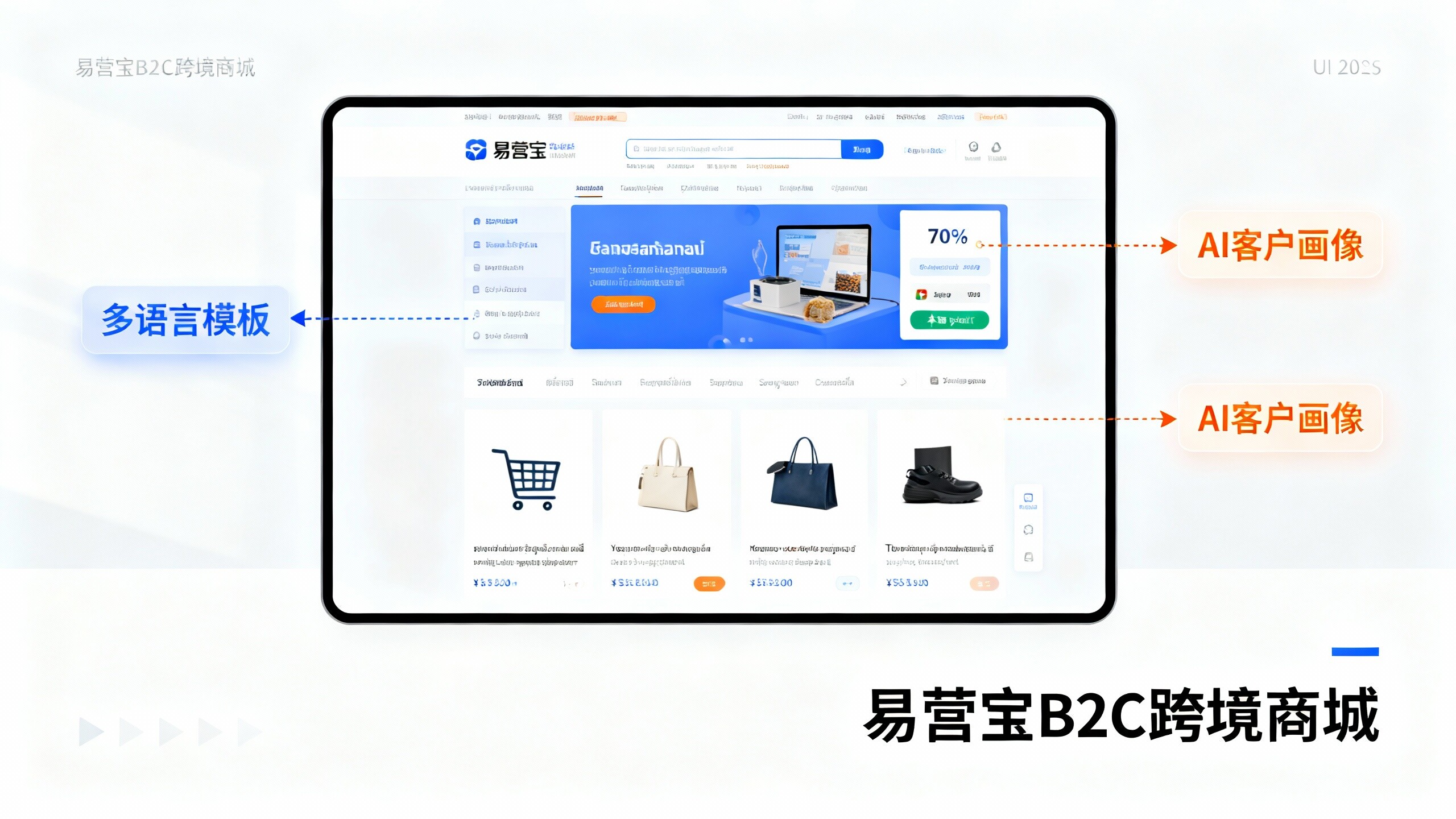
 EasyOperate B2C Cross-Border E-Commerce Platform & Independent WebsiteEasyStore B2C Cross-border E-commerce Independent Store is an intelligent website building and cross-border e-commerce integrated solution independently developed by EasyStore Information Technology (Beijing) Co., Ltd. The system is specially designed for small and medium-sized as well as large export enterprises, integrating 'website building, operation, marketing, advertising, and conversion' into one, helping enterprises quickly establish cross-border e-commerce independent stores to achieve brand globalization and global sales growth.
The platform supports multiple languages, multiple currencies, and multi-channel marketing, with built-in AI intelligent translation and SEO optimization systems, suitable for mainstream markets such as Southeast Asia, Europe and America, Latin America, and the Middle East, assisting Chinese manufacturing enterprises in efficiently deploying international e-commerce strategies. SSL证书易营宝提供专业SSL安全证书服务,包括单域名和泛域名证书,确保网站数据传输加密、身份验证和完整性保护,助力企业建立安全可信的在线业务环境。