EasyStore Cloud Intelligent Website Marketing System Platform!
- Are global buyers abandoning your independent website? Uncover the technical traps that 99% of companies ignore2025-06-19View Details
- Multilingual SEO optimization services help companies expand into international markets!2025-06-19View Details
- AI-driven SEO optimization services can double your website traffic!2025-06-19View Details
- Intelligent website building system + SEO optimization services to create an efficient marketing website!2025-06-19View Details
- Shandong enterprises must see: the five core advantages of independent station construction2025-06-17View Details
- The official agent of Google for foreign trade independent website: authoritative certification, trustworthy2025-06-17View Details
- Which is the best Chinese service provider for foreign trade independent website? Read this article is enough!2025-06-17View Details
- Foreign trade standalone site global server deployment, so that your website is fast2025-06-18View Details
8 Ecommerce Website Design Trends That Will Attract Your Customers in 2020 (Top)
1. Movement in product images
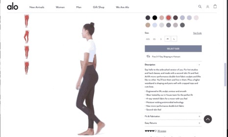
From the beginning, the e-commerce design trends of 2020 have utilized more advanced visuals, starting with motion design. This means fewer static images and more dynamic moving images. We are looking at more videos, movies, animations, and micro-interactions. We rarely saw these motion design elements in the past, but modern technology has made them more and more common. E-commerce websites, among other industries, rely on them to attract more attention.
Motion in e-commerce website design offers many practical advantages and is perfect for showcasing products in a more realistic way. As demonstrated in the Alo Yoga example above, motion design in product visuals allows shoppers to better understand what they are buying and can increase conversions and reduce returns by providing consumers with more information.
2. Unconventional Grid Layout
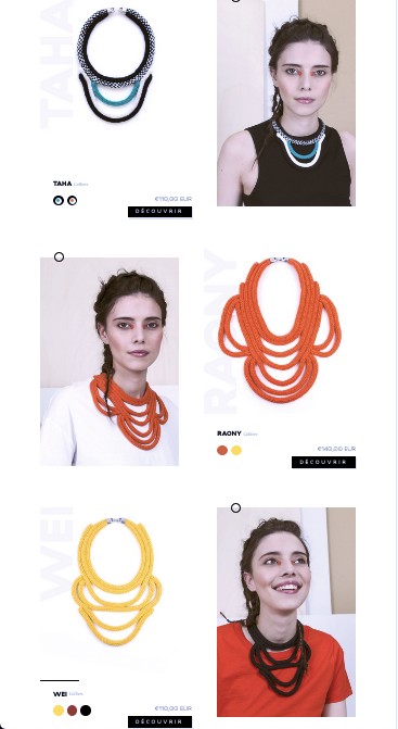
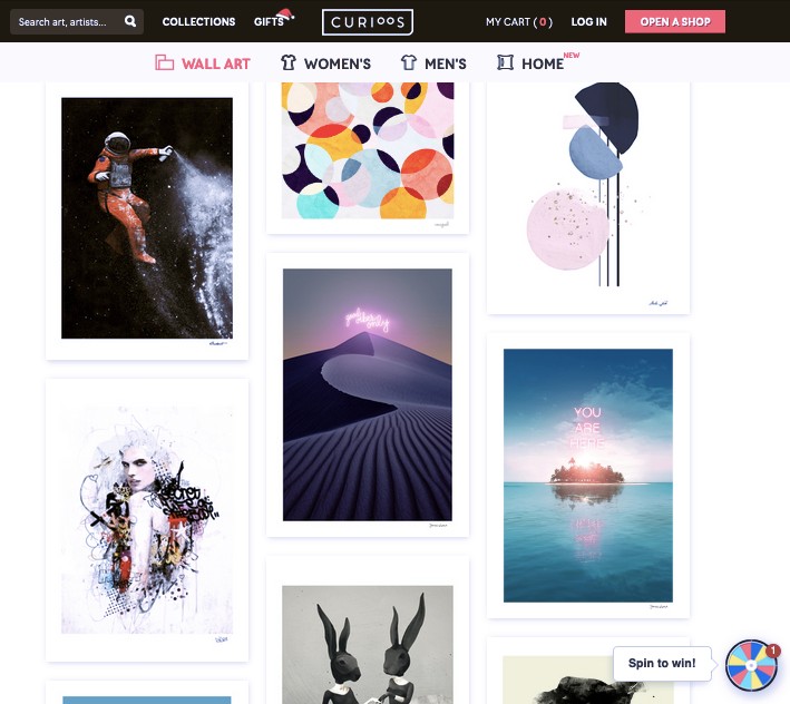
For years, square grid layouts have dominated e-commerce sites (think Amazon’s endless scroll of thumbnails). The strict rows and columns of same-sized products keep everything structured, make browsing easier, and work well for responsive design. But for some brands, trying new layouts is paying off, leading to more and more online stores jumping off the trend.
What are the benefits of abandoning the uniform grid layout of your web page? On the one hand, you will stand out because this design style is still rare so far. But it also gives your brand an edgy and modern feel, which is especially useful for fashion or young industries.
If you design your site correctly, you can also draw attention or spotlight to certain products, such as strategically highlighting your best-selling products without overtly pointing them out.
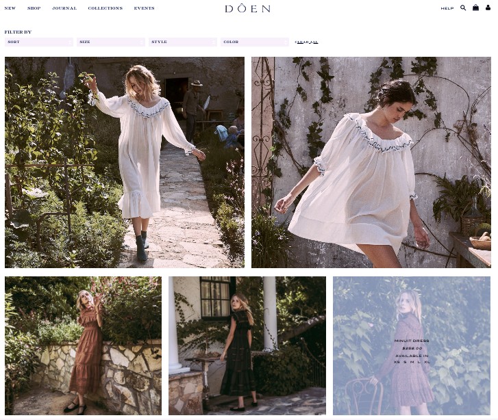
Worth knowing: This e-commerce design trend works best for brands with a relatively limited product range. If you sell a large number of products, this setup may take up too much screen real estate and confuse shoppers. To reap the benefits of an alternative grid without going all out, try diversifying the sizes of your product cards like Dôen above.
3. Landing Page-Product Page Hybrid
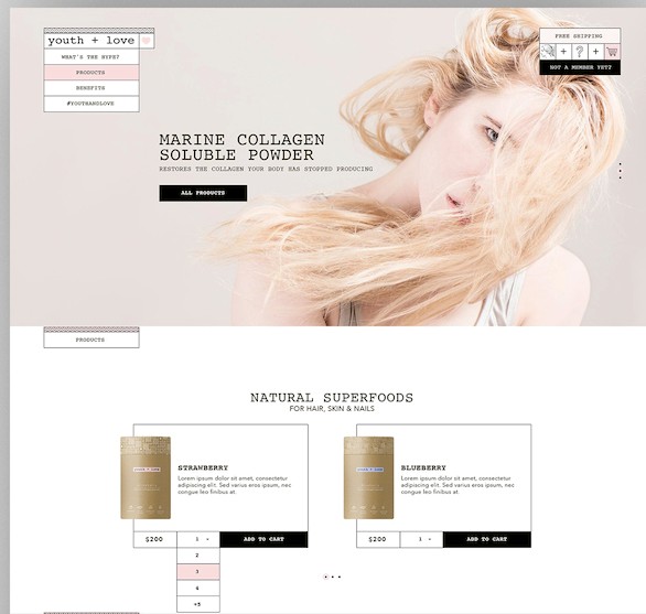
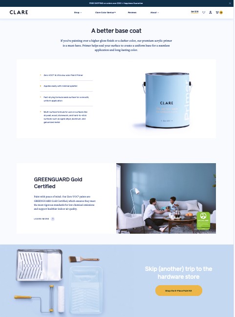
Past e-commerce design trends revolved around the idea that shoppers started on the homepage of a site and then found the products they were looking for. While this still works for some shoppers, a number of other approaches have emerged over the past few years that bypass the homepage entirely.
Advertisements and social media posts often take shoppers directly to product pages, so many visitors never see the home page. With this in mind, e-commerce website designers now often find more elements on landing pages than on their product page designs. The resulting hybrids act like mini-stores, centered around a single product or category, with clear navigation that makes it easy to navigate through the rest of the site.
4. Branded packaging box
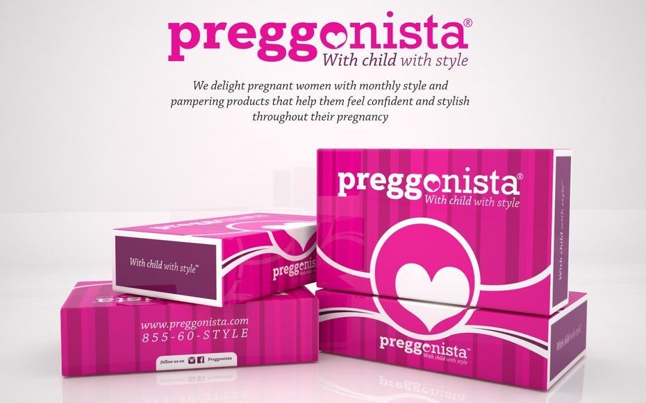
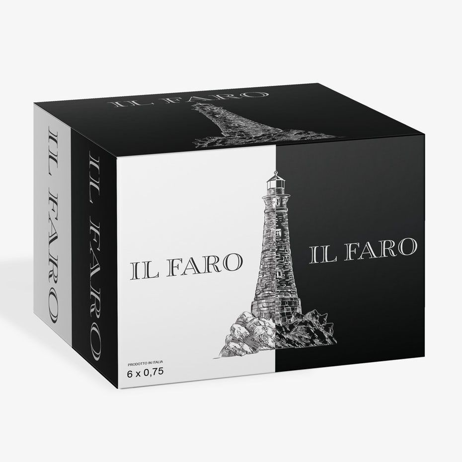
One rule of thumb for branding is to never miss an opportunity. Most companies already know the importance of branding on their product packaging, but for online stores and subscription services, there’s another often-overlooked gap in branding: the shipping box itself.
Custom shipping and delivery boxes not only boost your brand awareness, but they can also make customers more excited about deliveries and increase loyalty. It’s an opportunity to promote your special features, website, social media, or even just your brand colors. Some companies even go the extra mile by using eco-friendly boxes and packaging.
To be continued…
Similar Recommendations

