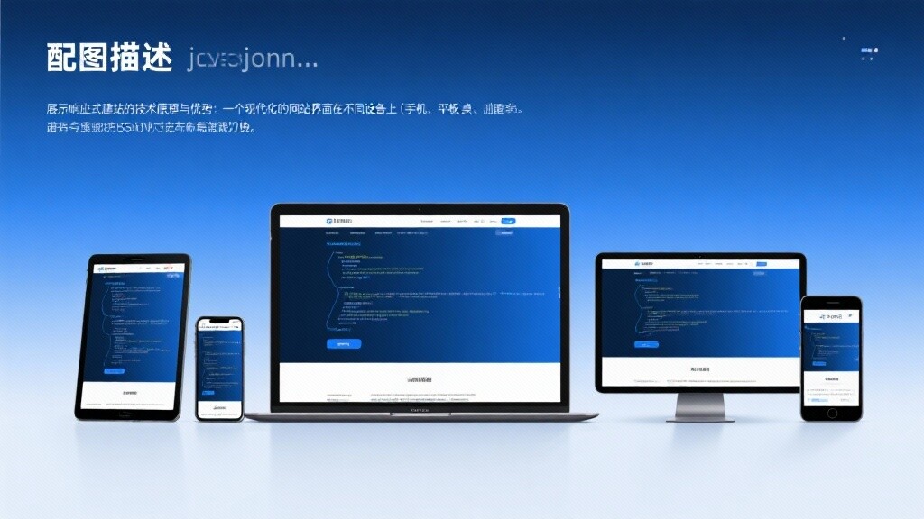
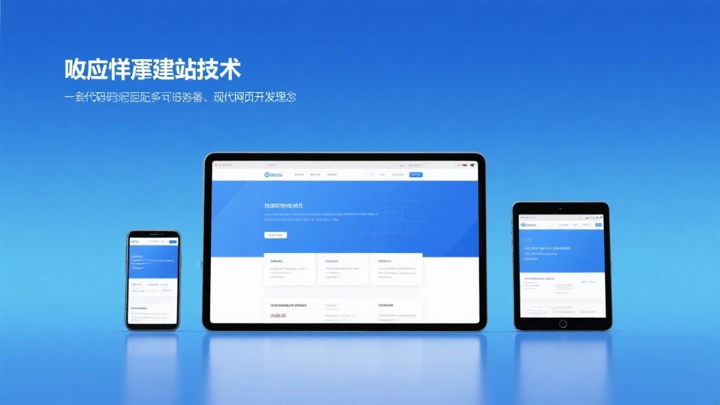
Definition of Responsive Website Building: Achieving Perfect Adaptation Across All Platforms with One Set of Code
Responsive Website Building (Responsive Website Building) is a process in website design and development that adopts the principles of Responsive Web Design (RWD) technology, constructing a flexible website that can automatically adjust layout, images, fonts, and navigation based on parameters such as the screen size, resolution, and orientation of the user's access device.
Core Differences Between Responsive Website Building and Traditional Website Models:
The Essence of Responsive Website Building:Eliminating device barriers to ensure all users receive a seamless, consistent, high-quality experience (UX) on any device.
The Evolution of Responsive Website Building: From Fixed Pixels to Flexible Experience
The evolution of responsive website building is closely related to the explosion of smart devices, representing the adaptation and optimization of web design in an ever-changing digital environment.
1. Precursor: Fixed Layout and Fluid Layout (2000s-2010)
Technical Attempts: Early web pages mostly used fixed pixel (px) layouts, making it difficult to adapt to different resolutions. Later, fluid layouts began using percentages as units, but still couldn't solve the issue of large-scale cross-device compatibility.
Limitations: The lack of ability to detect device characteristics meant structural adjustments couldn't be made between mobile and desktop devices.
2. The Birth and Establishment of the RWD Concept (2010-2012):
Milestone: Ethan Marcotte formally introduced the concept of Responsive Web Design in 2010, integrating fluid grids, flexible images, and media queries as the three core technologies.
Technology Popularization: The widespread adoption of CSS3 provided RWD with media queries as a core technical support, enabling web pages to make decisive layout adjustments based on viewport width.
3. Google's Official Recommendation and Popularization (2012-2016):
SEO Policy: Google officially declared in 2012 that responsive design is the preferred solution for mobile optimization, as it simplifies crawler work and consolidates page authority.
Framework Maturity: The widespread application of front-end frameworks like Bootstrap and Foundation enabled non-professional developers to quickly build responsive websites.
4. Mobile-First Indexing and Performance Optimization (2016-Present):
Mandatory Standard: Google introduced "Mobile-First Indexing", making the mobile version of a website the primary basis for ranking.
Performance-Driven: The introduction of Core Web Vitals (LCP, INP, CLS) elevated the requirements of responsive website building from "viewable" to "fast and stable." The focus shifted to performance optimization and resource loading on demand.
The Technical Principles of Responsive Website Building: Collaborative Work of Three Core Pillars
The success of responsive website building relies on the advanced capabilities of modern CSS and HTML, enabling one-time code writing for multi-platform adaptation.
1. Media Queries: The Key to Achieving "Decisive" Layouts
Principle: Media queries are a core technology of CSS3. They allow browsers to apply different CSS styles based on specific device attributes (most commonly
min-widthandmax-width, i.e., breakpoints).Mechanism: It defines a series of conditional styles. For example, when the screen width is less than 768 pixels (mobile and tablet), the desktop's 3-column layout style is overridden by a single-column vertical stack style.
2. Fluid Grids: The Foundation for "Flexible" Scaling
Principle: All layout containers, columns, and elements use **percentages (%)** as units instead of fixed pixel values.
Benefits: Regardless of how the screen size changes, the relative proportions and positional relationships between elements are maintained, achieving smooth, seamless scaling of the layout.
3. Flexible Images and Media: Ensuring Optimized Visual Content
Principle: By setting the CSS rule
max-width: 100%; height: auto;, images, videos, and other media files are ensured to never exceed their parent container's boundaries and scale proportionally with the container.Performance Enhancement: Modern RWD uses HTML's
<picture>element orsrcset/sizesattributes to intelligently load different-sized images based on the device's actual resolution and viewport size, avoiding the slowdown caused by loading desktop-sized images on mobile devices.
4. Viewport Meta Tag: The Starting Point of Website Building
Principle: The HTML header must include
<meta name="viewport" content="width=device-width, initial-scale=1.0">.Function: It tells mobile browsers to set the page's viewport width to the device's actual physical width, which is a mandatory prerequisite for activating all responsive rules.
Core Features and SEO Strategic Advantages of Responsive Website Building
The value brought by professional responsive website building is multifaceted and mutually reinforcing, making it an essential choice for enhancing a brand's digital competitiveness.

1. Gaining SEO Ranking Advantages (Google Official Certification)
Feature: A unified URL structure consolidates all traffic and backlink authority on a single page, avoiding the potential authority dispersion and standardization issues caused by M-sites.
Advantage: Ensuring your website complies with "Mobile-First Indexing" requirements enhances the mobile user experience, directly translating into higher Google rankings and more stable organic traffic.
2. Maximizing User Experience (UX) Optimization
Feature: The website's layout, font sizes, and clickable areas (buttons, links) are optimized for touchscreens and mobile reading habits.
Advantage: Reducing the bounce rate of mobile users while increasing page dwell time and session duration, all of which are key signals for Google to assess content quality and relevance.
3. Lowering Operational and Maintenance Costs
Feature: Only one content management system (CMS) and one codebase need to be maintained.
Advantage: Whether it's content updates, new features, or technical maintenance, only one operation is required, significantly reducing the workload for developers and content editing teams, as well as potential errors.
4. Enhancing Cross-Device Data Analysis and Conversion Efficiency (CRO)
Feature: Due to unified URLs, it's easy to track users' complete conversion paths and behaviors across different devices.
Advantage: Analytics tools (e.g., GA4) can more accurately perform cross-device attribution, allowing marketers to precisely identify conversion bottlenecks on mobile or desktop and develop more targeted CRO strategies.
Advanced Applications and High-Performance Practices of Responsive Website Building
Modern responsive website building is no longer just about simple layout stacking but involves meticulous management of performance and resource loading.
1. Performance-First Responsive Image Strategies
Advanced Practice: Using the <picture> element to load different cropped and formatted (e.g., WebP) images based on viewport size and device pixel density.
Purpose: Ensuring mobile users do not download high-resolution images meant for desktop, significantly improving LCP (Largest Contentful Paint) performance.
2. Critical CSS Prioritized Loading
Advanced Practice: Identifying the minimum CSS code required for rendering above-the-fold content and **inline** it into the HTML header.
Purpose: Eliminating render-blocking to allow user devices to paint above-the-fold content faster, which is one of the core technologies for optimizing Core Web Vitals.
3. Responsive Typography and Font Optimization
Advanced Practice: Using CSS's
vw(viewport width) units or theclamp()function to define font sizes and line heights.Purpose: Ensuring font sizes not only change at breakpoints but also transition smoothly across all device sizes, providing the best reading comfort.
4. Touch Optimization and Interaction Design
Advanced Practice: Designing larger clickable areas (to avoid user misclicks) and optimizing navigation menus into easy-to-operate hamburger menus or bottom navigation bars for mobile.
Purpose: Improving the usability of key conversion steps like form filling and button clicks on mobile, directly boosting CRO.
EasyProfit: Your Responsive Website Building and SEO Performance Expert
The responsive website building services provided by EasyProfit are systematic projects based on international SEO standards, Core Web Vitals performance optimization, and high-conversion design. We ensure your website not only runs on any device but also operates quickly, efficiently, and with high conversion rates.
SEO-First Responsive Architecture: From project initiation, Mobile-First Indexing and Core Web Vitals are treated as core validation standards, ensuring your website has high-ranking factors at the technical foundation.
High-Performance RWD Implementation: Using technologies like Critical CSS, responsive image optimization, and CDN deployment to ensure the website's mobile loading speed and interaction stability reach industry-leading levels.
UX-Driven Mobile Design: Focusing on touch optimization, navigation design, and information hierarchy to ensure mobile users can easily find information and complete conversions.
Long-Term Maintenance and Iteration Support: Built on mainstream CMS and frameworks, the code is clean and easy to maintain, ensuring your website remains ahead in future technology iterations.
Choose EasyProfit to make your responsive website building a decisive strategic investment that drives brand growth and wins mobile traffic dividends.
FAQ
1. How does responsive design specifically impact my SEO rankings?
It directly affects your ranking potential and stability.
Mobile-first priority: Google primarily uses your mobile version as the ranking basis. If your responsive site has slow mobile loading speeds or poor user experience (failing Core Web Vitals), your overall rankings will face severe penalties.
Weight consolidation: Unified URLs ensure all backlinks and ranking weight are consolidated into one version, avoiding the weight dispersion and indexing issues caused by separate M sites.
2. What's the relationship between Core Web Vitals (CWV) and responsive design?
CWV are three key metrics measuring how "good" a responsive website is.
LCP (Loading Speed): Is your responsive site fast? Professional RWD must optimize image loading strategies and critical CSS.
INP (Interaction Speed): Does your responsive site have low latency when clicking buttons or inputting on mobile? RWD must optimize JavaScript execution.
CLS (Layout Stability): Does your responsive layout shift during loading? RWD must reserve space and use proper image loading techniques to prevent this.
3. How does responsive design solve slow image loading across different screen sizes?
By using the <picture> element and srcset attribute.
<picture>element: Allows specifying different image files for various screen sizes and resolutions - browsers will select the most suitable version.srcset: Lets browsers automatically choose optimal images based on the user's viewport size and pixel density, ensuring mobile users only download smaller files, dramatically saving bandwidth and time.
4. Is responsive design more expensive than traditional PC+M separate sites?
Initial design costs may be slightly higher, but long-term total cost of ownership (TCO) is lower.
Initial cost: Requires more meticulous engineering due to complex breakpoint planning and performance optimization.
Long-term cost (more critical): RWD only needs one codebase, one CMS - maintenance, updates, and SEO optimization require single investment, while PC+M sites need double the input, making RWD's long-term cost efficiency far superior.

Customer Reviews
Mr. Han, Market Director of a B2B industrial product export company
"Our previous website had separate PC and mobile sites, with extremely low mobile inquiry conversion rates, and every content update required dual operations. EasyShop completely rebuilt our site with responsive design and optimized performance targeting Core Web Vitals. Now our site shows significantly improved mobile scores on Google PageSpeed Insights. Most importantly, mobile bounce rates decreased by , and inquiry form completion rates increased by . Responsive design truly helped us capture international buyer traffic in the mobile era."
Ms. Meng, Operations Manager of a consumer goods e-commerce platform
"As an e-commerce business heavily reliant on SEO traffic, we understand mobile's critical importance. EasyShop not only delivered professional RWD construction but also implemented performance-first image loading and critical CSS strategies. Post-launch, Google Search Console shows our mobile usability score is perfect, with LCP performance metrics reaching excellent levels. Traffic growth came naturally - organic search traffic grew in six months, and mobile transaction conversion rates surpassed desktop for the first time."
![Video teaching: 5 minutes to start Guangdong SEO optimization software core functions Video teaching: 5 minutes to start Guangdong SEO optimization software core functions]() Video teaching: 5 minutes to start Guangdong SEO optimization software core functions5-minute video teaching takes you to quickly master the core functions of Guangdong SEO optimization software! EYB provides responsive website building, global traffic ecological docking and social media automation operation tools to help Shenzhen and neighboring enterprises easily build foreign trade websites.AI-driven technology makes website optimization smarter and supports multi-language independent station construction, especially suitable for cross-border e-commerce enterprises. Learn now how to improve global digital marketing results with this SaaS software and get exclusive rights to foreign trade websites!
Video teaching: 5 minutes to start Guangdong SEO optimization software core functions5-minute video teaching takes you to quickly master the core functions of Guangdong SEO optimization software! EYB provides responsive website building, global traffic ecological docking and social media automation operation tools to help Shenzhen and neighboring enterprises easily build foreign trade websites.AI-driven technology makes website optimization smarter and supports multi-language independent station construction, especially suitable for cross-border e-commerce enterprises. Learn now how to improve global digital marketing results with this SaaS software and get exclusive rights to foreign trade websites!![Shenzhen enterprises must see! The 5 fatal misunderstandings of quickly building a website Shenzhen enterprises must see! The 5 fatal misunderstandings of quickly building a website]() Shenzhen enterprises must see! The 5 fatal misunderstandings of quickly building a websiteShenzhen enterprises in the rapid construction of the site is often caught in the responsive station building misunderstandings, affecting the global traffic ecological layout. EYB Technology reveals 5 fatal misunderstandings: insufficient multi-language localization, template SEO defects, social media automation traps, mobile-friendly misunderstandings, independent station and traffic cut-off. Provide Guangdong SEO optimization software solutions to help you efficiently gain customers through exclusive rights to foreign trade websites. Get exclusive Shenzhen SEO optimization software services now and build a multilingual site in 10 minutes!
Shenzhen enterprises must see! The 5 fatal misunderstandings of quickly building a websiteShenzhen enterprises in the rapid construction of the site is often caught in the responsive station building misunderstandings, affecting the global traffic ecological layout. EYB Technology reveals 5 fatal misunderstandings: insufficient multi-language localization, template SEO defects, social media automation traps, mobile-friendly misunderstandings, independent station and traffic cut-off. Provide Guangdong SEO optimization software solutions to help you efficiently gain customers through exclusive rights to foreign trade websites. Get exclusive Shenzhen SEO optimization software services now and build a multilingual site in 10 minutes!![How responsive website building can help companies improve user experience? How responsive website building can help companies improve user experience?]() How responsive website building can help companies improve user experience?Responsive website building is the key to enterprise digital transformation, EYBao realizes perfect multi-terminal adaptation through AI adaptive technology, and the loading speed is increased by 40%. This article explains how responsive station building through the fluid grid, media query and other core technologies to enhance the user experience, and share the successful cases of education, manufacturing industry, to help you build a high-conversion digital portal. Get a professional website building program now!
How responsive website building can help companies improve user experience?Responsive website building is the key to enterprise digital transformation, EYBao realizes perfect multi-terminal adaptation through AI adaptive technology, and the loading speed is increased by 40%. This article explains how responsive station building through the fluid grid, media query and other core technologies to enhance the user experience, and share the successful cases of education, manufacturing industry, to help you build a high-conversion digital portal. Get a professional website building program now!![Shenzhen foreign trade station: why responsive design is the standard? Shenzhen foreign trade station: why responsive design is the standard?]() Shenzhen foreign trade station: why responsive design is the standard?Shenzhen foreign trade station experts analyze why responsive design has become a standard match for the sea! Yiyingbao AI intelligent website building system combined with global CDN acceleration technology, help foreign trade enterprises in Guangzhou, Dongguan, Zhejiang, Jiangsu and other places to build high conversion website, mobile loading speed increased to 0.9 seconds, inquiry conversion rate increased by 3 times. Uncover how to improve SEO ranking by 50% through responsive design, reduce CPC cost by 40% in South America, and avoid multi-language adaptation traps. Immediately get the mobile optimization solution for foreign trade independent station to seize the first opportunity in emerging markets!
Shenzhen foreign trade station: why responsive design is the standard?Shenzhen foreign trade station experts analyze why responsive design has become a standard match for the sea! Yiyingbao AI intelligent website building system combined with global CDN acceleration technology, help foreign trade enterprises in Guangzhou, Dongguan, Zhejiang, Jiangsu and other places to build high conversion website, mobile loading speed increased to 0.9 seconds, inquiry conversion rate increased by 3 times. Uncover how to improve SEO ranking by 50% through responsive design, reduce CPC cost by 40% in South America, and avoid multi-language adaptation traps. Immediately get the mobile optimization solution for foreign trade independent station to seize the first opportunity in emerging markets!![New Trends in Foreign Trade Website Construction: How Can Responsive Websites Improve B2B Conversion Rates? New Trends in Foreign Trade Website Construction: How Can Responsive Websites Improve B2B Conversion Rates?]() New Trends in Foreign Trade Website Construction: How Can Responsive Websites Improve B2B Conversion Rates?Revealing New Trends in Foreign Trade Website Construction! How Can Responsive Websites Increase B2B Conversion Rates by 40% Through AI + SEO Dual-Engine Optimization Systems? Easy-Promotion SaaS Marketing Platform Integrates Global CDN Acceleration and Multi-Language Adaptation to Create High-Conversion Foreign Trade Standalone Sites. Learn How Machinery Export Enterprises Achieved a 210% Increase in Mobile Inquiry Growth Through Practical Case Studies, and Gain Access to Four Major Enhancement Strategies Including Smart Form Optimization and Behavior-Triggered Pop-Ups. Download the <2024 Foreign Trade Standalone Site Technology White Paper> Now and Embark on Your Global Digital Marketing Journey!
New Trends in Foreign Trade Website Construction: How Can Responsive Websites Improve B2B Conversion Rates?Revealing New Trends in Foreign Trade Website Construction! How Can Responsive Websites Increase B2B Conversion Rates by 40% Through AI + SEO Dual-Engine Optimization Systems? Easy-Promotion SaaS Marketing Platform Integrates Global CDN Acceleration and Multi-Language Adaptation to Create High-Conversion Foreign Trade Standalone Sites. Learn How Machinery Export Enterprises Achieved a 210% Increase in Mobile Inquiry Growth Through Practical Case Studies, and Gain Access to Four Major Enhancement Strategies Including Smart Form Optimization and Behavior-Triggered Pop-Ups. Download the <2024 Foreign Trade Standalone Site Technology White Paper> Now and Embark on Your Global Digital Marketing Journey!![Responsive Website Design and SEO Optimization: Key to Improving Foreign Trade Website Rankings Responsive Website Design and SEO Optimization: Key to Improving Foreign Trade Website Rankings]() Responsive Website Design and SEO Optimization: Key to Improving Foreign Trade Website RankingsUnveiling the Golden Combination Strategy of Responsive Website Design and SEO Optimization! EasyStore AI Website System enhances global reach through multilingual support, worldwide CDN acceleration, and AI marketing engine, helping foreign trade enterprises in Shenzhen, Shanghai, Beijing, and more to build high-conversion websites. This article deeply analyzes mobile-first design, multilingual SEO optimization, technical SEO, and other key techniques, sharing AI-driven content production and traffic growth solutions to help you achieve dual growth in Google rankings and social media exposure. Get professional website selection guidance and SEO optimization secrets now!
Responsive Website Design and SEO Optimization: Key to Improving Foreign Trade Website RankingsUnveiling the Golden Combination Strategy of Responsive Website Design and SEO Optimization! EasyStore AI Website System enhances global reach through multilingual support, worldwide CDN acceleration, and AI marketing engine, helping foreign trade enterprises in Shenzhen, Shanghai, Beijing, and more to build high-conversion websites. This article deeply analyzes mobile-first design, multilingual SEO optimization, technical SEO, and other key techniques, sharing AI-driven content production and traffic growth solutions to help you achieve dual growth in Google rankings and social media exposure. Get professional website selection guidance and SEO optimization secrets now!![Shanghai Foreign Trade Website Development Trends: The Application of Social Media Automation Tools Shanghai Foreign Trade Website Development Trends: The Application of Social Media Automation Tools]() Shanghai Foreign Trade Website Development Trends: The Application of Social Media Automation ToolsExploring Shanghai's Foreign Trade Website Trends: How Social Media Automation Tools Empower Global Growth Through SaaS Marketing Platforms. This article provides an in-depth analysis of the integration of responsive website building with AI marketing engines, covering innovative features like intelligent content generation and cross-time-zone scheduling. It helps foreign trade enterprises in Shenzhen, Guangdong, Beijing, and other regions enhance their responsive website SEO performance. Access industry-leading solutions to achieve 300% social media follower growth and reduce customer acquisition costs by 52%!
Shanghai Foreign Trade Website Development Trends: The Application of Social Media Automation ToolsExploring Shanghai's Foreign Trade Website Trends: How Social Media Automation Tools Empower Global Growth Through SaaS Marketing Platforms. This article provides an in-depth analysis of the integration of responsive website building with AI marketing engines, covering innovative features like intelligent content generation and cross-time-zone scheduling. It helps foreign trade enterprises in Shenzhen, Guangdong, Beijing, and other regions enhance their responsive website SEO performance. Access industry-leading solutions to achieve 300% social media follower growth and reduce customer acquisition costs by 52%!![Responsive Web Design: Why It's the Top Choice for Foreign Trade Enterprises? Responsive Web Design: Why It's the Top Choice for Foreign Trade Enterprises?]() Responsive Web Design: Why It's the Top Choice for Foreign Trade Enterprises?Responsive web design is the preferred solution for foreign trade enterprises expanding into overseas markets. Yixunbao SaaS Marketing Platform leverages AI marketing engines and global server clusters to deliver 40% faster loading speeds and 35% higher SEO scores. This article details the SEO advantages of responsive websites, compares them with traditional web design solutions, and shares success stories from Shenzhen and Shanghai-based foreign trade companies to help you build high-conversion independent sites. Learn how to reduce customer acquisition costs through social media automation and AI technology!
Responsive Web Design: Why It's the Top Choice for Foreign Trade Enterprises?Responsive web design is the preferred solution for foreign trade enterprises expanding into overseas markets. Yixunbao SaaS Marketing Platform leverages AI marketing engines and global server clusters to deliver 40% faster loading speeds and 35% higher SEO scores. This article details the SEO advantages of responsive websites, compares them with traditional web design solutions, and shares success stories from Shenzhen and Shanghai-based foreign trade companies to help you build high-conversion independent sites. Learn how to reduce customer acquisition costs through social media automation and AI technology!

