I. The Authoritative Definition and Core Value of Mobile Adaptation
1. The authoritative definition of Mobile Adaptation
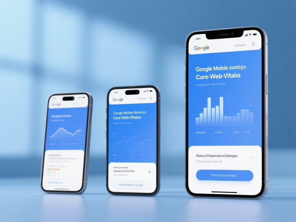
Mobile adaptation is a website design and development process centered on user experience (UX) and supported by a robust technical architecture . It aims to ensure that a website's content, functionality, and interactive elements seamlessly adapt to different types and sizes of mobile devices (including smartphones and tablets), maintaining a consistent visual aesthetic, user-friendly operation logic, and lightning-fast loading performance . Successful mobile adaptation is a core technical requirement for **Google's ranking algorithm (especially mobile-first indexing) and user conversion rates**.
2. The core strategic value of mobile adaptation
II. The Development History of Mobile Adaptation: From Independent Websites to Mobile-First Indexes
The history of mobile adaptation is a process of the internet's complete migration from desktop monopoly to mobile dominance , and also a process of Google's algorithms continuously moving closer to user experience .

1. Early Stage: M-site and Independent Content (2007-2012)
Technical characteristics: Mobile devices are still in their early stages, and the mainstream solution is to establish a separate mobile site (M site, such as https://www.google.com/url?sa=E&source=gmail&q=m.example.com) .
Main issues: Complex content management (two versions need to be updated simultaneously) , high SEO difficulty ( duplicate content issues, dispersed link authority ).
2. The Rise of Responsive Design (RWD) and Technical Specifications (2012-2016)
Milestone: Ethan Marcotte introduced the concept of Responsive Web Design (RWD). Google officially began recommending RWD .
Technological transformation: Using CSS Media Queries , a single codebase and URL were implemented to adapt to all devices. SEO issues were resolved .
Challenge: Early RWD solutions sometimes resulted in mobile devices loading too much redundant code , impacting speed.
3. Mobile-first indexing and the performance revolution (2016 to present)
Key Focus: Google announces "Mobile-First Indexing." Google primarily determines a website's ranking by crawling and evaluating its mobile version .
Technological advancements: **Core Web Vitals (CWV)** has become a key performance indicator for mobile devices. Technologies such as AMP (Accelerated Mobile Pages) are used to pursue ultimate mobile speed .
Trend: Mobile adaptation has evolved from **"layout adaptation" to "performance and experience adaptation"**, with speed and smooth interaction becoming the key to success.
III. The Technical Principles of Mobile Adaptation: Analysis of Three Mainstream Solutions
There are three main technical solutions for mobile adaptation, each with its underlying principles and impact on SEO.
1. Responsive Web Design (RWD)
Technical principle: Using the same set of HTML code and URLs , CSS Media Queries identify the screen size, resolution, and other characteristics of the accessing device , and then dynamically adjust the layout, font size, and image size .
SEO Impact: This is the most recommended approach by Google. A single URL structure is the most Google-friendly for crawling, avoids duplicate content issues , and concentrates link authority.
Key technology:
<meta name="viewport" content="width=device-width, initial-scale=1">must be set correctly.
2. Dynamic Serving
Technical principle: Using the same URL , the server identifies whether the accessing device is a desktop or a mobile device based on the user agent, and then sends different HTML/CSS code .
SEO Impact: Google approves of this , but requires servers to have the Vary HTTP header correctly configured to inform Google's crawler that website content will vary based on the User Agent . Incorrect configuration may prevent mobile content from being crawled .
3. Separate URLs (M-sites)
Technical principle: Different URLs (e.g.,
www.example.comcorresponds tom.example.com) are used to provide desktop and mobile versions of the content respectively.SEO Impact: Google still supports it, but it's the least recommended. The
<link rel="alternate">and `<link rel="canonical">tags must be used correctly to establish the relationship between desktop and mobile URLs ; otherwise, serious problems such as duplicate content and diluted authority will occur.
IV. Core Features and Strategic Advantages of Mobile Adaptation
1. The key to Google's mobile-first indexing
Feature: Google now primarily crawls your mobile web pages for indexing and ranking evaluation.
Advantages: Ensures your website's visibility on Google . If your mobile adaptation is poor, even the best desktop content may not rank highly .
2. Core Web Vitals (CWV) Metric Optimization
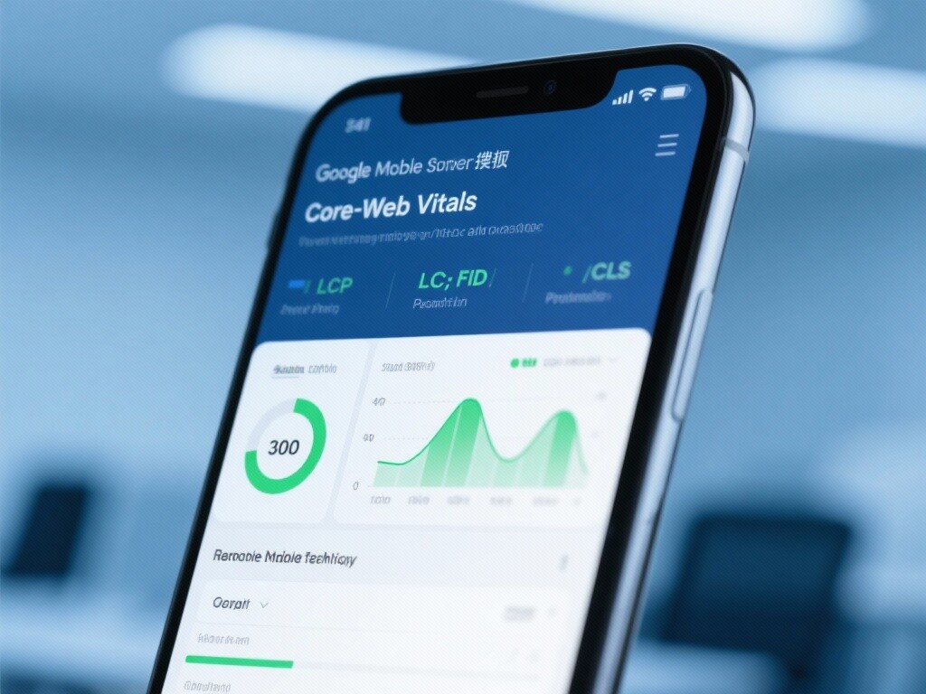
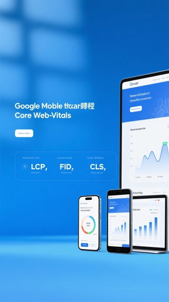
Features: Mobile adaptation must optimize the following three key performance metrics:
LCP (Largest Contentful Paint): Maximum content rendering time (a measure of loading speed).
FID (First Input Delay): The delay before the first input (a measure of the speed of interactive response).
CLS (Cumulative Layout Shift): Cumulative layout offset (measures the visual stability of a page).
Advantages: CWV is a direct signal of Google ranking ; optimizing CWV directly improves user experience and search ranking .
3. High compatibility across multiple devices and browsers
Features: The adaptation solution needs to take into account different browser environments such as iOS, Android , Chrome, and Safari .
Advantages: Ensuring global coverage of users can get a consistent, stable, and error-free access experience , maximizing the value of traffic.
4. Unified content management and SEO efficiency
Features: (Especially for RWD solutions) Content only needs to be published once and can be displayed on all devices.
Advantages: Significantly reduces content maintenance costs and SEO complexity , and avoids the risk of multiple versions of content being out of sync.
V. In-depth Applications and Practical Scenarios of Mobile Adaptation
1. Conversion path optimization for DTC/e-commerce websites
Application: Ensures a smooth and seamless mobile shopping and checkout process .
Practical application:
Touch-friendly design: Ensures buttons are large enough and spaced appropriately for easy touch.
Form simplification: Mobile forms should require as little user input as possible and utilize autofill .
Payment process optimization: Supports mobile quick payment methods such as Apple Pay/Google Pay , shortening the checkout process .
2. Content marketing and ensuring a good blog reading experience
Application: Ensure high-value SEO content is easy to read and share on mobile devices.
Practical application:
Font size and line height: Use ** A font size of 16 p x or higher ensures sufficient line height and paragraph spacing**, reducing reading fatigue.
Image optimization: Ensure all images are responsive and use lazy loading on mobile devices to guarantee LCP speed .
Share button usability: Place the social share button in a fixed position that is easy to click but does not obscure the content .
3. Lead capture optimization for B2B websites
Application: Ensure smooth operation of lead capture functions such as mobile inquiries and white paper downloads .
Practical application:
One-click call/email: Make customer service phone numbers or emails clickable buttons for easy and instant contact by mobile users.
Attached CTA (Call to Action): Place an attachable CTA button (such as "Free Consultation") at the bottom of the mobile screen to improve conversion rates.
4. Technical SEO Diagnosis and Performance Optimization
Application: Continuously monitor and improve mobile performance metrics.
Practical application: Regularly use tools such as Google PageSpeed Insights and Chrome Lighthouse for mobile testing. Prioritize resolving LCP and FID issues in the CWV metric , such as eliminating rendering-blocking resources and optimizing server response time .
VI. YiYingBao: Your Mobile Adaptation and SEO Growth Expert
E-Creative focuses on providing comprehensive mobile adaptation solutions that meet Google's mobile-first and Core Web Vitals requirements , ensuring your website achieves the highest SEO rankings and conversion rates .
Responsive Architecture Design: We adopt the **Google-recommended RWD solution** to ensure a single codebase, efficient operation and maintenance , and perfect adaptation to all devices.
Core Web Vitals Performance Optimization: Our technical team is proficient in front-end code optimization, lazy loading of images, and key CSS extraction techniques to help your website achieve the **Google CWV Green Standard**.
Mobile Conversion Path Optimization (M-UX): Focusing on mobile user experience design , optimizing key conversion links such as navigation, forms, and CTAs to increase mobile revenue .
Mobile-First Index Compliance Audit: Conduct a professional mobile-first indexing technology audit of your website to ensure that all content and links are correctly and completely indexed by Google's crawlers .
FAQ
1. What is Google's "Mobile-First Indexing" and how does it affect my website ranking?
Answer: Mobile-First Indexing means Google primarily determines your website's ranking and indexed content by crawling and evaluating your mobile version.
Impact: If your mobile version has missing content, slow loading, or poor user experience, even if your desktop version performs perfectly, Google may lower your overall ranking based on the poor mobile evaluation.
2. Which is better: Responsive Web Design (RWD) or an M-site (separate URL)?
Answer: Responsive Web Design (RWD) is the optimal solution in of cases.
RWD Advantages: Simplest technology, lowest SEO risk (single URL consolidates weight), lowest content maintenance cost.
M-site Issues: Requires maintaining two sets of code and content, prone to content desync and link weight dispersion, and must use complex
<link rel="alternate">tags, which is very unfriendly for SEO.
3. How can I quickly check if my website meets mobile compatibility requirements?
Answer: Use Google's official tools for testing.
Google Mobile-Friendly Test: Quickly checks if your page is deemed **"mobile-friendly"** by Google.
Google PageSpeed Insights: Analyzes your mobile page performance in Core Web Vitals (LCP, FID, CLS) and provides specific optimization suggestions.
4. What is LCP in Core Web Vitals (CWV), and how to optimize it?
Answer: LCP (Largest Contentful Paint) is a core metric for measuring website loading speed.
Definition: LCP measures the time it takes for the largest content element (e.g., main image, large headline block) to load and display to users. Google recommends LCP should be within seconds.
Optimization Methods: Improve server response speed (TTFB), delay loading non-critical images and CSS, compress images, eliminate render-blocking resources, etc.
Customer Reviews
Mr. Qi, CEO of a D2C cross-border e-commerce company
"Over 70% of our traffic comes from mobile, but conversion rates remained lower than desktop. EasyYun conducted thorough mobile adaptation and Core Web Vitals optimization. They not only improved our LCP speed by seconds but also optimized mobile cart interaction and checkout flow. After 3 months of optimization, our mobile bounce rate dropped by , and order conversion increased by . Mobile adaptation's ROI far exceeded expectations—it's truly a growth investment in numbers."
Ms. Sun, CMO of a B2B industrial software company
"We assumed B2B clients only used desktops and ignored mobile adaptation. But EasyYun's analysis showed our potential clients search for 'industry solutions' on mobile during commutes. They implemented responsive design and specifically optimized mobile whitepaper download forms and 'one-click contact' features. Post-adaptation, mobile traffic ranking from Google searches steadily rose, and mobile inquiries increased by . This proves even for B2B, mobile adaptation is a core SEO competitiveness not to be overlooked."
![Is Your B2B Website Still ‘Sleeping’? 5 Strategic Tactics to Get Global Clients Actively Placing Orders! Is Your B2B Website Still ‘Sleeping’? 5 Strategic Tactics to Get Global Clients Actively Placing Orders!]() Is Your B2B Website Still ‘Sleeping’? 5 Strategic Tactics to Get Global Clients Actively Placing Orders!How Can a B2B Standalone Site Achieve 300% Order Growth Globally Through Precise Positioning, Multilingual Infrastructure, and Trust System Building? A Must-Read Cross-Border Growth Guide for Export Business Owners!
Is Your B2B Website Still ‘Sleeping’? 5 Strategic Tactics to Get Global Clients Actively Placing Orders!How Can a B2B Standalone Site Achieve 300% Order Growth Globally Through Precise Positioning, Multilingual Infrastructure, and Trust System Building? A Must-Read Cross-Border Growth Guide for Export Business Owners!![Is TikTok Advertising Really a Waste of Money? A Pitfall Avoidance Guide for Exporters: Full Analysis of Registration, Content, and Performance! Is TikTok Advertising Really a Waste of Money? A Pitfall Avoidance Guide for Exporters: Full Analysis of Registration, Content, and Performance!]() Is TikTok Advertising Really a Waste of Money? A Pitfall Avoidance Guide for Exporters: Full Analysis of Registration, Content, and Performance!TikTok Advertising Pitfall Avoidance Guide for Export Businesses, from Registration to Performance Optimization, Helping You Acquire Customers Accurately Without Stepping on Landmines!
Is TikTok Advertising Really a Waste of Money? A Pitfall Avoidance Guide for Exporters: Full Analysis of Registration, Content, and Performance!TikTok Advertising Pitfall Avoidance Guide for Export Businesses, from Registration to Performance Optimization, Helping You Acquire Customers Accurately Without Stepping on Landmines!![Foreign Trade Newbie's Secret to Success: Explode Overseas Client Inquiries in 30 Days with Just Two Steps Foreign Trade Newbie's Secret to Success: Explode Overseas Client Inquiries in 30 Days with Just Two Steps]() Foreign Trade Newbie's Secret to Success: Explode Overseas Client Inquiries in 30 Days with Just Two StepsHow Can Foreign Trade Newbies Quickly Explode Overseas Client Inquiries Within 30 Days? This Article Reveals Two Key Steps: Building an Independent Website and Utilizing Google Ads. By Implementing These Two Steps, Newbies Can Rapidly Enhance Brand Trust, Achieve Precise Traffic Guidance, Effectively Reduce Customer Acquisition Costs, and Improve Conversion Rates.
Foreign Trade Newbie's Secret to Success: Explode Overseas Client Inquiries in 30 Days with Just Two StepsHow Can Foreign Trade Newbies Quickly Explode Overseas Client Inquiries Within 30 Days? This Article Reveals Two Key Steps: Building an Independent Website and Utilizing Google Ads. By Implementing These Two Steps, Newbies Can Rapidly Enhance Brand Trust, Achieve Precise Traffic Guidance, Effectively Reduce Customer Acquisition Costs, and Improve Conversion Rates.![How professional website building services can help businesses grow How professional website building services can help businesses grow]() How professional website building services can help businesses growIn this paper, we analyze in detail how professional website building services can help enterprises realize digital transformation through standardized processes, and comprehensively analyze the value and implementation points of the website building service process from demand analysis to post-maintenance.
How professional website building services can help businesses growIn this paper, we analyze in detail how professional website building services can help enterprises realize digital transformation through standardized processes, and comprehensively analyze the value and implementation points of the website building service process from demand analysis to post-maintenance.![SEM optimization tips: How to make your advertising more effective? SEM optimization tips: How to make your advertising more effective?]() SEM optimization tips: How to make your advertising more effective?This article delves into SEM optimization techniques, analyzes the differences between SEM and SEO, and provides practical methods for rapid website inclusion, loading speed optimization, and SEO ranking improvement, helping companies improve advertising effectiveness and website performance.
SEM optimization tips: How to make your advertising more effective?This article delves into SEM optimization techniques, analyzes the differences between SEM and SEO, and provides practical methods for rapid website inclusion, loading speed optimization, and SEO ranking improvement, helping companies improve advertising effectiveness and website performance.![SEO optimization tips: How to make your website ranking soar? SEO optimization tips: How to make your website ranking soar?]() SEO optimization tips: How to make your website ranking soar?This article is a comprehensive SEO optimization guide that covers key techniques such as keyword research, content optimization, technical SEO, etc. It is suitable for business owners, marketers, and webmasters to read and help improve the ranking of the website in search engines.
SEO optimization tips: How to make your website ranking soar?This article is a comprehensive SEO optimization guide that covers key techniques such as keyword research, content optimization, technical SEO, etc. It is suitable for business owners, marketers, and webmasters to read and help improve the ranking of the website in search engines.![SEO Optimization Tutorial: 10 Practical Techniques for Beginners to Get Started Quickly SEO Optimization Tutorial: 10 Practical Techniques for Beginners to Get Started Quickly]() SEO Optimization Tutorial: 10 Practical Techniques for Beginners to Get Started QuicklyThis 2000-word professional guide provides a detailed breakdown of core SEO optimization techniques, including keyword strategies, content creation essentials, technical optimization, and other practical knowledge to help readers systematically master effective methods for improving website rankings.
SEO Optimization Tutorial: 10 Practical Techniques for Beginners to Get Started QuicklyThis 2000-word professional guide provides a detailed breakdown of core SEO optimization techniques, including keyword strategies, content creation essentials, technical optimization, and other practical knowledge to help readers systematically master effective methods for improving website rankings.![SEO Optimization Guide: How to Get the Maximum Traffic with the Lowest Cost? SEO Optimization Guide: How to Get the Maximum Traffic with the Lowest Cost?]() SEO Optimization Guide: How to Get the Maximum Traffic with the Lowest Cost?This SEO optimization guide details process methods from keyword research to content optimization, with particular emphasis on high-return low-cost strategies. Whether you are an individual blogger or a corporate marketer, you can gain practical SEO optimization techniques.
SEO Optimization Guide: How to Get the Maximum Traffic with the Lowest Cost?This SEO optimization guide details process methods from keyword research to content optimization, with particular emphasis on high-return low-cost strategies. Whether you are an individual blogger or a corporate marketer, you can gain practical SEO optimization techniques.

