I. Core Definition and 3 Strategic Values of Foreign Trade Responsive Web Design
1. Authoritative Definition of Foreign Trade Responsive Web Design
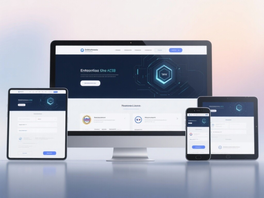
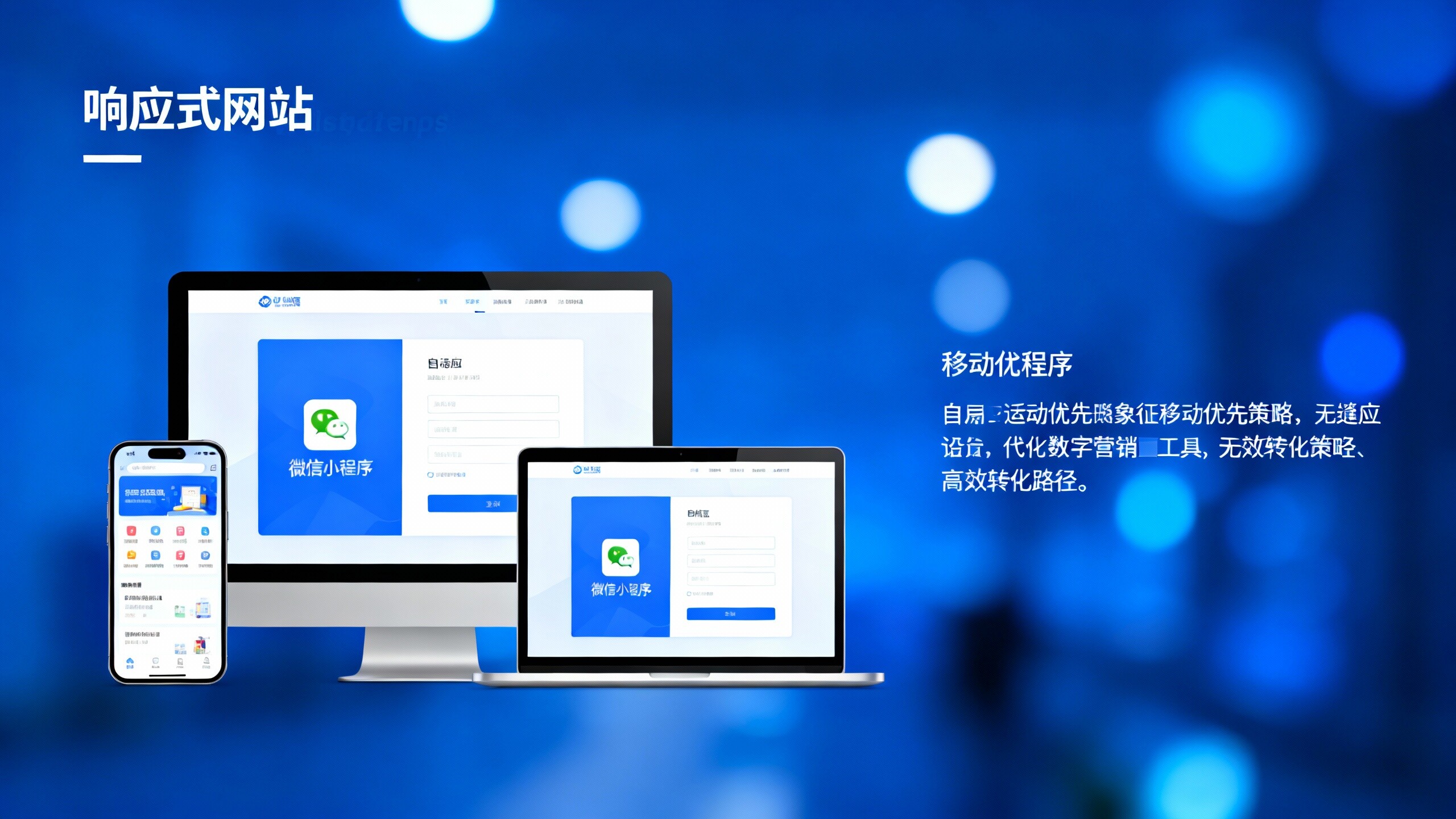
**Foreign Trade Responsive Web Design (Foreign Trade Responsive Web Design, RWD)** refers to the use of **elastic layout and CSS Media Queries** technology, enabling the website to **automatically adjust layout, images, and navigation elements** based on the screen size of the user's device (whether desktop, tablet, or mobile), ensuring **the same URL and the same set of code** can provide **the best user experience** on all devices. It is officially recommended by Google as **the best practice for mobile-friendly website design**.
2. 3 SEO and Business Strategic Values of Responsive Design
Choosing a responsive architecture is a strategic decision for foreign trade enterprises to capture global mobile traffic:
- **Meeting Mobile First Indexing Requirements:** Google adopts **mobile-first indexing**, and the **unified code and content** of responsive websites ensure consistency between mobile and desktop content, avoiding ranking losses.
- **Reducing Management and SEO Costs:** Only **maintaining one URL and one set of code** simplifies website updates, content publishing, and SEO optimization processes, eliminating issues like Hreflang and duplicate content caused by $m.$ subdomains.
- **Improving User Experience and Conversion Rate (CRO):** Responsive design ensures **seamless cross-device experience**, significantly **reducing mobile bounce rates**, thereby enhancing user satisfaction and inquiry/order conversion rates.
3. Development History and Industry Standards of Responsive Design
Early stage (2000s): Mainly used **standalone mobile sites ($m.$ subdomains)**, with high maintenance costs and prone to content duplication. Mid-stage (2010s): The concept of responsive design (RWD) was proposed by Ethan Marcotte, with **CSS Media Queries** becoming mainstream technology. Modern era (2020s to present): Responsive design is deeply tied to **Core Web Vitals (CWV)**, and **Mobile First** has become a mandatory SEO standard. Foreign trade websites must **focus on speed and experience**, ensuring **peak performance** under responsive architecture.

II. 5 Core Technical Principles of Foreign Trade Responsive Web Design: Mobile First and Performance
**The technical core of Foreign Trade Responsive Web Design** lies in the flexibility of code and the consistency of performance:
1. CSS Media Queries Adaptive Layout Principle
Principle: Through **CSS Media Queries**, developers can define **style rules for specific screen sizes (breakpoints)**. Technical application: Based on the device's **width, height, and resolution**, the website can dynamically apply different CSS styles, achieving **automatic adjustment** of layout, fonts, and navigation bars, ensuring **readability and interactivity** of content on any device.
2. Mobile First Architecture Design Principle
Principle: **Design and develop the mobile view first, then gradually expand to desktop**. Technical application: This ensures the **highest priority** for mobile user experience and loading speed. Foreign trade websites will prioritize loading **the most critical content and functions** on mobile, **delaying or hiding** complex desktop elements (such as large animations, sidebars), directly aligning with Google's **Mobile First Indexing Requirements**.
3. Elastic Images and Viewport Scaling Principle
Principle: Images and layout elements should use **relative units (such as percentages, em)** instead of fixed pixels to adapt to different screens. Technical application: Through **srcset attribute or Picture tag**, ensure the system **automatically loads the most suitable image size** based on the user's actual device size, avoiding loading oversized desktop images on mobile devices, significantly improving **loading speed (LCP)**.
4. Consistency of Core Web Vitals (CWV) Optimization Principle
Principle: CWV measures **user-perceived loading, interaction, and visual stability**. Technical application: Responsive design ensures **unified code libraries**, guaranteeing that **LCP (Largest Contentful Paint), FID (First Input Delay), and CLS (Cumulative Layout Shift)** indicators for both **desktop and mobile** are synchronously optimized, meeting Google's **unified page experience** evaluation standards.
5. Touch Event Optimization and Interaction Principle
Principle: Mobile interaction mainly relies on **touch and gestures**. Technical application: Responsive website design must ensure **CTA buttons** are large enough with **reasonable spacing** to prevent user misclicks. Navigation menus should adopt **hamburger or dropdown designs** for convenient one-handed operation on mobile, which is key to **foreign trade website optimization** for improving mobile conversion rates.
III. 4 Technical Features and Practical Applications to Improve Foreign Trade Responsive Website Efficiency
1. Technical Feature: Unified URL Structure and Simplified Hreflang
Feature: Responsive design (RWD) uses **only one URL**. Practice: For multilingual foreign trade websites, although **Hreflang** is still required, the unified URL eliminates the need to handle **complex mutual referencing of Hreflang between $m.$ subdomains and desktop versions**, greatly reducing the technical maintenance difficulty and error rate of international SEO.
2. Practical Application: Mobile Inquiry CRO Optimization
Practice: Mobile conversion rates are usually lower than desktop. Application: **Foreign Trade Responsive Web Design** must fix **core CTAs (such as WhatsApp floating buttons, call buttons)** at the bottom of the mobile screen. **Inquiry forms** should adopt **minimalist designs**, collecting only the most necessary information, or use **single-step forms** to reduce scrolling and input burdens.
3. Practical Application: Synchronous Loading of SEO Metadata and Content
Practice: Ensure **Title, Meta Description, H1 tags, and main content** for **desktop and mobile** are **completely consistent**. Application: Responsive websites should avoid **hiding any SEO-purpose key text or links on mobile**, as Google crawlers primarily evaluate based on the mobile view, and hidden content may lead to keyword ranking drops.
4. Practical Application: Clickability Optimization and Touch Target Size
Practice: Improve user experience by avoiding **"touch targets too close"** errors. Application: Ensure all buttons and links are **at least 48 x 48 pixels** (Google's recommendation) and have **sufficient spacing** around touch targets. This is especially important for **product clicks, navigation, and inquiry buttons** on foreign trade websites.

IV. Application Scenarios and SEO Strategies for Foreign Trade Responsive Web Design
1. Scenario 1: Cross-border B2C E-commerce
Application: Focus on responsive optimization of **product listing and detail pages**. Ensure **product images, prices, add-to-cart** elements are clearly visible on small screens, and **checkout processes** are extremely simplified on mobile to maximize mobile shopping traffic capture.
2. Scenario 2: B2B Industrial Product Inquiry Websites
Application: Although B2B transactions mostly occur on desktop, **initial searches and information collection** often happen on mobile. Responsive design must ensure **technical specifications, company qualifications, contact methods** and other core trust information are **easy to read and access** on phones, quickly guiding users to initiate inquiries.
3. SEO Strategy Linkage for Responsive Websites
Strategy: **Foreign Trade Responsive Web Design** provides a perfect foundation for SEO. Based on this, SEO strategies should focus on: **1) Speed optimization** (ensuring CWV compliance); **2) Mobile content consistency checks** (preventing accidental content hiding); **3) Unified structured data deployment** (ensuring Rich Snippets display correctly on mobile).
V. Upgrade Now, Use Responsive Websites to Unlock Global Mobile Traffic Dividends!
Is your existing foreign trade website performing poorly on mobile, leading to **high bounce rates and stagnant SEO rankings**? An unqualified website structure is pushing your global clients to competitors! EasyWin's deep responsive website and SEO expert team specializes in **Mobile First architecture reconstruction, CWV performance optimization, and mobile CRO strategies**. We ensure your **Foreign Trade Responsive Web Design** meets Google's highest standards, achieving **seamless cross-device experience and high-efficiency conversion**. **Book a free mobile-friendliness and performance diagnosis now**, and get your global mobile traffic growth solution!
Click to get free responsive website and SEO solutionsFAQ
1. Which is better for SEO: Responsive Design or Standalone Mobile Sites ($m.$ subdomains)?
Answer: **Responsive Design (RWD) is clearly better.** It is the mobile-friendly solution officially recommended by Google. Standalone mobile sites require additional **Hreflang and Canonical tags** to handle duplicate content issues, with high maintenance costs and risks. RWD uses unified URLs and code, fully complying with **Mobile First** principles.
2. How does Responsive Web Design affect Core Web Vitals (CWV) performance?
Answer: RWD's unified code is easier to optimize. The challenge is ensuring **no unnecessary desktop resources are sent to mobile devices**. Through **media queries, srcset**, and **Lazy Loading** techniques, ensure mobile loads only essential content, optimizing **LCP and FID** indicators.
3. How to ensure inquiry forms are user-friendly on mobile in responsive foreign trade websites?
Answer: **1) Simplify fields:** Keep only key information (name, email, requirements). **2) Use step-by-step forms:** Break complex forms into steps. **3) Optimize keyboard types:** Ensure numeric input pops up numeric keyboards. **4) Use large fonts and input boxes** for easy touch input.
4. What is Mobile First Indexing, and how does it affect foreign trade website rankings?
Answer: Mobile First Indexing means Google primarily uses **mobile website content** for indexing and ranking evaluation. If your mobile site **lacks content, loads too slowly, or has accidental hiding**, your **overall SEO ranking** will be severely negatively impacted.

Customer Reviews
Mr. Zhao, North American Electronics Foreign Trade Merchant
"After upgrading to a responsive website, we solved the long-standing issue of high mobile bounce rates. EasyWin's **Mobile First optimization** strategy is very professional, with the website's CWV indicators all excellent. **Within 3 months of the new website launch, mobile traffic and inquiries both increased by over 45%, with rankings significantly improved.** Responsive design is truly the cornerstone of foreign trade SEO."
Ms. Li, European B2B Industrial Supplier
"Choosing responsive design has greatly simplified our website maintenance and international SEO efforts. EasyEnsures ensures that our **product diagrams and technical documentation** remain clear and readable on mobile devices, while optimizing **CTA buttons and inquiry forms** for mobile. **The Hreflang for multilingual versions has also become very stable due to unified URLs**. Now we can focus more on content and marketing rather than technical maintenance."
![How to do the construction of the official website of the enterprise to do high conversion? 7-step SaaS platform to build a practical guide to the station How to do the construction of the official website of the enterprise to do high conversion? 7-step SaaS platform to build a practical guide to the station]() How to do the construction of the official website of the enterprise to do high conversion? 7-step SaaS platform to build a practical guide to the stationWant to turn traffic into customers? How to do the construction of the official website of the enterprise for high conversion?7 Step SaaS Platform Station Building Practical Guide provides an executable path for the landing of the marketing website: through the SaaS platform station building and AI topology, we can quickly build a responsive page and complete the configuration of the WeChat mini-programs, to meet the needs of the construction of the official website of the enterprise and the official website of the enterprise. The guide covers the global deployment points of responsive website SEO optimization, foreign trade responsive website construction and cross-border marketing, taking into account brand promotion and conversion rate improvement, suitable for city partners and marketing teams to refer to. Read it now and get free diagnosis and tailor-made optimization suggestions to improve conversion quickly.
How to do the construction of the official website of the enterprise to do high conversion? 7-step SaaS platform to build a practical guide to the stationWant to turn traffic into customers? How to do the construction of the official website of the enterprise for high conversion?7 Step SaaS Platform Station Building Practical Guide provides an executable path for the landing of the marketing website: through the SaaS platform station building and AI topology, we can quickly build a responsive page and complete the configuration of the WeChat mini-programs, to meet the needs of the construction of the official website of the enterprise and the official website of the enterprise. The guide covers the global deployment points of responsive website SEO optimization, foreign trade responsive website construction and cross-border marketing, taking into account brand promotion and conversion rate improvement, suitable for city partners and marketing teams to refer to. Read it now and get free diagnosis and tailor-made optimization suggestions to improve conversion quickly.![Build a high-conversion marketing website in one minute with EYB AI intelligent website building system Build a high-conversion marketing website in one minute with EYB AI intelligent website building system]() Build a high-conversion marketing website in one minute with EYB AI intelligent website building systemEYBao AI intelligent website building system, one minute to build a high conversion marketing website, designed for Shenzhen foreign trade website and foreign trade responsive website construction. Combined with foreign trade website agency services and EYB City Partner local support, built-in Shenzhen SEO optimization software and Guangdong SEO optimization software capabilities, to help you quickly build a website in Guangdong, Shenzhen quickly build a website and improve the conversion of inquiries. The platform integrates AI topology, TDK automatic generation and social media automation to reduce operating costs and accelerate the flow of traffic to the transaction. Apply for free diagnosis, experience efficient website building and customer acquisition.
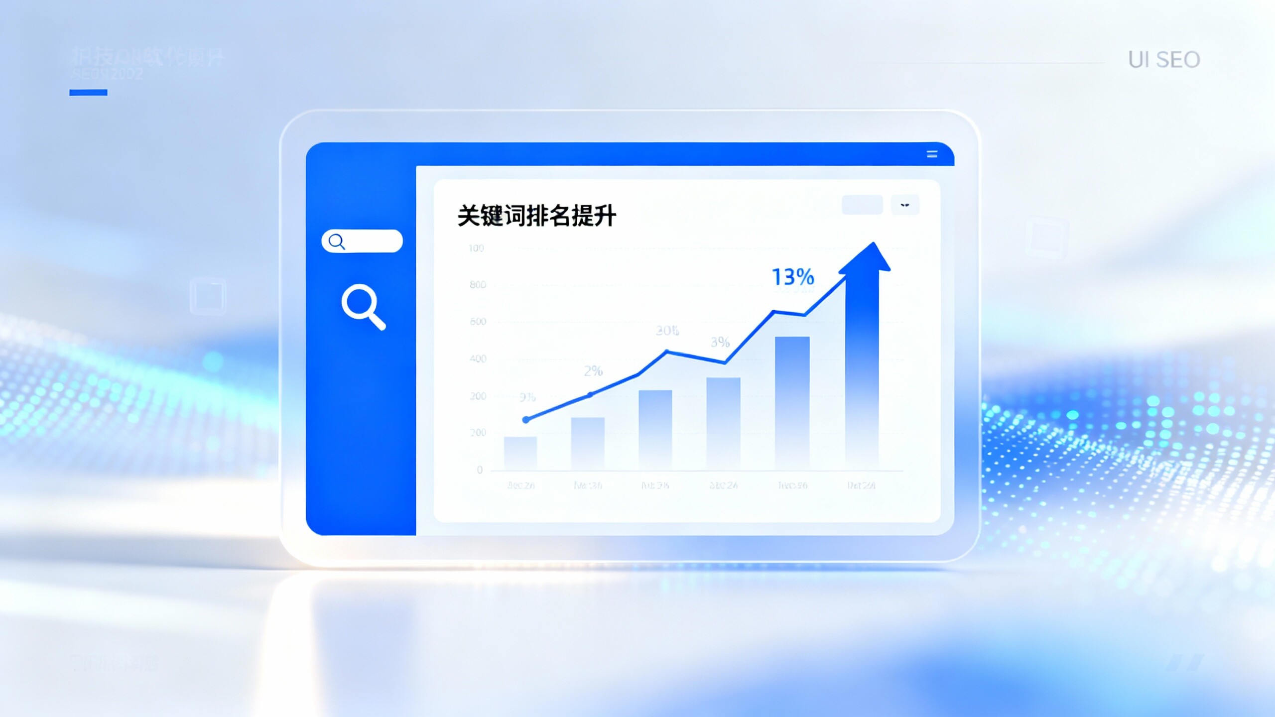
Build a high-conversion marketing website in one minute with EYB AI intelligent website building systemEYBao AI intelligent website building system, one minute to build a high conversion marketing website, designed for Shenzhen foreign trade website and foreign trade responsive website construction. Combined with foreign trade website agency services and EYB City Partner local support, built-in Shenzhen SEO optimization software and Guangdong SEO optimization software capabilities, to help you quickly build a website in Guangdong, Shenzhen quickly build a website and improve the conversion of inquiries. The platform integrates AI topology, TDK automatic generation and social media automation to reduce operating costs and accelerate the flow of traffic to the transaction. Apply for free diagnosis, experience efficient website building and customer acquisition.![Three Steps to Enhance Foreign Trade Keyword Rankings with Shenzhen SEO Optimization Software Three Steps to Enhance Foreign Trade Keyword Rankings with Shenzhen SEO Optimization Software]() Three Steps to Enhance Foreign Trade Keyword Rankings with Shenzhen SEO Optimization SoftwareEasyStore AI Intelligent Website Building System's Three-Step Method combines Shenzhen SEO optimization software and Guangdong SEO optimization software to assist foreign trade enterprises in quickly setting up websites in Shenzhen and Guangdong, transforming marketing websites into stable traffic and high-conversion engines. Through precise diagnosis, content optimization, and responsive foreign trade website construction, as well as a closed-loop approach to backlinks and intelligent ad placements, it addresses pain points such as stagnant long-term keyword rankings, low traffic conversion, and complex maintenance. Whether you are looking for a foreign trade website agency or aiming to become an EasyStore city partner, apply now for a free site diagnosis and expert guidance to quickly improve Shenzhen rapid website construction efficiency and foreign trade keyword rankings.
Three Steps to Enhance Foreign Trade Keyword Rankings with Shenzhen SEO Optimization SoftwareEasyStore AI Intelligent Website Building System's Three-Step Method combines Shenzhen SEO optimization software and Guangdong SEO optimization software to assist foreign trade enterprises in quickly setting up websites in Shenzhen and Guangdong, transforming marketing websites into stable traffic and high-conversion engines. Through precise diagnosis, content optimization, and responsive foreign trade website construction, as well as a closed-loop approach to backlinks and intelligent ad placements, it addresses pain points such as stagnant long-term keyword rankings, low traffic conversion, and complex maintenance. Whether you are looking for a foreign trade website agency or aiming to become an EasyStore city partner, apply now for a free site diagnosis and expert guidance to quickly improve Shenzhen rapid website construction efficiency and foreign trade keyword rankings.![Shenzhen Rapid Website Building Real Case Analysis Helps You Quickly Go Online and Acquire Customers Shenzhen Rapid Website Building Real Case Analysis Helps You Quickly Go Online and Acquire Customers]() Shenzhen Rapid Website Building Real Case Analysis Helps You Quickly Go Online and Acquire CustomersShenzhen Rapid Website Building Real Case Analysis demonstrates how to use EasyStore AI intelligent website building system to complete Shenzhen foreign trade website construction and responsive website design within a few weeks, quickly transforming marketing websites into stable customer acquisition channels. The case highlights the combination of MVP launch, AI keyword expansion and automated TDK, global CDN and Shenzhen SEO optimization software, Guangdong SEO optimization software, solving common issues for foreign trade website agents such as long cycles and localization challenges. Want to quickly build a website in Guangdong, reduce customer acquisition costs, and expand overseas markets? Learn about EasyStore City Partner Program or book a demo, contact us for a trial immediately.
Shenzhen Rapid Website Building Real Case Analysis Helps You Quickly Go Online and Acquire CustomersShenzhen Rapid Website Building Real Case Analysis demonstrates how to use EasyStore AI intelligent website building system to complete Shenzhen foreign trade website construction and responsive website design within a few weeks, quickly transforming marketing websites into stable customer acquisition channels. The case highlights the combination of MVP launch, AI keyword expansion and automated TDK, global CDN and Shenzhen SEO optimization software, Guangdong SEO optimization software, solving common issues for foreign trade website agents such as long cycles and localization challenges. Want to quickly build a website in Guangdong, reduce customer acquisition costs, and expand overseas markets? Learn about EasyStore City Partner Program or book a demo, contact us for a trial immediately.![How Branding Combines with Cross-Border Marketing?3 Cases of SaaS Platform Builders Creating Overseas Growth Funnels How Branding Combines with Cross-Border Marketing?3 Cases of SaaS Platform Builders Creating Overseas Growth Funnels]() How Branding Combines with Cross-Border Marketing?3 Cases of SaaS Platform Builders Creating Overseas Growth FunnelsThis article reveals how brand promotion can be combined with cross-border marketing with three major cases, showing the replicable path of SaaS platform website building in enterprise official website building, marketing website and foreign trade responsive website construction. The article explains the architecture of independent multi-language website, responsive website SEO optimization, mobile priority and WeChat small program configuration, as well as the landing strategy of localization and scale delivery through city partners. Read on to get hands-on KPIs and technical points to help you turn traffic into high quality leads and overseas sales with SaaS platform website building. To improve conversion and overseas coverage, click to learn about customized enterprise website building and solutions.
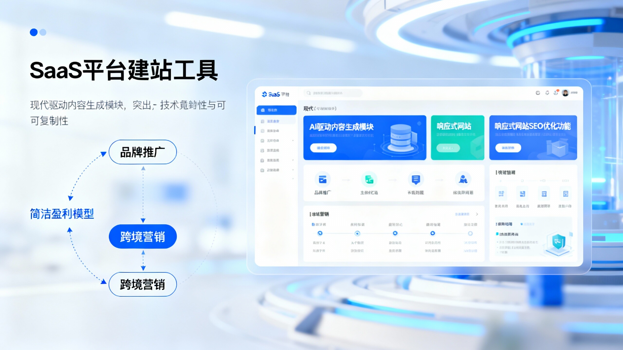
How Branding Combines with Cross-Border Marketing?3 Cases of SaaS Platform Builders Creating Overseas Growth FunnelsThis article reveals how brand promotion can be combined with cross-border marketing with three major cases, showing the replicable path of SaaS platform website building in enterprise official website building, marketing website and foreign trade responsive website construction. The article explains the architecture of independent multi-language website, responsive website SEO optimization, mobile priority and WeChat small program configuration, as well as the landing strategy of localization and scale delivery through city partners. Read on to get hands-on KPIs and technical points to help you turn traffic into high quality leads and overseas sales with SaaS platform website building. To improve conversion and overseas coverage, click to learn about customized enterprise website building and solutions.![City Partner Recruitment Program: Rapid Replication of Profitability Models with Enterprise Official Website Building Tools City Partner Recruitment Program: Rapid Replication of Profitability Models with Enterprise Official Website Building Tools]() City Partner Recruitment Program: Rapid Replication of Profitability Models with Enterprise Official Website Building ToolsRecruiting city partners, with the help of eBaoTech SaaS platform website building and enterprise official website building tools, rapid replication of brand promotion and cross-border marketing profit model. As a city partner, you can deliver marketing websites, responsive websites for foreign trade and official website construction, and complete WeChat app configuration and responsive website SEO optimization.AI-driven and templated delivery reduces the technical threshold, shortens the cycle from consultation to the first order, and helps to build a stable customer pool and replicable revenue. Contact us now to get the cooperation manual and free trial, and start the road to localized scale and profitability.
City Partner Recruitment Program: Rapid Replication of Profitability Models with Enterprise Official Website Building ToolsRecruiting city partners, with the help of eBaoTech SaaS platform website building and enterprise official website building tools, rapid replication of brand promotion and cross-border marketing profit model. As a city partner, you can deliver marketing websites, responsive websites for foreign trade and official website construction, and complete WeChat app configuration and responsive website SEO optimization.AI-driven and templated delivery reduces the technical threshold, shortens the cycle from consultation to the first order, and helps to build a stable customer pool and replicable revenue. Contact us now to get the cooperation manual and free trial, and start the road to localized scale and profitability.![How much does a SaaS platform cost to build a website? Enterprise official website construction 7 cost breakdown and money-saving tips How much does a SaaS platform cost to build a website? Enterprise official website construction 7 cost breakdown and money-saving tips]() How much does a SaaS platform cost to build a website? Enterprise official website construction 7 cost breakdown and money-saving tipsWondering how much SaaS platforms really cost to build a website? This article breaks down the seven cost details of enterprise official website construction (planning and design, template or customization, front-end responsive, back-end docking, third-party services, content and SEO, operation and maintenance), and provides templating + AI money-saving tips and responsive website SEO optimization strategies. Applicable to enterprise official website construction, foreign trade responsive website construction and cross-border marketing scenarios, taking into account brand promotion, marketing website, city partner and WeChat small program configuration and other expansion needs. Click to view the practical budget table and free customized plan, quickly assess the input and output, and reduce the cost of customer acquisition.
How much does a SaaS platform cost to build a website? Enterprise official website construction 7 cost breakdown and money-saving tipsWondering how much SaaS platforms really cost to build a website? This article breaks down the seven cost details of enterprise official website construction (planning and design, template or customization, front-end responsive, back-end docking, third-party services, content and SEO, operation and maintenance), and provides templating + AI money-saving tips and responsive website SEO optimization strategies. Applicable to enterprise official website construction, foreign trade responsive website construction and cross-border marketing scenarios, taking into account brand promotion, marketing website, city partner and WeChat small program configuration and other expansion needs. Click to view the practical budget table and free customized plan, quickly assess the input and output, and reduce the cost of customer acquisition.![Foreign trade responsive website construction of mobile priority strategy: how to fill the micro letter small program configuration? Foreign trade responsive website construction of mobile priority strategy: how to fill the micro letter small program configuration?]() Foreign trade responsive website construction of mobile priority strategy: how to fill the micro letter small program configuration?Foreign trade responsive website construction with mobile priority as the core, combined with WeChat small program configuration complementary social traffic and private domain reach, significantly improve lead retention and conversion efficiency. Based on the SaaS platform station building for multilingual enterprise official website building and enterprise official website construction, to create a marketing website, combined with responsive website SEO optimization, AI word expansion and structured data, can achieve efficient brand promotion and cross-border marketing. We provide city partners and enterprises with on-the-ground implementation, filing compliance and WeChat mini-program configuration checklist to help quickly launch and amplify overseas traffic. Contact us today for a customized mobile-first implementation solution.
Foreign trade responsive website construction of mobile priority strategy: how to fill the micro letter small program configuration?Foreign trade responsive website construction with mobile priority as the core, combined with WeChat small program configuration complementary social traffic and private domain reach, significantly improve lead retention and conversion efficiency. Based on the SaaS platform station building for multilingual enterprise official website building and enterprise official website construction, to create a marketing website, combined with responsive website SEO optimization, AI word expansion and structured data, can achieve efficient brand promotion and cross-border marketing. We provide city partners and enterprises with on-the-ground implementation, filing compliance and WeChat mini-program configuration checklist to help quickly launch and amplify overseas traffic. Contact us today for a customized mobile-first implementation solution.


