









- Is the EV SSL certificate market shrinking or upgrading? How should companies assess certificate procurement?Aug 11, 2026View details
- Why the old AMP SEO 2020 practices no longer work and what has changed in current optimization prioritiesAug 02, 2026View details
- How to Choose Topics for an Industry News Section to Attract More Organic Search TrafficJul 29, 2026View details
- Digital Marketing Shenzhen Market Insights: Why Are Companies Expanding Overseas Looking for Growth Teams in Shenzhen?Jul 31, 2026View details
- Can Zhejiang foreign trade independent websites still be developed today? Look at changes in traffic and lead generationJul 28, 2026View details
- What New Signals Are Emerging in Enterprise Services SaaS Marketing ReportsJul 27, 2026View details
- What Does a Global Traffic Ecosystem Service Provider Do? What Are the Differences from a Single Advertising AgencyJul 16, 2026View details
- What should you focus on in the latest enterprise SaaS report? From renewal rates and delivery costs to overseas growth opportunitiesJul 12, 2026View details
Which pages are more important when building a B2B website for the Japanese market?
When building an overseas website, many companies tend to understand “multilingual” as simply “translating a Chinese website into Japanese.” However, once they enter the Japanese market, problems quickly become apparent: the website is online, but traffic is unstable; visitors arrive, but inquiries are slow to come. The reason is often not whether there is a website, but that the page logic required by a B2B website for the Japanese market is not exactly the same as that of an ordinary foreign trade website.
When screening suppliers, Japanese business users generally place greater importance on information completeness, page orderliness, corporate credibility, and whether the communication threshold is sufficiently low. In other words, a B2B website targeting Japan is not better simply because it has more pages; instead, its key pages should be prioritized and done correctly. For companies researching their website-building direction, clarifying “which pages are more important” is more important than rushing to launch.
Not All Pages Are Equally Important: Japanese Customers First Look at Whether They Can Cooperate with Confidence
In the North American market, many buyers enter product detail pages more quickly. In the Japanese market, however, visitors often first evaluate whether a company is worth learning more about through pages such as the homepage, company profile, case studies, and contact page. This is especially true for websites in manufacturing, equipment, industrial components, and corporate services, where the speed at which trust is established directly affects subsequent inquiries.
Therefore, when building a B2B website for the Japanese market, page priorities are generally not about “filling the site with products first,” but about addressing these core questions:
- Who is this company, and is it stable and reliable?
- What products or solutions does it provide, and are they presented clearly?
- Does it have service experience or project credentials?
- If I want to get in touch, is the process clear, courteous, and low-pressure?
Building the website according to this logic makes its structure more closely aligned with the decision-making process of Japanese users, while also supporting subsequent SEO indexing and conversion.
Homepage: More Than a Corporate Facade—it Is the First-Round Filter
The role of the homepage in the Japanese market is often underestimated. Many companies design the homepage as a brand poster, emphasizing visual impact while overlooking the information that B2B visitors actually want to confirm. For Japanese-speaking users, the homepage needs to answer three questions quickly: Who are you? What do you do? Why are you worth contacting?
A homepage better suited to the Japanese market should generally include a clear business overview, industry application areas, core product entrances, company background information, and visible contact buttons. The website copy should not be overly exaggerated. Its tone should be measured and accurate, avoiding generic expressions such as “world-leading” and “one-stop service” as the only messages.
If a company provides an integrated website-building and marketing solution covering website development, SEO optimization, and advertising, the homepage should be even more specific about “what problems it can solve.” For example, does it help manufacturing companies build multilingual websites, improve Google indexing, and generate overseas inquiries, or does it help brands build independent websites and advertising landing pages? Japanese visitors have limited tolerance for vague statements. The more specific the content, the more likely they are to continue browsing.
Product Pages: The Japanese Market Does Not Fear Extensive Content, but It Does Dislike Empty Content
Many foreign trade websites share a common problem with their product pages: plenty of images but few specifications; many categories but shallow descriptions. For a B2B website targeting the Japanese market, such product pages are unlikely to support purchasing decisions. Japanese users often want to see a sufficiently complete information framework during their initial contact.
A product page should include at least the following types of content: product applications, specifications, applicable industries, available models, customization capabilities, and delivery or service methods. For non-standard products, it may also include “common application scenarios” or “implementation process details” to help visitors reduce the cost of understanding.
There is also a very practical detail: Japanese buyers do not always send an inquiry immediately. Many first discuss internally, compare materials, and forward information to colleagues. Therefore, if a product page remains merely “presentational,” it will be difficult to move to the next stage. By contrast, pages with a clear structure, complete information, and consistent terminology are more likely to be saved and viewed repeatedly.
For companies using an intelligent website-building system to build an overseas website, product pages should ideally support flexible expansion, such as field management for different language versions, custom SEO title settings, and modular parameter configuration. This not only facilitates subsequent Google SEO but also prevents maintenance confusion across multilingual pages.
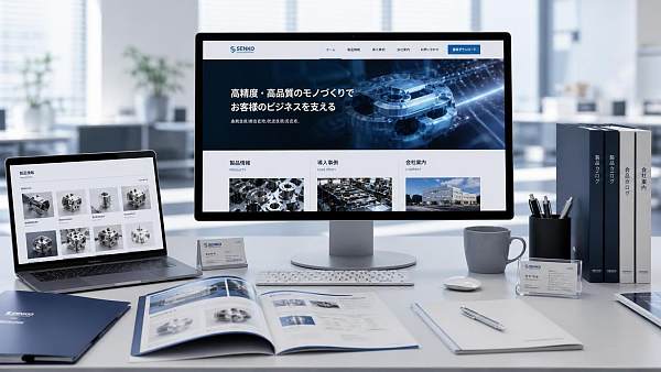
Case Study and Track Record Pages: Important Evidence Japanese Customers Use to Evaluate Credibility
If the homepage is responsible for making a first impression, the case study page moves the question of “whether we can cooperate” one step forward. The Japanese market places great importance on a sense of proven results—whether you have served relevant industries, whether you have practical implementation experience, and whether you truly understand customer needs.
Case study pages do not necessarily need to be written in an elaborate style, but they must be authentic, specific, and readable. Instead of vaguely stating that you have “served many customers,” a more effective approach is to present cases by industry, scenario, or project type. For example: building a Japanese-language website for a manufacturing company, restructuring the product information architecture for a foreign trade company, or configuring multilingual landing pages for a brand expanding overseas. This presentation helps visitors quickly assess how similar you are to their own situation.
If there are not yet enough Japan-related cases, solution pages and application scenario pages can temporarily replace part of the function of case study pages. The key is not to pile up numbers, but to demonstrate professional judgment: you understand what customers in the industry care about and know how a website should support marketing conversion.
Company Profile Page: Its Position in the Japanese Market Is More Important Than Many People Imagine
Many companies place the “About Us” page near the end, believing it to be optional supplementary content. However, for a B2B website targeting the Japanese market, the company profile page is actually crucial. When interacting with an unfamiliar supplier, many Japanese visitors actively review the company background, including its founding date, main business, service scope, location, team capabilities, and overseas service experience.
The focus of this type of page is not self-praise, but reducing uncertainty. This is particularly important for companies providing intangible services such as website development, SEO, and advertising marketing. The company profile page needs to show customers that you are not a team assembled temporarily for a single project.
For a platform-based service provider such as Yiyingbao, which has long served foreign trade companies and brands expanding overseas, the company profile page can naturally present its technical capabilities and service scope, such as AI-powered intelligent website building, multilingual website development, B2B marketing websites, SEO and GEO optimization, and coordination between advertising and social media. For Japanese market users, this clear service map is more persuasive than simply emphasizing “we are very strong.”
Contact Page: The More Considerate It Is, the More Likely It Is to Generate Inquiries
Many websites make their contact page extremely simple: one form and one email address. This may appear sufficient, but for Japanese users, such a communication entrance may not be very user-friendly. When making initial contact, Japanese companies are often cautious and want to confirm whether the contact person is clearly identified, whether communication is formal, and whether they can expect a response.
Therefore, the contact page should ideally include at least the following information: a contact form, business email, company name, basic address information, available communication languages, expected response time, and, where necessary, FAQ prompts. The form should not contain too many fields, but it should not be overly cursory either. A reasonable approach is to allow visitors to specify the type of inquiry, such as product consultation, partnership discussion, quotation requests, or website-building consultation.
If the company targets high-value B2B customers, the contact page can also include guidance for “project requirements,” making it easier for customers to explain their needs and helping the sales team follow up more effectively. When the communication threshold is lowered, inquiry quality is generally more stable.
These Two Types of Pages Are Easily Overlooked, but They Often Affect SEO and Conversion
One type is the FAQ page. Before making a decision, B2B visitors in the Japanese market often have many detailed questions, such as minimum order quantities, delivery times, customization support, sample availability, after-sales service, and the maintenance mechanism after a website goes live. Organizing these questions in advance not only improves the user experience but also helps cover more long-tail search terms.
The other type is the industry solution page. For companies providing integrated website-building and marketing services, having only standard menu items such as “website-building services,” “SEO services,” and “advertising services” can easily appear too abstract. By contrast, organizing content around topics such as “overseas website development for manufacturers,” “B2B inquiry-generation websites for the Japanese market,” and “multilingual SEO customer acquisition solutions” better matches the search habits of information researchers and makes it easier for pages to correspond to specific needs.
When Building a Japanese Website, It Is Not Better to Make Every Page More Japanese; It Is Better to Match Decision-Making Habits
When building a B2B website for the Japanese market, some companies focus entirely on visual style and try to make the site “look very Japanese.” This can certainly help, but what truly determines performance is still the way information is organized. Whether the page is restrained, the logic is clear, the explanations are complete, and the contact process is formal matter more than surface-level colors and layout.
From the perspective of integrated website development and marketing, a B2B website that can truly serve the Japanese market should take presentation, search, and conversion into account from the outset. In other words, the pages are not only for people to view; they must also facilitate Google indexing, support subsequent SEO optimization, be suitable for extension into advertising landing pages, and be continuously maintained for different language markets.
This is why more and more companies choose integrated solutions with intelligent website building, content management, SEO configuration, and multilingual support when developing overseas websites. The Japanese market has high requirements for detail, and making repairs piecemeal later is often more costly than planning clearly from the beginning.
If You Can Only Complete a Few Pages First, We Recommend This Priority Order
For companies with limited budgets that also want to validate the Japanese market quickly, focus first on the essentials: homepage, product pages, company profile page, case study/solution pages, and contact page. These types of pages form the most basic trust loop and are also the most common starting points for conversion on B2B websites targeting the Japanese market.
Once the basic content is stable, gradually expand content modules such as FAQ pages, industry application pages, news and information pages, and downloadable materials pages. This approach prevents the initial website-building process from taking too long while ensuring that the website does not merely “look like it has launched” without any actual conversion capability.
Ultimately, the Japanese market is not impossible to develop, but it is not suitable for a rough approach. Having fewer pages is not a problem, but the key pages must withstand viewing, research, and comparison. For companies planning a website for the Japanese market, clarifying page priorities is often the first step toward increasing inquiries.
Related Articles

Related Products
 Yiyingbao SaaS Intelligent Website Building and Marketing SystemYiyingbao SaaS Intelligent Website Building and Marketing System, AI-powered no-code website building, rapid creation of multilingual B2B international websites in 10 minutes, global server acceleration, AI-powered SEO optimization, helping businesses connect efficiently with global markets. The perfect integration of technology and operation makes building an international trade website remarkably simple
 AI+SEM Intelligent Advertising Marketing SystemAI+SEM drives intelligent ad creation, empowering full-funnel precision advertising marketing. The system automatically generates weekly/monthly reports, AI recommends keywords and target countries, monitors core metrics in real-time with intelligent alerts, and enables one-click high-conversion ad solutions to help quickly acquire customers and improve ROI.
 AI+SEO Dual-Engine System Optimization ServicesYiyingbao’s AI+SEO dual-engine optimization system helps foreign trade enterprises acquire high-quality organic traffic through AI-powered keyword research, content generation, and comprehensive technical optimization, significantly improving search rankings and conversion rates.
 AI+SNS Social Media Marketing SystemYingbao AI+SNS Social Media Marketing System - Precision social capture for the social media era. Supports one-click content synchronization across major platforms like Facebook and LinkedIn. AI intelligently rewrites posts for enhanced relevance. 24/7 AI customer service and user profiling analysis empower businesses to efficiently expand into global markets.
 AI+SEO营销解决方案易营宝AI+SEO营销解决方案,通过AI批量写作、智能生成TDK、精准关键词扩词等功能,全面优化网站SEO效果,提升流量与转化率。助力企业构建高效智能网站新生态。
 AI+SEM Advertising Marketing SolutionsAI+SEM Advertising Marketing Solution leverages AI technology to deeply empower SEM ad campaigns. It automatically generates weekly/monthly reports using AI, presenting account data across multiple dimensions for comprehensive insights into campaign performance and trends. The system precisely recommends keywords and target countries, intelligently generates high-conversion ad copy, and enables one-click activation of efficient campaign plans to help businesses rapidly acquire customers. Simultaneously, it monitors core metrics in real time, intelligently identifies abnormal fluctuations, and issues timely alerts to ensure stable, high-return advertising results.
 Domain Name ServicesEasyWin provides professional domain name services, including intelligent queries, one-stop registration, brand protection, and full lifecycle management, helping businesses build a digital brand image.
 EasyOperate B2C Cross-Border E-Commerce Platform & Independent WebsiteEasyStore B2C Cross-border E-commerce Independent Store is an intelligent website building and cross-border e-commerce integrated solution independently developed by EasyStore Information Technology (Beijing) Co., Ltd. The system is specially designed for small and medium-sized as well as large export enterprises, integrating 'website building, operation, marketing, advertising, and conversion' into one, helping enterprises quickly establish cross-border e-commerce independent stores to achieve brand globalization and global sales growth.
The platform supports multiple languages, multiple currencies, and multi-channel marketing, with built-in AI intelligent translation and SEO optimization systems, suitable for mainstream markets such as Southeast Asia, Europe and America, Latin America, and the Middle East, assisting Chinese manufacturing enterprises in efficiently deploying international e-commerce strategies. SSL证书易营宝提供专业SSL安全证书服务,包括单域名和泛域名证书,确保网站数据传输加密、身份验证和完整性保护,助力企业建立安全可信的在线业务环境。









