








- The U.S. has ended the $800 de minimis exemption for non-postal shipments; express courier packages must be formally declared.Nov 16, 2026View details
- ASEAN Signs Digital Economy Framework Agreement, Moving Toward Harmonized Cross-Border E-Commerce RulesNov 15, 2026View details
- Shenzhen Becomes the First City in Mainland China to Exceed RMB 5 Trillion in Foreign TradeNov 15, 2026View details
- Fujian Announces the First Batch of Provincial-Level Cross-Border E-Commerce Industrial Parks and Key Brands for CultivationNov 14, 2026View details
- Amazon Global Store Announces the Launch of the 2026 Black Friday Global Shopping SeasonNov 14, 2026View details
- CCTV.com Examines APEC’s Role in China’s Foreign TradeNov 12, 2026View details
To improve ad landing page conversion rates, should you optimize the above-the-fold section or the form first?
First determine whether users decide to “learn more” within the above-the-fold section, then assess whether the form causes drop-off at the final step. Most advertising landing pages should not rely on intuition to choose one over the other: the above-the-fold section determines whether visitors are willing to stay, while the form determines whether users willing to take action can submit successfully. If users leave shortly after clicking through, optimize the above-the-fold section first; if page views, button clicks, and form opens are all substantial but submissions are few, prioritize the form.
The assessment of improving advertising landing page conversion rates should follow the post-click journey: whether the page immediately delivers on the advertising promise, whether users understand how the product or service relates to their needs, whether they receive sufficient credible evidence, and only then the friction involved in providing information. Attributing all problems to the form often leads teams to repeatedly adjust fields without addressing the fundamental reason visitors are unwilling to leave their contact details.
Use funnel behavior to determine what to optimize first
Do not focus only on the overall conversion rate. A decline in the overall conversion rate may result from broader intent in advertising traffic or from an unfocused page message; the same outcome requires entirely different solutions. Advertising platforms, page analytics tools, and form submission records should be compared over the same time period, looking at at least time spent after landing, browsing below the fold, primary button clicks, form starts, and successful submissions.
One point that is easy to misjudge is that a high button click-through rate does not necessarily mean there is no issue with the above-the-fold section. Some above-the-fold sections use strong action phrases such as “Get a Quote” or “Download Now,” which may generate many exploratory clicks. If many users exit after opening the form, check not only the form but also whether the area near the button clearly explains what users will receive after submission, how they will be contacted, and whether full contact details are required.
The above-the-fold section must first deliver on the advertising promise
The above-the-fold section is not a place to pile together brand slogans, lengthy introductions, and large images. Users who click an ad enter the page with a specific expectation, such as finding pricing for a certain type of product, customization capabilities, samples, lead-time information, or overseas market services. Without scrolling, the above-the-fold section should answer three questions: what is offered here, whether it is the same as what was promised in the ad, and what result the next action will deliver.
The headline should use the core subject and need-related terms from the ad whenever possible, rather than replacing them with abstract promotional language. If an ad emphasizes “custom equipment solutions” but the above-the-fold section only says “Professional service you can trust,” users must guess the page's relevance themselves, significantly reducing their willingness to stay. The subheadline can supplement applicable scenarios, key specification ranges, delivery methods, or response details, but it should not compress every selling point into one dense paragraph.
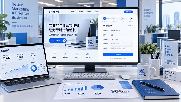
Visual materials should also support users' decision-making. B2B inquiry pages are suitable for displaying product details, application conditions, optional configurations, or delivery results; service-oriented pages are suitable for explaining with process diagrams, deliverable samples, or actual work interfaces. Generic office images unrelated to the current advertising theme occupy above-the-fold space without reducing users' questions. Oversized image loading, text placed over complex backgrounds, or a mobile hero image that crowds out the headline can likewise make the above-the-fold section ineffective.
The above-the-fold call-to-action buttons do not need to be more numerous. One primary action paired with one low-commitment alternative is sufficient, such as providing “View Specifications” or “Download Materials” alongside “Get a Solution.” The two actions should correspond to different intentions: the former for people with an established need, and the latter for those still comparing options. If all buttons lead to the same long form with only different wording, they instead create an illusion of choice.
Form optimization is not simply about removing fields
Only when data shows that users have reached the form stage should input friction be examined in depth. The most common issue is not the number of fields itself, but that fields appear too early, their purpose is unclear, or the input method does not suit the device environment. When mobile devices account for a high proportion of advertising traffic, inputs such as phone number, email address, country or region, and product model all need to be tested individually; dropdown menus that work smoothly on desktop may become long lists that are difficult to use on mobile devices.
Fields should be divided into “must know before submission” and “can be supplemented during follow-up communication.” The information genuinely needed for initial contact is often contact details, the type of requirement, and a brief description. Information such as budget, purchasing cycle, detailed specifications, and attachments can be designed as optional, or completed during communication after submission, if they are not indispensable prerequisites for quotation or technical evaluation. For information that must be collected, clearly state its purpose near the field, such as using country or region to match language or service time zones, or using product quantity to estimate the scope of requirements, so users do not feel that information is being requested without purpose.
- Place error messages next to the relevant fields and retain the information already entered. Showing only “Invalid information” at the top after submission forces users to search again for the problem location.
- Do not rely solely on placeholder text for input labels. Placeholder text disappears once users start typing, making it easy for them to forget what type of information is required, especially when multiple specification fields are displayed side by side.
- Phone number fields should allow common international number formats. Do not block genuine leads by being overly strict about spaces, hyphens, or country code formats.
- State the expected outcome after submission near the submit button, such as “Submit to receive the information needed for a quotation” or “We will reply based on your requirements.” Avoid overstating immediate response, and do not leave only the meaningless word “Submit.”
The above-the-fold section and the form are often affected by the same issue
Some pages appear to have a high above-the-fold bounce rate, while the actual reason is that the search terms brought in by ads are too broad. For example, ads may cover informational query terms while the page immediately asks users to complete an inquiry form. Users may simply be looking for parameters or comparison materials, so naturally they will not continue. In this case, changing the above-the-fold copy or form fields first is only a partial fix. A more appropriate approach is to separate ad groups and landing pages: high-intent terms should lead to quotation request pages, while research-oriented terms should lead to pages containing specifications, descriptions, or material downloads, with a lighter conversion entry point.
Conversely, if the above-the-fold section promises “Fast Quotation” while the form requires extensive non-essential information, it also creates a disconnect between the two. The ad and above-the-fold section establish an expectation of low waiting time and a low threshold, while the form increases the cost of taking action. Every promise on the page should be fulfilled in the next step of the process; this is more effective for stabilizing conversion quality than independently pursuing eye-catching headlines or ultra-simple forms.
Use small-scale testing to avoid rework
Do not make major changes to the above-the-fold section and form at the same time. Otherwise, even if submission volume changes, it will be impossible to know which adjustment produced the effect. First determine the priority stage based on the funnel, then change only one clear hypothesis. For example, when insufficient above-the-fold delivery is suspected, leave the form unchanged and test the headline, hero image description, and primary button copy; when form friction is suspected to be too high, keep the ad and above-the-fold section consistent and adjust only required fields, error messages, or mobile controls.
During the testing period, also check whether traffic sources remain stable. Intent varies significantly across regions, devices, advertising creatives, and search terms. Viewing them together can easily lead to incorrect conclusions. An increase in submission volume should not immediately be considered page success; it is also necessary to verify whether leads contain valid contact details, whether requirement descriptions are complete, and whether the source can be identified after sales follow-up. Only by connecting the advertising promise, above-the-fold information, and form-collected content into one continuous path can advertising budgets avoid being repeatedly consumed by ineffective clicks and invalid inquiries.
Related Articles
 How much does it cost to open a Yandex Ads account? How are the setup fees calculated?
 How Can You Assess the Quality of Leads Generated by Google Ads Management?
 How can manufacturing ad landing pages be optimized to reduce form abandonment?

Related Products
 Yiyingbao SaaS Intelligent Website Building and Marketing SystemYiyingbao SaaS Intelligent Website Building and Marketing System, AI-powered no-code website building, rapid creation of multilingual B2B international websites in 10 minutes, global server acceleration, AI-powered SEO optimization, helping businesses connect efficiently with global markets. The perfect integration of technology and operation makes building an international trade website remarkably simple
 AI+SEM Intelligent Advertising Marketing SystemAI+SEM drives intelligent ad creation, empowering full-funnel precision advertising marketing. The system automatically generates weekly/monthly reports, AI recommends keywords and target countries, monitors core metrics in real-time with intelligent alerts, and enables one-click high-conversion ad solutions to help quickly acquire customers and improve ROI.
 AI+SEO Dual-Engine System Optimization ServicesYiyingbao’s AI+SEO dual-engine optimization system helps foreign trade enterprises acquire high-quality organic traffic through AI-powered keyword research, content generation, and comprehensive technical optimization, significantly improving search rankings and conversion rates.
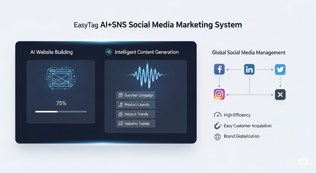
 AI+SNS Social Media Marketing SystemYingbao AI+SNS Social Media Marketing System - Precision social capture for the social media era. Supports one-click content synchronization across major platforms like Facebook and LinkedIn. AI intelligently rewrites posts for enhanced relevance. 24/7 AI customer service and user profiling analysis empower businesses to efficiently expand into global markets.
 AI+SEO营销解决方案易营宝AI+SEO营销解决方案,通过AI批量写作、智能生成TDK、精准关键词扩词等功能,全面优化网站SEO效果,提升流量与转化率。助力企业构建高效智能网站新生态。
 AI+SEM Advertising Marketing SolutionsAI+SEM Advertising Marketing Solution leverages AI technology to deeply empower SEM ad campaigns. It automatically generates weekly/monthly reports using AI, presenting account data across multiple dimensions for comprehensive insights into campaign performance and trends. The system precisely recommends keywords and target countries, intelligently generates high-conversion ad copy, and enables one-click activation of efficient campaign plans to help businesses rapidly acquire customers. Simultaneously, it monitors core metrics in real time, intelligently identifies abnormal fluctuations, and issues timely alerts to ensure stable, high-return advertising results.
 Domain Name ServicesEasyWin provides professional domain name services, including intelligent queries, one-stop registration, brand protection, and full lifecycle management, helping businesses build a digital brand image.
 EasyOperate B2C Cross-Border E-Commerce Platform & Independent WebsiteEasyStore B2C Cross-border E-commerce Independent Store is an intelligent website building and cross-border e-commerce integrated solution independently developed by EasyStore Information Technology (Beijing) Co., Ltd. The system is specially designed for small and medium-sized as well as large export enterprises, integrating 'website building, operation, marketing, advertising, and conversion' into one, helping enterprises quickly establish cross-border e-commerce independent stores to achieve brand globalization and global sales growth.
The platform supports multiple languages, multiple currencies, and multi-channel marketing, with built-in AI intelligent translation and SEO optimization systems, suitable for mainstream markets such as Southeast Asia, Europe and America, Latin America, and the Middle East, assisting Chinese manufacturing enterprises in efficiently deploying international e-commerce strategies. SSL证书易营宝提供专业SSL安全证书服务,包括单域名和泛域名证书,确保网站数据传输加密、身份验证和完整性保护,助力企业建立安全可信的在线业务环境。