








- 21st Century Business Herald: AI and CTV Become Core Growth Engines for Digital Marketing in Overseas MarketsNov 18, 2026View details
- China Presents 25 Cooperation Outcomes in Areas Including Cross-Border E-Commerce During APECNov 18, 2026View details
- AI Products Drive Hong Kong Exports Up 64.9% in September, Fastest Growth in Over 40 YearsNov 17, 2026View details
- National Bureau of Statistics: Foreign trade grew rapidly in October, providing stable support for global tradeNov 17, 2026View details
- The U.S. has ended the $800 de minimis exemption for non-postal shipments; express courier packages must be formally declared.Nov 16, 2026View details
- ASEAN Signs Digital Economy Framework Agreement, Moving Toward Harmonized Cross-Border E-Commerce RulesNov 15, 2026View details
How Can Ad Landing Page Design Reduce Mobile Form Abandonment
The core challenge of mobile advertising landing pages is this: a user being willing to click does not mean they are willing to complete a complex lead-capture process on a phone. Ad traffic often comes from fragmented browsing scenarios, where users may be commuting, between meetings, or switching among multiple supplier pages. Once a form requires repeated zooming, extensive data entry, waiting for verification codes, or dealing with unclear privacy notices, the cost of leaving the page is far lower than the cost of submitting the form.
The key to reducing drop-off is not to make the form “more prominent,” but to enable users to complete the next step with the least friction based on their current device, intent, and level of trust. Landing page design should treat the form as a conversion path, rather than simply a set of fields at the bottom of the page.
First, distinguish between “lead qualification” and “initial contact”
Many landing pages use a complete inquiry form as the only entry point: name, company, country, email, phone number, product model, purchase quantity, budget, purchasing timeframe, and detailed requirements are all mandatory. While this design may appear convenient for sales qualification, it shifts all internal information-gathering costs onto first-time visitors.
Mobile devices are particularly unsuitable for requesting excessive information during the first interaction. For visitors who are still comparing suppliers, confirming product specifications, or verifying delivery capabilities, leaving a business email address, WhatsApp contact information, or a brief requirement is already sufficient to establish follow-up communication. Information such as company size, purchasing cycle, and annual demand can be collected by sales representatives during subsequent communication or selectively gathered on a secondary page after form submission.
A more reasonable criterion is this: a field should be required only if, without it, the team would be unable to respond or determine ownership of the requirement. If it merely facilitates subsequent segmentation, reporting, or lead-tag optimization, it should not block submission. Mobile first-screen forms typically only need a name or salutation, contact information, and a description of requirements. If the product category can already be identified on the product page, there is no need to ask visitors to manually enter the product name again.
Address input friction in addition to the number of fields
Even with the same four fields, different input methods can result in completely different abandonment rates. In advertising landing page design, form controls should match the field type rather than relying on a single standard text input box.
- Email fields should trigger an email keyboard, reducing the number of times users need to switch to the symbol keyboard.
- Phone fields should trigger a numeric keyboard and allow international phone number formats, rather than enforcing the digit length or country code of a specific country.
- For limited options such as country, purchase quantity, and application industry, searchable drop-down menus, radio buttons, or segmented selections are preferable to manual input.
- Requirement descriptions may include brief prompts, such as “product model, quantity, destination, or application scenario,” but do not prefill an entire block of text that users need to delete.
- Verification codes should not become a routine blocking step. If spam submissions are genuinely a concern, prioritize verification mechanisms that cause less disruption to legitimate users, and check their availability in the target market's network environment.
Field labels should not rely solely on placeholder text inside input boxes. Once users begin typing, the placeholder disappears, making it easy to forget what the current field requires. A more reliable approach is to retain fixed labels above the input boxes and provide brief examples next to fields where formatting errors are likely. Error messages should also appear close to the relevant field, stating “Invalid email format” or “Please select a country,” rather than displaying only a generic submission failure message at the top of the page.
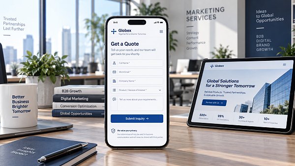
Ensure the form can be completed within thumb-reachable areas
Simply compressing a desktop page onto a mobile phone is a common cause of form abandonment. Mobile users typically operate with one hand, and side margins, floating customer service buttons, Cookie notice bars, and bottom navigation can all crowd out effective tap areas. If the submit button is located at the end of a long form, users must continue scrolling after completing it to confirm, which can also lead to interruption.
Input fields and buttons need sufficiently large tap areas and spacing between them to prevent accidental taps. Submit buttons should use clear action descriptions, such as “Get a Quote,” “Send Requirements,” or “Contact a Technical Consultant,” rather than ambiguous wording such as “Submit.” When a form is long and cannot genuinely be shortened, it can be divided into two steps: first obtain contact information, then collect additional requirements. However, splitting the form is meaningful only when each step is sufficiently short and progress is clear. Dividing the same complex content across multiple screens does not automatically reduce friction.
You should also prevent the submit button from being obscured by fixed floating layers on mobile devices. Testing should not focus only on common large-screen phones; it should also check narrower screens, expanded browser bottom toolbars, landscape orientation, and performance after page zooming. For pages targeting overseas markets, check commonly used browsers and text wrapping in different languages separately to prevent longer phrases in German, French, and other languages from pushing buttons or error messages outside the visible area.
Pre-submission trust signals should address real concerns
Mobile users may be reluctant to provide their information not because the form is too long, but because they are uncertain about what will happen after submission. Especially in B2B purchasing scenarios, contact information involves business communication and supplier selection, so visitors will be concerned about how their information will be used, how they will be contacted, and whether they will be marketed to frequently.
Trust signals should be placed near the submit button rather than buried in the footer. Effective content typically includes: information is used only to respond to this inquiry, contact is available by email or WhatsApp, the expected response timeframe, and a privacy policy entry point. If the page promises a “quick quote,” internal response processes should be able to support that claim; response times that cannot be guaranteed should not be presented as firm commitments.
Qualification certificates, factory images, customer logos, or delivery capability descriptions can help build trust, but they cannot replace an explanation of how data will be used. If the page targets regions such as the EU that place importance on transparency in personal data processing, it should provide a clear and accessible privacy notice and avoid combining inquiry consent with marketing subscriptions through pre-selected checkboxes.
Do not funnel all visitors into the same form
The form task on the landing page must align with advertising keywords and creative promises. Users searching for “custom parts quotation” typically need to quickly upload drawings, material specifications, and quantities; users who click on brand display ads may prefer to download a catalog, view product videos, or initiate an instant chat first. Using the same general contact form to handle these intents reduces information relevance.
For file upload needs involving drawings, specification sheets, and similar documents, allow users to submit basic contact information first and then choose to upload attachments. On mobile networks, slow uploads of large files, restricted file formats, or failed permission requests may cause already entered content to be lost. The page needs to clearly specify acceptable file types and size limits. If an upload fails, it should retain the fields already entered and provide alternative contact methods instead of requiring users to start over.
Instant messaging buttons should not be merely decorative either. If WhatsApp, online chat, or email buttons serve as alternative entry points to the form, ensure that redirect links, preset messages, and availability for receiving inquiries work properly. Otherwise, users may leave the landing page without receiving a response. This may appear to reduce form abandonment, but in reality it merely shifts lead loss to other channels.
Use the funnel to identify drop-off points, rather than looking only at submission volume
The number of form submissions only indicates the outcome; it cannot show where the problem lies. More valuable observations include: after users enter the page from an ad click, how many see the form area; how many begin entering the first field; after which fields they exit; whether submission failures occur during verification, uploading, or redirection; and whether there are significant path differences across ad groups, countries, devices, and browsers.
Tracking should record events including form impressions, field focus, field errors, form start, successful submission, and failed submission, while avoiding directly writing personal information such as complete contact details and requirement text into analytics tools. If a large number of users enter only their email addresses before exiting, the issue may be excessive subsequent fields. If there is no success event after clicking submit, prioritize checking API responses, validation rules, cross-domain configuration, and thank-you page redirects rather than immediately changing the copy.
During optimization, adjust only one key variable at a time, such as removing one required field, modifying phone number rules, moving the privacy notice next to the button, or replacing the submit button copy. Simultaneously changing page layout, ad creatives, and form structure will make it impossible to determine which adjustment affected conversion. What mobile forms truly need to pursue is not “collecting all information at once,” but enabling visitors with clear interest to complete their first contact smoothly without sacrificing lead follow-up capability.
Related Articles
 How to troubleshoot a low conversion rate after running Facebook ads?
 How Can You Evaluate the Advertising Performance of a Digital Marketing Service Provider?
 How much does it cost to open a Yandex Ads account? How are the setup fees calculated?


Related Products
 Yiyingbao SaaS Intelligent Website Building and Marketing SystemYiyingbao SaaS Intelligent Website Building and Marketing System, AI-powered no-code website building, rapid creation of multilingual B2B international websites in 10 minutes, global server acceleration, AI-powered SEO optimization, helping businesses connect efficiently with global markets. The perfect integration of technology and operation makes building an international trade website remarkably simple
 AI+SEM Intelligent Advertising Marketing SystemAI+SEM drives intelligent ad creation, empowering full-funnel precision advertising marketing. The system automatically generates weekly/monthly reports, AI recommends keywords and target countries, monitors core metrics in real-time with intelligent alerts, and enables one-click high-conversion ad solutions to help quickly acquire customers and improve ROI.
 AI+SEO Dual-Engine System Optimization ServicesYiyingbao’s AI+SEO dual-engine optimization system helps foreign trade enterprises acquire high-quality organic traffic through AI-powered keyword research, content generation, and comprehensive technical optimization, significantly improving search rankings and conversion rates.
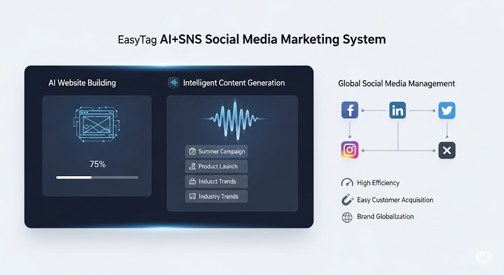
 AI+SNS Social Media Marketing SystemYingbao AI+SNS Social Media Marketing System - Precision social capture for the social media era. Supports one-click content synchronization across major platforms like Facebook and LinkedIn. AI intelligently rewrites posts for enhanced relevance. 24/7 AI customer service and user profiling analysis empower businesses to efficiently expand into global markets.
 AI+SEO营销解决方案易营宝AI+SEO营销解决方案,通过AI批量写作、智能生成TDK、精准关键词扩词等功能,全面优化网站SEO效果,提升流量与转化率。助力企业构建高效智能网站新生态。
 AI+SEM Advertising Marketing SolutionsAI+SEM Advertising Marketing Solution leverages AI technology to deeply empower SEM ad campaigns. It automatically generates weekly/monthly reports using AI, presenting account data across multiple dimensions for comprehensive insights into campaign performance and trends. The system precisely recommends keywords and target countries, intelligently generates high-conversion ad copy, and enables one-click activation of efficient campaign plans to help businesses rapidly acquire customers. Simultaneously, it monitors core metrics in real time, intelligently identifies abnormal fluctuations, and issues timely alerts to ensure stable, high-return advertising results.
 Domain Name ServicesEasyWin provides professional domain name services, including intelligent queries, one-stop registration, brand protection, and full lifecycle management, helping businesses build a digital brand image.
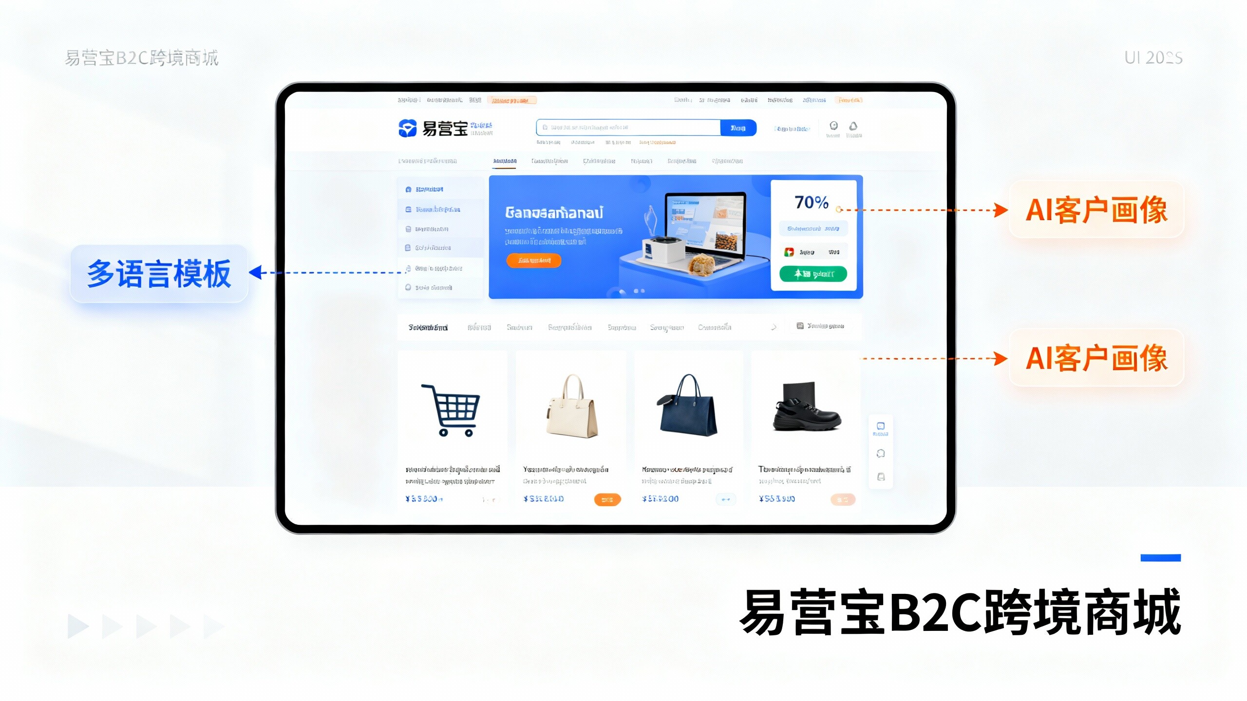
 EasyOperate B2C Cross-Border E-Commerce Platform & Independent WebsiteEasyStore B2C Cross-border E-commerce Independent Store is an intelligent website building and cross-border e-commerce integrated solution independently developed by EasyStore Information Technology (Beijing) Co., Ltd. The system is specially designed for small and medium-sized as well as large export enterprises, integrating 'website building, operation, marketing, advertising, and conversion' into one, helping enterprises quickly establish cross-border e-commerce independent stores to achieve brand globalization and global sales growth.
The platform supports multiple languages, multiple currencies, and multi-channel marketing, with built-in AI intelligent translation and SEO optimization systems, suitable for mainstream markets such as Southeast Asia, Europe and America, Latin America, and the Middle East, assisting Chinese manufacturing enterprises in efficiently deploying international e-commerce strategies. SSL证书易营宝提供专业SSL安全证书服务,包括单域名和泛域名证书,确保网站数据传输加密、身份验证和完整性保护,助力企业建立安全可信的在线业务环境。