









- Which customer acquisition channels will be affected by cross-border marketing trends in 2026?Sep 06, 2026View details
- Which homogenization risks should be considered in an analysis of the AI-powered website building industry?Aug 30, 2026View details
- How Will AI Marketing Trends 2026 Change Advertising Budget AllocationAug 28, 2026View details
- Is the EV SSL certificate market shrinking or upgrading? How should companies assess certificate procurement?Aug 11, 2026View details
- Why the old AMP SEO 2020 practices no longer work and what has changed in current optimization prioritiesAug 02, 2026View details
- How to Choose Topics for an Industry News Section to Attract More Organic Search TrafficJul 29, 2026View details
Can responsive website development achieve 100% compatibility?
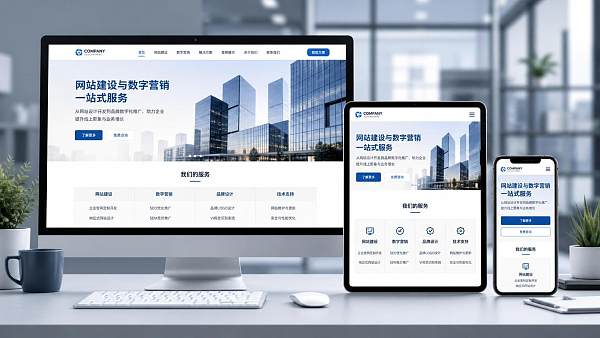
Let’s start with a clear answer: can responsive website development achieve 100% compatibility between mobile and PC? In a demonstration environment, it is not uncommon to achieve an “almost fully passed” result for a defined set of device models, operating system versions, and browser versions. However, in the real internet environment, once all devices, browser shells, resolutions, and input methods are taken into account, “100% compatibility” is usually a marketing claim rather than a strictly achievable engineering result.
The reason is not abstract: “compatibility” itself has no single standard. Some consider a page compatible if it can open; others require the layout to remain intact. Some require animations, forms, payments, maps, videos, lazy loading, and tracking to work properly, while others also include keyboard navigation, screen-reader performance, loading under weak network conditions, and state preservation after switching between portrait and landscape orientations. As the standard changes, the so-called compatibility rate changes accordingly.
When discussing responsive website development, the most common misunderstanding is treating “the page can automatically adapt and scale” as equivalent to “the mobile and PC versions are completely identical.” The core of responsive design is that the same front-end structure adjusts its layout according to viewport width, pixel density, and interaction methods. It addresses adaptation, but it does not automatically eliminate differences between devices. Mobile devices prioritize touch interaction, while PCs mainly use a mouse and keyboard. Some mobile browser address bars expand and contract, affecting the visible height; desktop browsers may handle font rendering, scrollbar widths, and default form styles differently. Even with standards-compliant code, differences may still appear in details.
Why “100% Compatibility” Is Difficult to Achieve
First, consider the device side. Common widths are not limited to breakpoints such as 320, 375, 390, 768, 1024, and 1440. The logical width of a foldable phone changes when it is unfolded or folded, and the visible area changes when a tablet is used in split-screen mode. Certain high-refresh-rate screens are also more sensitive to animation frame drops. On the browser side, even browsers based on the Chromium engine may behave differently across versions when handling `position: sticky`, `overflow`, autofill in input fields, and permission pop-ups. iOS WebKit has its own distinctive limitations, with video autoplay, fixed positioning, bottom safe areas, and file-upload styles often causing edge-case issues.
Another frequently overlooked point is that content is not static material. Chinese, English, German, Russian, and Arabic differ significantly in length. A multilingual site may look normal on a desktop but encounter navigation wrapping, button-text overflow, broken tables, and misaligned numbers and units on a narrow screen. If the page also contains product specifications, model codes, shipping dimensions, installation diagrams, SKU attributes, or downloadable attachment lists, these elements are more likely than ordinary promotional copy to trigger compatibility issues because they are naturally longer, denser, and less regular.
Therefore, can responsive website development achieve a 100% compatibility rate? The more accurate answer is: the scope can be defined clearly enough to achieve a high level of consistency within that scope. However, if the testing boundaries are not specified and a 100% guarantee is made directly, it often cannot withstand detailed scrutiny.
How Should the Compatibility Rate Be Understood?
Rather than asking for an absolute figure, it is more meaningful to evaluate compatibility in layers. The first layer is “accessibility,” meaning that the page can open, the main content is readable, and basic navigation is usable. The second layer is “operability,” such as whether menus can expand, filters can be clicked, forms can be submitted, verification codes can be displayed, and files can be uploaded. The third layer is “consistent experience,” including font-size rhythm, image cropping, hover feedback, modal layering, scroll position, animation timing, and state preservation after switching to landscape orientation. The fourth layer approaches “near pixel-level consistency.” This has the highest cost in cross-device environments and is most easily disrupted by differences between local systems.
Many disputes actually arise here: a client may say, “It only needs to be viewable on mobile,” but after launch discovers that a landing-page button is offset by two pixels, a fixed consultation bar covers the purchase button at the bottom, or the submission area is pushed off-screen after the form keyboard appears. The client then considers the site “incompatible.” From an engineering perspective, these are not issues at the same level.
If a page is responsible for marketing conversion, compatibility evaluation must include another criterion: critical paths must not break. For example, an oversized hero image may load slowly over a 4G network. Although it eventually appears, the bounce rate may increase. A quotation form may work properly in desktop Chrome, but on certain Android devices the wrong keyboard type may appear after entering a phone number, while the submit button is covered by a floating customer-service widget. From a business perspective, such a situation should be judged a compatibility failure. In other words, compatibility is not simply about whether CSS takes effect; it is about whether core actions can be completed smoothly.
The Parts of a Responsive Website Most Likely to Have Problems
Navigation is a high-frequency problem area. Desktop sites commonly use multi-level dropdown menus, while mobile sites generally switch to drawer-style menus. If desktop interactions are copied directly, a touch area that is too small, unstable expansion of secondary menus, and unclear navigation hierarchy can lead to accidental taps. Another typical issue is that the fixed header height changes with font scaling in different systems, compressing the above-the-fold content or even causing anchor-positioning offsets.
Tables also frequently cause problems, especially when they contain many horizontal fields such as specifications, dimensions, materials, lead times, and packing information. A multi-column table looks natural on a PC, but if it is simply scaled down on mobile, the text may become unreadable. If forced line breaks are used, model numbers and specifications may become misaligned. More reliable approaches usually include converting the content into stacked card-style fields or retaining horizontal scrolling while keeping the correspondence between headers and data clear and controlling the minimum column width.
Images and videos do not become fully responsive simply by setting `max-width: 100%`. Some product images have unusual aspect ratios, and important information may be cropped when a landscape image on a desktop is displayed on a mobile device. If fallback handling for certain WebP or AVIF assets is not properly implemented in older environments, blank spaces may appear. Incorrect video-cover dimensions may also cause layout shifts. When visual resources involve installation steps, structural details, or process-section diagrams, poor visibility means that the page cannot be considered well compatible even if it technically “adapts.”
Forms involve even more details. Common real-world issues after launch include the page zooming in when an input field is tapped on iOS, Android autofill changing the background color, inconsistent date-picker behavior, truncated file names in upload controls on some browsers, and validation prompts that use only color differences without text explanations. If a site includes inquiries, appointments, or material downloads, these areas should generally receive higher testing priority than purely presentational modules.
Coding Standards Can Raise the Ceiling, but Cannot Replace Testing
Reasonable HTML structures, flexible layouts, media queries, relative units, image lazy loading, semantic forms, and progressive enhancement can indeed significantly improve the upper limit of compatibility. For example, minimizing reliance on fragile absolute positioning, preserving sufficient click areas for buttons and input fields, avoiding text embedded directly in images, and preparing suitable assets for different resolutions can eliminate many problems during the coding stage.
However, standards-compliant coding does not mean that real devices are necessarily safe. A 375-pixel width simulated by a development-tool emulator can simulate dimensions, but it cannot fully reproduce system font scaling, browser-toolbar expansion and contraction, touch-inertia scrolling, or the repaint cost on low-performance devices. A carousel that switches smoothly on a desktop may drop frames on an older phone because of oversized images and excessive shadows. A bottom-fixed button that is correctly positioned in a standard browser may be covered inside an embedded WebView with a customized bottom bar.
Therefore, the “compatibility rate” is ultimately determined jointly by the device scope, testing process, and regression mechanisms, not by simply stating that “responsive technology is used.” A 100% claim without testing boundaries is generally unverifiable.
What Is a More Realistic Goal?
Rather than pursuing an abstract figure, more realistic goals usually include the following: ensuring that key pages are stable and usable on mainstream devices; prioritizing important forms and conversion paths; validating multilingual and long-text scenarios in advance; preventing content updates from easily breaking the layout; and enabling low-cost regression testing during subsequent maintenance. These goals may sound less impressive, but they are closer to the problems a website actually encounters during long-term operation.
If the question “Can responsive website development achieve 100% compatibility between mobile and PC?” must be addressed, it can be stated more accurately: under a predefined browser matrix, predefined operating system versions, predefined page templates, and predefined interaction paths, the compatibility target can be set very high. Once the boundaries are exceeded—for example, by outdated browsers, extreme resolutions, excessively long translated text, third-party script conflicts, user-defined font enlargement, or embedded-browser restrictions—the result cannot simply be described as “100%.”
When evaluating page quality, it is also unnecessary to focus only on superficial consistency. Desktop and mobile versions do not need to be completely identical. A module suitable for using mouse hover to view details may be more appropriately changed to click-to-expand on mobile than mechanically copied from the desktop layout. What responsive design truly pursues is that the same information and functions can be clearly viewed and smoothly used on different devices, rather than having every pixel replicated exactly.
Ultimately, the answer is not complicated: in theory, the compatibility scope can be defined narrowly enough to achieve “100%.” In real projects, as long as the website serves users in a real-world environment, it is more appropriate to pursue the highest possible consistency within defined boundaries and focus on key functions, testing on real devices, and subsequent maintenance. This type of compatibility is usually more meaningful than an absolute promise.
Related Articles



Related Products
 Yiyingbao SaaS Intelligent Website Building and Marketing SystemYiyingbao SaaS Intelligent Website Building and Marketing System, AI-powered no-code website building, rapid creation of multilingual B2B international websites in 10 minutes, global server acceleration, AI-powered SEO optimization, helping businesses connect efficiently with global markets. The perfect integration of technology and operation makes building an international trade website remarkably simple
 AI+SEM Intelligent Advertising Marketing SystemAI+SEM drives intelligent ad creation, empowering full-funnel precision advertising marketing. The system automatically generates weekly/monthly reports, AI recommends keywords and target countries, monitors core metrics in real-time with intelligent alerts, and enables one-click high-conversion ad solutions to help quickly acquire customers and improve ROI.
 AI+SEO Dual-Engine System Optimization ServicesYiyingbao’s AI+SEO dual-engine optimization system helps foreign trade enterprises acquire high-quality organic traffic through AI-powered keyword research, content generation, and comprehensive technical optimization, significantly improving search rankings and conversion rates.
 AI+SNS Social Media Marketing SystemYingbao AI+SNS Social Media Marketing System - Precision social capture for the social media era. Supports one-click content synchronization across major platforms like Facebook and LinkedIn. AI intelligently rewrites posts for enhanced relevance. 24/7 AI customer service and user profiling analysis empower businesses to efficiently expand into global markets.
 AI+SEO营销解决方案易营宝AI+SEO营销解决方案,通过AI批量写作、智能生成TDK、精准关键词扩词等功能,全面优化网站SEO效果,提升流量与转化率。助力企业构建高效智能网站新生态。
 AI+SEM Advertising Marketing SolutionsAI+SEM Advertising Marketing Solution leverages AI technology to deeply empower SEM ad campaigns. It automatically generates weekly/monthly reports using AI, presenting account data across multiple dimensions for comprehensive insights into campaign performance and trends. The system precisely recommends keywords and target countries, intelligently generates high-conversion ad copy, and enables one-click activation of efficient campaign plans to help businesses rapidly acquire customers. Simultaneously, it monitors core metrics in real time, intelligently identifies abnormal fluctuations, and issues timely alerts to ensure stable, high-return advertising results.
 Domain Name ServicesEasyWin provides professional domain name services, including intelligent queries, one-stop registration, brand protection, and full lifecycle management, helping businesses build a digital brand image.
 EasyOperate B2C Cross-Border E-Commerce Platform & Independent WebsiteEasyStore B2C Cross-border E-commerce Independent Store is an intelligent website building and cross-border e-commerce integrated solution independently developed by EasyStore Information Technology (Beijing) Co., Ltd. The system is specially designed for small and medium-sized as well as large export enterprises, integrating 'website building, operation, marketing, advertising, and conversion' into one, helping enterprises quickly establish cross-border e-commerce independent stores to achieve brand globalization and global sales growth.
The platform supports multiple languages, multiple currencies, and multi-channel marketing, with built-in AI intelligent translation and SEO optimization systems, suitable for mainstream markets such as Southeast Asia, Europe and America, Latin America, and the Middle East, assisting Chinese manufacturing enterprises in efficiently deploying international e-commerce strategies. SSL证书易营宝提供专业SSL安全证书服务,包括单域名和泛域名证书,确保网站数据传输加密、身份验证和完整性保护,助力企业建立安全可信的在线业务环境。









