









- Which customer acquisition channels will be affected by cross-border marketing trends in 2026?Sep 06, 2026View details
- Which homogenization risks should be considered in an analysis of the AI-powered website building industry?Aug 30, 2026View details
- How Will AI Marketing Trends 2026 Change Advertising Budget AllocationAug 28, 2026View details
- Is the EV SSL certificate market shrinking or upgrading? How should companies assess certificate procurement?Aug 11, 2026View details
- Why the old AMP SEO 2020 practices no longer work and what has changed in current optimization prioritiesAug 02, 2026View details
- How to Choose Topics for an Industry News Section to Attract More Organic Search TrafficJul 29, 2026View details
- Digital Marketing Shenzhen Market Insights: Why Are Companies Expanding Overseas Looking for Growth Teams in Shenzhen?Jul 31, 2026View details
- Can Zhejiang foreign trade independent websites still be developed today? Look at changes in traffic and lead generationJul 28, 2026View details
What are the impacts of responsive design on SEO? From crawling, user experience to conversion, explained in one go
The impact of responsive design on SEO is no longer just about whether a page displays correctly on mobile devices. For website and marketing service integrated projects, it affects search engine crawl paths, index consistency, mobile experience, and conversion efficiency after traffic arrives. Especially in multilingual website development, overseas promotion, and long-term SEO growth scenarios, responsive design often determines whether a site can keep scaling or be slowed down by technical details.
Many teams understand responsive design as a front-end adaptation issue, but in actual business terms, it is more closely related to underlying growth capability. A unified URL structure, stable content output, and a consistent cross-device experience all directly affect indexing, rankings, and conversions. For this reason, the impact of responsive design on SEO has already become a key item that cannot be ignored when evaluating website systems and marketing solutions.
Look at the essence first: responsive design affects search performance, not just styling
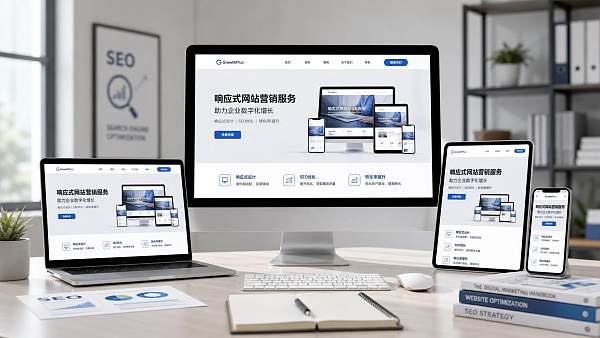
In simple terms, responsive design means using the same page content and adapting it to desktop, tablet, and mobile through different layout rules. Its core is not “shrinking the page,” but ensuring that under the same URL, the main content, structural signals, and functional entry points can all be accessed smoothly on different devices.
This is also why the impact of responsive design on SEO is so obvious. Search engines can more easily understand the topic and authority of a single page without repeatedly judging the relationship between multiple device versions. For websites with a lot of content, complex page hierarchies, and the need to balance advertising and organic search, this consistency is especially important.
If a site still uses a separate mobile site, common issues include inconsistent content, missing tags, abnormal redirects, and scattered links. These problems may not make the page impossible to index, but they can waste crawl budget on duplicate paths, thereby affecting the exposure efficiency of core pages.
Crawling and indexing: why technical structure can widen SEO differences
From a crawl perspective, the biggest value of responsive design is reducing the search engine’s understanding cost. A unified URL means the search engine only needs to crawl one page version, page authority will not be diluted because the desktop and mobile versions are split apart, and internal linking relationships become clearer.
At the indexing level, the impact of responsive design on SEO is mainly reflected in content consistency. If the same page shows different body text, titles, or structured information across devices, search engines may have difficulty determining which version is more complete, ultimately affecting indexing quality.
This point is even more sensitive for multilingual sites and overseas independent sites. Because pages often also carry hreflang, canonical links, regional versions, and marketing landing page logic. Once the mobile version is split off separately, maintenance costs rise significantly and the error rate increases accordingly.
Mobile experience is not only about user perception; it also directly affects rankings
Search engines are paying more and more attention to page experience, especially on mobile. The impact of responsive design on SEO is reflected here more directly. Whether the page is readable, whether buttons are easy to tap, whether the first screen is stable, and whether images are loaded slowly all affect user dwell time and search engines’ judgment of page quality.
If a page looks complete on desktop but has text crowding, hard-to-fill forms, horizontal scrolling, or first-screen misalignment on mobile, search rankings are usually hard to stay stable for long. The reason is not complicated: users leave quickly, behavioral data weakens, and technical signals also deteriorate accordingly.
What is more worth noting is that many marketing websites simultaneously take on SEO, advertising landing, and inquiry conversion tasks. At this point, responsive design cannot only pursue “displayability”; it must ensure that visitors from different sources can smoothly complete browsing, comparison, consultation, and submission actions.
Several experience details that are easy to ignore
- Excessive first-screen weight causes slow mobile loading, affecting crawl and bounce rates.
- Key content is folded too deeply, making it difficult for both search engines and users to quickly identify the topic.
- Inquiry buttons, phone buttons, or form entry positions are unstable, interrupting the conversion path.
- Multilingual switching is too deeply hidden on mobile, reducing overseas access efficiency.
From rankings to conversions: responsive design begins to take on business responsibility
When discussing the impact of responsive design on SEO, stopping at indexing and rankings is still not enough. Because truly valuable SEO is not about bringing users to the page, but about making the page capable of sustained conversion or lead generation.
In B2B inquiries, cross-border e-commerce, and brand going-global scenarios, visitors are often highly dispersed across devices. Some search on mobile first, some return to desktop for comparison, and others enter through ads or social media a second time. If the page information is inconsistent across devices, trust will drop significantly.
Therefore, the impact of responsive design on SEO will ultimately be transmitted to conversion rates. Whether the title structure is clear, whether product information is complete, whether case modules are readable, and whether forms are easy to submit—these seemingly front-end issues are actually determining the commercial results of SEO traffic.
From an integrated service perspective, websites, SEO, advertising, and social media operations should not be fighting their own battles. Platforms like Yiyingbao, which simultaneously cover smart website building, SEO optimization, ad placement, and multilingual operations, derive their value from allowing front-end structure, content distribution, and conversion pathways to be collaboratively designed, reducing repeated rework later on.
Which scenarios need responsive design to be included in the evaluation more urgently
Not every site faces the same problems, but the following business types are more sensitive to responsive design, and the SEO results are more likely to be magnified.
- Multilingual official websites: they need a unified content structure while also accommodating access habits in different regions.
- Foreign trade marketing sites: they rely on Google search for inquiries, and mobile traffic often accounts for a considerable share.
- Cross-border e-commerce: many pages, complex filtering, and image-heavy content mean technical details directly affect crawl efficiency.
- Advertising landing pages: they need to load quickly and also maintain a consistent experience with organic search pages.
- Brand going-global sites: they need to balance SEO, social traffic, and AI search visibility.
The common point in these scenarios is that the website is not a brochure, but a growth foundation. At this point, the impact of responsive design on SEO will permeate the entire process of content production, technical maintenance, ad delivery, and lead management.
When evaluating, don’t just look at the template appearance; look at these judgment points too
Many projects, when selecting a solution, only pay attention to whether the page looks good and easily ignore technical details. A truly effective evaluation should also look at design adaptation, SEO foundation capabilities, and subsequent operations costs.
Items recommended for priority inspection
- Whether a unified URL is used instead of a separate mobile site.
- Whether the mobile and desktop body text, titles, and meta information are consistent.
- Whether images, scripts, and third-party plugins have been compressed and deferred for loading.
- Whether navigation, breadcrumbs, pagination, and internal links remain usable on mobile.
- Whether forms, buttons, and conversion components adapt to different devices and regional access environments.
- Whether multilingual and multi-regional pages can maintain synchronized structures stably.
If the project also involves AI website building, SEO automation, and omnichannel marketing coordination, then whether the system supports continuous iteration is equally important. Responsive design is not a one-time pre-launch task; it is a capability that evolves with content growth and page expansion over the long term.
Put responsive design back into the growth chain for judgment
Returning to the original question, what are the impacts of responsive design on SEO? The answer is not limited to “it helps mobile rankings.” It actually runs through crawl efficiency, index stability, page experience, cross-device consistency, and ultimately inquiry and conversion performance.
If you are evaluating a website system, a site redesign, or an overseas marketing solution, a more stable approach is to first place page structure, device adaptation, content consistency, and conversion pathways in the same table, and then judge whether the current solution truly supports long-term SEO growth.
When a website needs to be understood efficiently by search engines and also used smoothly by users, responsive design is no longer a visual-level choice, but a foundational decision jointly made by technology and marketing. Once this step is clear, content creation, ad placement, and global expansion become much more likely to generate sustained returns.
Related Articles



Related Products
 Yiyingbao SaaS Intelligent Website Building and Marketing SystemYiyingbao SaaS Intelligent Website Building and Marketing System, AI-powered no-code website building, rapid creation of multilingual B2B international websites in 10 minutes, global server acceleration, AI-powered SEO optimization, helping businesses connect efficiently with global markets. The perfect integration of technology and operation makes building an international trade website remarkably simple
 AI+SEM Intelligent Advertising Marketing SystemAI+SEM drives intelligent ad creation, empowering full-funnel precision advertising marketing. The system automatically generates weekly/monthly reports, AI recommends keywords and target countries, monitors core metrics in real-time with intelligent alerts, and enables one-click high-conversion ad solutions to help quickly acquire customers and improve ROI.
 AI+SEO Dual-Engine System Optimization ServicesYiyingbao’s AI+SEO dual-engine optimization system helps foreign trade enterprises acquire high-quality organic traffic through AI-powered keyword research, content generation, and comprehensive technical optimization, significantly improving search rankings and conversion rates.
 AI+SNS Social Media Marketing SystemYingbao AI+SNS Social Media Marketing System - Precision social capture for the social media era. Supports one-click content synchronization across major platforms like Facebook and LinkedIn. AI intelligently rewrites posts for enhanced relevance. 24/7 AI customer service and user profiling analysis empower businesses to efficiently expand into global markets.
 AI+SEO营销解决方案易营宝AI+SEO营销解决方案,通过AI批量写作、智能生成TDK、精准关键词扩词等功能,全面优化网站SEO效果,提升流量与转化率。助力企业构建高效智能网站新生态。
 AI+SEM Advertising Marketing SolutionsAI+SEM Advertising Marketing Solution leverages AI technology to deeply empower SEM ad campaigns. It automatically generates weekly/monthly reports using AI, presenting account data across multiple dimensions for comprehensive insights into campaign performance and trends. The system precisely recommends keywords and target countries, intelligently generates high-conversion ad copy, and enables one-click activation of efficient campaign plans to help businesses rapidly acquire customers. Simultaneously, it monitors core metrics in real time, intelligently identifies abnormal fluctuations, and issues timely alerts to ensure stable, high-return advertising results.
 Domain Name ServicesEasyWin provides professional domain name services, including intelligent queries, one-stop registration, brand protection, and full lifecycle management, helping businesses build a digital brand image.
 EasyOperate B2C Cross-Border E-Commerce Platform & Independent WebsiteEasyStore B2C Cross-border E-commerce Independent Store is an intelligent website building and cross-border e-commerce integrated solution independently developed by EasyStore Information Technology (Beijing) Co., Ltd. The system is specially designed for small and medium-sized as well as large export enterprises, integrating 'website building, operation, marketing, advertising, and conversion' into one, helping enterprises quickly establish cross-border e-commerce independent stores to achieve brand globalization and global sales growth.
The platform supports multiple languages, multiple currencies, and multi-channel marketing, with built-in AI intelligent translation and SEO optimization systems, suitable for mainstream markets such as Southeast Asia, Europe and America, Latin America, and the Middle East, assisting Chinese manufacturing enterprises in efficiently deploying international e-commerce strategies. SSL证书易营宝提供专业SSL安全证书服务,包括单域名和泛域名证书,确保网站数据传输加密、身份验证和完整性保护,助力企业建立安全可信的在线业务环境。









