- Which metrics should you review in an international digital agency data analysis reportMay 08 2026View details
- To what extent can digital marketing strategy agencies implement their services?May 08 2026View details
- At what stage is global marketing consulting suitable to get involved?May 08 2026View details
- How to select an AI+SEM Advertising System supplier?May 08 2026View details
- Why International Digital Marketing Strategies Are Increasingly Emphasizing LocalizationMay 08 2026View details
- How to compare Beijing global digital marketing service providers more efficientlyMay 08 2026View details
- When Choosing a Shanghai Global Digital Marketing Company, Should You Focus on Case Studies or the TeamMay 08 2026View details
- Which markets are suitable for international digital agency social media marketingMay 08 2026View details
Web Design and UI Trends for 2021
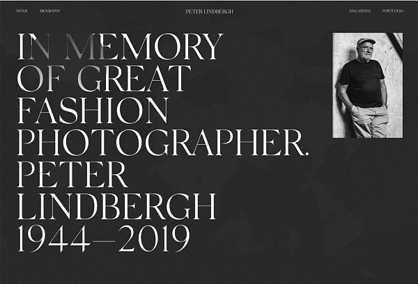
Dark Mode
Dark mode is everywhere. Since most browsers and mobile devices have the ability to switch between light and dark modes, you need to consider how your app will look when you adopt a dark scheme, even if it's not the default.
Since dark mode has become a top choice among users, more designers are turning to darker, darker color palettes for overall website and user interface designs.
These projects often have polarizing effects, so even if you don’t plan on switching options, it’s important to consider how dark mode affects the overall mood of your messaging and the content of your website design.
For designers who are creating lighter interfaces, consider and design for how dark mode will look once the user opts in. Remember, dark mode isn’t just a reversal of your color palette, it should be an intentional combination of dark and dark colors that creates the same visual effect as light mode and maintains readability and functionality.
Some tips for making the most of dark mode in website design include:
You don't have to use "white" and "black"; think of light and dark in light and dark mode. (Maybe use a light gray on a dark purple background.)
Stay away from highly saturated colors on dark backgrounds.
Use color variations (light and dark) to establish hierarchy.
Provide a toggle switch for light and dark mode so that users can choose the appearance design.
Don’t forget about accessibility in dark mode, and pay attention to size and contrast.
Experimental fonts
Experimental fonts are becoming increasingly popular in website and mobile app projects.
These fonts are different, unique or custom to the project. Experimental fonts range from stunning fine art to surprises as part of standard font design.
Experimental fonts may be a monochrome style, include color, be animated, and include full or abbreviated character sets.
A few ways to make the most of experimental fonts include:
1. Because these fonts can be visually heavy, keep the rest of the design simple.
2. Pair with a highly readable secondary font.
3. Consider custom experimental fonts for key elements, such as the one used for the Designmodo logo.
A design without too many faces
This trend may be a direct result of the global coronavirus pandemic, with fewer designers and faces.
The reason is practical: Since people aren’t wearing masks in large groups, designers are looking for ways to use existing stockpiles of imagery to build appropriate images. Or they’re choosing images without people in them.
This may be your first time browsing various websites and you have rarely seen them.
While this is a big trend right now, don’t expect it to stick around long term after the pandemic as people start gathering in larger groups again.
Related Articles
Related Products

