EasyStore Cloud Intelligent Website Marketing System Platform!
- Are global buyers abandoning your independent website? Uncover the technical traps that 99% of companies ignore2025-06-19View Details
- Multilingual SEO optimization services help companies expand into international markets!2025-06-19View Details
- AI-driven SEO optimization services can double your website traffic!2025-06-19View Details
- Intelligent website building system + SEO optimization services to create an efficient marketing website!2025-06-19View Details
- Shandong enterprises must see: the five core advantages of independent station construction2025-06-17View Details
- The official agent of Google for foreign trade independent website: authoritative certification, trustworthy2025-06-17View Details
- Which is the best Chinese service provider for foreign trade independent website? Read this article is enough!2025-06-17View Details
- Foreign trade standalone site global server deployment, so that your website is fast2025-06-18View Details
Marketing website web design skills practical version
The quality of page design directly determines the user's browsing experience, so what issues should be paid attention to during web design?
This article will share with you practical tips for improving web design. Without further ado, let’s get straight to the point.
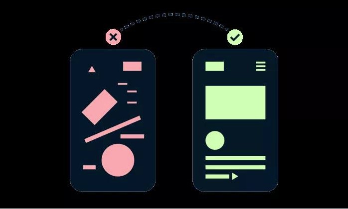
1. Use color overlays on photos with text
In web design, sometimes you have to deal with some bad images. Try to treat them as background textures instead of main focal elements by overlaying brand colors on semi-opaque settings. Make the overlay text more readable by improving the contrast. For example, in the example below, a dark blue shade is added to the text to further enhance the contrast.
picture
2. Don’t Overuse Negative Space
Designers seem to love using negative space, and many people on the Internet recommend using more negative space. But when there is too much negative space between elements, people's eyes will fall into the void and the coherence between elements will be interrupted.

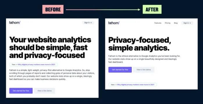
3. “Stop talking nonsense”
You should know that many people don't have the patience to read a long string of text on a page, which means that your web page has very little time to attract people's attention. Therefore, the content of the page must be concise, and the key points must be highlighted, and "less nonsense" should be said.
4. Make layouts visually appealing even if they only have text
The text-only portion of a landing page can be difficult to design, especially if you don’t have the opportunity or resources to optimize the page with illustrations, images, or photos.
At this time, you can use brand colors and display details to enhance the visual design effect.
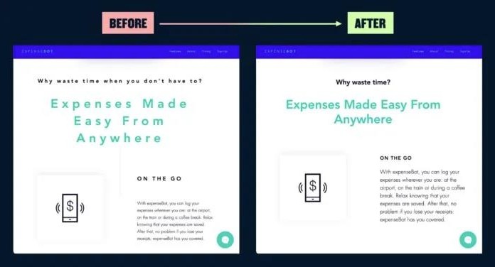
5. Small icons, big illustrations
Icons are important, but they should be displayed appropriately. Some elements are more suitable for "supporting roles". If you enlarge them, you will only get a bad effect.
For example, if you use the icon as the "supporting role" of the title, the title text content will undoubtedly be more prominent and the display will be more reasonable.

6. Reduce letter spacing
There are many ways to use letter spacing to subtly improve typography, but if you don’t have a lot of experience with typography, stick to adding a little more letter spacing to all caps headlines. Adding extra letter spacing to sentence case text can create readability issues and can disrupt the natural rhythm of a typeface design.
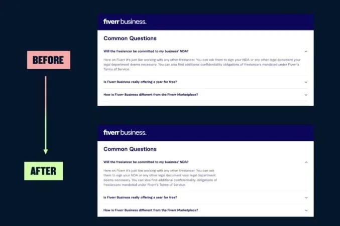
7. Pay attention to the length of the FAQ section
The FAQ section is an important part of many web pages, and the optimal line length is between 45 and 75 characters, including spaces and punctuation.
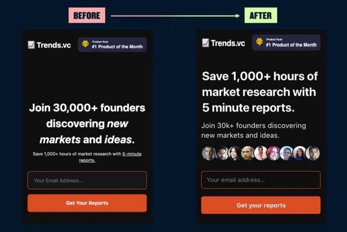
8. Demonstrate social value
In this example, the real value proposition is hidden in a subheading that’s barely noticeable.
This is when you can increase the authenticity of your social proof by adding the faces of real users.
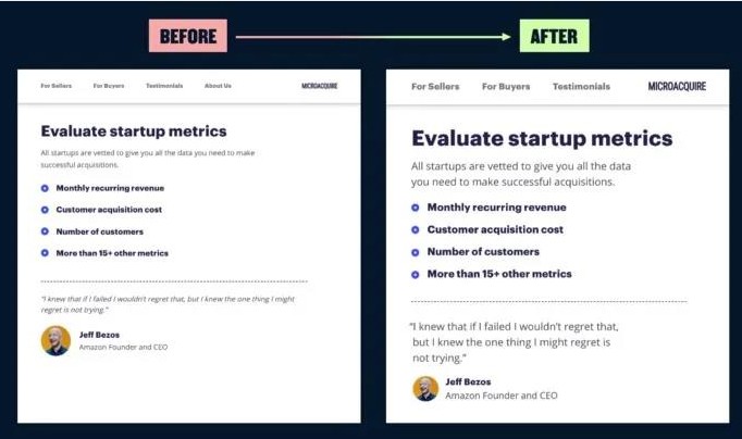
9. No one likes small text
In this example, I used variable typography in CSS to create the main body copy at 11px and the navigation links at 9px.
The browser default font size of 16px is now 20 years old - using modern fonts designed for screens, start with text size between 18-20px.
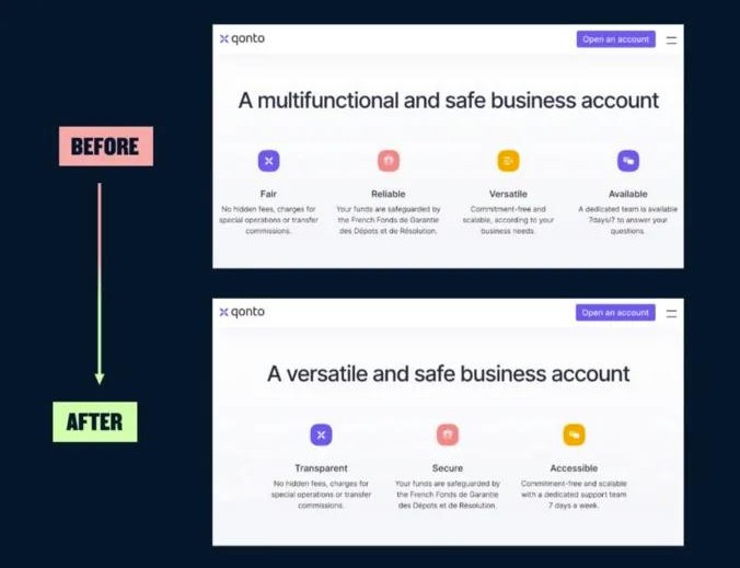
10. Use the Law of Probability
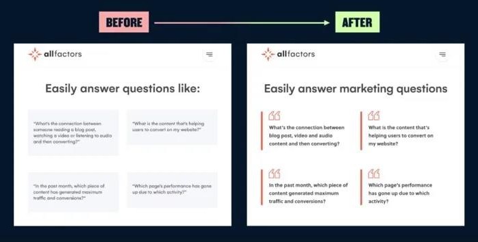
Make your page layout contain an odd number of elements. If you need to show 4 points, try to combine 2 of them and show them with 3 points.
If this is difficult to achieve, prioritize the most important ideas and eliminate the weakest ones.
In a layout like the example below, having to look at four bullet points can feel like cognitive overload.
11. Keep the text as short as possible
Consolidate and reduce text content where possible. Create size contrast between headlines and copy to improve visual hierarchy, and use negative space to create a clean experience when you have a lot of content to show.
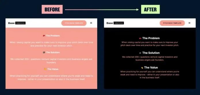
12. Use bright colors to emphasize key points
Using bright colors over a large area will create an imbalance in contrast and may not achieve the purpose of highlighting the text content. For smaller elements, such as buttons, you may want to avoid white text as much as possible.
13. Check the contrast of gray text
Using grey text is a popular practice for creating hierarchy between text elements. But this often makes the text less readable due to lack of contrast. Use some online tools to check the contrast and increase the contrast of the font size if you need to establish a clearer visual hierarchy.
The above are 13 tips for marketing website web design. I hope it can be helpful to you.
Similar Recommendations


